It’s that time of year when I reflect on another year’s worth of design tutorials here on Blog.SpoonGraphics and check over the stats to see which posts ended up proving the most popular. Here’s a roundup of the most popular tutorial posts from 2012 based on the number of StumbleUpon ‘thumbs up’ votes.
Last year saw figures of around 14,000 likes for some of the popular posts of 2011, so it’s a big surprise to see this year’s most popular tutorial only come in with just over 1000 likes, with the average being around 500. It definitely looks like social media traffic as a whole has dramatically dropped with each post only having a hand full of shares on Twitter, Facebook and Google+.
As always I’m keen to hear your thoughts on my content. Which tutorial from the list was your favourite? Or was there a post I haven’t included that you found particularly useful?


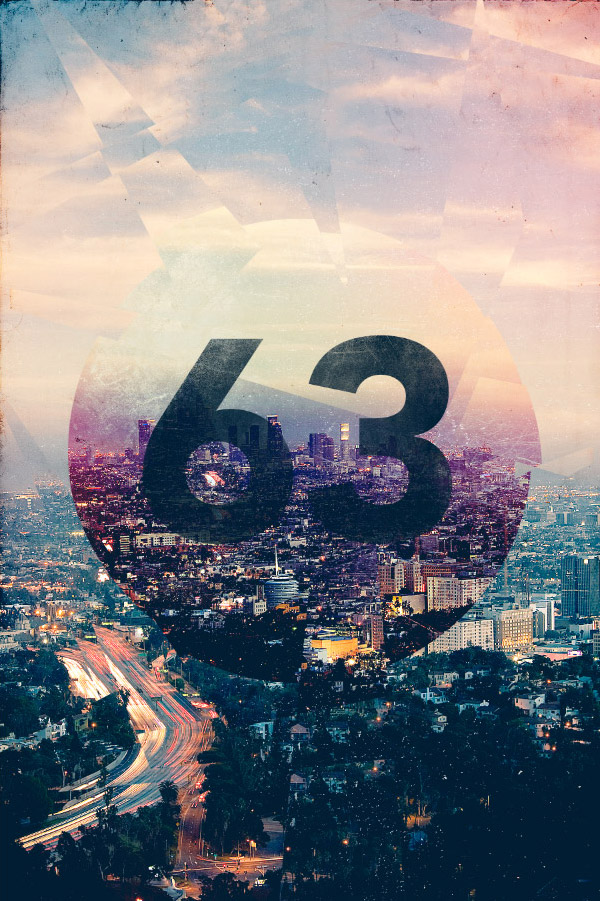


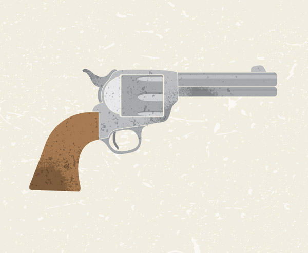







I wouldn’t be able to decide! I liked the Cityscape design very much, but my favorites were the vector designs, because I just got into Illustrator lately.
Thanks for all the fenomenal content this year Chris, you are awesome. Happy new year!
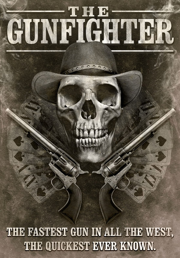
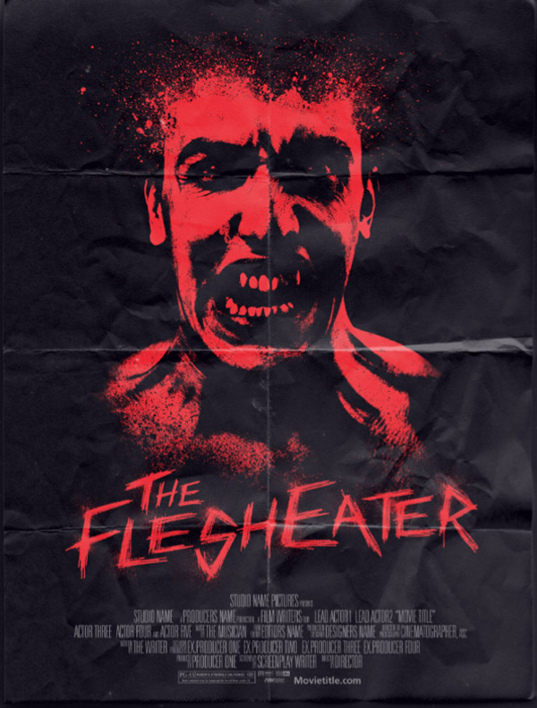
I really enjoyed many of these tutorials – so hard to pick a favourite – probably the gunfighter poster or flesh eaters as they combine images, graphics and type.
Thanks man for all you do to help out. Of course your benefits are there too, but there are a lot of people that put up tutorials half heartedly. Yours are careful and well thought out. Nice work. Keep it up :)
Another great year Chris – all the best for a successful 2013.
Wow, I missed the Cityscape Design and it really looks great. I really like your tuts that taught me a lot about how to use Illustrator to create nice illustrations, so I’d say that my favorite for the look is Cityscape, but my favorite in term of what I learnt are the Yeti and cute little Skull.
I’m looking forward to 2013 tuts, and again, thanks a lot :)
Some great guides in there, something for everyone, thanks for all the tutorials through the year.
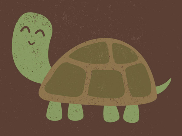
I don’t know that I can choose my favorite tutorial (though I am going to have to try the sponge effect on the turtle since that reminds me of something I used to do in art class a half century ago). I use no social media, so there won’t be a “LIKE” from me using those sources. I find my tutorials through CraftCrave, RSS feeds, and random searches (never Google) since I spend no time on Facebook or Twitter. In your statistics, do you factor in the minority of us that don’t care for social media?
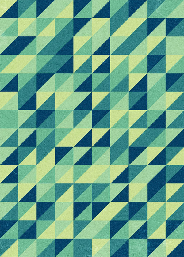
A year full with great tuturials. My vote is on Retro triangle pattern, cool way of utilzing Illustrator. I for one would like to see more illustrator tutorials in 2013, although there were a hole bunch in 2012.
Nice to see, which tutorials I’ve missed the last year :). I will grab a cup of coffee and take a look to those ones :)
some great tutorials, loved the yeti one!
Great collection of tutorials, nice variation.
I missed the mascots tutorial, need to read that one. Awesome year Chris! Looking forward for more this 2013.
Loved doing the drooling monster tutorial.
Your character tutorials are second to none and I’ve learnt so much from them and even created my own now!
I also tried the skull and cross bones one but struggled with the pattern effect bounding.
Keep up the fab work Chris :)
Vector Yeti is so cute! I’d be glad to try to create him :) Thanks for teh round-up
Poster design is very fantastic. I think Chis will share fantastic designs in 2013. Chis is very creative on graphics. We are waiting more posts about “Phoshop ” used on design fantastic graphics.
“How To Create a Movie Style Photo Effect in Photoshop” is Very useful to me. Thanks for sharing
Amazing … One of the blog i check everyday.
Hope 2013 would be even better. Thnx and keep it up Chris.