This post was originally published in 2012
The tips and techniques explained may be outdated.
I’m sure we all remember painting with sponge (or potato!) stamps as a child, but back then we didn’t really appreciate the cool distressed effect the printing technique created. Today designers and illustrators strive to add that retro/vintage style to their work with textures, so in this tutorial we’ll cover the process of creating a cute kids style illustration complete with a vector sponge stamp effect.
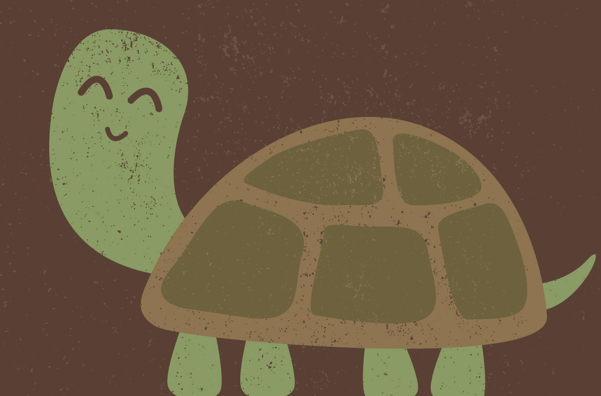
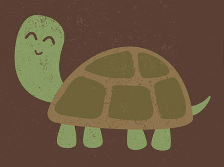
We’ll be creating this cute turtle character as part of this tutorial. The overall styling of the character is super simple with large round shapes and irregular lines to relate to the kids theme, then a range of vector texture elements are used to distress the solid shapes to create an old print or stamp effect.
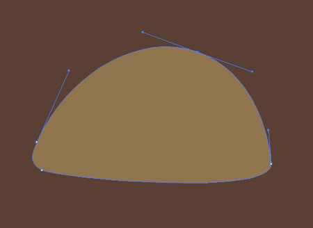
Open up Adobe Illustrator and fill the artboard with a brown rectangle. Use the pen tool to roughly draw the outline of the turtle’s shell. Don’t worry too much about precise proportions, but make sure those paths are made with large bezier handles for smooth curves.
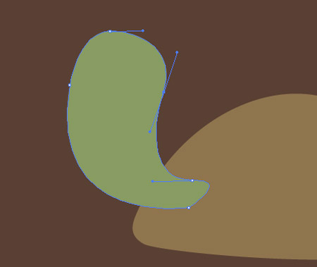
Move on to the outline of the turtle’s head and neck, taking creative liberties on the sizing and proportion to create a kids’ style character. Fill the head with a suitable green colour.
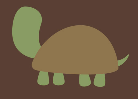
Add four legs and a little tail in green, then select the shell element and hit CMD+Shift+] to send this item to the top of the stack.
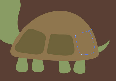
Use the pen tool with a large green colour to draw the individual plates onto the turtle’s shell. Wobbly lines all add to the overall style we’re going for.
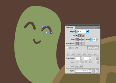
Finish off the turtle character with a cute expression using stroked paths. Increase the weight to around 7pt and select the round cap options.
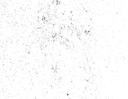
To create the vintage/retro print or stamp effect we’ll need some kind of grainy grunge texture file. Increase the contrast of a texture photograph, or use a ready made set of brushes such as my Subtle Grunge Photoshop Brushes.
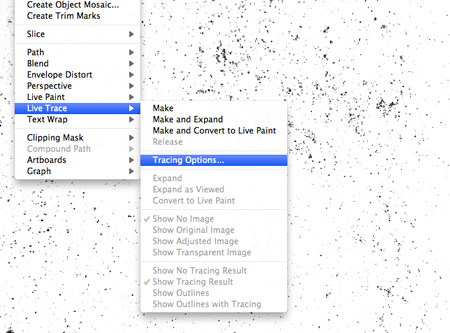
Copy and paste a copy of a grain texture into Illustrator. We want our vector illustration to be completely vector, so head to Object > Live Trace > Tracing Options to configure the vectorizing options.
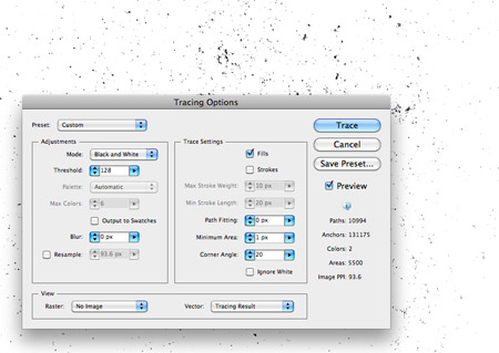
Leave the default Black and White preset, but change the Path Fitting to 0px and Minimum Area to 1px to accommodate the finer details, then Trace the raster image into a vector texture.
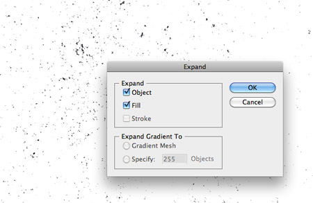
Go to Object > Expand to convert the Live Trace object into solid vector elements.
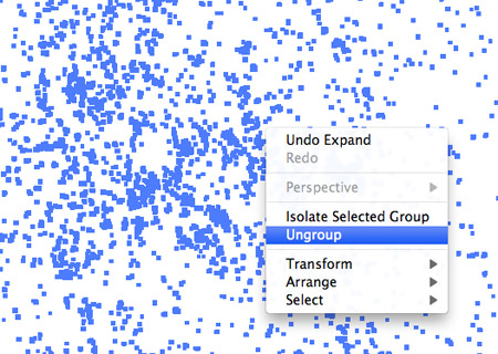
Right click and select Ungroup to begin splitting the texture grains from the white background. Repeatedly Ungroup several times until the Ungroup option no longer appears.
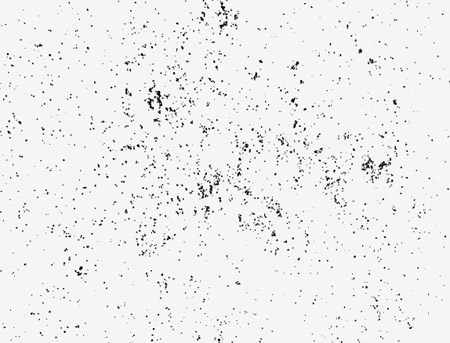
Select the white background and delete it from the vector texture.
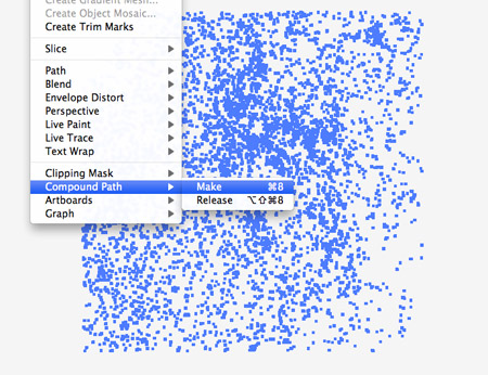
Every single grain of the texture is currently a separate shape, so draw a selection around the texture and create a Compound Path.
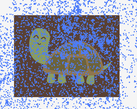
Make a copy of the texture file and scale it over your illustration, then make a duplicate of the background rectangle and send it to the top (CMD+Shift+]).
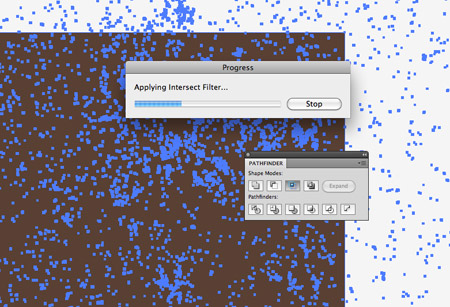
Select both the duplicated rectangle and the texture file and hit the Intersect button from the Pathfinder palette to trim the texture to size. If you run into any ‘Overlapping Object’ errors, a simple solution is to ungroup any elements then recreate the Compound Paths.
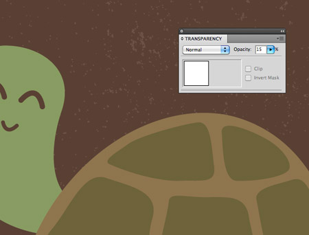
Alter the stacking order with the CMD+[ shortcut to position the texture just above the background rectangle, then give it a white fill and reduce its opacity to 15%.
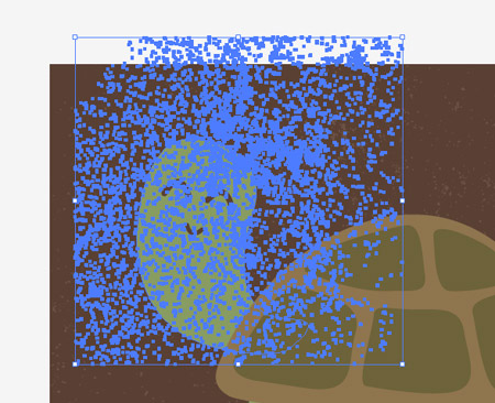
Position another copy of the texture over the turtle’s head, then repeat the process of making a duplicate object and using it as a tool to trim the texture to size with the Pathfinder.
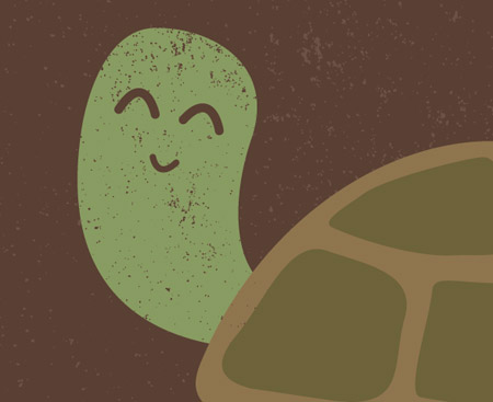
Give the texture over the turtle’s head the same fill as the background to give the impression of a print effect with areas of missing paint/ink.
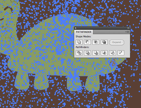
Add another texture over the body and legs, but this time don’t forget to create a compound path out of the shell, legs and tail items. Any groups of individual shapes need combining as a compound path to avoid Pathfinder errors.
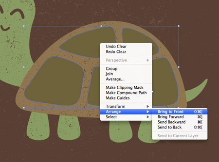
Once the texture has been added to the turtle’s body, send the plate elements to the top of the stack so the texture doesn’t affect them.
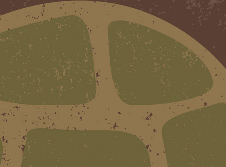
Give the plates their own texture overlay, but using the same fill as the turtle’s shell to create a layered impression.
This leaves our cute little turtle character complete. The simple shapes give the turtle that happy and friendly appearance while the texture helps relate to a tactile printed finish. Best of all the whole illustration remains vector based which allows infinite scaling.


I love the graphic outcome, but wouldn’t it be easier to just use masks? And it would be editable, too.
Just Awesome….
Simple and fun! Thanks, Chris! :)
Cute :-)
Nice tutorial, tanks.
This is a great way to add texture using vectors. Also the file is fully editable and can be scaled to any size without loss of quality you would get with a photoshop file.
http://www.paperacrobat.blogspot.co.uk/2012/04/say-no-to-noise.html?m=1
Nothing can be predictable here ……… Nice work !!
nice tutorial :-)
could save yourself a little work by selecting ignore white so you don’t have the hassle of ungrouping (multiple times) and deleting the white background ;-)
yeah saved about 30 seconds and a few clicks lolz
duh you have to select ignore white in the tracing options screen …^ ^
Aww, I love the turtle! So cute. ♥ Thanks for sharing this sweet tut.
Good post! Keep it up.
I just want to give my personal advice to successful web design:
1. Include a Tagline
2. Implement Site Search
3. Don’t overuse graphics
4.Use site maps
5. Always have a stable workflow
6. Make each page easy scannable
7. Do not mislead visitors purposely through design
8. Always reply to feedback
9. Use JavaScript sparingly
10. Avoid CAPTCHAs. They might be useful but they’re very annoying!
Good Post!
I would like go through the importance of content writing with relation to web design. These points will not make your website more compelling to visitors but will also rank high in search engines:
1. Ensuring that your spelling and grammar are correct should be top priority.
2. If you’re at a loss for what to write, hire online content writers. There are many talented individuals. Just remember that you always get what you pay for.
3. A simple way to reduce the complexity of content is to take what you have and narrow it down to 50%. It may seem a lot, but reduction in content will force one to focus on the important aspects.
4. Writing your content before you start designing your website can help you better approach the coding stage as you can pick the right elements that describe your content’s value.
5. If you sacrifice the quality of the content for the design of the website, your visitors will probably not even read your content and never return.
So with this said always remember, content is king!
Cute, simple and nice. Great job!!
Simple yet effective, great tutorial!
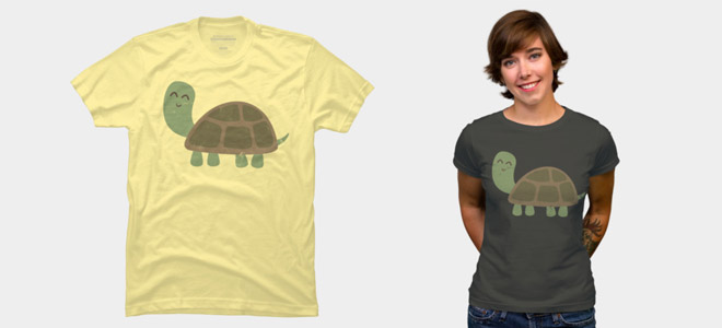
Sweet! Looks like he belongs on a t-shirt.
cool factor shape
This is a great tutorial. Thanks for sharing your techniques. I really enjoy following the process that designers take to get the final results. There are always many ways to do the same thing in many of the design programs.
That is cool! i have tow turtle i will try this tutorial on a real photo, i believe will be a nice pictures, thank u
i can’t :(
i’m an illustrator newbie… :[
This is a great tutorial. Thanks for sharing your techniques.