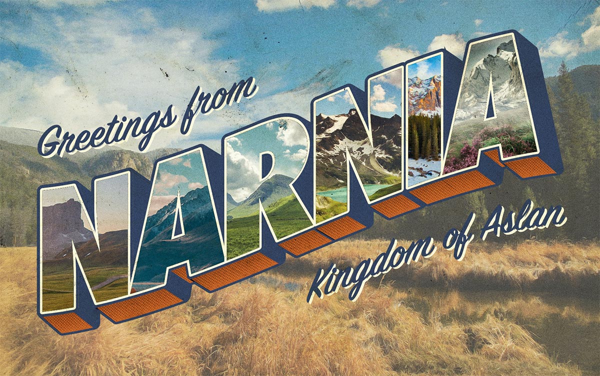
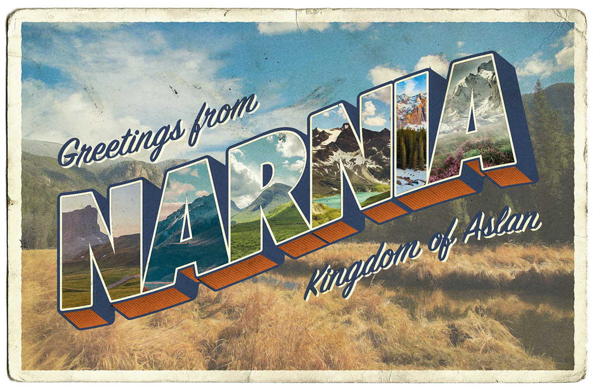
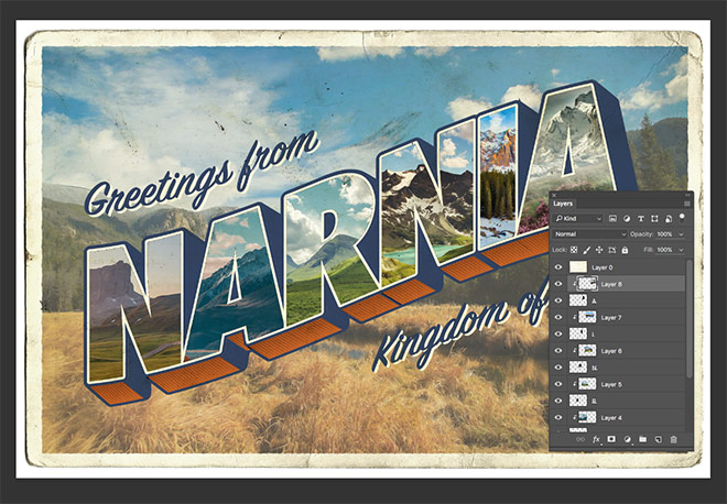
‘Large Letter’ was the name of a popular style of postcard design throughout mid-20th century. Often accompanied by the words “Greetings from…”, these postcards presented the name of a place with faux 3D type effects and featured a variety of pictures of that locale clipped within the text face of each letter. The style has become iconic and is referenced by designers who want to create artwork with a nostalgic or retro theme. In today’s tutorial I show how to create a vintage style large letter postcard design, using the tools available in Adobe Illustrator and Adobe Photoshop to replicate the visual traits of those original souvenirs.
Watch the video
Subscribe to the Spoon Graphics YouTube Channel
The design we’ll be creating in this tutorial is inspired by the classic style of Large Letter postcards. We’ll use Adobe Illustrator to produce the 3D text style, then import the artwork into Adobe Photoshop to replicate the picture effects within each letter. The addition of some image filters and textures will give the digital design the aesthetics of a vintage print.
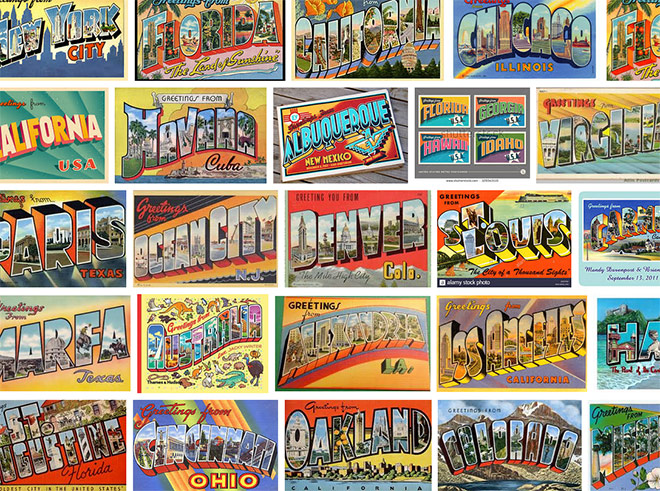
To familiarise yourself with this iconic design style, Google the words “Greetings from postcards” to see hundreds of examples from across America. You’ll notice the large lettering effect is common throughout, often warped in various angles and accompanied with bold colours.
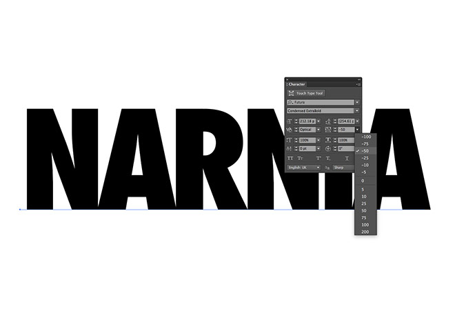
We’ll begin in Adobe Illustrator where we’ll construct the basic text layout. Create a new document and lay out your chosen place name with the Type tool. Choose a strong and bold font. I’m using Futura Condensed Extra Bold with the tracking reduced to -50.
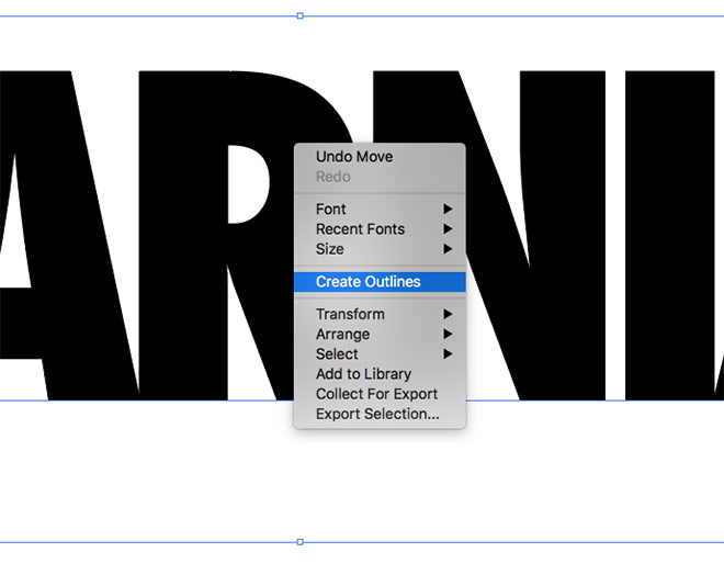
Convert the text element to outlines by selecting Convert Outlines from the right-click menu, or by using the shortcut CMD+Shift+O. This will turn the font into a series of vector letter shapes.
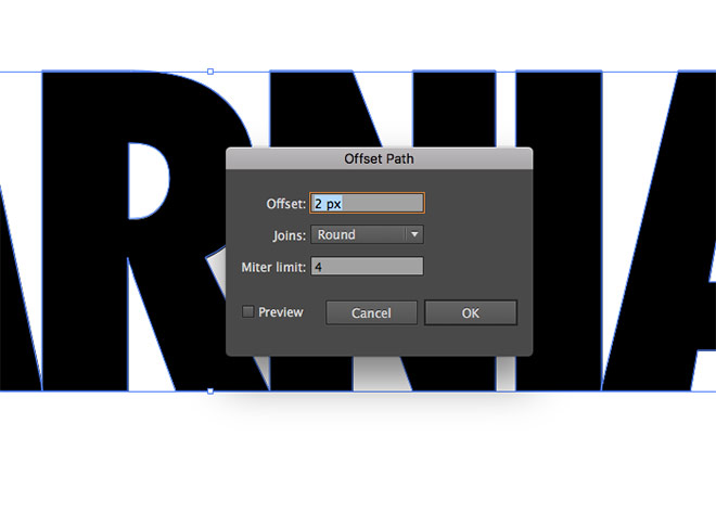
Go to Object > Path > Offset Path. Enter 2px in the options menu to create an enlarged copy of the text shapes. Give these new shapes a light grey fill.
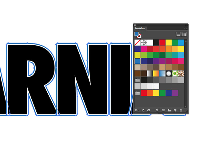
Use the Object > Path > Offset Path menu again to add another enlarged 2px outline. Change the fill of this second outline to a mid blue swatch.
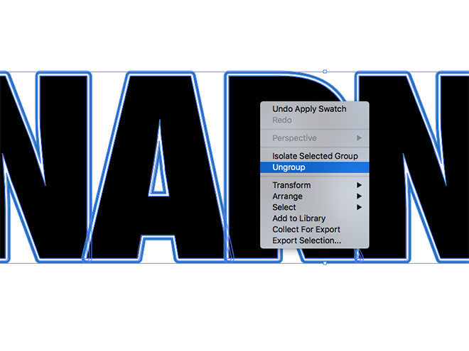
Currently the outlines of each letters overlap each other. Right click and select Ungroup to break apart the 3 sets of text shapes.
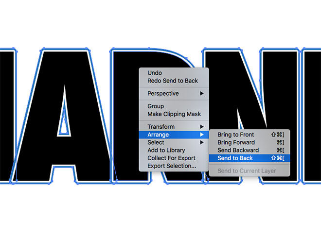
Hold the Shift key and carefully select all the blue outlines. Right click and choose Arrange > Send to Back.
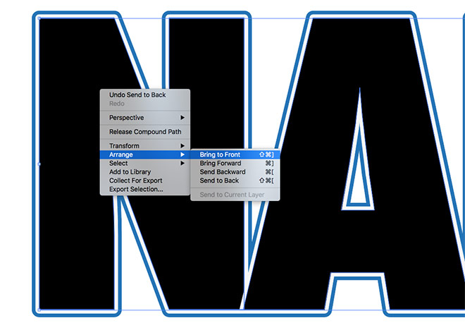
Make a new selection of all the original black text shapes. Right click and choose Arrange > Bring to Front.
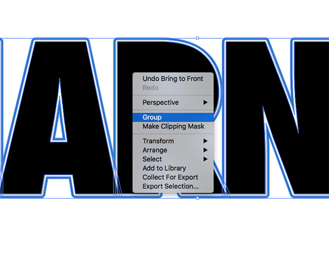
Draw a selection around the entire wording to capture all text shapes, then right click and select Group.
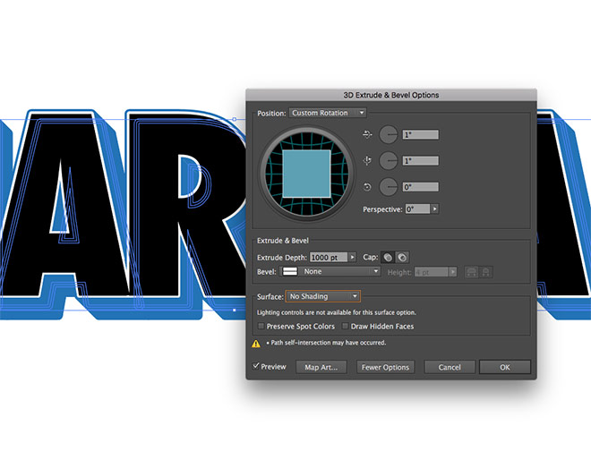
Under the Effect menu, select 3D > Extrude & Bevel. Alter the position settings to 1°, 1° & 0°. Increase the Extrude Depth to 1000pt, then change the surface option to No Shading.
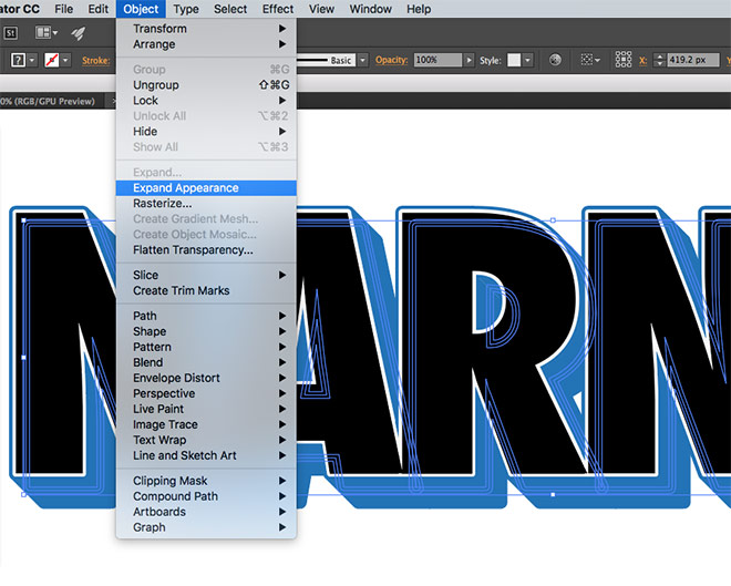
Go to Object > Expand Appearance to convert the 3D effect into a series of shapes.
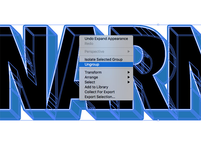
Repeatedly right click and select Ungroup until the option no longer appears in order to completely break the object apart into individual pieces.
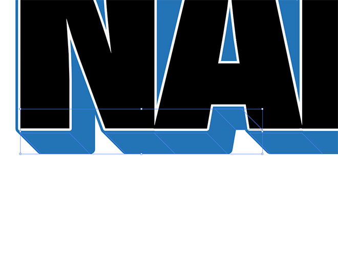
Hold the Shift key and select all the shapes that form the extruded parts along the bottom edge of each letter.
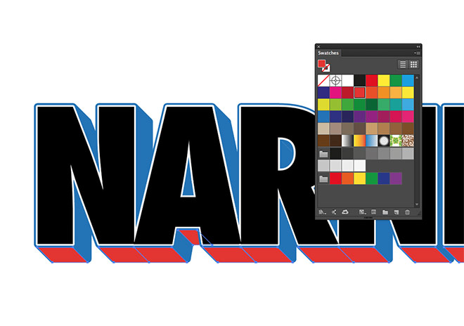
Change the fill colour of these selected shapes to a bright red or orange swatch.
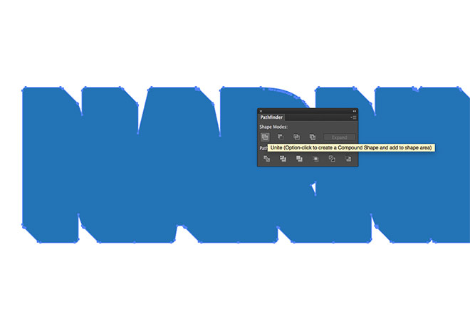
Draw a selection across the entire artwork and hit CMD+C to Copy, followed by CMD+F to Paste in Front. Click the Unite button from the Pathfinder panel to merge everything into a single shape.
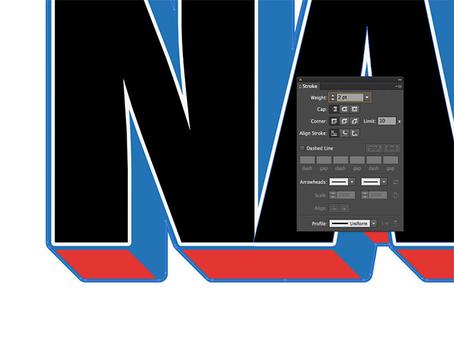
Switch the fill and stroke selections around in the toolbar to give this shape a blue outline. Increase the stroke weight to 2pt.
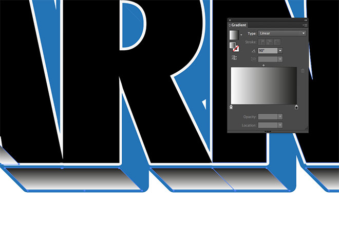
Use the Magic Wand tool to quickly select the red/orange shapes, then make a duplicate using the CMD+C and CMD+F shortcuts. Change the fill to a black-to-white gradient, then adjust the angle to 90° in the Gradient panel.
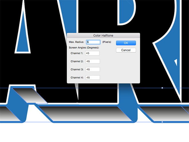
Go to Effect > Pixelate > Color Halftone and enter the settings 5px max radius, followed by 45 in each of the screen angles.
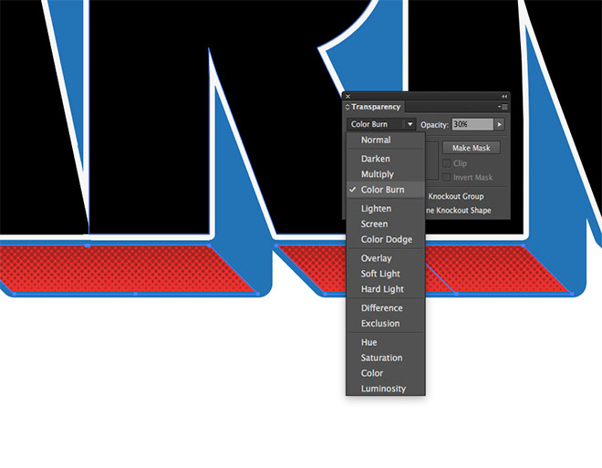
Change the blending mode of these shapes to Color Burn to allow the halftone effect to interact with the bright shapes below, then reduce the opacity to around 30%.

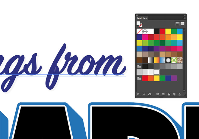
Lay out some accompanying text above and below the 3D wording. I’m using a hand scripted font from my collection named SignPainter. (No longer on Adobe Fonts. Try Corner Store instead! – https://spoon.graphics/3SFj1WK)
Copy the text elements, then use the Paste in Back (CMD+B) command to create a duplicate. Nudge the copies down and right using the cursor keys, then change the fill to the same light grey swatch that was previously used to add a simple drop shadow effect.
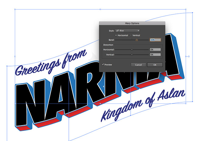
Select All using the CMD+A shortcut, then navigate to Object > Envelope Distort > Make with Warp. Change the Style dropdown menu to Rise with a Bend of 30%.
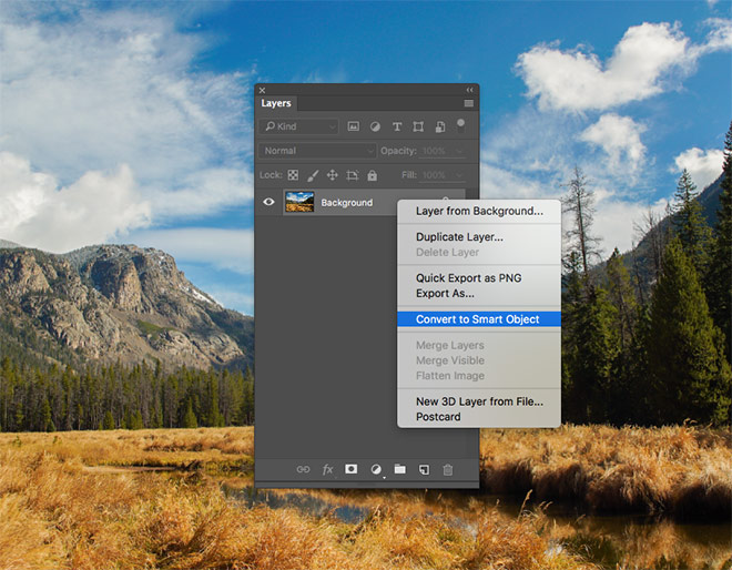
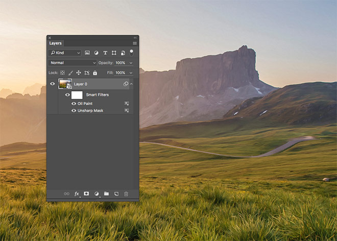
Switch over to Adobe Photoshop to begin preparing the main postcard canvas. Browse free photo websites such as Unsplash and Pexels to find a range of images that suit the locale of your chosen place. Open one of them in Photoshop and convert the layer to a Smart Object.
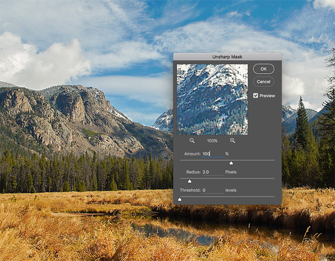
Go to Filter > Sharpen > Unsharp Mask. Change the settings to 100% Amount, 2px Radius and 0 Threshold.
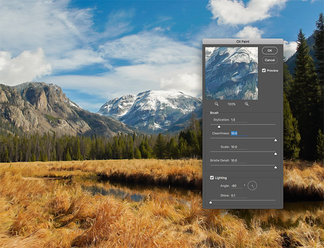
Add another effect, this time head to Filter > Stylize > Oil Paint. Modify the Stylization to 1.5 whilst maxing the other settings at 10. This filter quickly gives the photograph a painted effect to mimic the hand illustrated nature of the original postcards.
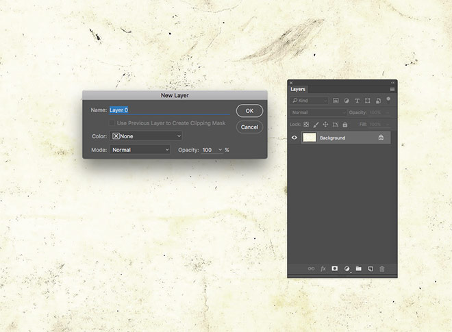
Download my free vintage postcard textures and open one of the blank postcard images into Photoshop. Go to Image > Mode > RGB Color to convert the image fro CMYK. Double click the Background layer to convert it into a standard layer.
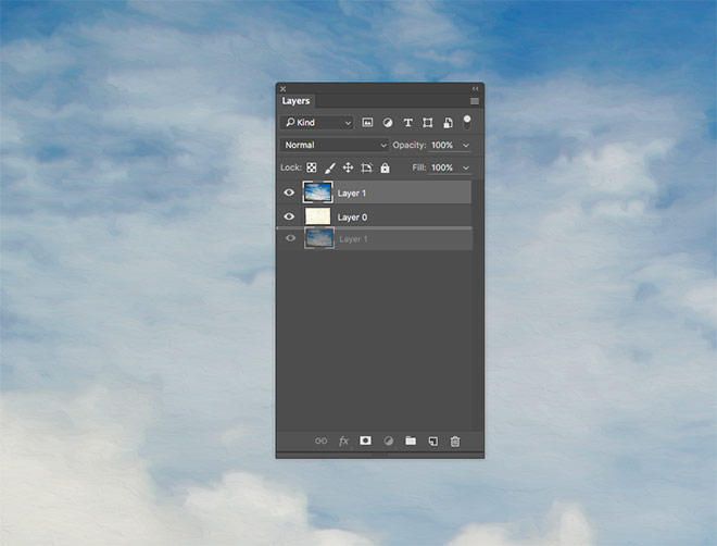
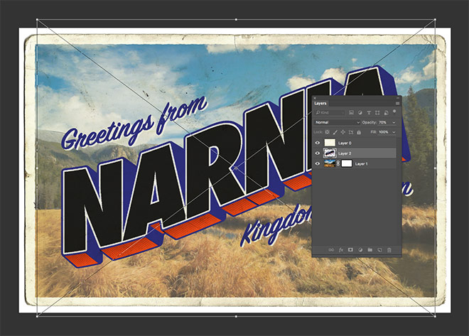
Switch over to the photograph document, then copy and paste it into the postcard canvas. Scale the image to size, then drag the photograph layer below the postcard texture in the Layers panel.
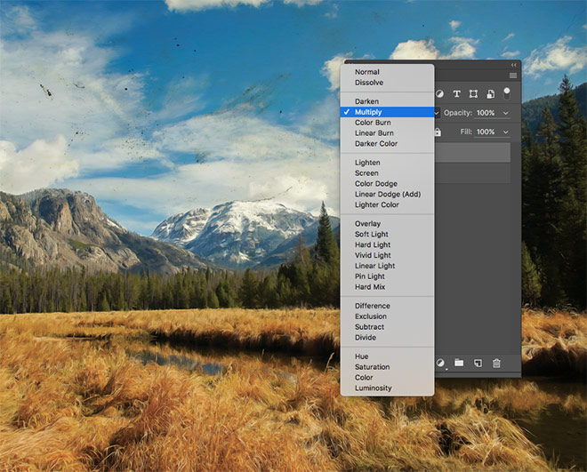
Change the blending mode of the postcard layer to Multiply to allow the tones and texture of the image to show through onto the underlying photograph.
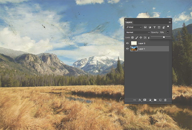
Select the photograph layer and reduce its opacity to around 70% to produce a washed out effect that simulates an old vintage print.
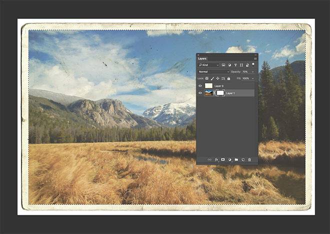
Use the Marquee tool to draw a rectangular selection within the postcard texture, then add a layer mask to trim the image down in size.
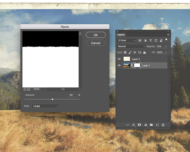
With the layer mask thumbnail selected in the Layers panel, go to Filter > Distort > Ripple. Enter 20% with the Large option selected to distort the hard edges of the mask.
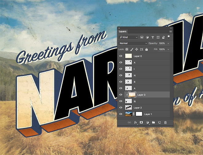
Switch over to Illustrator and take a copy of the text artwork. Paste it into the Photoshop canvas as Pixels, ensuring it sits below the postcard texture in the layer order.
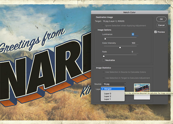
With the text artwork layer selected, go to Image > Adjustments > Match Color. Configure the Luminance to 10, Color Intensity to 100 and Fade to 0, then set the Source selection to the name of the current document, followed by Merged for the Layer option. This adjustment will alter the bright colours of the Illustrator artwork according to the hues of the background photo to allow those bright swatches to better blend with this vintage theme.
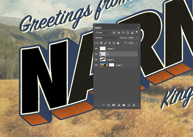
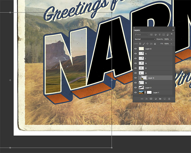
Select the Magic Wand tool and make a selection of the first letter face. Create a new layer and fill the selection with black using the ALT+Backspace shortcut.
Use the Magic Wand to select the next letter face and fill this selection on a new layer. Continue the process with each letter of the place name to create a series of individual letter layers.
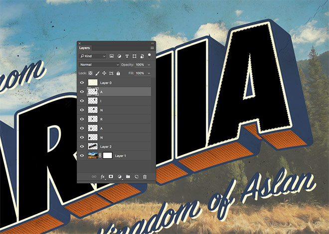
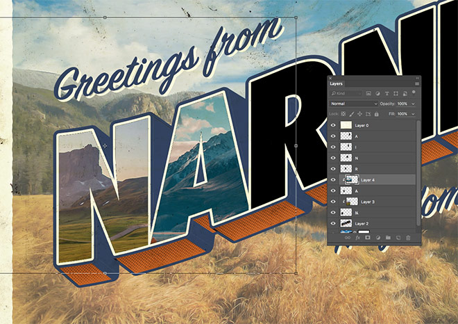
Switch over to the photograph document in Photoshop and double click the Smart Object layer thumbnail to edit its contents. Paste in an alternative picture from your collection. Save and close the PSB file to see the Smart Filters have been applied to this new image.
Copy and paste the photograph into the postcard document and position the layer above the first letter. Hold the ALT key and click between the two layers, or go to Layer > Create Clipping Mask to clip the picture to the shape of the letter layer.
Press CMD+T to Transform, then scale and position the picture to show an interesting portion of its contents within the letter face.
Open the next picture from your collection and paste it into the Smart Object of the photograph document to apply the painting effect filters. Copy the updated image into the postcard document and position it above the next letter layer. Apply a clipping mask and position the image to suit.
Repeat the steps of processing a photograph and clipping it within the letter face for each of the individual letter layers.
Vintage themed designs always benefit from a sprinkling of grain. Add an extra layer at the top of the layer stack, then go to Edit > Fill. Choose 50% Gray from the menu.
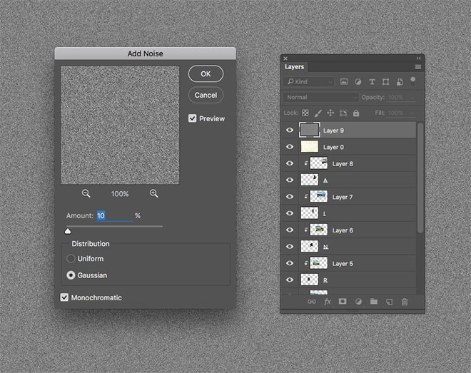
Go to Filter > Noise > Add Noise and configure the settings to 10% with the Gaussian and Monochromatic options checked.
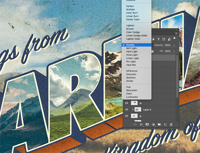
Change the blending mode of the noise layer to overlay, then reduce the opacity to tone down the impact of the graininess.
The final artwork is a great tribute to those classic postcard designs. Illustrator’s 3D tools help to replicate the text treatment in the original designs, whilst the image and texture adjustments in Photoshop help give the artwork an aged and distressed appearance to achieve the nostalgic vintage look.

Hello :)
Will you make a video tutorial ? Because I’m french and I have to admit I struggle to understand some steps :)
It would be very helpful !
Thank you for your amazing work :D
Maréva, je suis Français. Quelle(s) est/sont la/les étape(s) qui te pose(nt) problème?
Hello, I will see what I can do regarding the video! :)
I have done this sort of thing before, it makes a great vintage effect. There are new steps in here that I never thought of! Thanks, Chris!
Glad you learnt something new :)
Nice toot, however my finished type does not look like yours the extrude is much wider and the halftone dots are huge. What did I miss? Also, when I first added the gray it was not a thin line.
It sounds like you’re working in a smaller document size in Adobe Illustrator. I used the standard A4 template. You could enter lower values for those effects, or scale up your artwork to suit the figures I used.
Fantastic tutorial, along with Retro Text Effects. Tutorials really clear, well thought out, learned a lot. Thanks!!!
Thank you very much Kate!
Hi Chris,
Nice tuts…I followed each steps and at one point I’m stucked up…selected the text layer and went to image>adju>match color…….the match color option is not active..please find the attached screen shot link
https://www.dropbox.com/s/qut67sio7x6m72p/Untitled.jpg?dl=0
please help me to solve this
Hey Dane, I missed out an important step from the tutorial! The Match Color filter isn’t available in CMYK documents, and my postcard textures just happen to be in CMYK mode!
Go to Image > Mode > RGB Color to fix the issue (don’t flatten artwork)
Excellent!!!!!!!!!!!…thank u so much for ur help and the tutorial……….great tutorial as always
completed ..looks great..thank you
Great! :)
Thanks for making this tutorial – I was struggling with this very project last week!
What a coincidence! Hope the tutorial helped
If I ever get caught up, I would definitely like to try this! I remember postcards from Florida, as that is where I live. I used to think they were so tawdry! Now, they’re like masterpieces! LOL
Thank you for a great tutorial!
Su
Thanks Su! Give the tutorial a go and create a postcard masterpiece :)
Hey Chris, Great tutorial – just a quick question, I’ve transferred my text from AI to PS as pixels, as you suggested, but the “Match Color” option is unavailable. Any suggestions? Thanks!
Hey Andrea, I missed out an important step from the tutorial! The Match Color filter isn’t available in CMYK documents, and my postcard textures just happen to be in CMYK mode!
Go to Image > Mode > RGB Color to fix the issue (don’t flatten artwork)
excellent ..!
even if it’s hard for me.. translating all and trying to find the shortcuts on PC.. as a beginner as i am .. ;o)
great website !!!
Thanks Laurence. When translating those shortcuts for Windows, simply switch out any mention of CMD for the CTRL key ;-)
You are amazing! What a great tutorial. I always learn so much from you.
Thank you Monica
This site is very helpul for all of us. Thank u very much.
Thank you!
do not have illustrator, any chance you could post a quick version all in photoshop….have tried applying your retro tutorial, haven’t quite been able to make work. thanks
Thank you! I am having trouble with the dots showing through?
Love the style, it’d be so cool to see a web type revival with this type of style instead of all sites being flat!
Well, mine turned out crap, but I’ll keep trying!! Thank you!
Impresionante y espectacular tutorial, muchisimas gracias por el aporte, una postal vintage de lujo. En cuanto tenga un hueco voy a intentarlo…
Felicidades.
Loved the tutorial. I always like learning new ways to apply things I’ve learned. Super fun!
Glad you learnt something new! :)
Bon tutorial comme toujours.
Hi Chris Spooner, i really like your post with tutorial and help me for any work about design,
Please keep your nice post for me, hehehe
Thanks dude.
New creativity with some old concept and make something special thing there in your tutorial. Finally, I wanna give you thanks for it.
Thanks for your kind words Kate!
This is awesome! Thanks :)
Thanks Sam!
Would it be possible to use Affinity Designer instead of Illustrator? The Adobe subscription is so high. AD is $50 and done. Thanks!
Wow, pretty cool! I’ve learned some new tricks from this one. Thanks for sharing.
Awesome tutorial, Chris. I am learning lots with your posts. Thank you for your dedication.
Thanks for this awesome tutorial Chris! I’m having fun making “Greetings from…” cards that refer to historic sites near my home town.
Hi Chris, greetings from the UK! Our team are active followers – it’s amazing what clients request, and this walkthrough will no doubt come into its own later on :)
Please keep posting!
Thanks heaps.
Great tutorial. Your blog is amazing. These designs look, I hope you can add video tutorials ass well in order to see how your sketches take shape. Thanks!
Big time thanks Dude for sharing that 3D extrude tool, I didn’t knew that we have it in illustrator.