It’s that time of year when I reflect on another year’s worth of design tutorials here on Blog.SpoonGraphics and check over the stats to see which posts ended up proving the most popular. Here’s a roundup of the most popular tutorial posts from 2011 based on the number of StumbleUpon ‘thumbs up’ votes. If you compare them with last year’s figures you’ll see a dramatic decrease in the number of likes per post, but at least traffic figures are still going strong. I wonder if this suggests a decrease in the use of such social sharing sites?
Let me know if there’s any particular tutorial from 2011 that stands out to you. Maybe it’s one that isn’t even on the list!
How To Create a Beautiful Vector Portrait in Illustrator
View the tutorial 14,000 likes
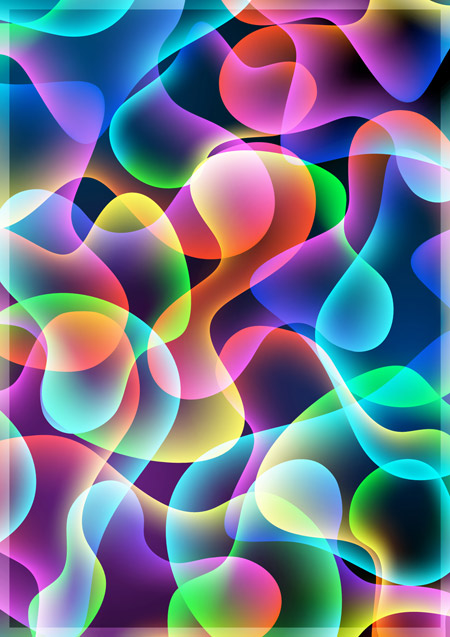
How To Create a Cool Abstract Radial Pattern Design
View the tutorial 12,000 likes





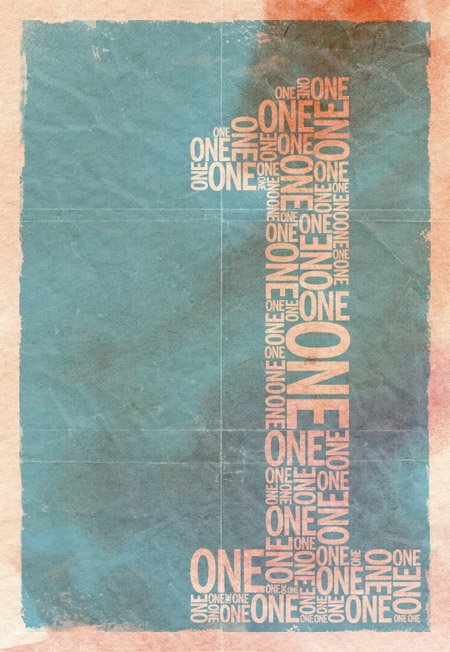
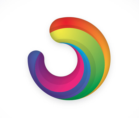

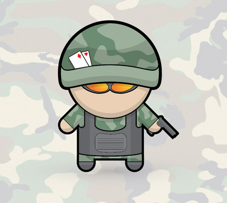



I had allready done the 90% of this tutorials during this year!!
That is really weird that it went from 14,000 strong at the start to only 2 at the end of the year! I dont think the quality of the tutorial ever changed so I have no idea of what went wrong there! I still enjoy every single post :) Looking forward to a great 2012 ! :D
Congrats on a prolific year! I love your tutorials because they always have a clean and simple style to them.
On the social media likes, I wouldn’t pay too much attention to that if I were you. The “How To Create A Colorful Abstract Poster Design in Illustrator” post is probably my least favorite one here – yet it has 1,616 likes. And the “Photo Color Correction for the Amateur Photographer” post, which is extremely useful, has only 22 likes. The “likes” seem to be related to some other factor than quality/ usefulness.
I never have time to sit down and get trough whole tutorial but i’m always reading whole. I love tutorials where is any kind of typography work. Big thanks for all of tutorials! :) Happy New Year! I hope that 2012 will be as good as 2011 on spoongraphics.
Nice collection of tutorial..in special way the vector illustration…my preferite. Best regards and great New Year! Thanks for sharing!
Hard to pick a fav. You have an amazing collection of great tuts. Thanks again for providing this creative how-tos avenue for designers.
Loved everyone of them! Learnt so much from you in the past months, thankyou :)
Hey Chris, I’m just finding your site, but love all the information you provide. I’ve got a suggestion for a future tutorial actually. I’m really interested to know how you create some of your sketchy vectors, similar to the cute Christmas ones a while back. I’m looking to create the same effect but haven’t pinned it just right yet. I’d love to hear how you accomplish it. Cheers!
i love all the information you provide…..Learnt so much from you in the past months, thanx for the sharing….
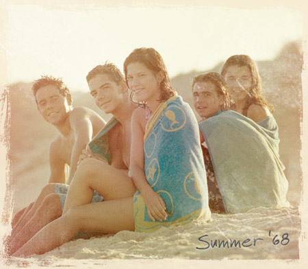
I especially enjoyed the tut “How To Give Your Photos a Vintage Polaroid Effect” – that was an interesting experience for me. Thanks Chris for all your tips!
love ur tutorial style..clear and easy to understand..thanks for sharing
Hi Chris
I am rather late with my comment, but I hope you read it anyway.
First of all: thank you very much for all the great work you provide here for us! I follow your blog since some time and look at any tutorial you post. Some I work through, from some I pick out some tipps and some I look just over for fun.
To your question about the decrease oft he „likes“
I would not rate that circumstance as a decrease of interest – not at all. I would rather say, it is a manifestation of speed of information. There are so many social media platforms, the flow of information back and forth ist lighning-fast. As a result: The span of attention oft he single person is cut into pieces; ist to say in so many pieces as the person is involved in platforms, forums, blogging etc.
A good friend on G+ wrote me a note one day: „I do not have the time to always read any message of my friends thoroughly, but there is fortunately the „like button“ which I click always just to show that I care!“
So, dear Chris, my suggestion is, that you just switch the position oft he „like buttons“ on your page. Instead at the end oft he post, put them on top. Or even try to put them vertically, sticked at the browser window to the left, so that they follow, when one scrolls down.
This would give me the opportunity to quickly click on „like“ and bookmark the article to read it later or do the tutorial later. It happen often, that I bookmark an article for later read, then forget about and surely also forget about the „like“-click. With the new method, maybe you can catch up some short-attention-span-people – who knows?
I can for sure not grant success, but it would be worth a try – what do you say?
Take my best wishes for 2012 – for all your projects and for fun, luck and happiness!
Warm regards
Monika (Designerist)
I love your style for creating tutorials. They are easy to follow and understand. It’s hard to pick just one tutorial that is a favourite as they are all awesome and relevant to what I do — create vector designs. Thank you so much for sharing your expertise and providing such an awesome resource to designers!
These tutorials will definitely help me to improve my desing skills. Greeting from Turkey.
Nice Tuts i have enjoyed
These are all really good I especially like the vector portrait. Look forward to seeing whats to come in 2012.
These are all really good, I especially like the vector portrait. Look forward to 2012