This post was originally published in 2011
The tips and techniques explained may be outdated.
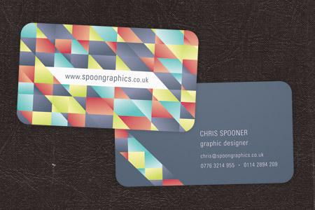
Need a new set of business cards? Follow this step by step tutorial to create a cool business card design in Adobe Illustrator. We’ll begin creating the vibrant pattern effect, then we’ll lay out the contact information and set up the final print ready file ready for sending off to your chosen print firm.
The business card design we’ll be creating as part of this tutorial features a vibrant pattern on the rear of the card, with a minimal design on the front allowing the contact information to stand out. The final printed card will be die-cut with round corners, so we’ll set up the print ready file appropriately with the correct dimensions, bleed and margins.
View the final die-cut business card design
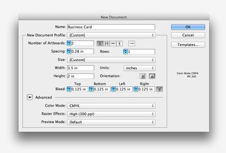
Open up Adobe Illustrator and create a new document. I’m using UPrinting for this business card design, so I’ll use their dimensions of 3.5″ by 2″ with 0.125″ of bleed. This deign will be double sided, so enter 2 in the Number of Artboards setting.
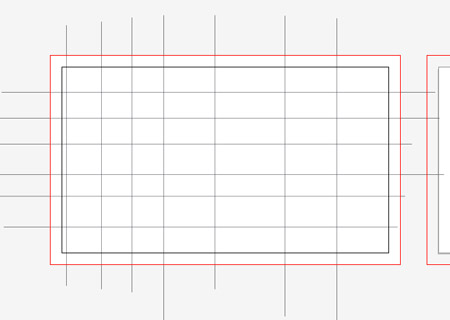
Draw a white rectangle across the whole of the first artboard, including the red bleed outline. Use the Line tool to begin drawing intersecting lines both horizontally and vertically.
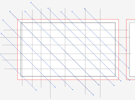
Add more intersecting lines to the design, this time diagonally by holding down the Shift key.
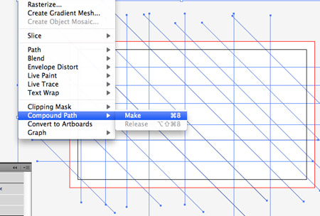
Select all the intersecting lines and convert them into a Compound Path by selecting the menu option or hitting CMD+8.
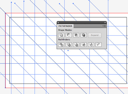
Add the white rectangle to the selection, then click the Divide option from the Pathfinder palette.
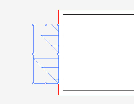
Right click and select Ungroup, then draw a selection across the linework beyond the edges of the document to delete them.
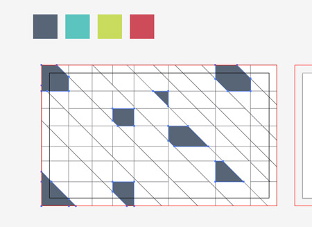
Set out a colourful colour scheme for your design (this one’s from ColourLovers), then begin filling random shapes with the first colour from the palette.
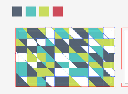
Continue cycling through the colours to fill the empty shapes with swatches from the palette.
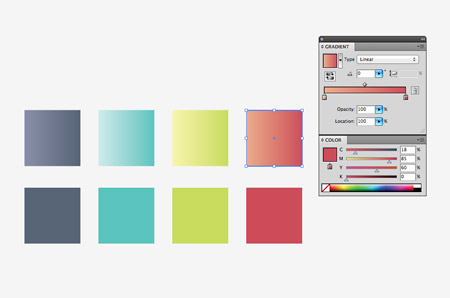
Make a duplicate of the colour swatches and create vibrant gradients from the base colour to a lighter tone.
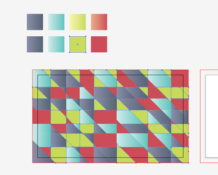
Use the Magic Wand tool to select all the shapes with the first colour from the palette, then use the Eyedropper tool to replace the flat colour fill with the new gradient.
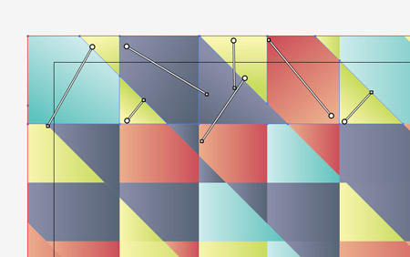
Once all the shapes have gradient fills applied, zoom in and use the Gradient Tool to alter the direction of the gradient randomly for each shape.
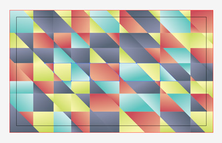
The random fills and alternating directions of the gradients creates a really cool pattern effect to fill up the rear of the card.
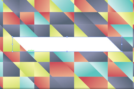
Toggle on Smart Guides then use the Pen tool to fill a selection in the centre of the card to allow space for a website URL.
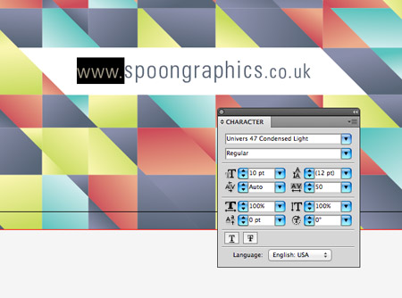
Enter the address of your website in your favourite font, then adjust the sizing slightly to lower the prominence of the prefix and suffix. Give it a fill using the darkest colour from your palette.
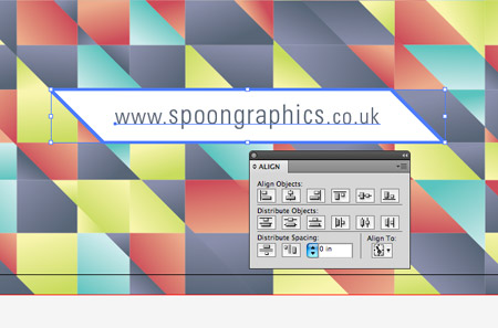
Select the text element and its surrounding shape, then give the shape an extra click to select it as the key object. Use the Align tool to centre the text to its container.
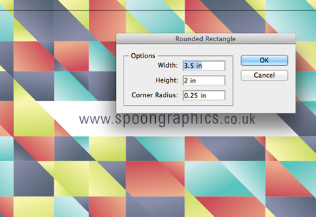
Grab the Rounded Rectangle tool and click on the artboard to enter specific dimensions. Enter 2.5″ by 2″ with a 0.25″ radius.
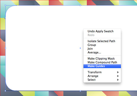
Right click on the newly created rectangle and select the Create Guides option. This will create a guideline to give an insight into how the card will be cropped down during printing.
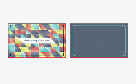
With the front of the card complete it’s time to move onto the rear. Fill a rectangle covering the second artboard with a swatch from the colour palette.
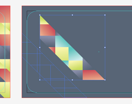
Select and copy a series of vibrant shapes from the front of the card and position them on the rear to continue the pattern. Position these shapes running across the lower left of the card.
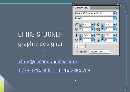
In the remaining white space use the Text tool to enter your name, job title and contact details using the typeface of your choice. Give certain text elements more visual prominence by altering its case and size.
The two contact telephone numbers are laid out side by side, so draw a small bullet with the circle tool to separate them.
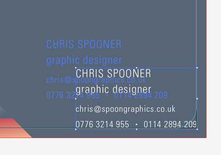
Align the text elements, then move them exactly into the lower right corner. Hold the Shift key then move the text elements back into their own space.
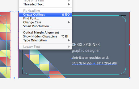
The overall design of the business card is complete, now let’s prepare the file for print. First select all and convert all text elements to outlines to avoid any font related problems with your printer.
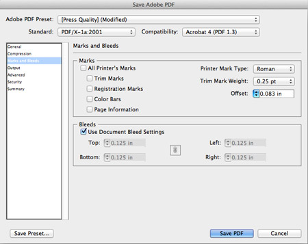
Go to File > Save As and select the PDF option. In the settings alter the preset to Press Quality then alter the standard to whatever is recommended by your printer. In this case it’s PDF/X-1a:2001. You also have the options of adding crop marks, but in this case they aren’t necessary so just the Use Document Bleed Settings option is checked.
Your print ready business card design is ready for sending off to your printer of choice. When they arrive in the post you’ll see the final product cropped to size according to the dimensions set in your print file.



I have always loved that pattern style of yours! Thanks Chris! :)
Yeh pattern design is very cool
thnaks for sharing this tut
:)
You always make the simplest of things look outstanding. A Great inspirational tutorial! You’ve made me want to go and re-design by business cards :)
Really awesome pattern design.
They look great. Going to have a try.
Also it was great to hear you talk about blogging on Pixel Control :)
we love to share with designer friends this stunning training.
Awesome tut ! I have to try it !
Very Cool. Thank you! :)
Hi Chris, super-cool tut!
Any tips for a vertical business card?
Thanks man. I am always learning new things from your tutorials. thanks!
Have you ever worked in Adobe Indesign?
You really make it appear really easy together with your presentation however I to find this business card sizes to be actually something which I think I would never understand. It seems too complicated and very huge for me. I am having a look forward for your subsequent post, I will try to get the dangle of it!
You really make it easy together with your style however I have to find this business card sizes to be actually something which I think I would never understand. It seems very complicated for me. I am having a look forward for your next post, I will try to get the useful tips of it!
I really need to redo my business cards . . . I think I can do it myself instead of waiting for help with this great tutorial – thanks!
This is something which we designers should read to improve our designing quality. You always have something for us to teach.
Very nice tutorial Chris, I will do some templates like this one for me. Thanks !!
Looks amazing, some great advice and its a refreshing article and great to see people taking an interest
A really big thanks for the tips, much appreciated!
Great article Chris. Simple enough for a beginner in Illustrator like myself.
You’ve make many company want to re-design business cards.
Leave a response
Surely it’s better practice to include a cutting guide in your artwork? If you sent that artwork to a printer you’d get squared business cards back for sure.
Just seen your tweet about this, consider it retweeted! Lovely work, always wondered the best way to work out those kinda patterns. And good link to ColourLovers not heard of them before!
Great tutorial Chris! Thanks.
Hi,this is really nice nice but have a problem with the selection of 2 artboards and the “Add the white rectangle to the selection, then click the Divide option from the Pathfinder palette.” Part…Please I would be glad if you help out
Shouldn’t the rounded rectangle by *3*1/2 x 2, and not 2-1/2×2?
This is great! I always love your designs, they look good, and your step by step instructions are amazing. Thank you so much!
Great tutorials. Thanks
Hello Chris….this is a great tutorial. I have a question.
I did follow all the instructions and I saved my sample business card….but I find that after uploading the cards to vista.com to print, it does not retain the rounded corners…and my saved document does not show the rounded corners (I also see your document for download does not show that as well). What could be the issue and can the printer see the guides or do you have to specify what shape you want the card printed? (I hope I made sense)
Great tutorial, really helped me a lot. But I also have the same question as above about the rounded corners? I can’t see the rounded corners in my pdf file, must I specify to the printer about the corners? Thanks for the help, keep up the good work! :)
What about for die cuts that are either within the interior of the business card or that start on an edge and travel inwards?
Is it the same process?
A pretty design i love it.
Awesomw <3
U really make it easy ^^
thnx