This post was originally published in 2011
The tips and techniques explained may be outdated.
Follow this step by step Illustrator tutorial to create a simple vector soldier character. We’ll begin by building the structure of the character with basic shapes, then adjust the line weights to create definition between the elements. To bring the character to life we’ll add blocks of colour before finishing it all off with a simple shading technique.
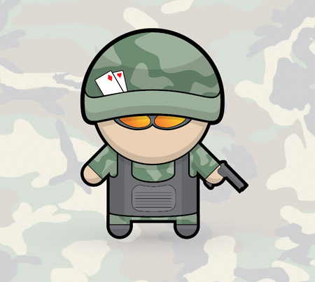
Similar to the recent mechanic character tutorial, this soldier cartoon features a range of basic shapes to give a stylised appearance. The main body of the character uses exactly the same approach, with just the accessories and clothing defining the character. You could go on to create a whole series of characters each with a different profession.
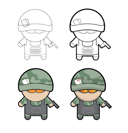
You can see the design take shape as it progresses from the black and white linework versions right through to the final colouring stages. Notice how the varied linework enhances the basic version, and how the shading enhances the flat blocks of colour.
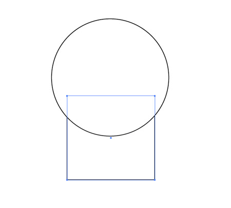
Open up Illustrator and begin by drawing a circle and a rectangle onto the artboard to represent the head and body.
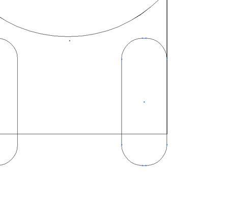
Use the Rounded Rectangle Tool with max corner radius to add some limbs. Align two legs with the edges of the body, then rotate two arms by 45 degrees and position them underneath the head.
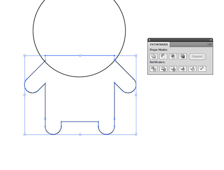
Select all the objects that make up the body and blend them together using the Merge option from the Pathfinder tool.
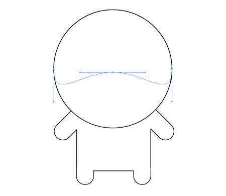
Copy the head (CMD+C) and paste in front (CMD+F), then move the lower most point vertically with the Direct Selection tool. Switch to the Selection Tool and scale up the shape to form a helmet.
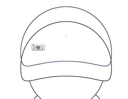
Duplicate the shape and move it upwards to create a parallel line along the lower edge, then use the Scissors tool to clip the shape where the lines intersect. Delete out the excess.
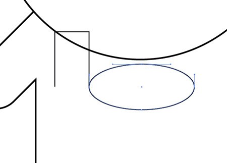
Use a series of rectangle and oval shapes to draw the outline of body armour. Use the Direct Selection Tool to delete out edges and points to create open paths.
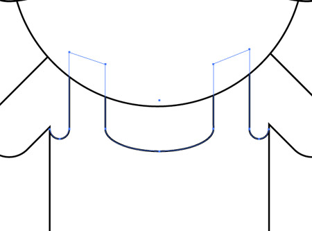
These paths can then be aligned and joined by zooming right in, selecting an open point from each shape and hitting CMD+J.
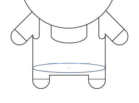
Draw an oval in the lower region of the body area and delete out the top most point to leave a curved line to indicate the edge of the body armour.
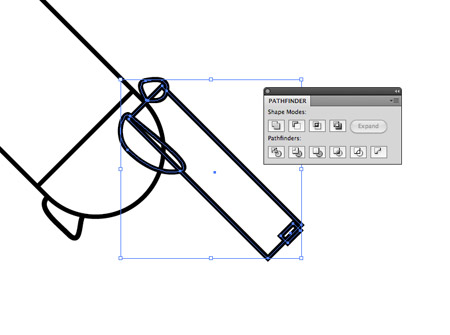
Draw and position a range of shapes using basic rectangles and custom shapes with the Pen tool to create a pistol. Merge all these shapes together with the Pathfinder tool.
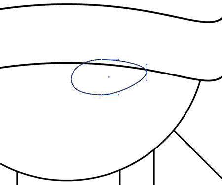
Use an oval as a base for a sunglasses lens. Adjust the shape by dragging the points out of position to distort the shape.
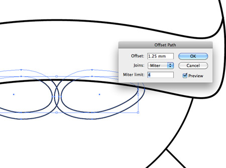
Reflect a copy onto the opposite side, then with both lenses selected go to Object > Path > Offset Path. Enter 1.25mm to create a frame for the sunglasses.
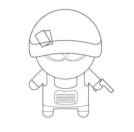
Continue adding in fine details until the character and its features are recognisable. Simple lines across the arms and legs identify where the clothing ends.
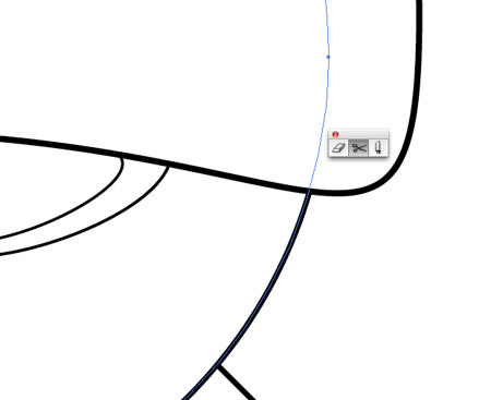
In order to create a thick outline, use the Scissors tool to intersect the paths that flow along the outer edge. Re-join the paths so a continuous path follows the entire outline of the character.
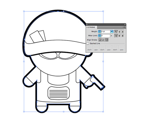
Increase the stroke weight of this outline to 4pt and align the stroke to the outside.
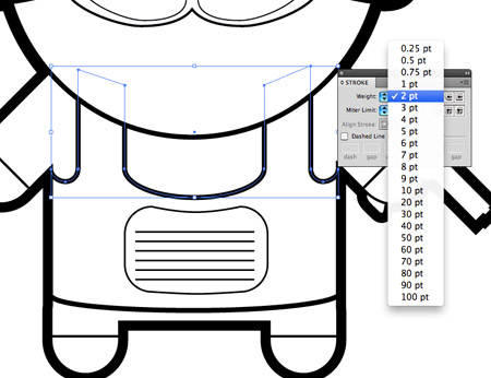
Adjust the stroke weights of the linework in the centre areas of the character. Use 2pt weights on linework that identifies an important feature and lower weights on finer details.
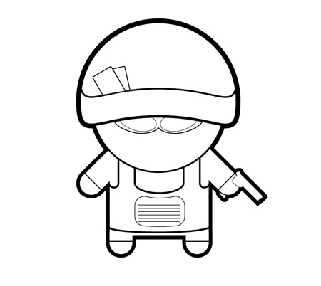
The character is now taking shape with the varied line weights adding great definition to each of the features.
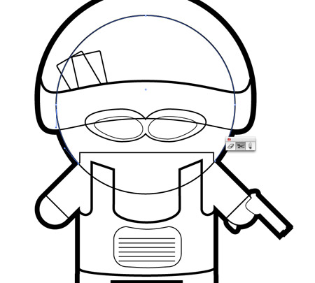
The illustration shouldn’t have white fills on any of the elements, so make sure the design doesn’t break when these fills are cleared. Use the Scissors tool to clean up the design by deleting out unwanted linework.
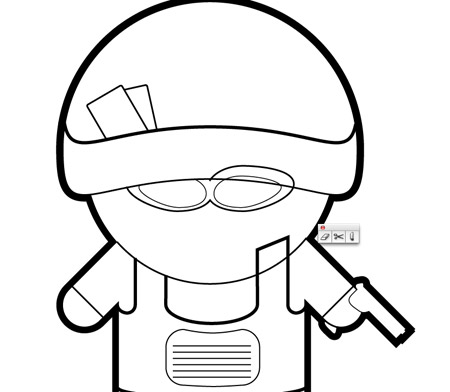
The upper half of the circle used for the head, the excess areas of the body armour and the sunglasses have all been clipped and deleted so the illustration works without any fills.
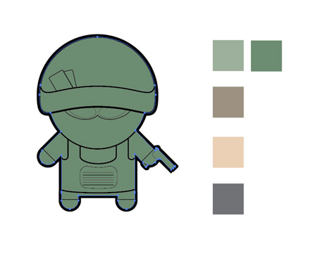
Create a new layer and paste a duplicate of the outlining shape. Swap the black stroke with a green fill to create a base for the colour blocks.
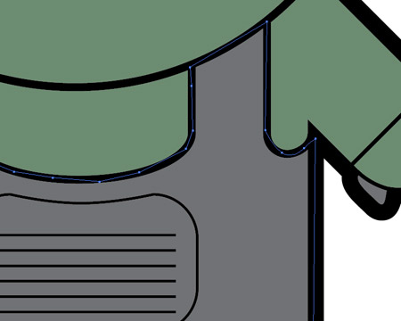
Lock the linework layer and use the Pen tool to carefully trace each object with a fitting fill colour. Aim to keep within the confines of the black stroke areas.
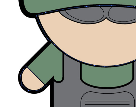
Continue building up blocks of colour to define each area of clothing, skin and armour. Remember these lines can be quick and rough as long as they’re hidden by the black linework on the layer above.
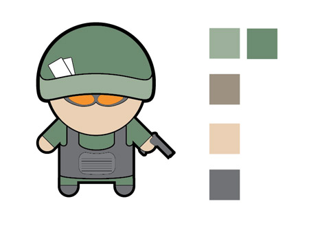
The illustration is looking even better with colour, but it still looks a little flat. This is where a couple of simple shading techniques really bring it to life.
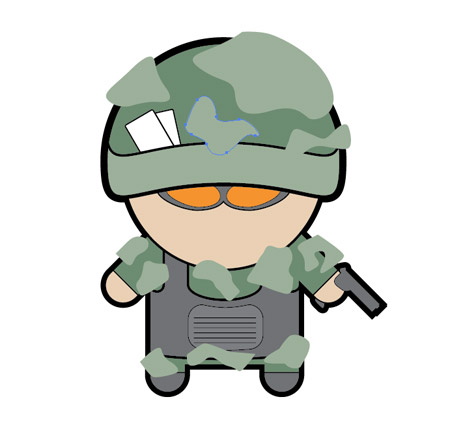
Use the Pen tool to draw a bunch of camo blobs across the character and fill them with a slightly lighter shade of green.
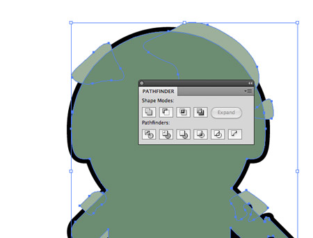
Select all the blobs and hit CMD+8 to create a Compound Path. Copy the outlining shape and bring it to the top (CMD+Shift+]), then use it along with the Pathfinder tool to Intersect the shapes to clip them down to the outline.
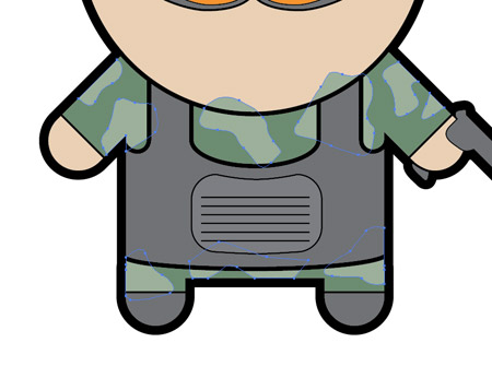
For the inner camo blobs, repeatedly press the CMD+[ shortcut until they sit below the other colour elements, which will hide any excess.
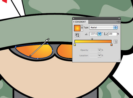
Add an orange to yellow gradient to the sunglasses and adjust the angle with the Gradient tool.
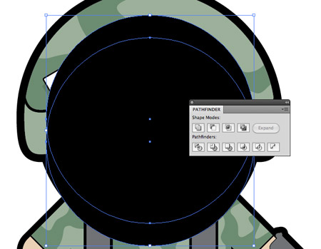
Next, draw a large black circle over the head area that just covers a small area of the body. Duplicate this shape and move it upwards slightly, then click the Subtract option from the Pathfinder palette to clip out the shape.
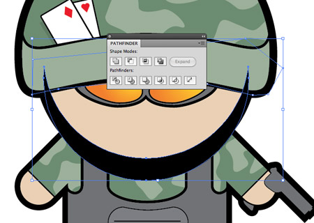
Draw a quick shape with the Pen tool to overlap any excess that spills onto the helmet and use the Pathfinder to clip away the unwanted shapes.
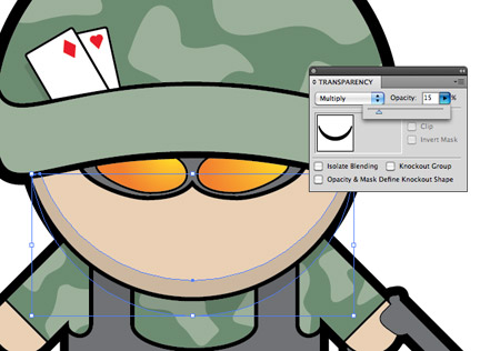
Change the blending mode of this black fill to Multiply and set the opacity to 15% to create a subtle colour change for the shading.
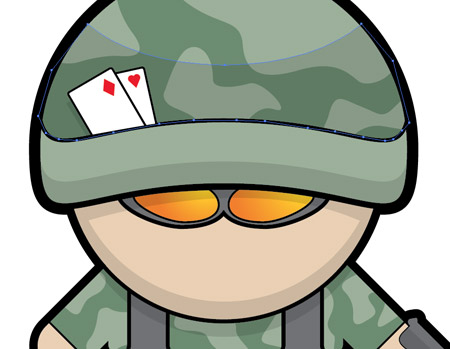
Continue drawing these shading areas across the design to give the impression of depth. Make copies of existing shapes to make parallel lines, then clip out the excess with the Pathfinder.
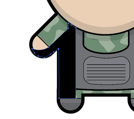
Use the Pen tool to draw a shadow across the hand, arm and body. Give this shape the same 15% Multiply styling to convert it into shading.
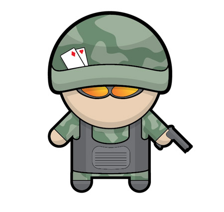
These shading elements don’t have to be 100% accurate or realistic, just a few blocks of subtle shadows will do a great job of adding an extra dimension to your illustration.

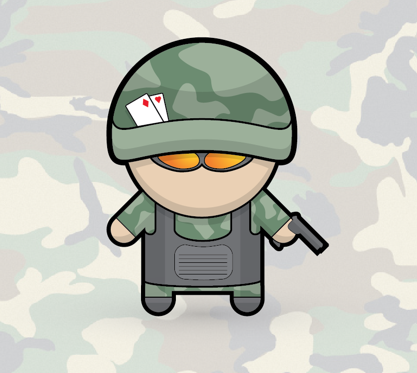
The soldier is now complete and ready to add to your collection of characters. Let’s see what other professions you can come up with!


Very well explained :).
Can you do a penguin ? :D
Haha I’m sure I could look at creating a penguin tut in the near future. Stay tuned!
Looks like fun.
I’m an ICT teacher, and my year 11s always have a go at your character tutorials – you should see the ninjas they created.
Anyways – how about a zombie character
ZM
It’s great to hear the kids are benefiting from these tutorials. I’m sure a zombie character would go down well. I’ll add that to the list too!
this is the first time i saw your blog its nice very useful info you posted
Hey Chris, this is a funny soldier :) Great job! I wonder, what’s up with the playing cards on his cap? :)
It’s a little homage to the old Cannon Fodder game I used to play on my Amiga. For some reason one of those characters had a couple of playing cards on his helmet.
Cannon Fodder was awesome!
Nice outcome, really enjoyed creating the mechanic character will give this a bash when I get some free time.
:-)
Thanks for taking the time to produce these tutorials. I enjoy them and always learn a new way of doing things. Keep them coming! Thanks.
Great to see another character come to life. I’ve not done any more since the Santa & Chef characters I did. You should get a gallery going so everyone can upload their efforts :-)
Another wicked tutorial!
Hey! nice job, and very useful technique for others themes like animals, people etc. you’r blog rocks!
black ops inspired?
cool bro… !!!
very well illustrated and explained as usual from Chris :)
good work.. keep rocking :)
Love your tutorials, i m a huge fan of them.
Thanks a ton.
I love these vector tuts, and with how well you explain them it has been very easy to pick up illustrator. Also, this character is very similar to your ninjas!
Looks Good, thanks Chris
wooww perfect very best job!!!!Very nice
hey, totally off-topic here: your awesome moo cards are featured in the MOO.com newsletter!!!
Thanks, this is a perfect job and very useful technique, nice tuts
Its a very useful blog. I really love it to Create the mechanic character. Definitely I will try it when I get some free time.
Great tutorials! Thanks for doing this!
Compliments!
I am trying out illustrator for the first time (have used PS for years) and am following this tut which I am enjoying very much. However I cannot get my head around using the direct selection tool, scissors and eraser to remove segments of outlines or shapes. Is it possible for some more detail on how to do this (I seem to get it working in parts by accident and then can’t do it again)??
Wao, amazing of simplicity, I liked it !
Hi! You have lot`s of great tutorials!
Congratulations!
I`we just started a tutorial indexing website and I would like to ask you to submit some tutorials :D
You can submit tutorials without registering, but if you register you will get gift points for each tutorial and you can use these points to buy ads.
Please visit it: http://www.tutorialswindow.com
Thanks
I have done it but vector is not actual :o
How do u create the background or where did u get the background ? My son is in the army..I thought it s so cute! So I save the pic and will sent it to him :)
Thanks :)
Great stuff I was doing OK until I got to the Scissors and pen tools! LOL got it done in other ways though. Would love to learn more! Thanks for sharing!
hey chris can u do something better for android logo, the current one is so dull, i think these figures are awesome inspiration for that
Great tutorial! Very easy to follow. Good fun too.
Well explained tutorial!!
This helps me a lot. Thanks, Chris!!
Chris,
Awesome character! Just did the tutorial as a reward to myself. :)
I was curious as to why you separate out the lines and fills. Just a preference?
Amanda
Hey Chris,
Wonderful tutorial and specially on the texturing part you have played around with good colors, One thing i don’t understand do you have any specific reason for the cards which is in the head.? Very nice tutorial and will come back to check again
Adam
Awsome blog dude. We have to start a blog as a college project. Didn’t really wana do it but you have inspired me!
Hail,
I’ve been looking over all these tutorials the last few days, and despite finding them quite difficult due to my complete lack of knowledge, I am trying to make some little guys my own.
I love the penguin idea, especially as I’ve been trying to do an evil duck for my site, but I can never seem to get anywhere with it, and doing evil eyes and their weird beak confuses me, but alas, we must work through it.
-D
Sweet tutorial man, going to try it soon!
Great tutorial, I had cannon fodder on my amiga 1200 back in the day – good times