Tutorials
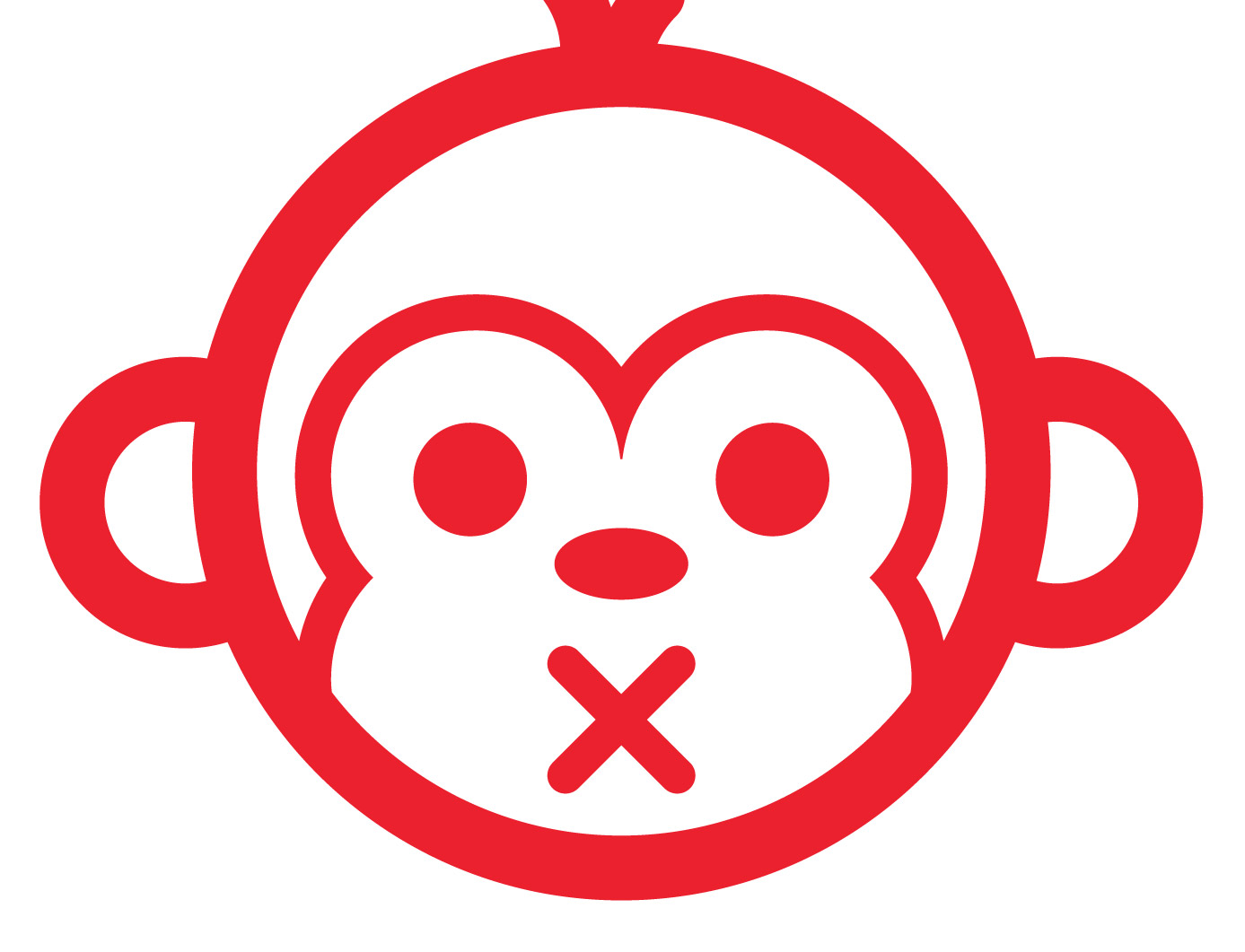
In today’s Adobe Illustrator tutorial we’re going to create the face of a cool monkey character with stylised vector line work. Illustrator’s crisp vector paths are perfect for the creation of products such as vinyl cut stickers, so we’ll use the theme of urban sticker art for our design and create an iconic graphic that could be seen on windows and signage in busy city areas.
Lomography and the lomo effect is massively popular in Photography circles. The origins of the lomo effect come from a budget Russian camera called the Lomo LC-A, but we can recreate the imagery produced by this little cheap camera on our own digital photos with the help of Photoshop. Follow this step by step Photoshop tutorial to easily give your photos the vibrant characteristics of lomography.
Sometimes it’s fun to create a logo design for a fictional client. Just pick a design style and play around with a concept of your choice without the hassle of the client approval process. This also gives you the chance to experiment with styles and trends you’ve seen around but never had the opportunity to try yourself. In this tutorial we’re going to create a logo design for a classic barber shop using the popular vintage theme. Follow the step by step guide to see how each individual element is crafted in Adobe Illustrator.
While I’m no pro videographer I do enjoy creating videos of my adventures on an amateur level. Recently I’ve been editing loads of footage from our road trip honeymoon in the USA, so I thought I’d share some of the techniques I’ve developed in Adobe Premiere to create cool vintage or retro style video effects. In this tutorial I’ll show you how I created an old style discoloured effect with film burns.
If you’re a regular reader of my blog you’ll know I love creating artwork in Illustrator using simple or basic shapes. This tutorial takes that idea to the extreme by using nothing by the rectangle tool to create a simple 8-bit style pixel character. Pixels are usually associated with Photoshop, but the great thing about Illustrator is your artwork is 100% vector, so unlike Photoshop you can scale your design to any size while retaining those blocky 8-bit characteristics.
We’re probably all familiar with the classic techniques of photographic toning from seeing various examples of Sepia toned images, but for years analog photographers have been experimenting with chemical toners to create various processing effects. One such technique is to split tone a print to create a dark blue and copper coloured image with a dark dejected mood. In this tutorial we’ll look at using Photoshop to replicate this classic technique in digital form, using Color Balance adjustments to achieve the same range of blue and yellow tones.