This post was originally published in 2014
The tips and techniques explained may be outdated.
Hand lettering typography illustrations are really cool, but it takes a lot of skill to craft authentic artworks by hand with pen and paper. Typically this style of art is created by elite illustrators, but I’ve found an entirely digital technique that allows us mere mortals to create cool looking artwork too! Follow this step by step Illustrator tutorial to learn how to manipulate text within a silhouette shape and add texturing to produce a realistic hand drawn style typography illustration.

After releasing last week’s free meat cut illustrations I received a few enquiries from people asking how they were made, so today’s tutorial is based on the same technique. We’ll be creating a trendy hand lettering style quote illustration, except with this method there’s no hand lettering required! Usually this artwork would be carefully hand drawn and scanned, but instead we’re going to cheat and use digital techniques to safely tweak the text until we’re happy then fake that analogue look with textures.
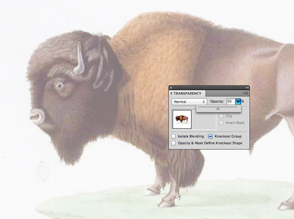
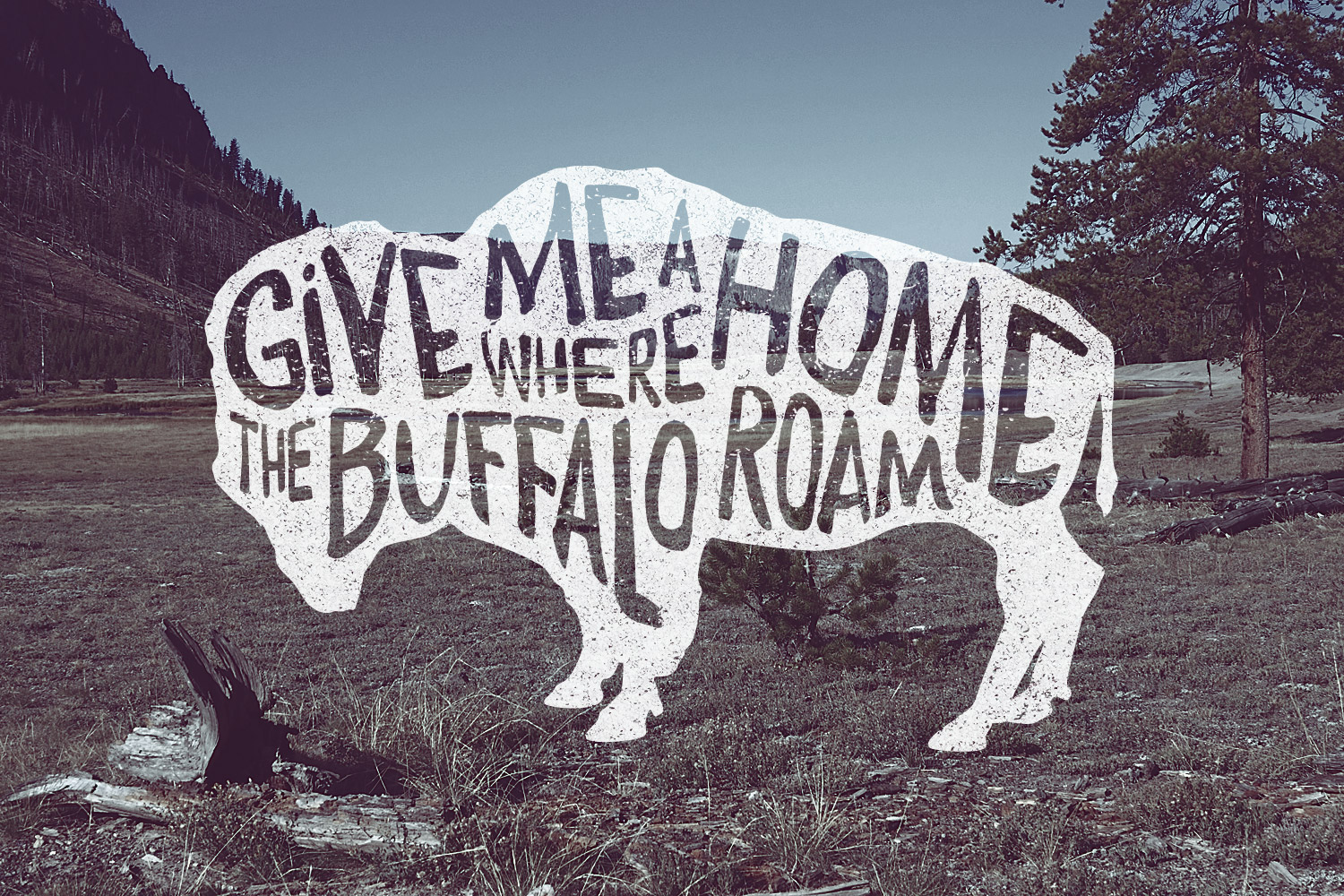
The quote I’ve chosen to depict in this typography illustration is “Give Me a Home Where the Buffalo Roam” from the classic Home on the Range song, so an image of an actual buffalo suits this quote perfectly. I’m using this public domain image as a reference. Paste in your reference image and reduce the opacity to around 50%.
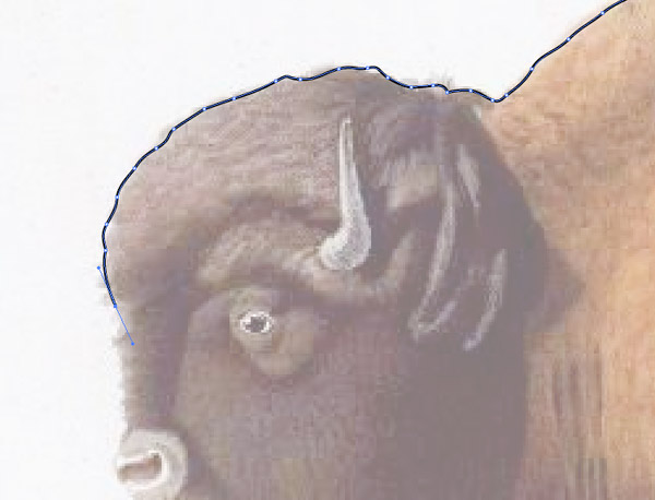
Select the Pen tool and begin tracing a rough outline around the subject. Accuracy isn’t too important because we’re trying to replicate a hand drawn style. Once the path is complete, add a black fill and remove the stroke.
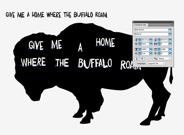
Type out your chosen quote somewhere on the artboard, then scan through your fonts collection for a nice hand drawn style. I’m using a premium font named Daft Brush, but here’s a roundup of loads of free handwriting fonts you can choose from. Create individual text elements for each word of the quote, fill them with white and place them over the silhouette image.

Begin scaling and rotating the text elements to roughly fit them within the silhouette image. Make sure the primary words are made the largest in size so the quote is easily readable.
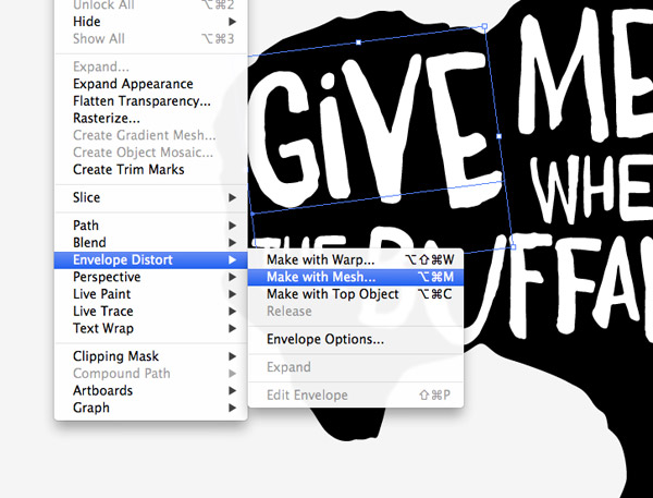
What our digital design is lacking that those hand lettered example have is the free flowing shapes of the text. The hand lettering illustrators will draw the words to match required shape, but it takes some skill to plot the letters so they fit perfectly. Instead we can use the Envelope Distort tool to manipulate and tweak the shape of our text until we’re happy. Select the first word and go to Object > Envelope Distort > Make with Mesh.
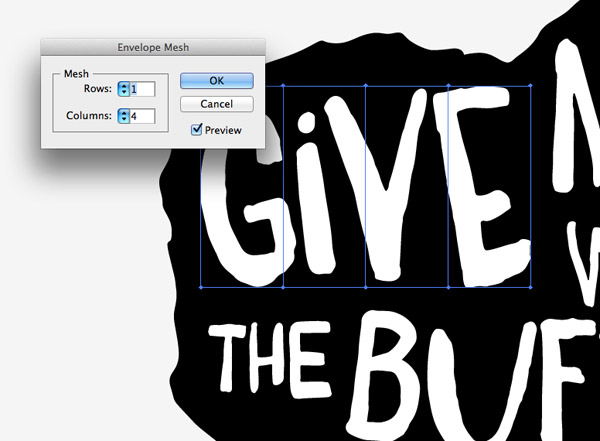
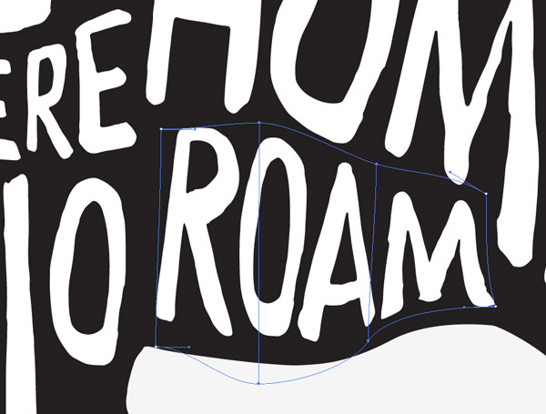
Add just one row but select a number of columns roughly equal to the number of letters in the word. The more columns there are the more the word can be reshaped, which is important for those words that need to fit into complex areas.
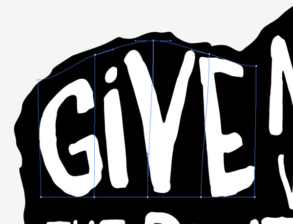
Use the Direct Selection tool to select each point of the mesh and move it into place to manipulate the text into the shape of the silhouette outline. Don’t forget to adjust the bezier handles to generate smooth curves.
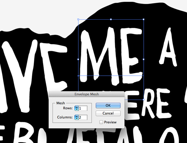
Shorter words don’t require as many mesh points because they’re smaller in size. Make just 2 columns for a two letter word.
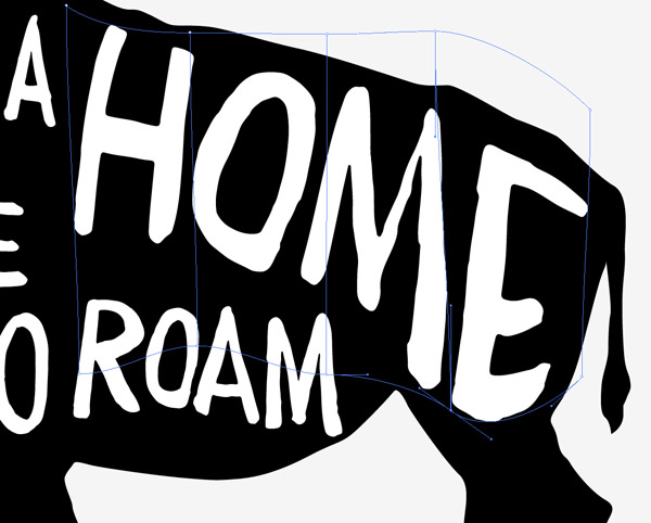
Some words will require some considerable manipulation to distort them into the required shape. Move those mesh points around to stretch the letters, but try to keep each column of the mesh equal in size so the letters are still evenly spaced.
For words on the second line the mesh points will need manipulating on the top and bottom so the word follows the flow between the existing text and the silhouette outline.

Aim to fill as much of the silhouette shape as possible but retain even gaps around the edges and in between each word. The great thing about designing digitally is you can move and tweak the letters until you’re happy. Whereas, whatever you draw by hand is permanent!
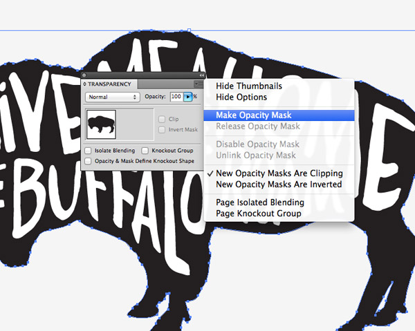
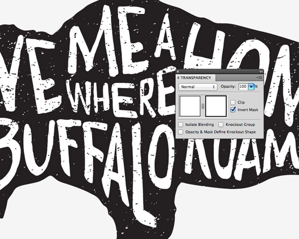
One advantage of authentically hand drawn artwork is the natural texturing that is generated from the ink or lead. We’ll need to fake this on our digital artwork. Add an Opacity Mask to the silhouette shape from the slide out menu from the Transparency panel.
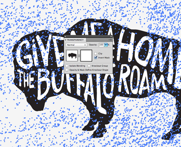
The opacity mask will create a black square inside the Transparency panel to represent the mask contents. Select this square to activate the mask, then paste in a texture from my Vector Textures pack. Deselect the Clip option and select the Invert Mask option, then reactivate the normal artwork by clicking the left hand square in the panel.
Make a group out of all the text elements then add a new Opacity Mask and paste in another texture to erase away tiny areas of the text too.
Finishing touches
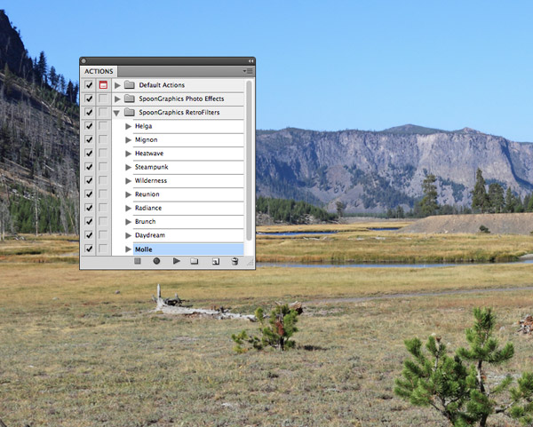
The vector design is complete, but a few extra steps to mock up the design will really finish it off. Open a complementing photograph in Photoshop and apply one of my RetroFilter Actions to add an interesting colour adjustment.
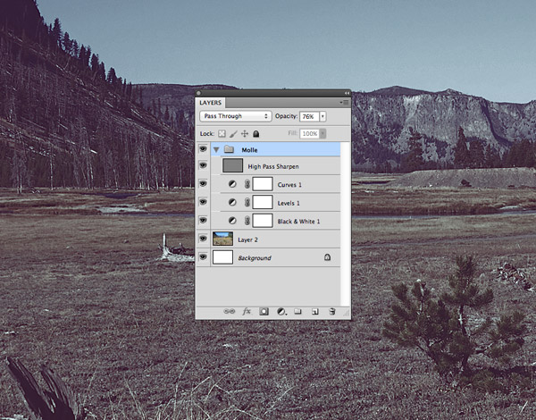
I’ve chosen the “Molle” Action then reduced the opacity to around 75% to allow some of the original colours to show through.
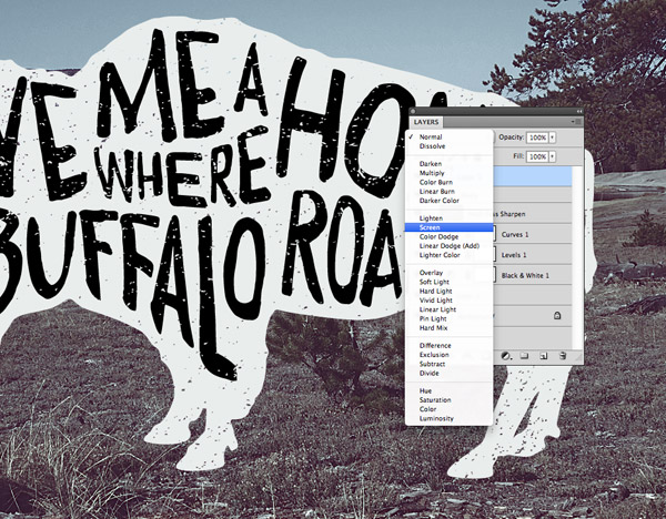
Paste in the vector artwork from Illustrator and press CMD+I to invert the colours. Change the blending mode to Screen to render the black text transparent and effectively punch out the text from the silhouette.
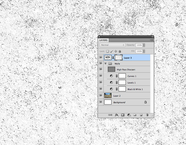
We’ve already added some vector texturing in Illustrator, but Photoshop allows for much more realistic edits. Create a Layer Mask, ALT-click on the layer mask thumbnail to activate it then paste in a texture file. Here I’m using one of the vintage textures available to Access All Areas members.
The final design has all the characteristics of authentic hand drawn art, but it didn’t require the perfection and patience that’s necessary with pen and paper. The manipulation of the text also helps disguise the fact that it’s a display font; warping the letters means that no two letters look identical. The greatest benefit of this digital technique though, is that the text can still be edited and the new wording will automatically form to the existing shapes.
Great tutorial as always. Digital options for fonts, typography and design in general are starting to loose ground to more manual/artistic creations. This is a great way to use a mixture of digital and manual (because I think it`s the human that makes the warp look good not Illustrator) and the result is amazing. Can`t wait to try this :)
Great tutorial, thanks Chris.
The use of the Envelope Distort tool is especially handy. I can’t wait to give this a go.
Thanks for another creative tutorial. I don’t have any projects in mind for using this yet but I’m sure ill be able to apply it somewhere in the future.
I have really enjoyed the content that you share. I will also say that the frequency of your sending is great as well. You always seem to have something great to share. Thanks a bunch!
I absolutely love this tutorial! I’ve always wanted to try this, but I’ve been afraid to do it by hand. I’m going to try it digitally now. I love the results!
Nice and very creative tutorial. I will definitely try this :) Thanks
Excellent Tutorial! Another great piece of content!
THANK you SO much for this tutorial! Awesome!
Marvelous tutorial! I think it’s great way to create posters, quotes, stylish modern art, even logo. Thank you Chris!!!!! Your blog is very inspirational!
Great tutorial!
nice one bro! thanks for sharing!
brilliant! thanks.
Brilliant and clever! Thanks Chris!
I had to laugh when I saw how you made the typography on the buffalo. It’s so easy if you know how to do it.
Now I know how to create better typography prints.
Thank you for this really helpful tutorial.
I have no words to say about your creativity as you described easiest way of typography. Thanks for sharing such a impressive post here.
I will only only one thing “awesome typography”.
You have done brilliant work here and you always publish informative articles.
Spoongraphics.co.uk is awesome site and produce quality posts always. We always keen to read your tutorials.
Thanks Chris , This great++
Just wondering can this be done just in Photoshop too? New to designing and only have photoshop at the current time. I love the technique!!! Great job!!!
Creativity at its best, great tutorial…cant wait to give it a try :D
That worked out great for me…my only problem is I used too many points when doing my initial outline so my animal legs are little jagged. Is there an easy way in illutrator to smooth it out? stroke seems to only help if i bump it up to around 40pt.
Real super simple & super slick, of course.
Hi chris! very helpful tutorial, although I’m not familiar with AI i prefer coreldraw and was wondering if I could do the same in coreldraw? any tips would be helpful thanks!
Hey! great tutorial! I’m on the last step and was wondering where you got the background picture from? Could you please post a link. Thanks! :)
Great tutorial! It was perfect timing to inspire my episode artwork from the podcast, Jonah Raydio.
http://instagram.com/p/o9zd0slebg/
Thank you for the great tutorial! It was very easy to follow! I used a picture of a black cat and a pumpkin patch background to create a Halloween event poster.
Great tutorial! Using the technique for our annual meeting graphics. Wish I could post an image.
Thank you so much for these incredible tutorials – I’m so excited about trying out these techniques :)
This is an awesome tutorial as always. Thank you so much Chris.
Thank you so mush i use this idea to present Close font family : http://crtv.mk/hem4
Thanks so much for the tutorial. I was inspired to create some graphics with my affinity for craft beer. Please view them at: https://www.behance.net/brianwelzbacher