This post was originally published in 2014
The tips and techniques explained may be outdated.
I’ve been having some fun lately creating logo emblems in an abstract design style based on the house sigils from Game of Thrones. This particular style where a subject is simplified and replicated with just straight lines results in cool stylized graphics which make fantastic logo designs. In today’s Illustrator tutorial I’m going to share my process of creating this abstract illustration style to help you create geometric line art of your own.
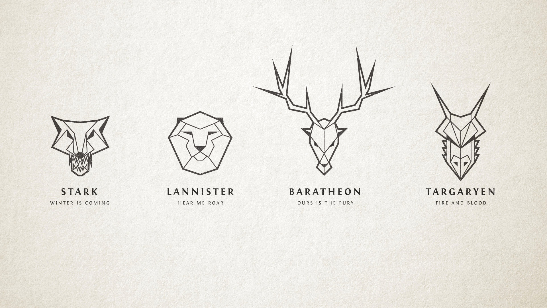
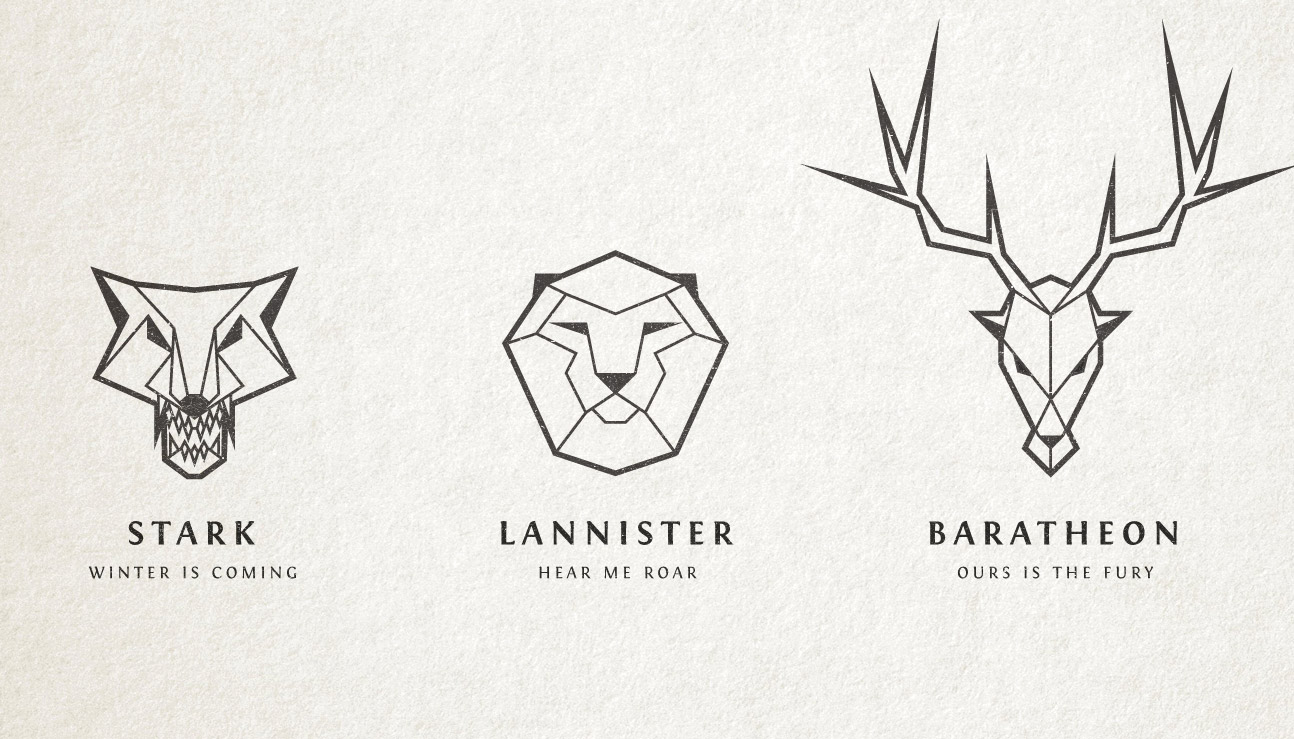
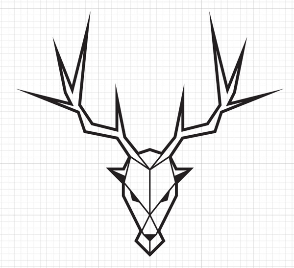
The designs I’ve been creating are these abstract takes on the various house sigils from Game of Thrones. Each one is created using only straight lines to create a stylised polygonal appearance which provides consistency throughout the series despite each sigil featuring a completely different animal. I’ll be explaining how to create the Baratheon stag, but the same design process is used to create any subject in this style.
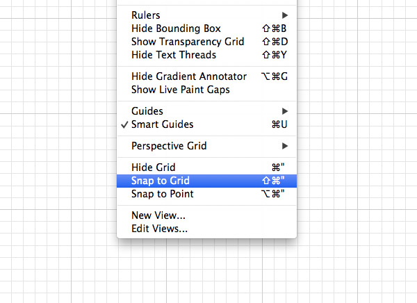
Open up Adobe Illustrator and create a new document. We need to make use of the built in grid tool to give our illustrations a consistent structure. Go to View and select Show Grid, then make sure the Snap to Grid option is also enabled.
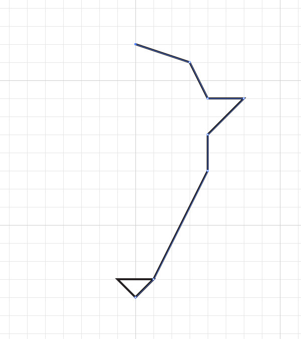
Grab the Pen tool and draw a triangle to represent the nose of the stag. With the nose being a central feature it makes it a good starting point to work from. Using Google Images as a reference, continue drawing the outline of the stag’s head, but aim to simplify the outline as much as possible to enhance the abstract geometric theme.
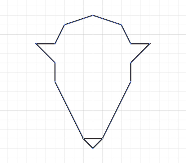
It’s easy enough to draw the opposite half of the head manually by cross referencing the number of grid lines between each point, but otherwise the path can be copied, pasted, reflected and joined to the original on more complex illustrations.
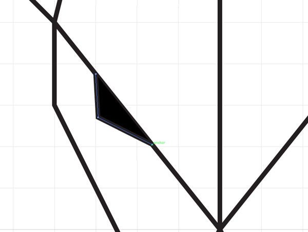
The key to achieving the geometric look is to intersect corner points to split the shape up into lots of segments. Not only does this add to the cool look of the final illustration, it also helps you visualise where details can be added to make the graphic look more like the subject it’s meant to be representing.
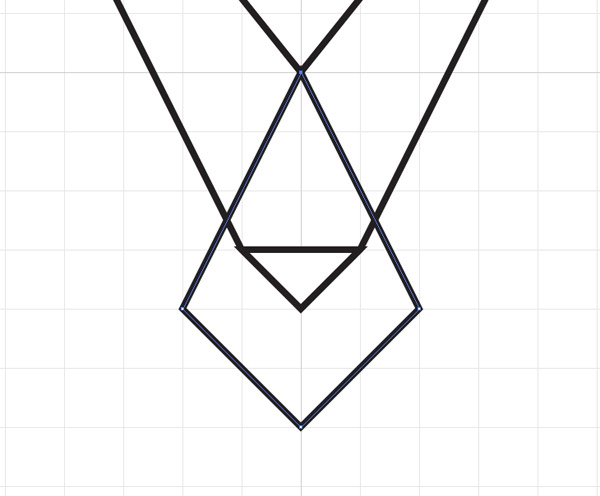
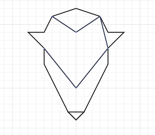
In the case of this stag illustration, the triangular shape created from extending the paths from the ears gives a nice point to anchor an additional shape to represent the stag’s muzzle. These additional paths all help outline an angry looking brow and a snout.
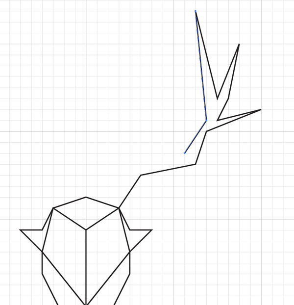
Use the snap to grid feature to draw a large antler on one side of the stag’s head. It can be tricky working within the confines of the grid, but it will ultimately provide the structure and consistency that’s needed to achieve the abstract geometric style.
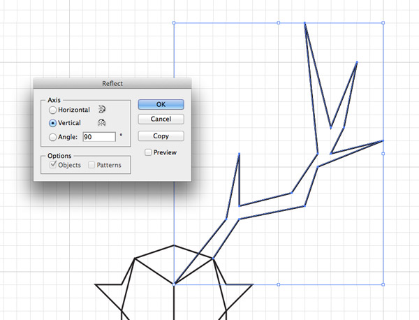
The antler is quite a complex shape that will be difficult to replicate manually on the other side of the stag’s head, so select the path and go to Object > Transform > Reflect. Select the Vertical option then hit the Copy button. Move the antler into position on the opposite side of the head.
There comes a point where were we need to break from the grid in order to add the finer details. Turn off the Snap to Grid feature and begin adding features such as an eye. Turn on Smart Guides to make it easy to snap the points to the existing paths.
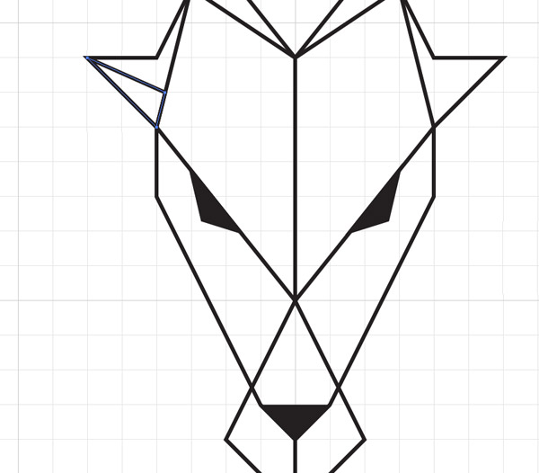
Giving key facial features like the eyes, nose and ears a black fill will make the face more recognisable. Draw these shapes manually with the Pen tool.
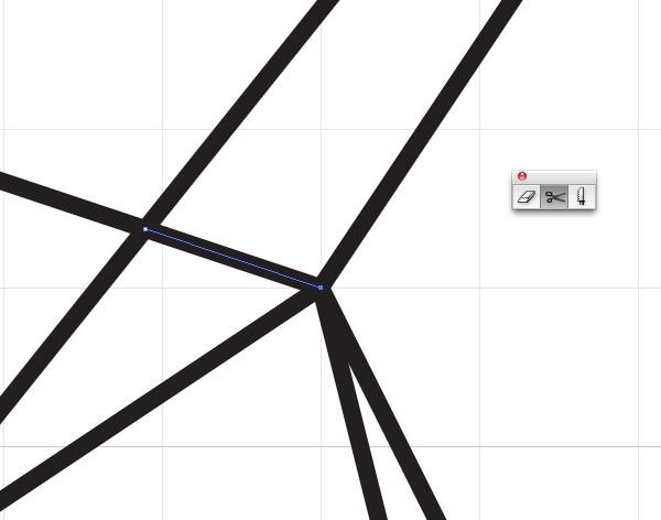
On this particular illustration the antlers seem quite disconnected from the head, so the Scissors tool is used to cut the head outline where it intersects the antler.
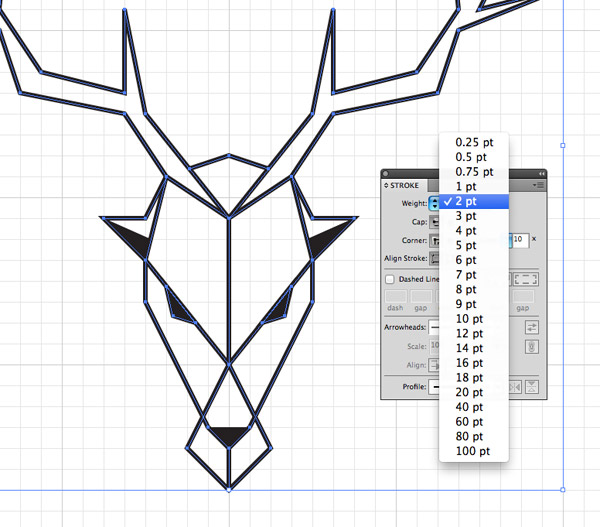
Select the entire illustration and bump up the stroke weight to 2pt to give it more presence. The thicker lines make a huge difference to the impact of the design.
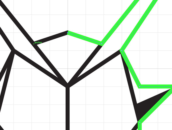
What would really ground the illustration is a slightly thicker outline, but there isn’t one continuous path to select. Instead of cutting and joining all the paths, we can simply draw another one over the top. Press CMD+2 to lock the illustration to avoid accidentally selecting an existing point, then choose a bright colour to make it clear where you’re working. Use the notifications provided by Smart Guides to draw an outline, clicking between each anchor point to draw a perfectly accurate shape.
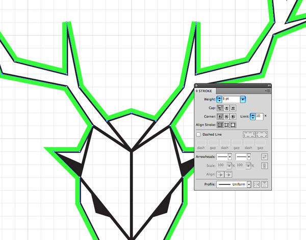
Press CMD+Alt+2 to Unlock All, then increase the stroke weight of the outline shape to 3pt and select the option to align this stroke to the outside. Notice how the corners of the antlers are squared off? We can fix that by adjusting the Miter limit.
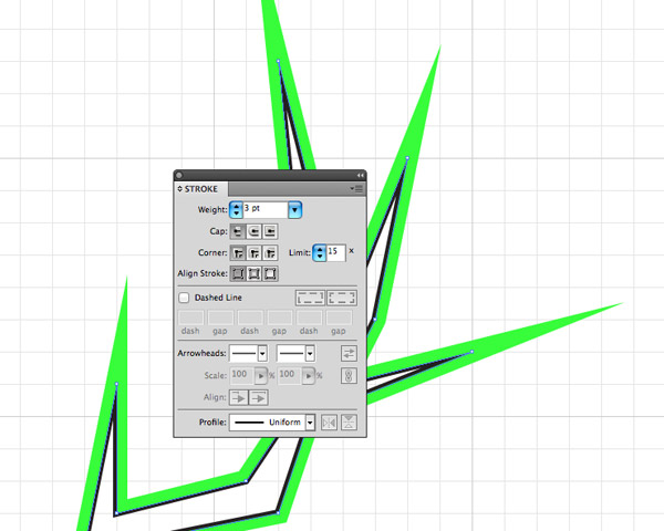
Adjust the Limit value in the Stroke palette until all the square corners are given nice long spikes.
Change the bright colour of the outline to black to match the rest of the illustration. The difference in line weight really adds to the design and helps the eye distinguish between the inner details and the main features that make the drawing recognisable.
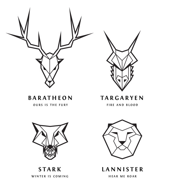
I used this same process to create a dragon, direwolf and lion logo to represent the main houses from Game of Thrones. There’s plenty more to cover so maybe I could create a complete series!

Love the drawings, thanks Chris!
Very good tutorial Chris
Beautiful artworks.
Gorgeous and some really helpful hints & tips in the tutorial
Very useful tutorial, thanks a lot!
Beautiful, and it works perfectly with the typeface.. Anyone knows where can I find it to buy it? I just fell in love with it…
It’s actually a freebie named Fontin – http://www.exljbris.com/fontin.html
Hi Chris, amazing work. And thanks for the link..
As a graphic design studio and great fan of GOT. Very nice article! Very informing.
Time to embark myself on a new project :D thanks for sharing this!
wow, I cant believe I just see this foundry! Thanks Chris, loved it!
Instead of redrawing the outline for a thicker outer stroke, try this:
(1) Cmd+A to select all.
(2) Cmd+C to copy.
(3) Cmd+B to paste in back.
(4) In the Pathfinder window, click “Union”.
(5) Adjust the stroke width & miter limit as described.
Much faster and less error-prone!
it was good and simple to understand and a well written post.
Awesome tutorial Chris.
Super original idea!
Thanks for another great tutorial. I set about following it before using the tips to create my own animal head.
I don’t often use Illustrator but I couldn’t pass this up.
This is an awesome tutorial, even great for beginners in illustrator like me. Thanks for this.
Very nice work. I look forward to seeing the rest of the sigils if you create them.
Urgh! Spelt my own name wrong
A great and creative tutorial man!
a great and crative tutorial man!
thank for sharing wonderful tutorial, this is a awesome tutorial !!!
My hat is off to your astute command over this toori-bcavp!
Great tutorial as ever, thanks for posting
Too Good Chris! Really simple and the results are stunning!. Thanks a lot for sharing the same.
Thanks Chris! this tutorial is awesome.
I did Batman :P
http://i.imgur.com/UkeRmWu.jpg
Great tutorial. Games of thrones is my favorite show.
Thanks for another great tutorial
That’s what i was looking for – Thank you !
This is awesome! I can’t believe you created this. Amazing!
Good work, nice re-interpretation in line-art style :)
Awesome effect! Thanks.
Wow, nice work here. I might make something like the giants or the mammoths. The tribe outside the wall may need their own sigil. Like this guy:
http://www.ranker.com/list/game-of-thrones-recap-season-4-episode-9-watchers-the-wall/matt-grippi?format=SLIDESHOW&page=9
Great tutorial/inspiration!
I have a n0ob question for anyone who can answer though – when working with the pen tool my lines never meet up where they visually should.
*Example* In the snout area under the triangular nose (where the vertical line is) the line always bounces either left or right of the triangle’s vertex. I’d like for the lines to meet but can’t manage this! It’s driving me insane!
I found the same thing, so I made sure all the lines had curved ends, and suddenly, they all looked joined and nice.
hope this helps.
omg!
I love it so much!!
Wow . This is great . I must try do it by myself . Thank you for sharing this .
This looks awesome. Can’t wait to try it!
Would it be okay to have this design as a tattoo? I totally love it!