This post was originally published in 2014
The tips and techniques explained may be outdated.
I’m sure we’ve all drooled over those awesome low poly art images and wondered how on earth they are made. You know, the ones that are made up of hundreds of tiny geometric shapes which combine to form an abstract image. I recently discovered a fantastic tool that makes it super easy to create them, so today I’m going to share the secret and explain how you can create your own low-poly geometric artwork using this magical app with some help from Illustrator and Photoshop.
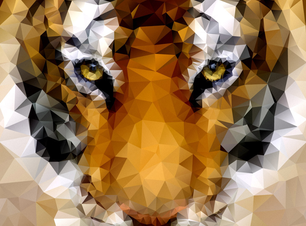
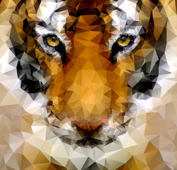
Here’s the style of artwork we’ll be creating in this tutorial. It’s a detailed image made up of hundreds of tiny geometric shapes which give the art that popular low-poly effect. The finished product gives the impression that the process is really complicated, but it’s actually super easy thanks to a free little program called I ♥ ∆. Quickly download it then you’re all ready to get started.
Preparing the image
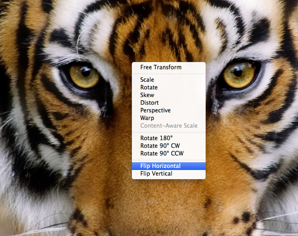
I’ll be using a photograph of a tiger from Shutterstock as the base for my artwork, but there’s some little tweaks that are required to make the photo completely symmetrical. Duplicate the layer and flip it horizontally.
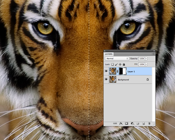
Add a Layer Mask to the flipped layer and fill one half with black to erase it and create a mirror effect between the two identical sides.
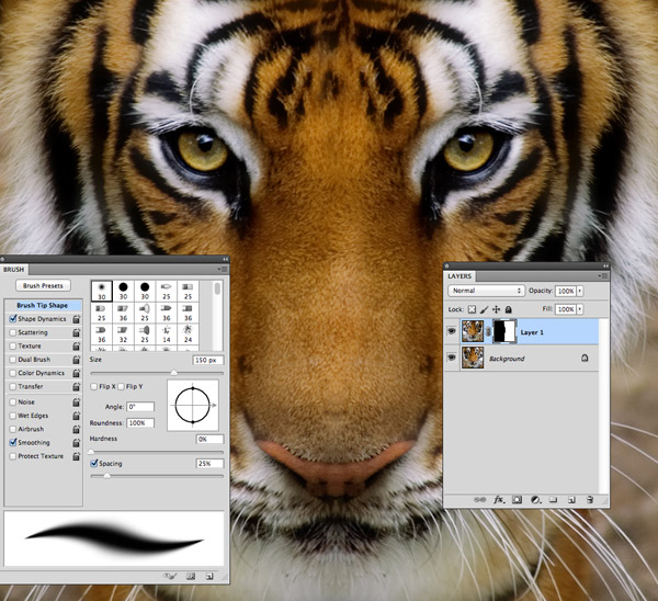
Use a soft brush to erase the harsh line between the two halves and blend them together to form a perfectly symmetrical image. Don’t worry too much about achieving a perfect seam as the fine details will be lost when the image is polygonified.
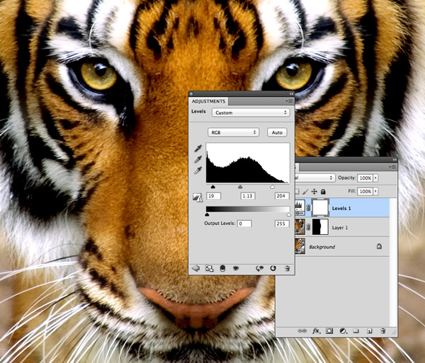
Add a Levels Adjustment Layer and increase the contrast to bring out the highlights and shadows. Images with high contrast will work best when turned into low-poly art to allow the light and dark areas to form recognisable areas.
Creating the low-poly effect
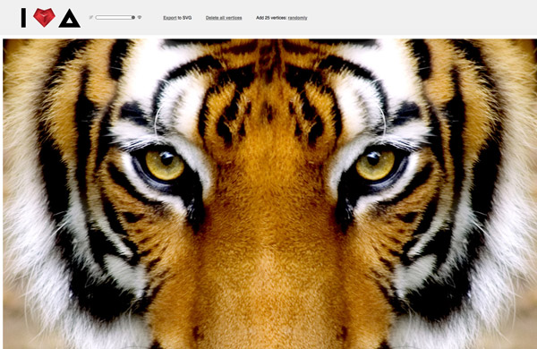
Download the I ♥ ∆ app from Somestuff.ru and open the index.html file from inside the Zip in your browser. Drag in your image of choice to start the editing process.
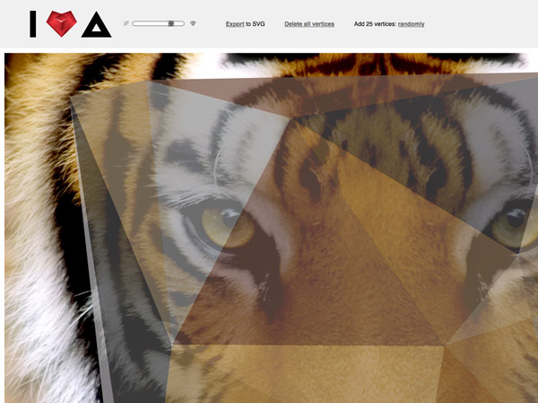
Click the “Add 25 Vertices” button to make a start, then reduce the opacity of the polygons so you can still see the reference image underneath.
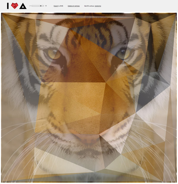
Begin by clicking as far into the four corners of your image as possible to fill the entire area with vector shapes.
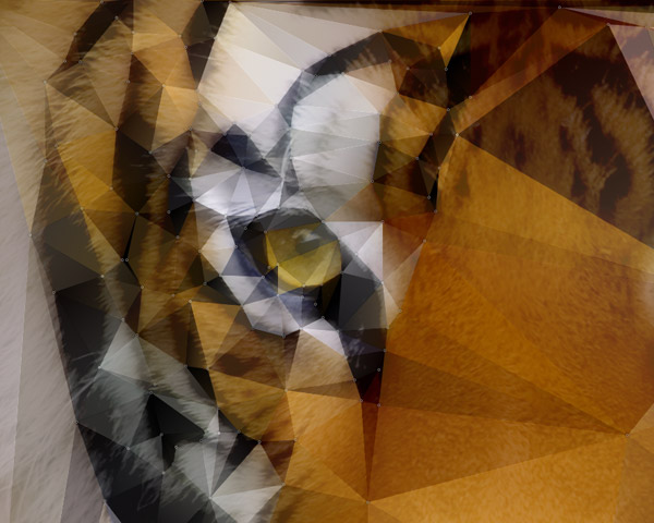
Now the slightly tedious process begins! Simply clicking away and trace the main characteristics of your reference image, so in this tiger photo I outlined the black stripes and area around the eye.
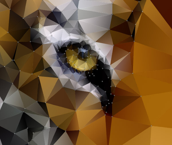
The key to creating a recognisable low-poly image is to add more detail in the important areas such as the eyes. Repeatedly click around the various elements of the eye to add multiple vertices and allow the polygons to create a more accurate image.
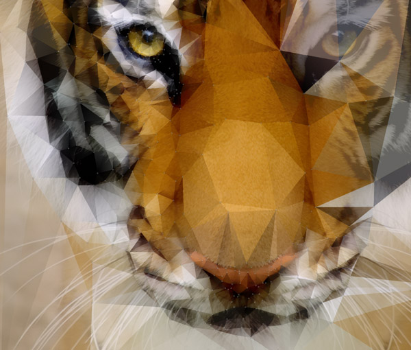
Roughly trace the rest of the image by following the lines of the reference photo, adding extra detail to the main facial characteristics.
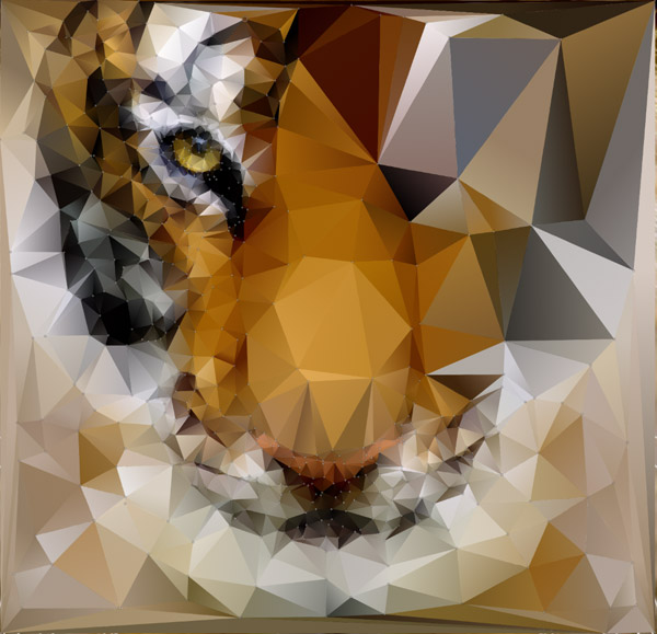
Keep sliding the opacity up and down to compare the vector polygon illustration with the reference image to make sure enough detail is being captured.
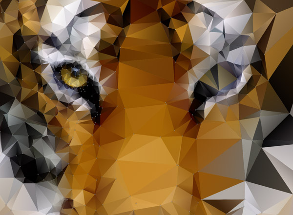
Begin working on the opposite side of the face, tracing the features to replicate the same level of detail. I originally tried creating just one half of the polygon image and mirroring it in Illustrator, but it was too difficult to match the vertices up to form a complete image. While it is the little CPU intensive, it’s easier to continue tracing the other half directly.
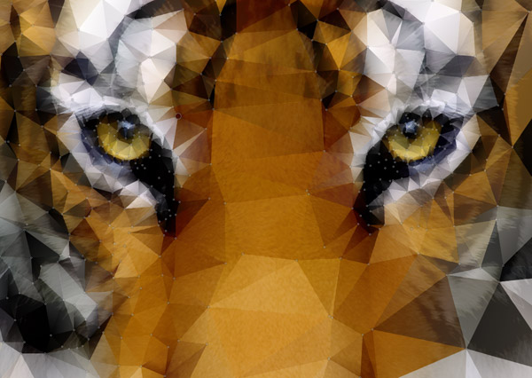
With this particular image being symmetrical it’s important to try and match the layout of the vertices so roughly the same level of detail is applied to each side.
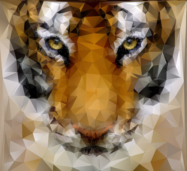
Contrasting areas of fine detail with lots of small shapes against less detailed areas with larger polygons helps retain that low-poly effect while achieving a recognisable image.
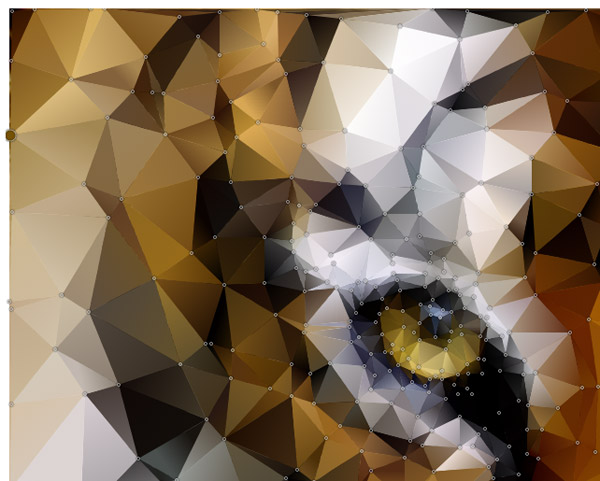
Finish off the illustration by adding a series of extra vertices all the way around the edge of the image to eliminate any awkward shapes.
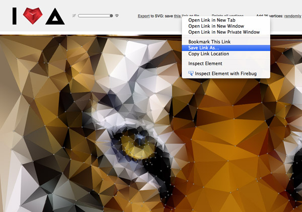
Once you’re happy with the polygon effect right click the Export link to save the artwork in SVG format. This can then be opened up in Illustrator for some final tweaking.
Tweaking the low-poly artwork
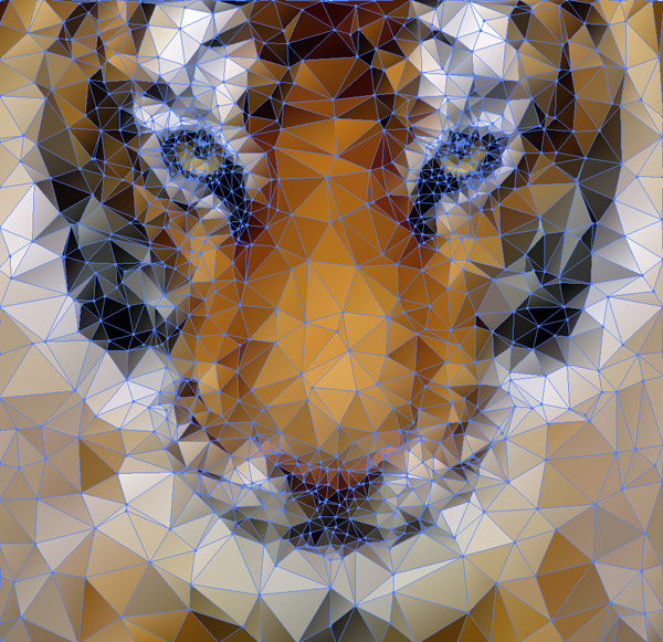
Open up the SVG image in Illustrator to see the artwork in all its vector glory. All those vertices are converted into points and paths with each shape being individually seletable.
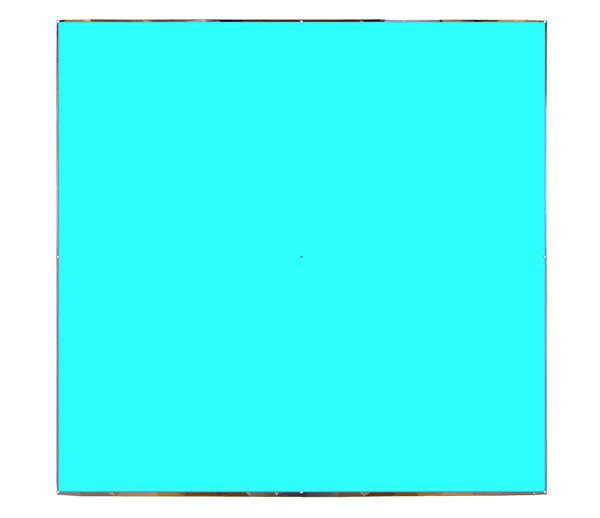
The edges of the image are a little rough, so the first step in Illustrator is to trim them to size. Draw a square within the confines of the artwork.
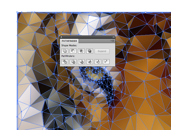
Remove the fill from the square then Select All and hit the Crop button from the Pathfinder panel to trim away everything beyond the edges of the square outline.
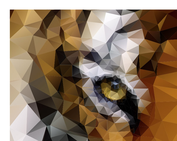
The trimmed edge is much cleaner and really neatens up the artwork. Right click and select Ungroup to make all the individual pieces selectable again.
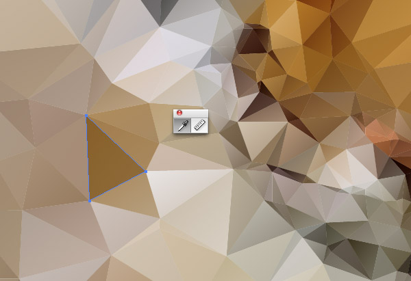
Take a step back and check over the artwork for any unsightly shapes or harsh colour fills. Each point can be tweaked with the Direct Selection tool, or its colour changed with the Eyedropper tool.
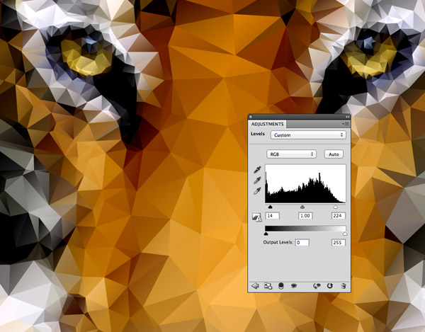
Select All and Copy the entire artwork into a Photoshop document. Add a Levels Adjustment Layer and adjust the shadows and highlights to really intensify the image with higher contrast and richer colours.
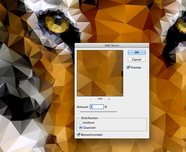
For one last tweak, add a touch of grainy noise (Filter > Noise > Add Noise) to add some subtle texturing and an extra level of detail to the artwork.
It’s hard to believe that awesome looking artwork like this can be created by simply clicking away in your browser! Polishing up that SVG artwork with Illustrator and Photoshop really enhances it into fantastic looking art worthy of a poster print.


Awesome work thanks Chris! Will try this beautiful artwork next week.
Thanks Chriss !! great app :)
I’ve found DMesh to be the best tool for these types of low poly illustrations.
Wow!! Thanks Chris!
Thanks for sharing this tutorial! I love this low poly effect and like you said – I was wondering how others do it. :)
Nice!
I wonder how this method can be more amazinge if it can be used while offline…
At last! I have found how to make it! Let me try it out will post further review of this post!
I guess that’s another way of getting rid of copyright issues, just transform images for the digital age!
Great tutorial, thank you.
How do i get this app to work? Do I have to have a Mac?
This is awesome. Looking forward to giving it a go!
Wow, that’s pretty impressive. Awesome tutorial, thanks for sharing.
Thanks Chriss ! awesome tut :)
Hey Hey Mr Chris. First off, amazing site and I visit every day. You found the right formula to help allot of people in design and i wanna thank you for that. When it comes to this tutorial however, I cant seem to drop a bitmap in 5 different browsers I have downloaded just for this tutorial. I don’t understand it. I open the page from the zip folder. It goes to it through explorer. First off it the page does not look like the tutorial or the page linked in the post. I am sure it has something to do with my browser and or lack of plug ins? I dunno…Once I read this tut I had a perfect idea for a poster I was commissioned to do for an annual animal charity… Could anyome help me make this work?
I have the same problem! please help
As Someone who’s not that experienced in PSD and Ai I really appreciate how easy you make it to follow your tutorials. I was able to create a lovely low poly image of a cat to add to my creative portfolio. Thank you so much!
Great tutorial, we have featured it here : http://theneodesign.com/best-adobe-photoshop-tutorials-april-2014/
Grrreat! Used this tutorial to make myself a new profile pic: http://kreativflurry.tumblr.com/post/84600965625/so-updated-my-facebook-profile-pic
As Clint mentioned DMesh also works but I♥∆ can generate randomly – which makes it way easier!
Amazing illustrator tutorial, we have featured it here : http://theneodesign.com/best-adobe-illustrator-tutorials-april-2014/
Thank you for the great tutorial. Very interesting style.
Thanks Chris for your great geometric low poly art easy way blog. I appreciate your easy way to create work. Really it’s beautiful, Thanks again for share this.
Nice tut but I’m gonna stick with DMesh, get all sorts of security and spam warnings for somestuff.ru
After reading all of these comments, I decided to try both Dmesh and I♥∆ , and Dmesh is the winner by a lot. It works about 50x faster and has a more defined UI.
Amazing Tutorial! Thanks
nice tutorial popular pictures