This post was originally published in 2014
The tips and techniques explained may be outdated.
The classic illustration style used on money is something I’ve always wanted to figure out how to replicate in Photoshop. There’s plenty of Photoshop tutorials that show how to create a basic halftone line effect, but they never quite capture that authentic engraved look with plenty of shading and tone. After lots of trial and error I finally managed to figure it out, so here’s an in depth tutorial on how to create a realistic money illustration effect in Photoshop (with some help from Illustrator!).
Watch the video
Subscribe to the Spoon Graphics YouTube Channel
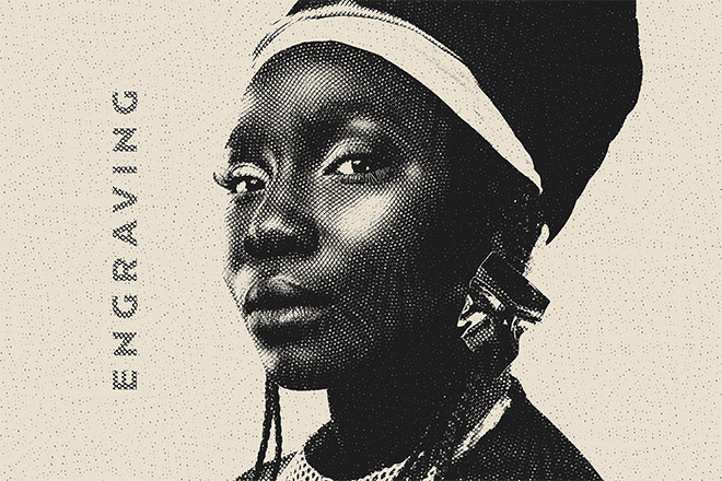
The effect we’ll be creating in today’s tutorial is this vintage engraved or etched illustration style that builds up the tonal areas of an image with lots of tiny lines. Unlike the basic halftone line effect used in other tutorials, this method actually uses curved and wavy lines that vary in weight to produce an accurate replica of this classic illustration technique.
Preparing the screens
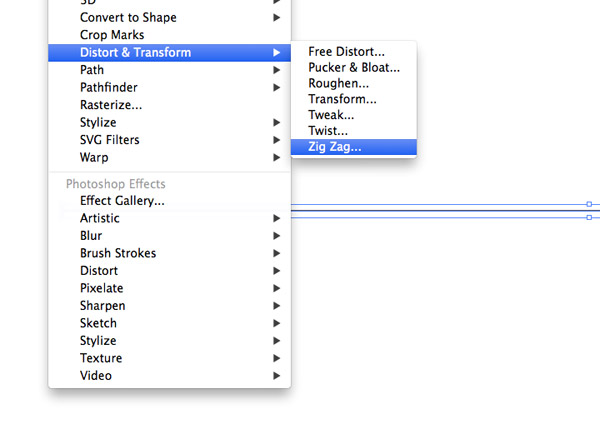
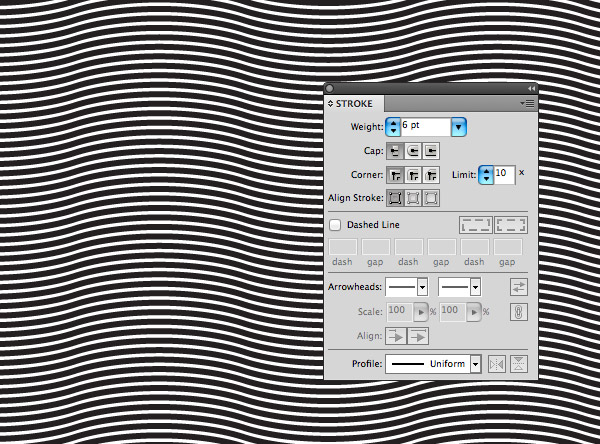
Before we can add the effect to a photograph we first need to build a range of ‘screens’ which will then be layered up over our chosen image to produce the carved illustration effect. Photoshop can certainly be used here, but Illustrator makes this job much easier. Create a new Illustrator document and draw a straight line on the artboard. Adjust it with no fill and a 1pt black stroke, then head to Effect > Distort & Transform > Zig Zag.
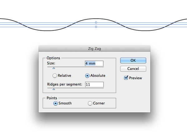
Enter 4mm in the Size option and apply 11 ridges in the settings. Select the Smooth option to create a wavy line.
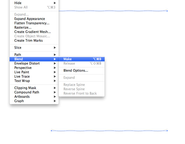
Hold the ALT and Shift keys and drag a duplicate of the wavy line vertically down the artboard then with both lines selected go to Object > Blend > Make.
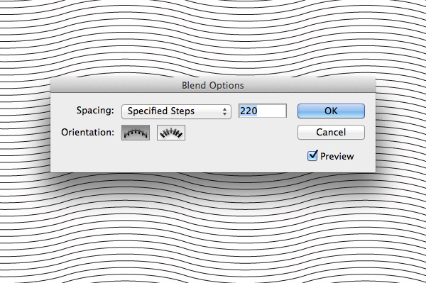
Head back to Object > Blend > Blend Options to configure the settings. Choose Specified Steps and adjust the number to produce a series of tightly packed parallel lines. 220 was a good figure for the scale of my document.
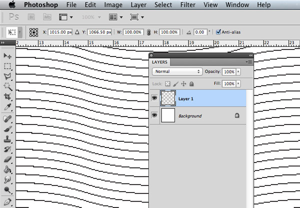
Take a copy of the blended lines then open a new document in Photoshop and paste them in. Choose Pixels as the Paste method.
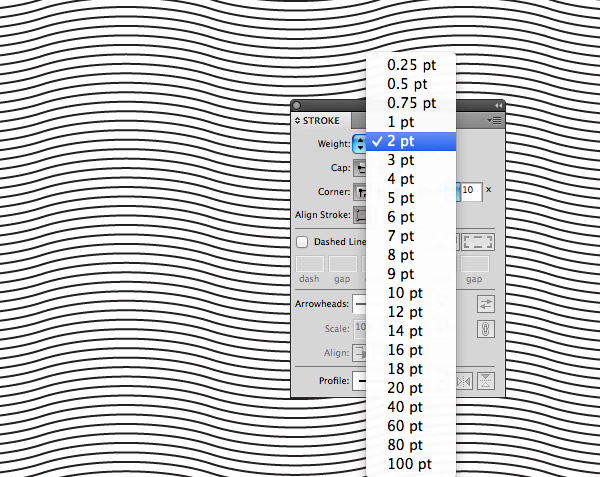
Switch back over to Illustrator and change the stroke weight to 2pt. Take a copy of this updated element and paste it onto a new layer in the Photoshop document.
Repeat the process of increasing the line weight by 1pt then pasting the heavier version on a new layer. Do this for 3pt, 4pt, 5pt and finally 6pt lines.
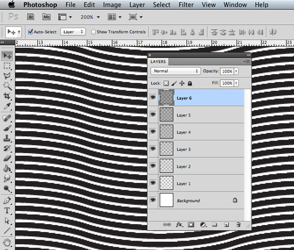
The layers in the Photoshop document should all be perfectly aligned, so as each layer is toggled in visibility the lines should subtly get thicker and thicker.
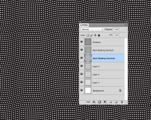
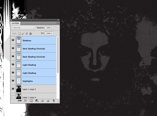
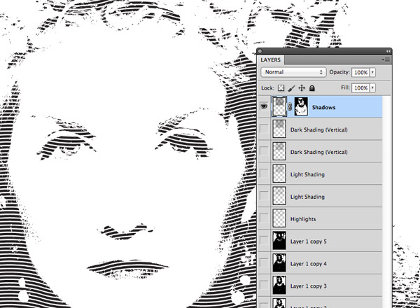
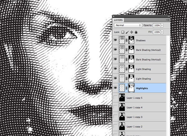
Now comes the trick that really allows this technique to work. Rename the darkest screen layer to Shadows and the following two layers to Dark Shading. On those two Dark Shading layers press CMD+T and rotate them by 90° so the wavy lines run vertically.
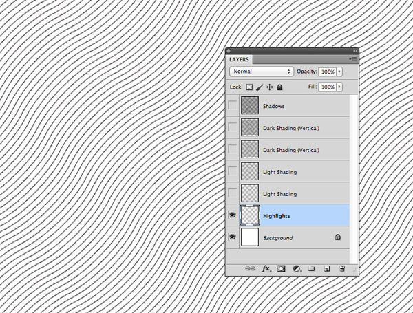
Rename the following two layers to Light Shading and the final lightest layer to Highlights. Transform this Highlights layer and rotate it by 45° so the wavy lines run diagonally.
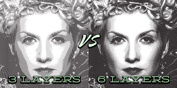
After spending hours trying to replicate this effect my real breakthrough came when I discovered that I needed more layers. When I analysed artwork in this style I could only see three weights of lines in different directions, but my original attempts with 3 layers didn’t quite cut it. Too much detail was lost and there we harsh lines between each tonal layer. The key is to use a couple of layers in the same direction that only have a difference in line weight of 1pt (the Dark Shading and Light Shading lines in our document). These layers hardly seem to make a difference when you see them individually, but when viewed on the whole as part of the full illustration they really add an extra level of detail and tone to the effect.
Applying the effect
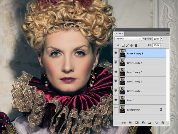
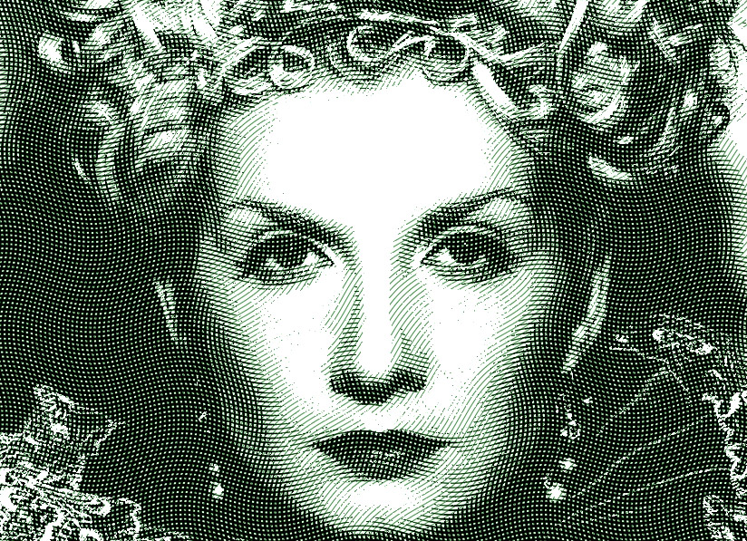
Open up your chosen image in Photoshop and duplicate it 6 times (one for each screen layer) by pressing the shortcut CMD+J. I’ve chosen this image of a haughty queen in royal dress from Shutterstock.
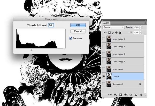
Turn off the visibility of all layers except the first one then go to Image > Adjustments > Threshold. Enter 80 for the Threshold Level. Repeat the process with all other layers, but incrementally increase the Threshold level to 100, 120, 140, 160 & 180;
Drag the 6 layers and lines into the photograph document and align them centrally over your image. Turn off the visibility for all these layers.
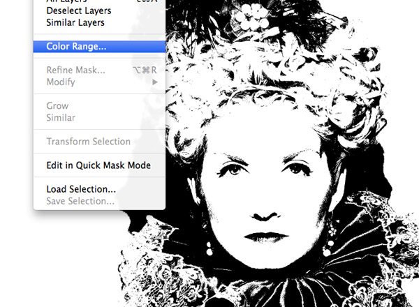
Turn on the visibility of the first layer with the lowest threshold value and go to Select > Color Range.
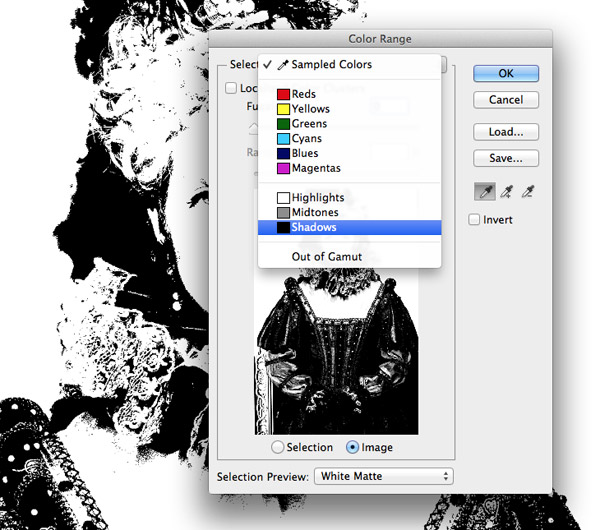
Change the Selection option to Shadows then hit OK. Alternatively make sure your foreground colour is set to black, then the default Sampled Colors option will suffice.
With the color range selection active select the Shadows layer and click the New Layer Mask icon at the bottom of the Layers palette. This will apply a mask using the selection to automatically erase out portions of the image that correspond to the brighter areas of the image.
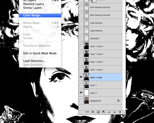
Turn off the visibility of all layers with the exception of the next Threshold layer. Load the Color Range selection of this layer and apply it as a layer mask to the Dark Shading layer.

Repeat the process of loading a selection and applying it as a layer mask to each layer of lines until the darkest threshold layer has been applied to the highlights lines layer.
Turn off all the Threshold layers and make all the line shading layers visible to see the full effect. Each layer of linework is limited to different areas of the image thanks to the variances in threshold levels. The shading layers that run in the same direction but have 1pt differences in weight help add extra levels of tone & detail and the shading is intensified further by the cross hatching.
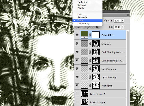
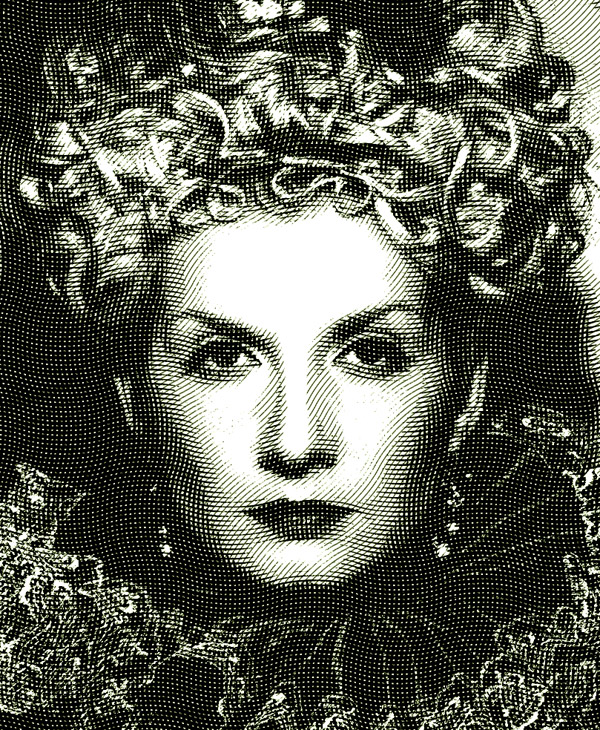
Add a Solid Color adjustment layer with a green fill to the top of the stack and change the blending mode to Color to give the illustration a green hue to finish off the money effect.
The final Photoshop money effect looks super realistic and really captures the authenticity of that classic engraved illustration style. The curvature of the lines and how they build up the detail and tone are what really makes this effect work. It can be quite a tedious process building those screen layers, but Access All Areas members will find a series of ready made PNGs in the source file download to make life easier.
Want more? Check out these great related products
The following resources cost a little money, but I definitely recommend checking these related products out to complement this engraved money effect.
Etching Halftone Action
Engraved And Halftone Creator
Engraving Waves Photo Effect
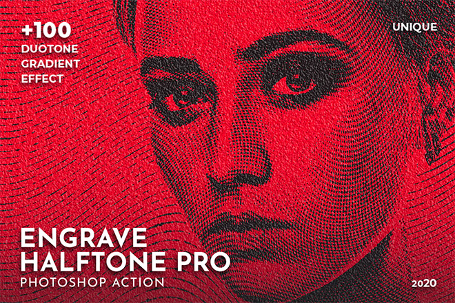
Engrave Halftone Pro Photoshop Action
Engrave Photoshop Action Kit

Amazing, I alway wonder that how did they do that on money paper and today you told that how it is made.
They did it in analog times, too. :)
Not really Mkk, this is an ‘engraving look’, to look as though it was ENGRAVED. Still, I myself was also looking on how to do a look like
that, thanks!
Whooot, Whooot!
Finally there’s a tutorial about this!
:)
Genius!
Awesome effect! Thanks.
Simple and Sweet Chris, Thanks a bunch!
oh so very cool! I am going to have to give this money effect a try. thanks!
Thank you!!! Best one yet.
There is a better way to do that, using halftone screen. It’s better, because each line has thickness variation, according to the dark/light areas.
That is brilliant tutorial was waiting for that since you announced this on facebook.
This is great. Thanks, Chris!
Excellent tutorial! The crosshatch effect is something that comes just not constantly enough that buying an action for it would be overkill, but it always catches me off guard.
This will definitely come in handy
great tutorial thanx!
This is the first time a leave a message on a tutorial website. This tutorial inspires me a lot. I may now apply this effect onto some other project that needs to be brushed out with denomination appearance.
Thank you, please keep this up!
Brilliant stuff!
Is there anyway to accomplish this entirely in Illustrator? I know there are thresholds in Live Trace etc. I’m thinking it would be sweet to end up with a version totally in vector format.
OK, I got this working pretty nice :)
The only problem I had was that the blend step number of 220 was too close when I blended the two lines on opposite sides of an A3 sized portrait document in Illustrator. At that step size, changing the line thickness to 6 pt made solid black.
I eventually had to change the blend step number to 120. This seemed to get a result similar to what Spoons looked like.
However, when I opened up my image in Photoshop and pasted in the line layers, the lines looked too far apart and I had to transform and shrink them down by about 60%. I suppose it all comes down to what size image the lines are placed over. I’ll have to fool around with image size or the blank document size in Illustrator.
It worked great in the end anyway!
Thanks again for the tutorial!
Awesome, thanks! And long live Garbo!
AWESOME! I have been trying to create this effect for a while…
Thank you for the very nice tutorial!!
I enjoyed the tutorial Chris – a lot of my work involves complicated vectors, and this one will prove to be a time saver for certain types of images. I included a link to one of my designs on Tumblr which uses your process – then applies a color layer.
Thanks again for your terrific tutorials (I also left a link to this Tut on the Tumblr Post)
Had a lot of fun doing this today. Bloody love your blog :-)
Awesome tutorial. Do you have an action pack for sale on this ?
gooog job Chris
Good job Chris… :)
Very Nice Tutorial..
Amazing…!!!
Excellent tutorial. Thanks for posting it!
Amazing tutorial, we have featured it here : http://theneodesign.com/best-adobe-photoshop-tutorials-april-2014/
cool. always wanted to print my own money ;-)
Really Cool ~ I’m from myanmar and i like your blog posts very much, they are really helpful to me :)
Very Effective and Easily Understandable Tutorial for the use of photoshop Effect.
Nice tutorial! Very understandable
Totally interesting and also different concept, Thanks for share.
Nice tutorial!
You’ve really captured all the eslsetians in this subject area, haven’t you?
Awesome tut
Nice work. Thanks for making these tutorials. Found your blog looking for a tutorial on ink blot effects – also well done. Cheers!
Nice! Thanks
Great work in your process and progress on defining this great tutorial. I can enjoy and understand when you find that one step that makes the final result perfect. Thanks for the work on this one.
Love, Love, Love!!! Can’t wait to get working on something with this effect. You do a great job of explaining how to make this work.
Thanks Chris!
Really an awesome tutorial.
Thanks for sharing it.
Wooh, nice it does work.