Tutorials
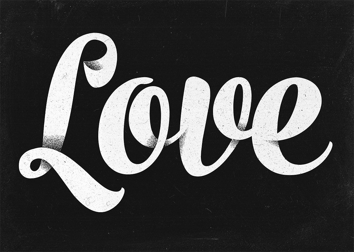
Cursive type, whether a script font or hand-lettered, often features elegant swashes and overlapping strokes. One way artists emphasise the curvature of their type is to apply shading, which adds an illusion of depth to the lettering piece. In today’s tutorial I’ll show you how to produce a shaded type effect in Adobe Illustrator. We’ll use a script font as the basis of our typography, then apply a series of gradients to give the impression that the letter strokes interweave and overlap.
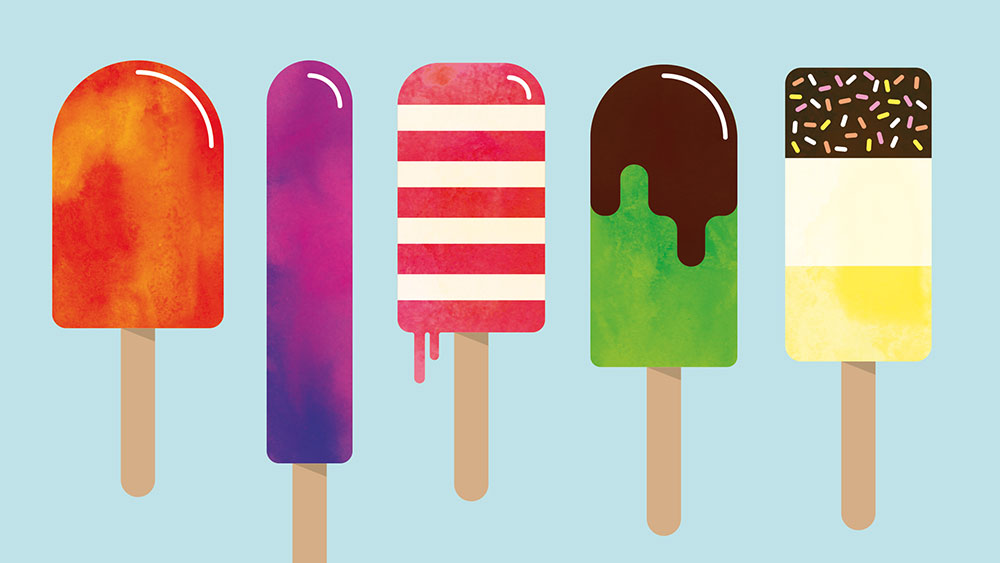
In today’s Adobe Illustrator tutorial I’ll show you how to make your own tasty popsicles or lollipop graphics. We’ll use a range of handy Illustrator tools to create the first colourful lollipop, then build upon each subsequent illustration with new additions which provide an opportunity to touch on different tools and techniques, then we’ll add some subtle texturing with my free watercolour circle textures.
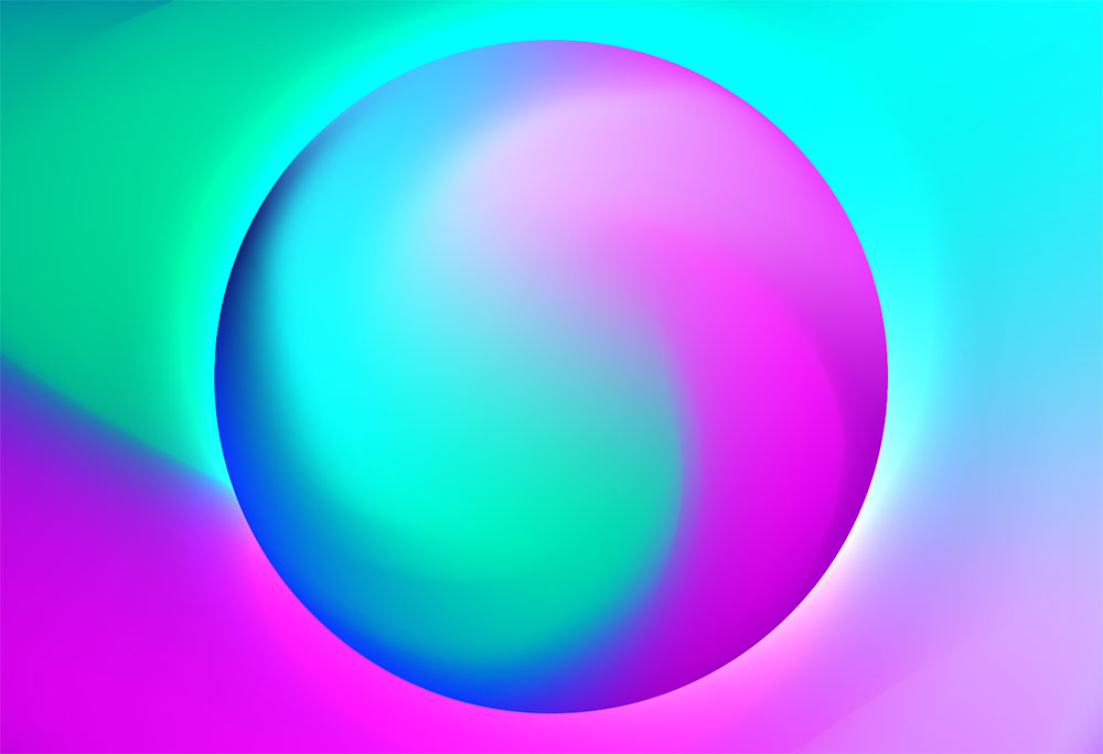
Today’s Adobe Illustrator video tutorial is a quick and easy guide to creating a vibrant gradient orb. It’s a simple process that uses just the Gradient Mesh and Warp tools in Illustrator, but the result is pretty cool. Being vector based means these orb graphics are extremely versatile, so they can be used for all kinds of branding projects, or just to create fun artwork.
Logo designs made in the style of line art are still a pretty popular trend at the moment, they feature simplified illustrations to produce a minimalist design. This style seems particularly common amongst outdoors themed logo designs, often including landscape scenes made entirely of lines, composed into a badge style layout. In today’s Adobe Illustrator tutorial I’ll take you through the process of creating your own line art badge logo. Despite creating the whole design with just lines, we’ll still incorporate a variety of useful Illustrator tips and techniques.
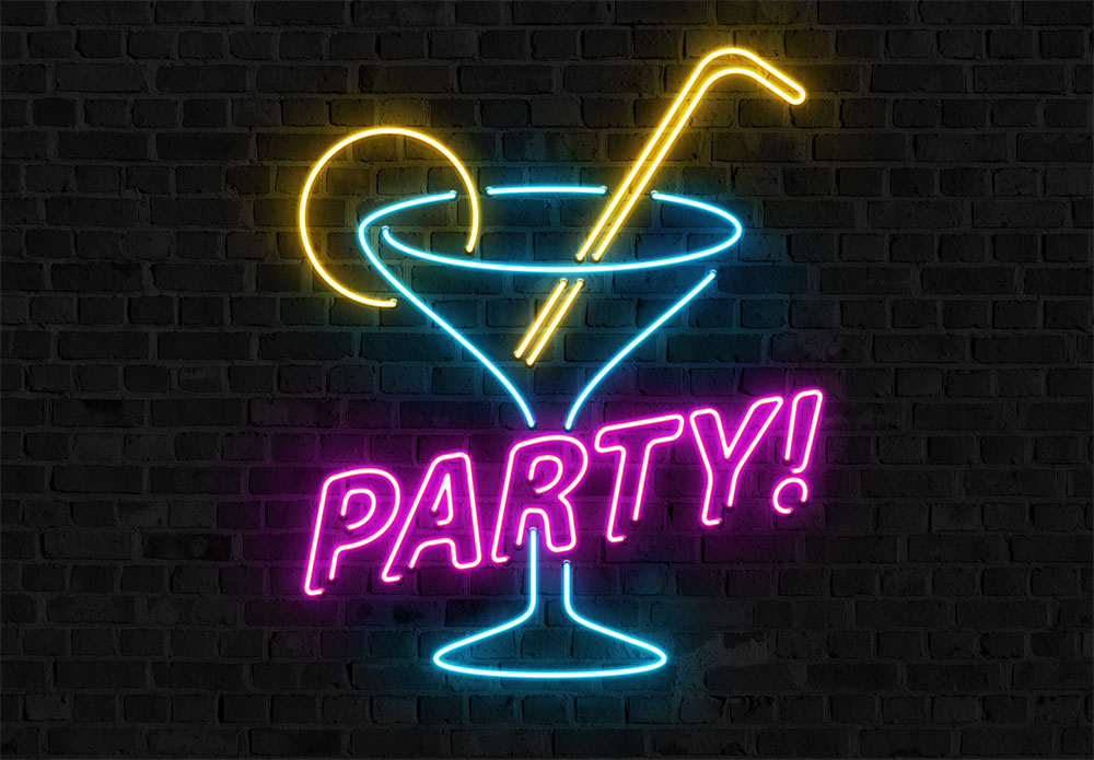
In today’s video tutorial we’re going to create a bright neon sign effect using the powers of Adobe Illustrator and Adobe Photoshop. While it is possible to construct the entire artwork in Photoshop alone, Illustrator offers some useful tools for producing the initial layout with its vector shape building capabilities. Where Photoshop really shines is with its various layer style options that can be configured to create vibrant lighting effects, which are perfect for depicting a realistic, illuminated neon sign.
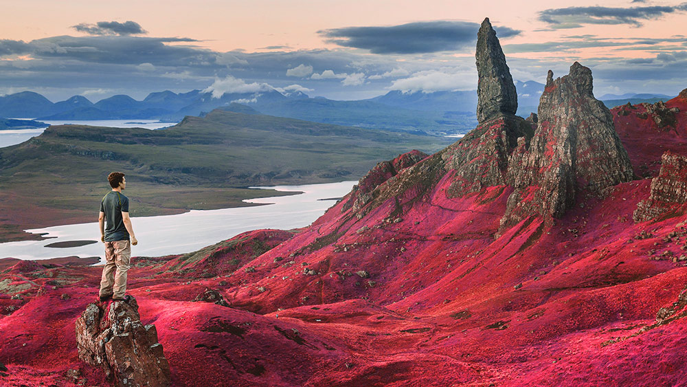
In today’s Photoshop tutorial we’re going to take a look at replicating the unique appearance of false-color infrared photography. Authentic infrared photos are captured using infrared film, or digitally using an infrared lens, but the overall style and aesthetic can also be simulated with some tweaks to a normal photograph in Adobe Photoshop. In false-color infrared photos the reds, blues and greens are reversed, so scenes with foliage and trees appear as a vibrant pink rather than green, which often looks like the photograph was taken on another planet! The result is a surreal image that transforms a typical landscape shot into a vibrant and unique photo.

