
Cursive type, whether a script font or hand-lettered, often features elegant swashes and overlapping strokes. One way artists emphasise the curvature of their type is to apply shading, which adds an illusion of depth to the lettering piece. In today’s tutorial I’ll show you how to produce a shaded type effect in Adobe Illustrator. We’ll use a script font as the basis of our typography, then apply a series of gradients to give the impression that the letter strokes interweave and overlap.
Watch the video
Subscribe to the Spoon Graphics YouTube Channel
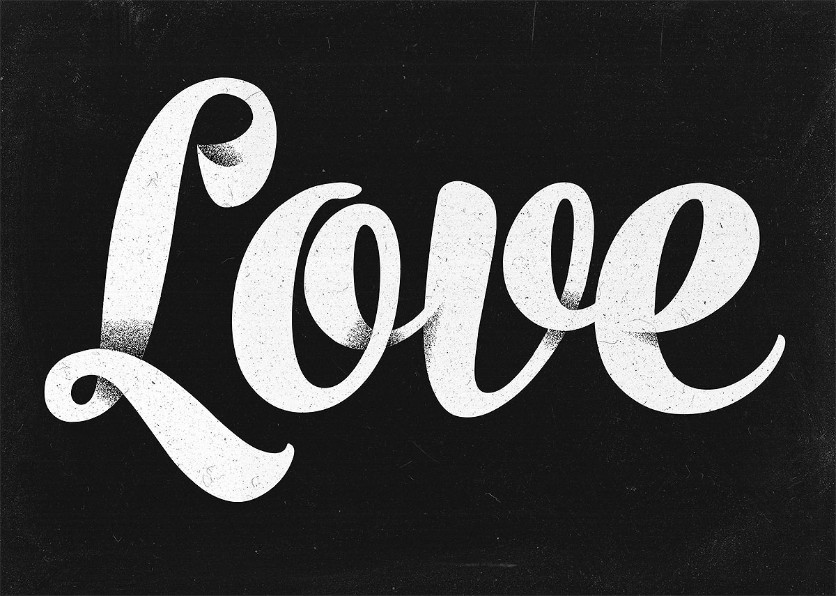
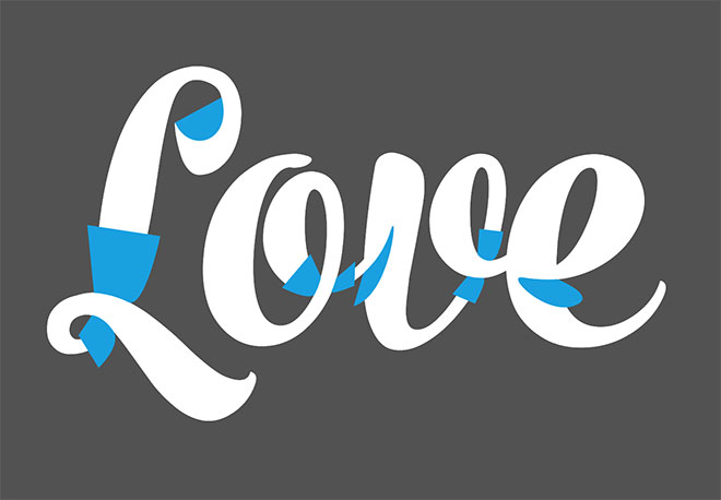
The artwork we’ll be creating in this tutorial features the word ‘Love’ in a bold, flowing script font with the addition of shaded elements that make the strokes of each letter appear as if they loop and overlap, rather than being flat two-dimensional type. Grain filters and dusty textures then used to distress the artwork with more of a low-fi appearance to finish off this grungy shaded type effect.
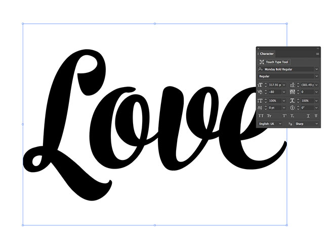
Create a new document in Adobe Illustrator and set out your desired wording in a script font. The typeface I’m using is one of my favourites, named Monday. Alternatively, if you’re a pro hand-lettering artist, the same effects can be applied to your type after it has been traced.
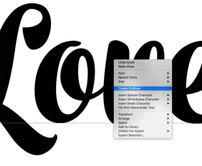
To convert the text element into shapes, right click and choose Create Outlines, or use the CMD+Shift+O shortcut.
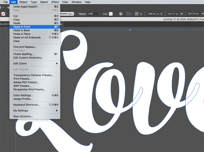
Move the type into some empty space around the artboard and give it a white fill. Hit CMD+C to Copy, then CMD+F to Paste in Front a duplicate directly on top.
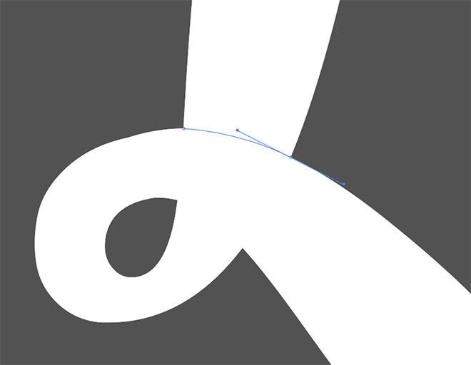
Make sure you have Smart Guides enabled in the View menu, which will make it easy to snap to existing points on the letterform paths. Wherever the stroke of a letter would overlap, draw a path between the two points at each side that continues the curvature.

Extend the path to form a shape that covers a portion of the letter, then back to the starting point. These points can be roughly placed, as long as the shape covers the full width of the letter stroke. Use a bright colour as the fill so it’s clearly visible.

Repeat the process by drawing a new shape on the opposite side of the overlapping stroke. Begin with a path that matches the curvature of the letter outline by clicking and dragging the bezier handle, then roughly complete the path to form a shape.

Whether these shapes are placed on the top and bottom, or left and right of an overlap will determine which portion of the stroke will appear on top when the shading is applied.
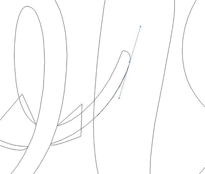
Shading can also be applied where the tails of letters extend into other letterforms. Turning on Outline mode from the View menu can make it easier to draw a path that follows the shape of the letter.
After carefully following the shape of the tail, extend the shape to cover a portion of the letter.
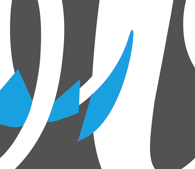
Draw these shapes wherever you want to add shading to the type.
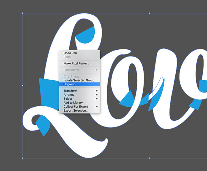
Select the type, then right click and select Ungroup to break the letters apart. With everything still selected, use the CMD+8 shortcut to create a Compound Path.
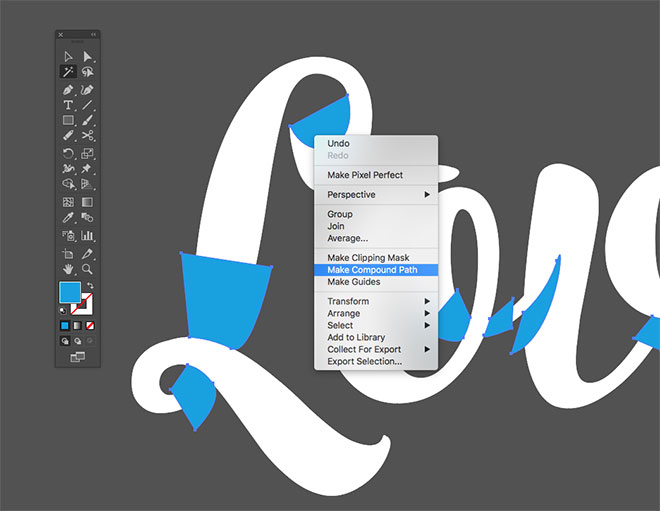
Use the Magic Wand tool to quickly select all the brightly coloured shapes with one click, then make a Compound Path from these objects too.
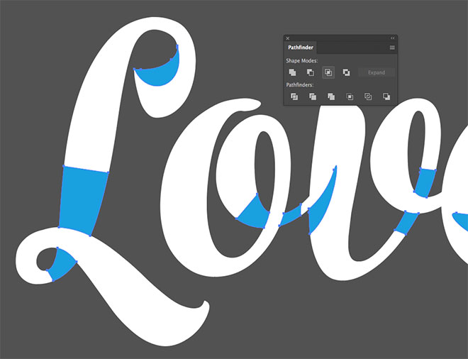
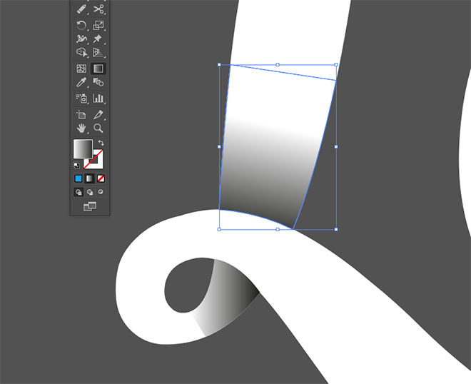
With the Selection tool active, hold the Shift key and click the type to add it to the selection, then use the Intersect button in the Pathfinder panel to trim the shapes to the outline of the type.
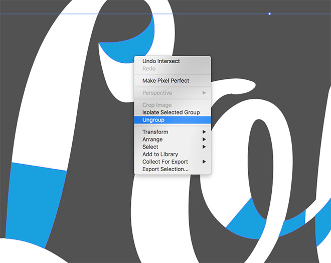
Right click and select Ungroup to separate the shapes into individually selectable objects.
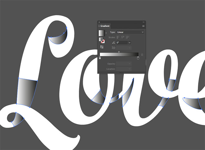
Swap the random fill colour to a black-white linear gradient.
Using the Gradient tool, select each shape in turn and click and drag to modify the direction of the gradient flow so it looks like a shadow being cast from the letter stroke.
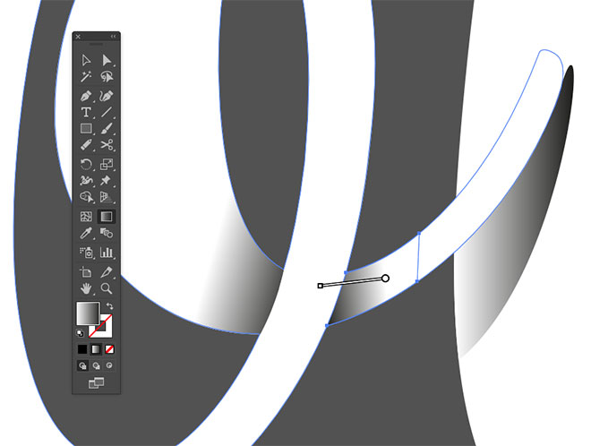
Set the flow so the darkest portion appears towards the overlapping area, and allow it to fade out so it doesn’t abruptly end at the edge of the shape it’s applied to.
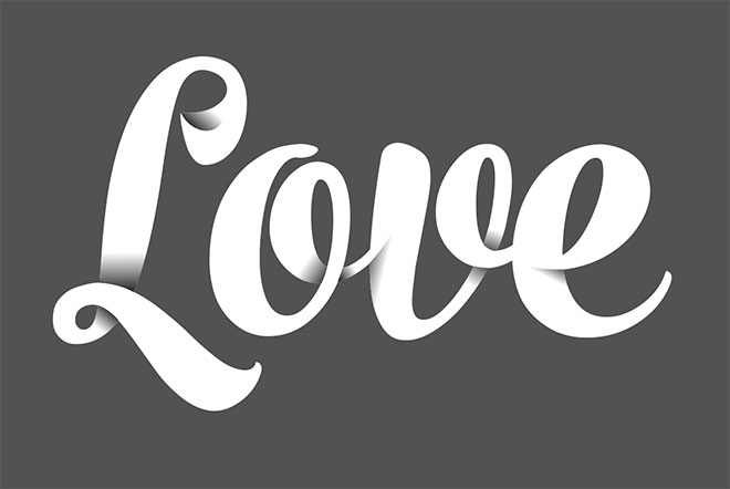
The addition of these simple gradients gives the type a three-dimensional appearance with an illusion of depth as the strokes interweave and overlap.
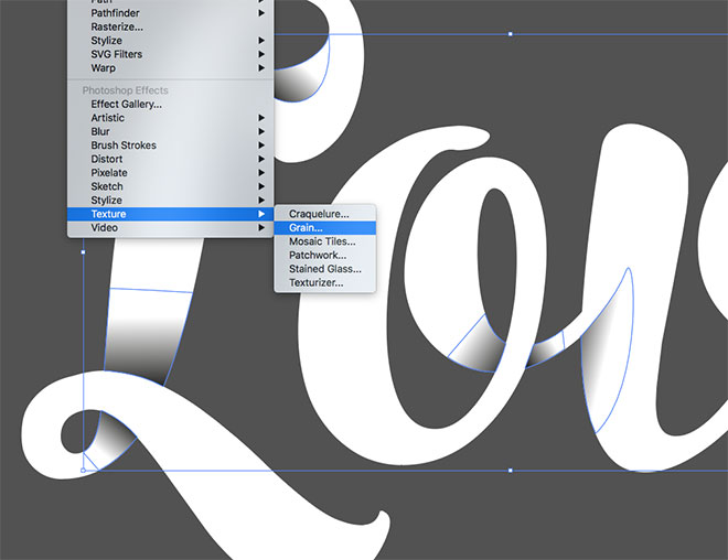
To take a effect a step further, a Grain texture can be applied to give the shading more of a stippled appearance. Select all the shapes with the Magic Wand tool and add the texturing via the Effect > Texture > Grain menu.
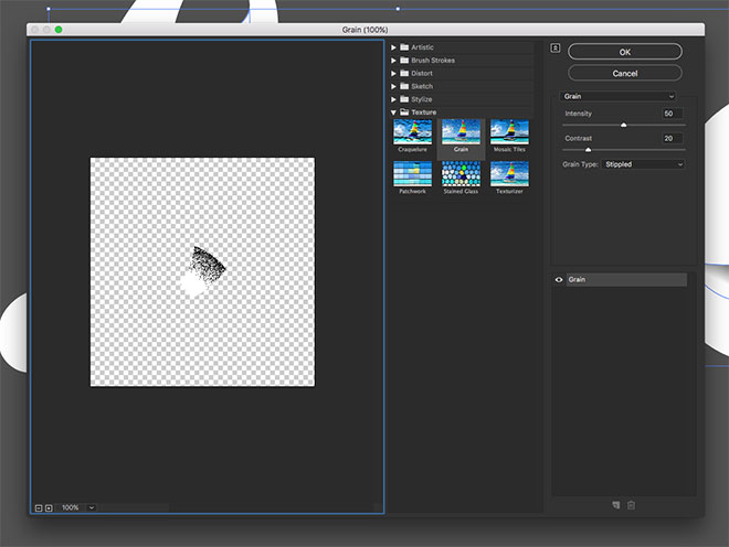
Configure the Grain settings to 50 Intensity and 20 Contrast with the Grain Type option set to Stippled.
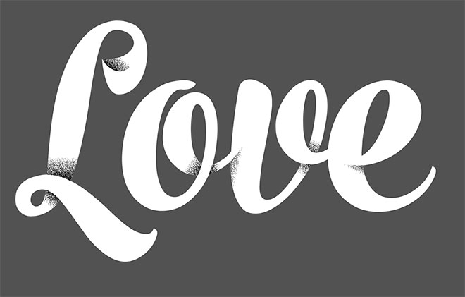
This grainy variant of the effect has more of a hand-lettered appearance as if the shading has been stippled with hundreds of pen dots.
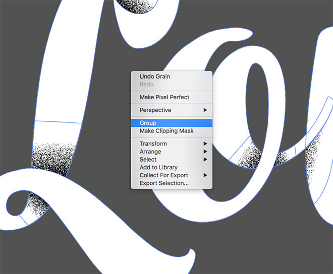
To complement the grainy style, additional textures can be added to finish off the artwork. Draw a selection around the entire design and Group everything together.
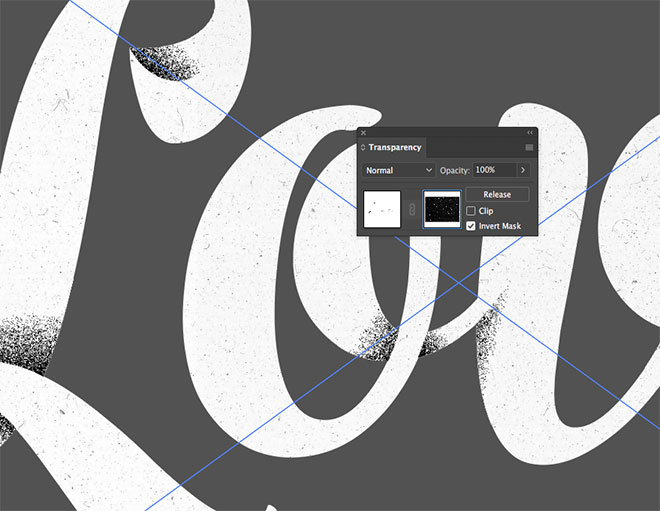
In the Transparency panel, click the Make Mask button, then activate the thumbnail on the right within the panel. Drag (or File > Place) one of my Free Film Dust Textures into the mask and scale it to fit over the type. Click the Invert Mask button to allow the tiny particles to distress the design. Click the thumbnail on the left to exit out of mask mode, back to the regular workspace.
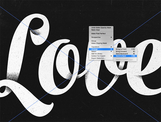
Place another film dust texture, this time for use as a background. Scale it to size, then send it to the back so the text is visible on top using the CMD+Shift+[ shortcut, or the Arrange > Send to Back command.
The final result is shaded type effect where the letter strokes appear to weave, loop and overlap, simply produced by a series of gradient-filled shapes in key places within the text outline. The artwork can be left clean and crisp, or distressed with grain effects and dusty textures to give the design a gritty hand-made appearance.
Love this design? Get the t-shirt!

That looks cool with the shading on it! Thanks!
Beautiful tutorial, loved it!
Very effective tutorial about Shaded Type Effect in Adobe Illustrator.
Very well explained
can you turn that grain into vector or are you leaving it as a raster element in the final artwork?
Excellent article Chris Spooner!!! I totally agree that you have to put out great content that graphics designer will find valuable on a regular basis. I think you always try to help us by your well written content. Great effort & thanks.