Logo designs made in the style of line art are still a pretty popular trend at the moment, they feature simplified illustrations to produce a minimalist design. This style seems particularly common amongst outdoors themed logo designs, often including landscape scenes made entirely of lines, composed into a badge style layout. In today’s Adobe Illustrator tutorial I’ll take you through the process of creating your own line art badge logo. Despite creating the whole design with just lines, we’ll still incorporate a variety of useful Illustrator tips and techniques.
Watch the video
Subscribe to the Spoon Graphics YouTube Channel
The artwork I’ll be creating in this tutorial is a badge style line art logo design with a camping theme. It features minimalist illustrations of mountains, a camp site and a lake, all made of paths with a single stroke weight. The layout is then composed into a circular badge with the addition of arced text and decorative light rays.
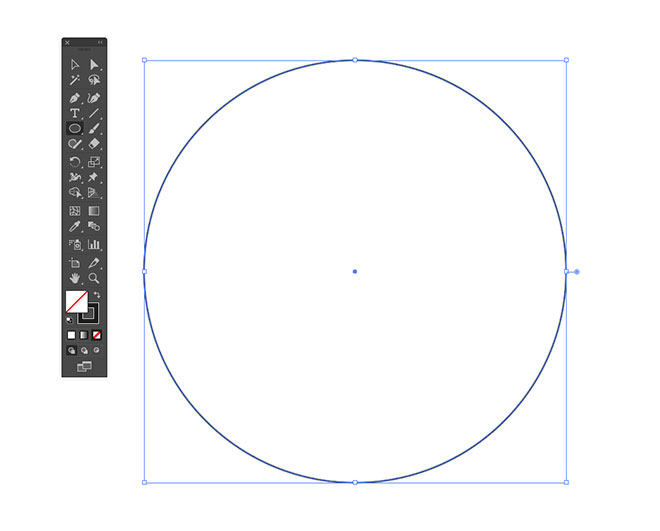
Open Adobe Illustrator and create a new document, the sizing doesn’t matter because the vector artwork can be scaled to any size, but you might want to turn off Scale Strokes and Effects in Illustrator’s Preferences panel to retain the same stroke weight when the artwork is scaled, at while you’re constructing your artwork. Begin by drawing a circle on the artboard. Remove the default white fill, leaving just a black stroke.
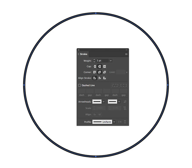
In the Stroke panel, increase the stroke weight to around 5pt to beef up the line. Also check the Round Cap and Round Corner options. These settings won’t be visible on this circle shape, but the same line style will also be used for all the subsequent paths we’re going to draw.
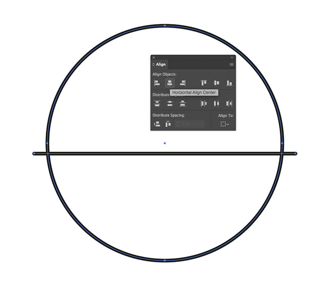
Switch over to the Line tool and draw a path that intersects the circle. Hold the Shift key to keep the line straight. Select both shapes and centre them up vertically using the Align panel.
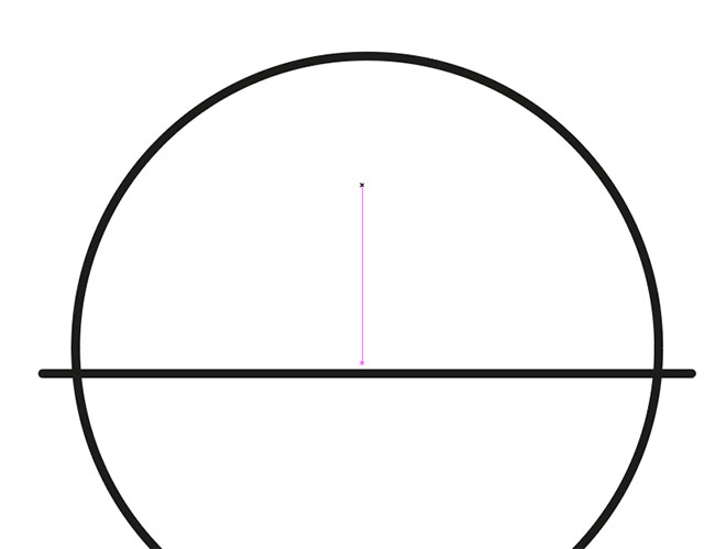
Make sure you have Smart Guides enabled from under the View menu, then use the pink tooltip to find the centre of the line. Follow it upwards, then draw a diagonal line back down to the horizontal path.
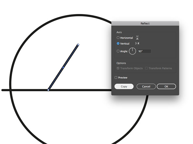
Go to Object > Transform > Reflect, check the Vertical option then hit the Copy button.
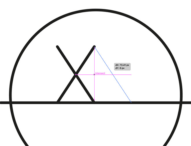
Move this duplicate line to form a triangle shape by snapping the two upper points together.
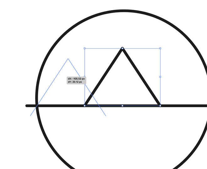
Shift and click both lines with the Move tool, then drag another copy by holding the ALT key. Position this duplicate to the left, overlapping the other elements slightly.
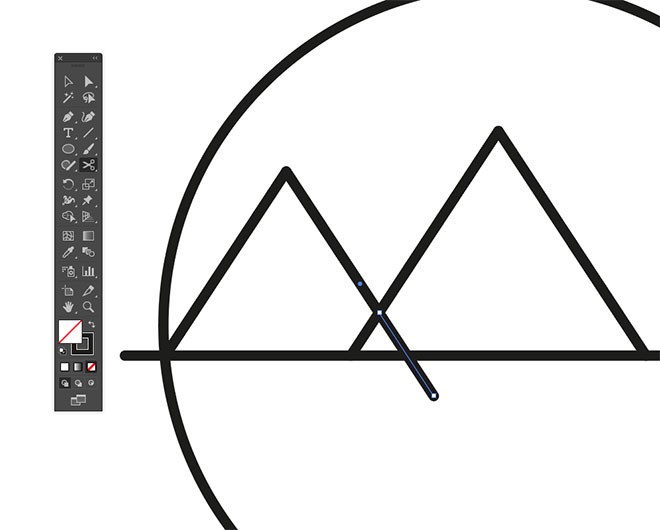
Use the Scissors tool to clip the lines where they intersect the other paths and delete the excess.
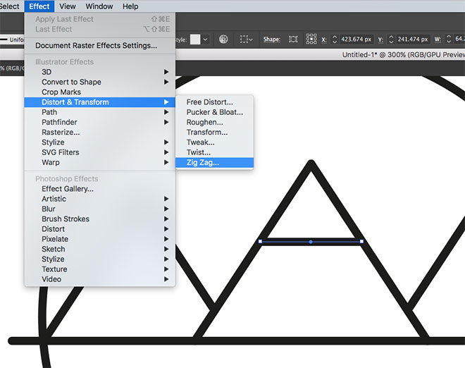
Draw a straight line between the two paths that form the middle triangle, then to to Effect > Distort & Transform > Zig Zag.
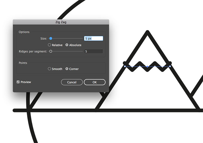
Configure the Zig Zag settings to 5px Size and 5 Ridges Per Segment to represent a simplistic snow capped peal on top of this basic mountain shape.

Nudge the zig zag line to fit within the mountain, then ALT+Drag a copy for the other mountain. Use the Direct Selection tool to shorten the path to fit within this smaller triangle.
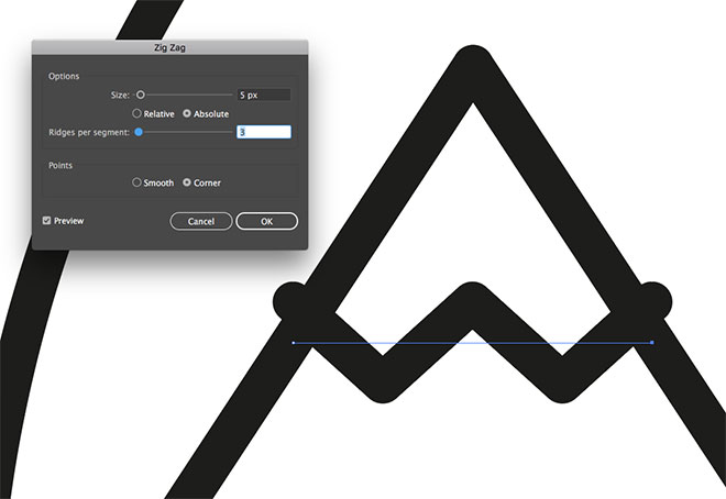
Click the Zig Zag effect in the Appearance panel to edit the settings. Reduce the number of Ridges to 3.
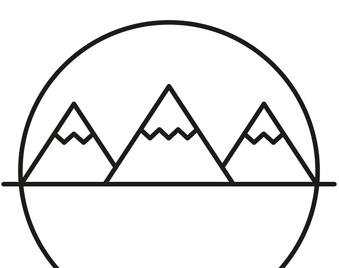
Draw a selection around the three paths that form the smaller mountain, then produce a reflected copy using the Object > Transform > Reflect command. Position the duplicate on the other side.
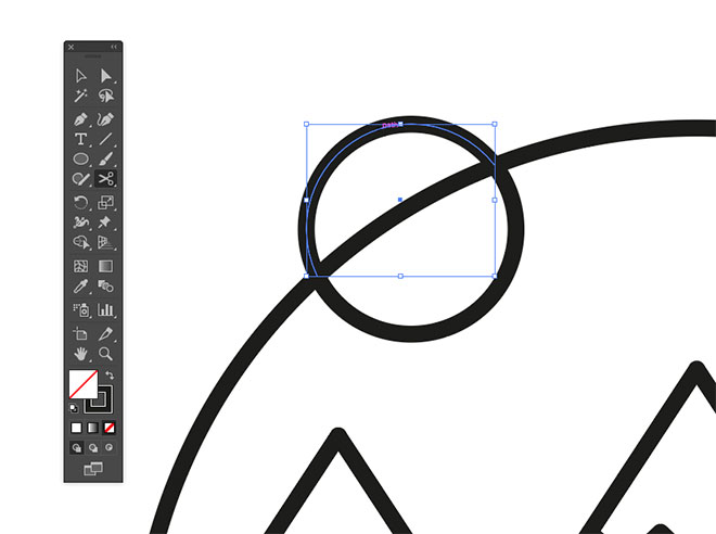
Use the Ellipse tool to draw a small circle to represent the sun. Overlap it with the larger circle and trim away the excess with the Scissors tool.
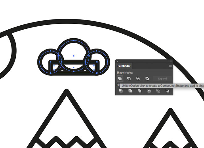
Use a mixture circles and a rectangle shapes to form a cloud. With all the shapes selected, Unite them with the Pathfinder panel to form a clean outline.

ALT+Drag duplicates of the cloud and position them in around the scene. Overlap some clouds with other elements.

Use the Scissors tool to trim and delete the paths wherever they intersect with the other shapes.
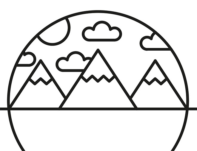
By simplifying things to their basic form and reproducing them with simple shapes you can create minimalist illustrations of anything!
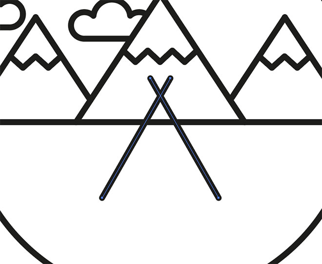
Draw a tent by creating an angled line. Duplicate and reflect the line and cross the two near the top. Reposition them centrally within the composition.
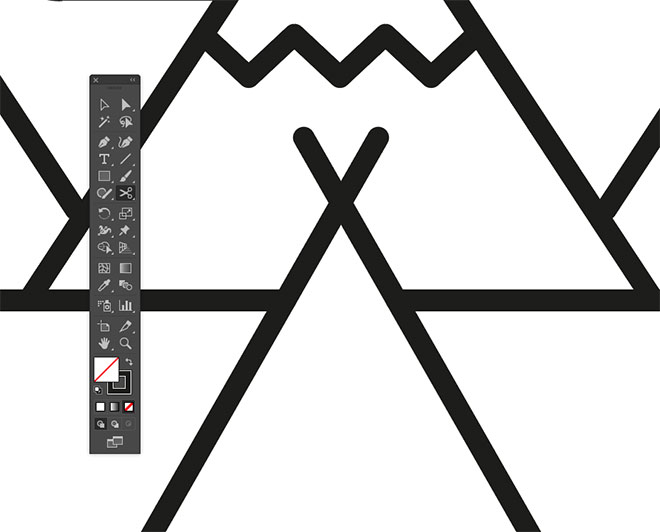
Use the Scissors tool where the lines overlap with the horizontal to effectively place the tent in the foreground.
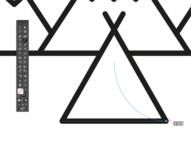
Select the Arc tool from under the Line tool group. Hold Shift and draw a curved path from the centre, down to one of the corners. Repeat the process on the other side.
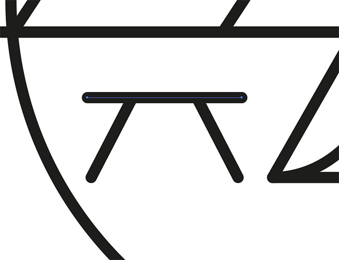
A simplified bench can be produced by just drawing three lines using the same techniques used so far.
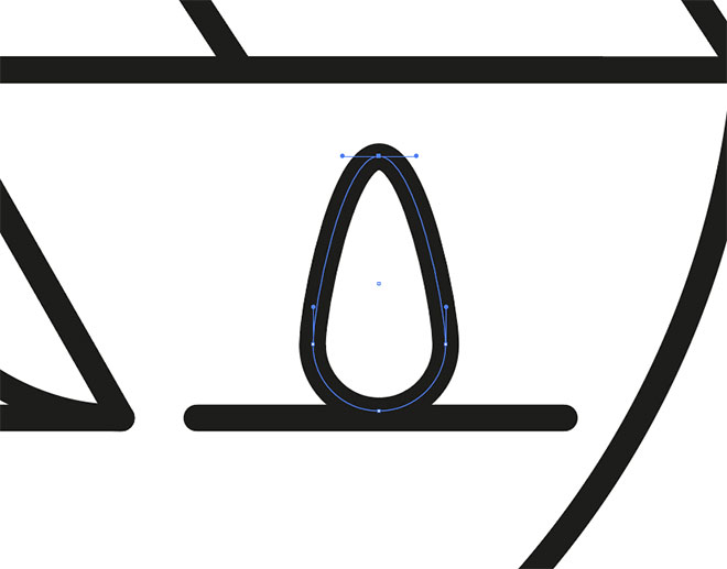
To draw the flames of a campfire on the other side, begin with a circle and drag the uppermost point upwards.
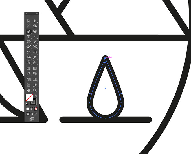
Select the Pen tool, then ALT+Click the top point to remove the bezier handles, converting this point into a sharp corner.
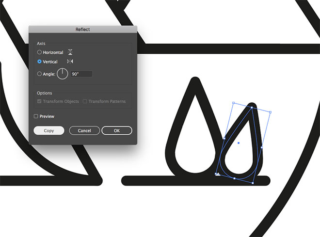
Copy, scale and rotate a duplicate of this shape and position it to one side, then reflect a copy for the other side.
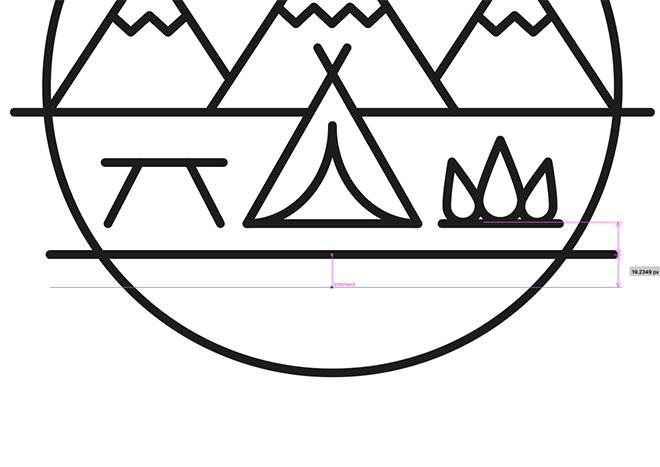
To draw a lake in the foreground, begin with a straight line that spans the width of the design. Hold the ALT and Shift keys and drag a copy vertically.
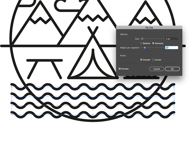
Use the CMD+D shortcut for Transform Again a few times to produce a series of evenly spaced lines. Select them all then add a Zig Zag effect with 17 Ridges Per Segment and the Smooth option checked.
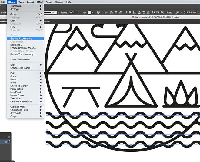
Go to Object > Expand Appearance to permanently apply the Zig Zag effect, which will then allow the paths to be trimmed, otherwise altering the path length would affect the Zig Zag effect.
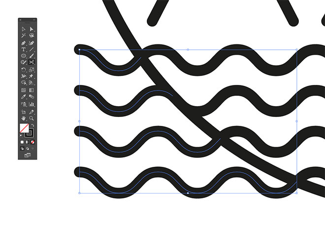
Use the Scissors tool to split the paths where they intersect with the circular outline, then delete the excess.
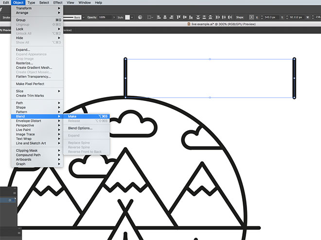
Draw a single vertical line, then drag a copy off to one side. With both lines selected, go to Object > Blend > Make.
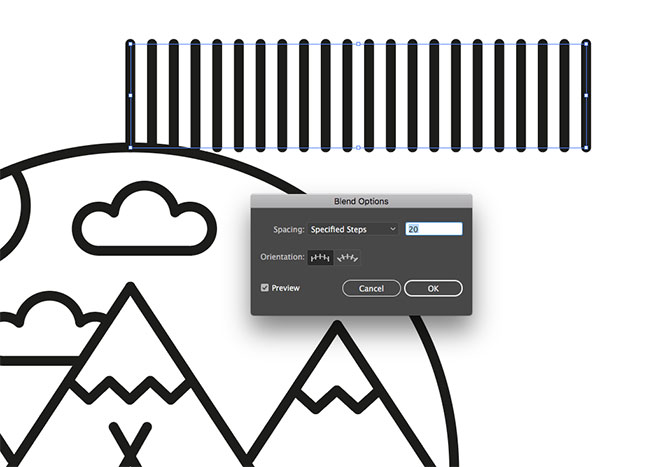
Head back to Object > Blend > Blend Options and choose Specified Steps with an appropriate number that generates a gap between the lines.
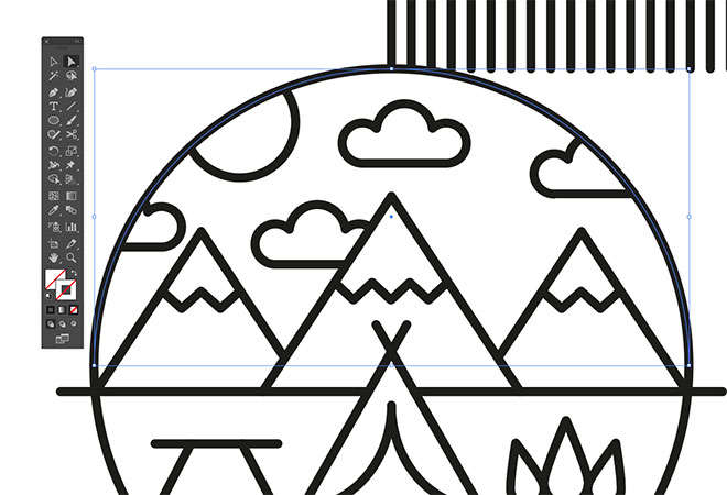
Select the main circular outline and Copy (CMD+C) and Paste (CMD+F) a duplicate. Clear out its stroke, then click and delete the lowermost point with the Direct Selection tool.
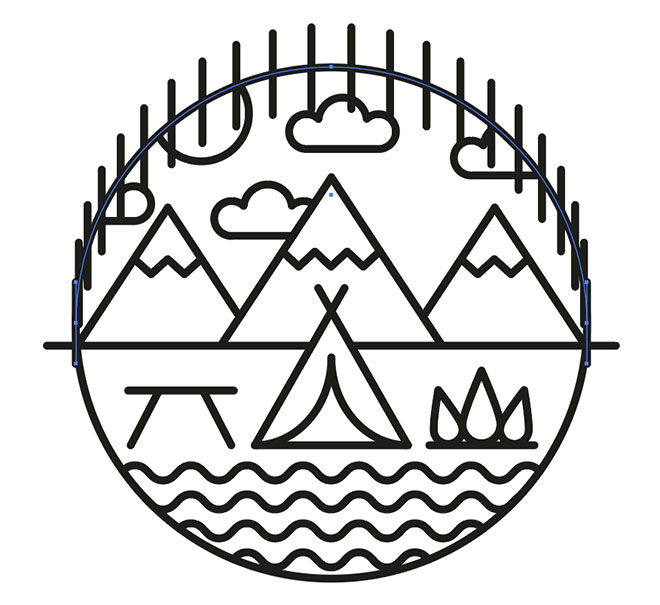
Add the blended lines to the selection, then go to Object > Blend > Replace Spine.
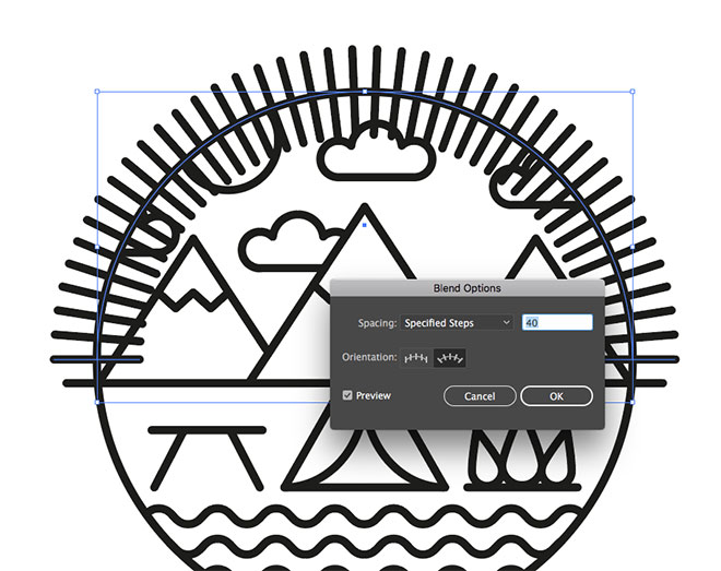
Head back to Blend Options and turn on the Preview to configure the settings. Change the Orientation option to flare the lines out from the centre, then alter the number of steps to around 40.
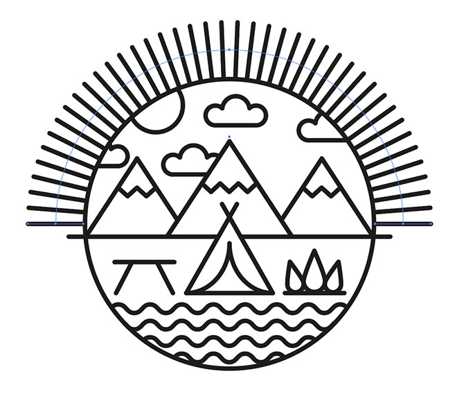
Scale and reposition this blended element to produce a series of light rays around the top half of the badge logo.
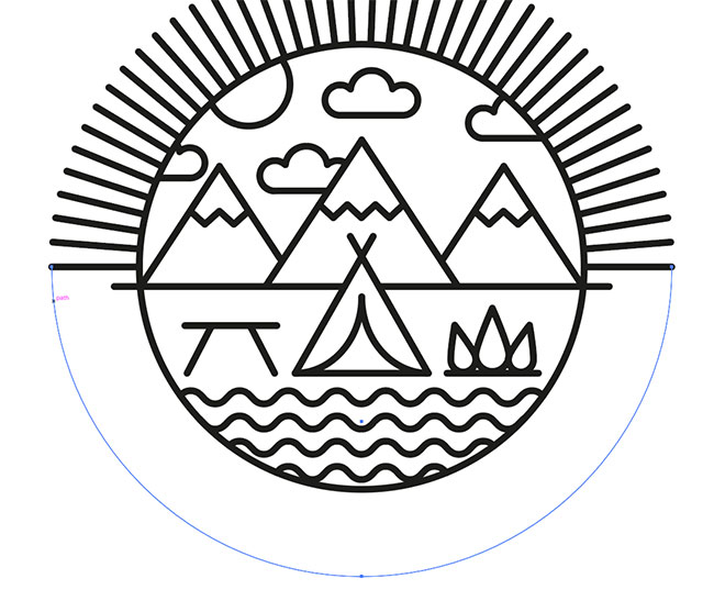
Make another copy of the circular outline, clear out the fill and delete the uppermost point. Scale this path for use with the Type On a Path tool.
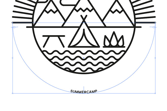
Enter your chosen wording for your badge logo. Set the Paragraph style to center, then move the interface lines with the Direct Selection tool to properly orient the text on the path.
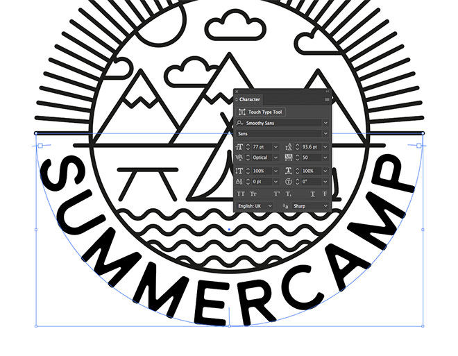
Alter the font style to fit the text into the available space. I’m using a font named Smoothy Sans with 50 tracking, increased to the maximum size that fits along the path.
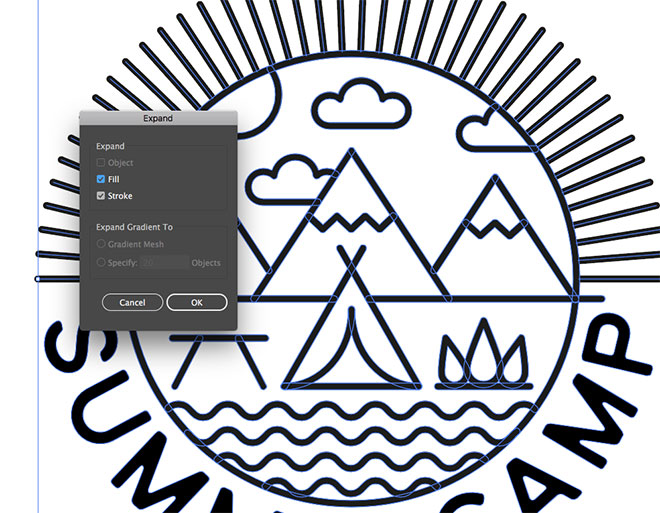
The logo design is now complete, but to finalise the artwork, go to Object > Expand to convert all effects and paths to outlined shapes. You might want to save an editable copy first just you can you want to tweak the original paths.
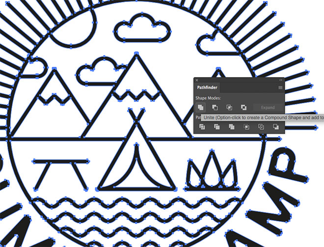
Click the Unite button to merge everything into one shape. If any items disappear in the process, it means some elements haven’t been properly expanded. Use the Object > Expand procedure again to make sure everything has been converted.

The final result is a stylish single-weight line art logo with an outdoors theme. Creating the main illustration with simplified shapes and paths helps achieve the minimalist look, while composing the design into a circular layout produces a neat little badge graphic.
Want more? Check out these great related products
The following resources cost a little money, but I definitely recommend checking these related products out.



Thank you for this tutorial. It was not something I would think of trying, and I learned a couple new things, too.
Help! What do I do if Expand is greyed out?
Beautiful tutorial Chris, loved it :)
I wish someone would make an extension that can use paths with the pathfinder. Seems so 90s to use the scissors to delete the lines that overlap.
Developers, we need you here! :)
Very useful tutorial. Thanks!
I know that you are the best for all adobe illustrator tips. In the past I found a lot of important tutorials and now I got another. By following your blog my knowledge increasing day by day. Thanks for sharing with us the great tips.
Wow, Many many thanks for sharing with us the great tutorial. As a new graphic designer adobe-illustrator was so hard for me. But by following your blog I can understand everything easily.
Creative calculation, nice techniques to create a Line Art Badge Logo in Adobe Illustrator.
Various kinds of Fonts Tutorial it’s excellent !!!! I really enjoyed it! Nice Tutorial for creative logo design.
Beautiful Tutorial.!! Simply loved it!
I Think this is great post. Everyone should work for helping others. Thanks Admin