Tutorials
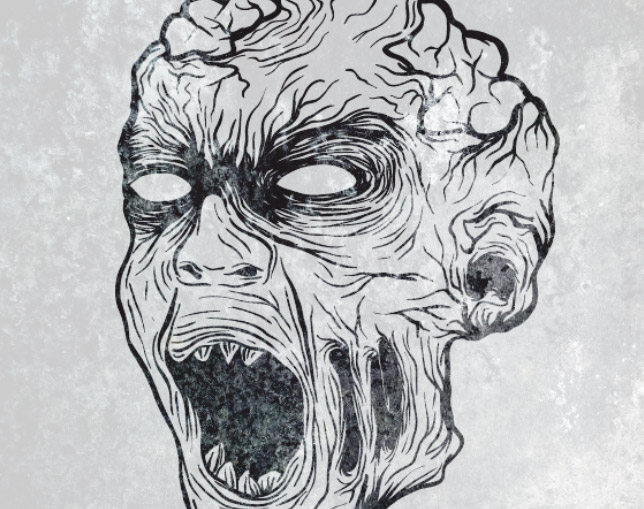
October is here, which means designers and illustrators get that extra excuse to include skulls, zombies and monsters in their work with the arrival of Halloween. Follow this step by step Adobe Illustrator tutorial to create a hand-drawn zombie illustration. We’ll use a photograph as a basic reference then use our Wacom tablet along with Illustrator’s vector brush tools to draw up various gruesome elements on our zombie character.
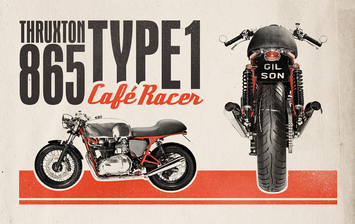
Follow this step by step tutorial to create a 1960’s style retro motorcycle ad for a modern café racer custom. We’ll mock up the ad design using inspiration from original ad designs from the time period then use Photoshop to replicate the basic screen printing effect and textures to give the artwork an aged appearance.
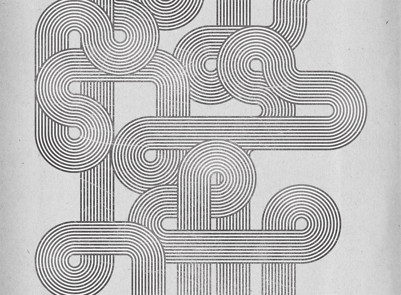
In the recent typography inspiration showcase a design by Jordan Metcalf particularly caught my interest, which reminded me of the design style used in the Mexico 1968 Olympics branding. I decided to combine these inspirations and create my own poster design artwork in a similar style. Follow this step by step tutorial to create a flowing composition of geometric lines based on the retro style of the Mexico 1968 Olympics branding. We’ll use Illustrator’s powerful vector tools to create the pattern, then switch over to Photoshop to weather the design for that awesome retro style appearance.
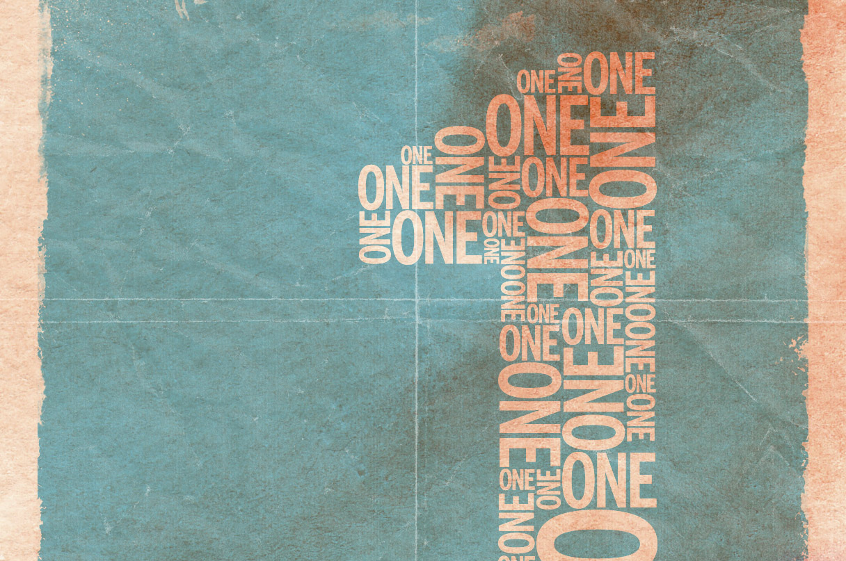
Follow this step by step tutorial to create a retro style typographic poster design with distressed textures and a muted colour scheme. We’ll create a typographic layout based on the number ‘one’ using Illustrator’s easy manipulation tools, then switch over to Photoshop to lay out the poster design composition and grunge everything up with some textures to create that cool dated retro look.
Follow this step by step Adobe Illustrator tutorial to create a simple vector penguin character. We’ll be using many of Illustrator’s basic shapes to create the structure of the character, which makes this tutorial great for beginners. We’ll then make use of various gradients to really bring the character to life with depth and dimension.
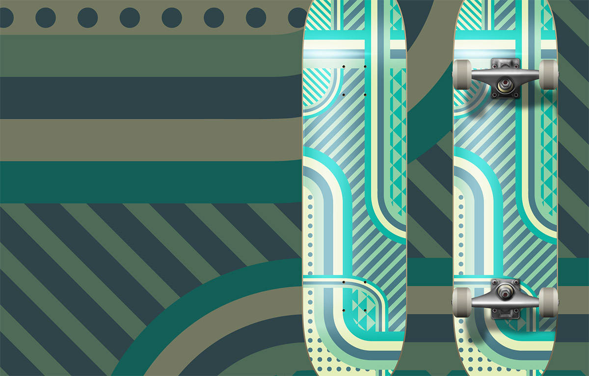
There’s something about designing for unusual applications such as skateboard decks that really makes the design process much more fun. Maybe it’s the unique canvas size that makes things a little more challenging, or just the cool feeling you get when you see it mocked up as a complete deck. Follow this step by step Illustrator tutorial to create a vector patterned deck design with a minimal colour scheme.