Tutorials
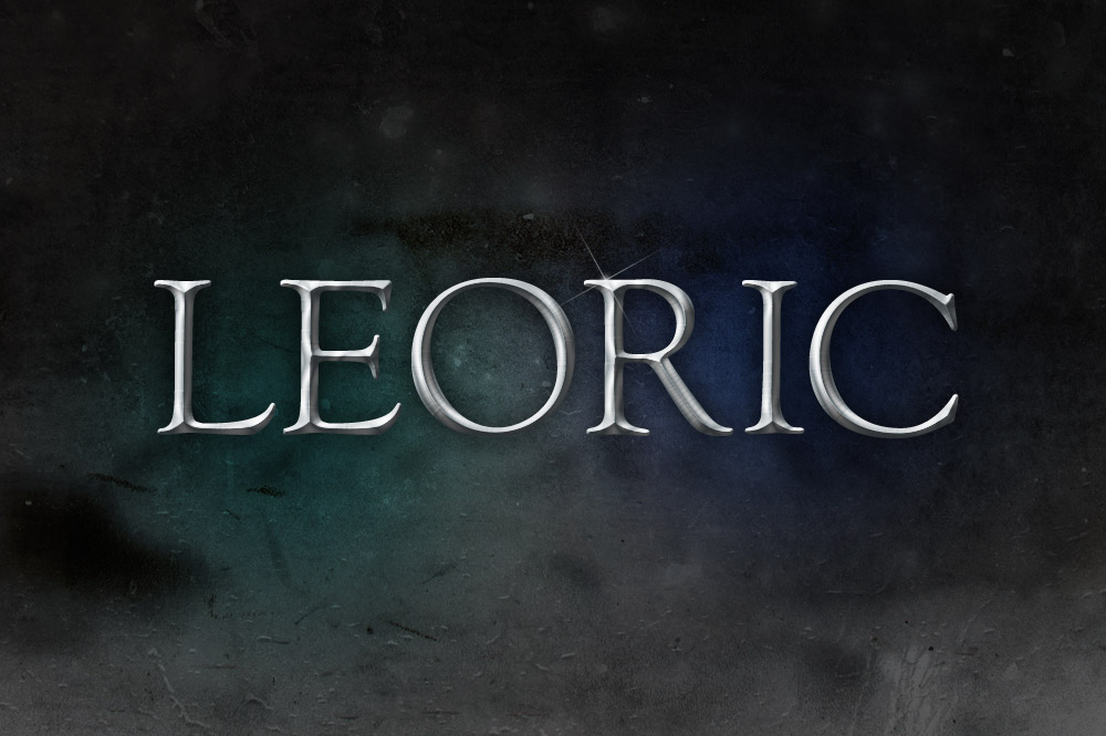
Follow this step by step tutorial to create a realistic pewter style metal text effect in Photoshop. The best part is it’s really easy! Just a couple of Photoshop layer styles is all it takes to create the basic effect, with a subtle tweak or two to perfect the lighting to maximise the realism.
The post-processing stage of photography is definitely the most fun and creative. It’s where you can really transform your otherwise bland and boring photos into really intense images that draw in the viewer. In this tutorial we’ll cover the process of editing your landscape photos in Photoshop to give an epic, almost fantasy style appearance with bright colours, high contrast and lots of fine detail.
Follow this logo design process walkthrough to see the making of a cubist style logo design made up of lots of detailed vector facets. Not only will we be creating the actual design in Adobe Illustrator, but I’ll also be describing the whole logo design process in this tutorial, from the initial sketches right through to finishing off the final design.
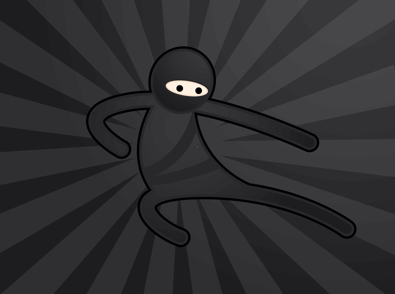
Follow this step by step Adobe Illustrator tutorial to create a simple vector ninja character. The design is made from basic shapes and uses Illustrator’s core tools, which makes this tutorial perfect for beginners.
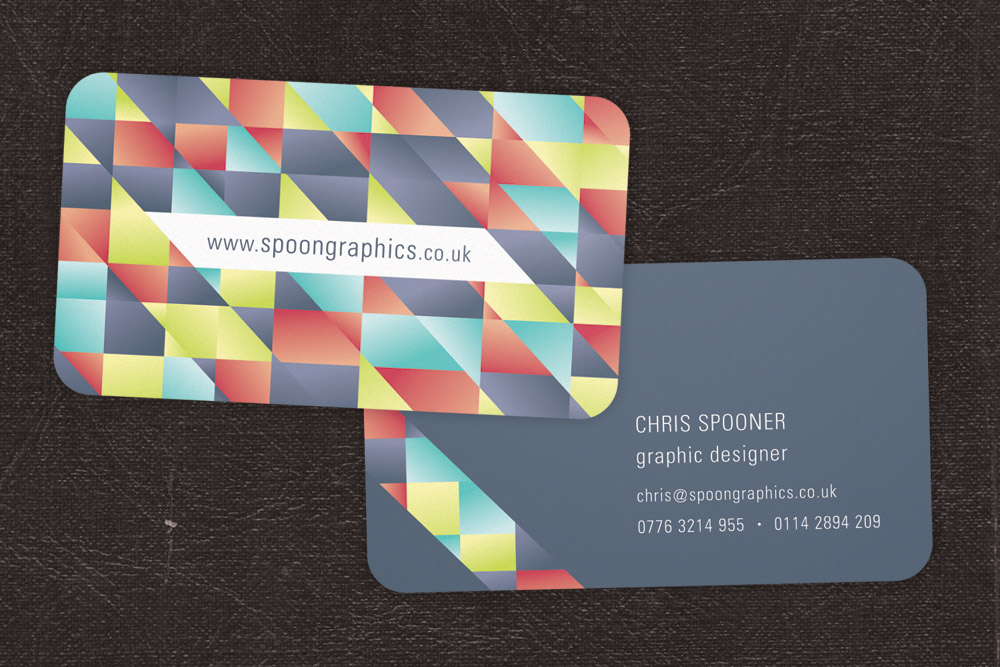
Need a new set of business cards? Follow this step by step tutorial to create a cool business card design in Adobe Illustrator. We’ll begin creating the vibrant pattern effect, then we’ll lay out the contact information and set up the final print ready file ready for sending off to your chosen print firm.
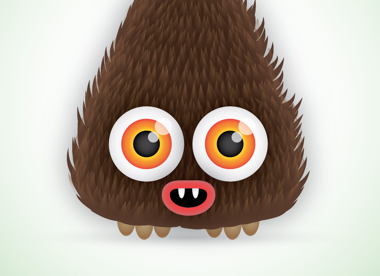
Follow this step by step Illustrator tutorial to create a cute vector monster character. We’ll create the character from basic shapes to give a cute and friendly appearance then we’ll bring the character to life with gradient colours and a detailed fur effect.

