The warped and distorted text effect is a classic technique artists would use when creating collages, posters and flyers with photocopiers in the analog days. The effect is still used today to create abstract art, but we can now also use digital creative software to reproduce the distorted appearance with text, logos and other graphics. In today’s guide I show three ways to create photocopy style glitch distortions. Firstly the manual way using a scanner, then techniques to mimic the effect in Photoshop and Illustrator.
Watch the video
Subscribe to the Spoon Graphics YouTube Channel
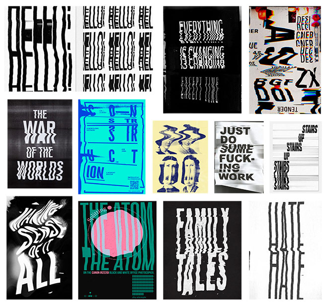
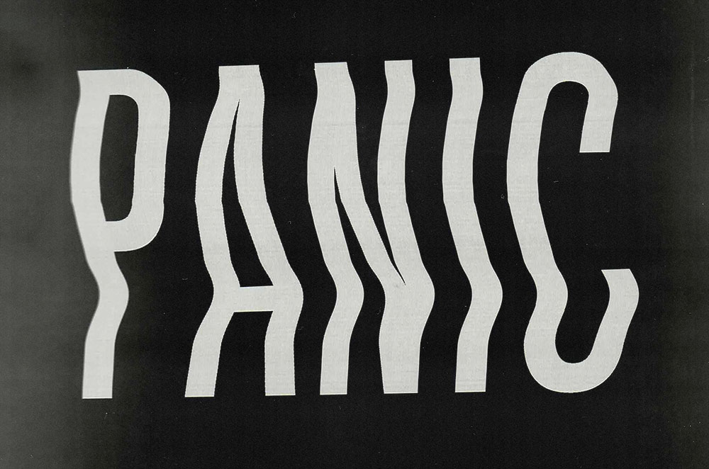
Artists incorporate the photocopy distortion effect into all kinds of art with an abstract style. The warped appearance can be applied to text, logos or imagery to give it a glitched look, often combined with other ‘low-fi’ aesthetics, such as grainy textures, harsh contrast and bright colours.
Method One: Using a Scanner
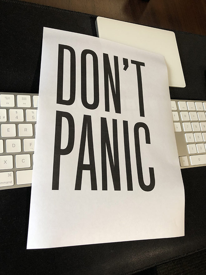
Using the original technique to produce experimental effects is the most fun! To create photocopy distortions manually, you will need to print your artwork onto paper then feed it back into your computer via a scanner.
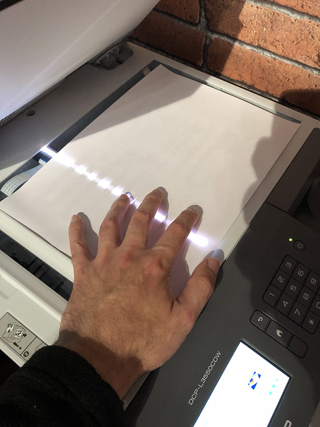
As the scanner is scanning your artwork, move the paper around to distort the final result. Experiment with fast and slow shifts in different directions, move the page to follow the scanner and slowly rotate it for a variety of warped effects.
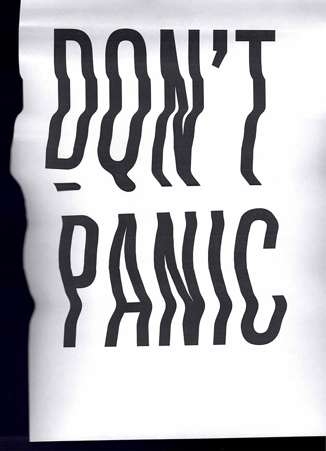
Using a scanner produces the most authentic results. All the distortions are realistically made from the different movements during the scanning phase. You’re also left with natural texturing and blurring.
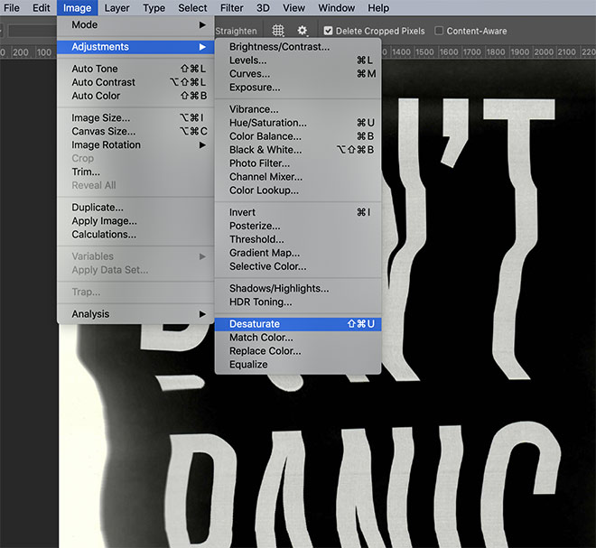
Open the scan in Photoshop to process the result. Optionally invert the colours, then go to Image > Adjustments > Desaturate to remove any colour casts.
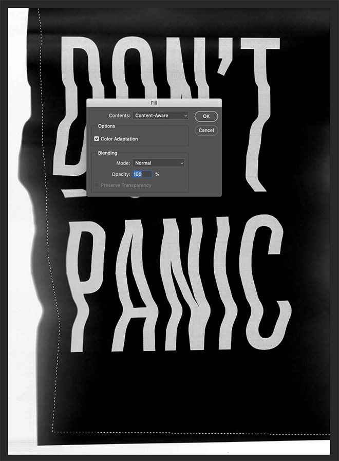
To clean up areas of the scan, draw a selection using the Polygonal Lasso tool, then use the Content Aware method under the Edit > Fill command to generate matching background texturing.
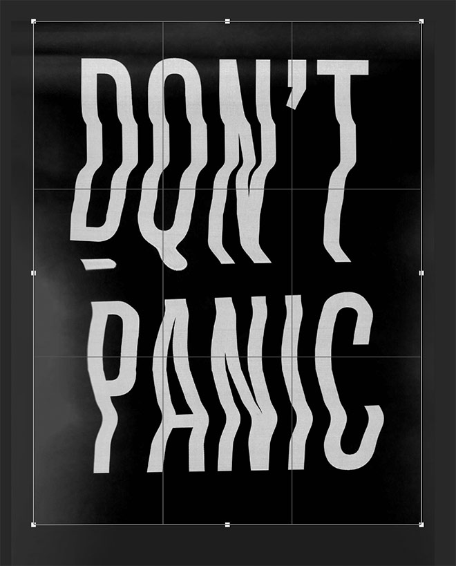
Use the Crop tool to trim the canvas into suitable proportions for a poster, flyer, album cover, or abstract piece of art.
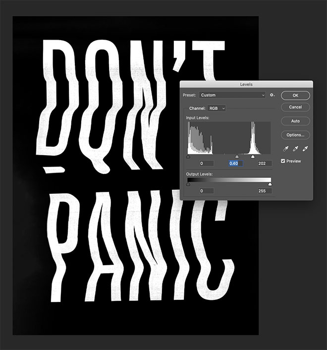
The Image > Adjustments > Levels tool can be used to boost the contrast by darkening the shadows and brightening the highlights.
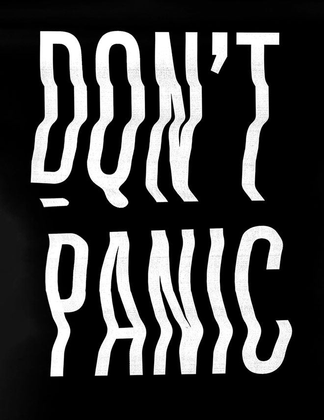
This manual technique generates the most authentic results with realistic warping and texturing, but it is completely experimental in that you don’t really have any control over the final outcome.
Method Two: Adobe Photoshop
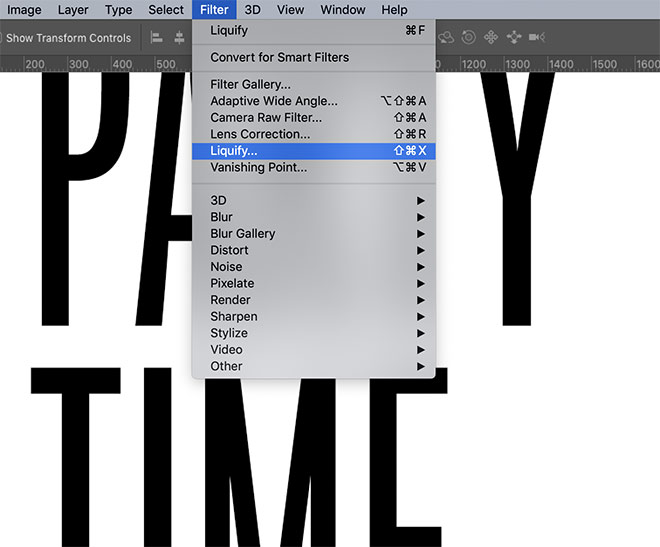
It is possible to produce similar glitch effects without leaving your computer. Create your artwork in Photoshop, then go to Filter > Liquify.
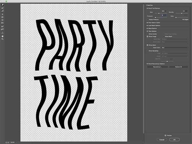
Reduce the Pressure setting, then smear the artwork to generate the distorted appearance. Using a low pressure gives you more control over the final appearance by allowing you to warp the artwork more with each stroke.
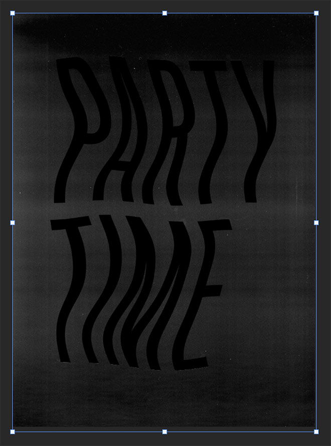
The problem with creating the effect digitally is it’s too clean to look authentic. Download my Free Photocopy Textures to add a grainy background to the canvas.
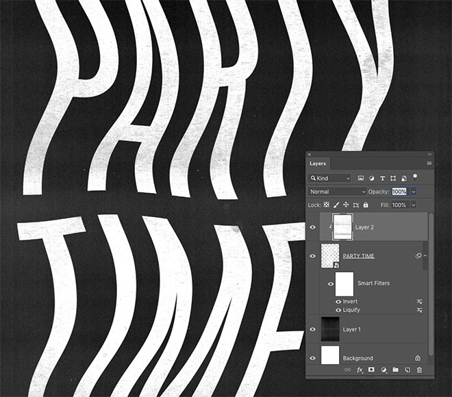
Additional texturing to the white areas of the artwork can be applied by inverting a texture and clipping it to the text layer. Place the texture on top, then hold the ALT key and click between the layers to make a clipping mask.
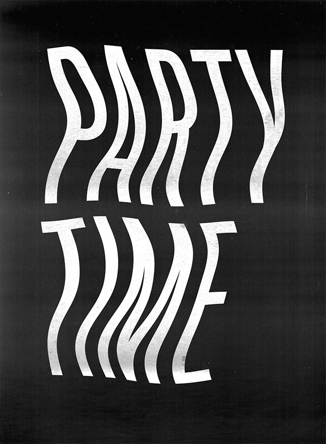
Being able to apply distortions exactly where you want is a huge benefit of working digitally. The outcome isn’t quite as realistic, but the addition of textures helps it look authentic.
Method Three: Adobe Illustrator
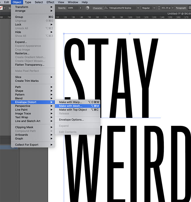
Adobe Illustrator has its own unique tools for distorting vector artwork. Go to Object > Envelope Distort > Make With Mesh.
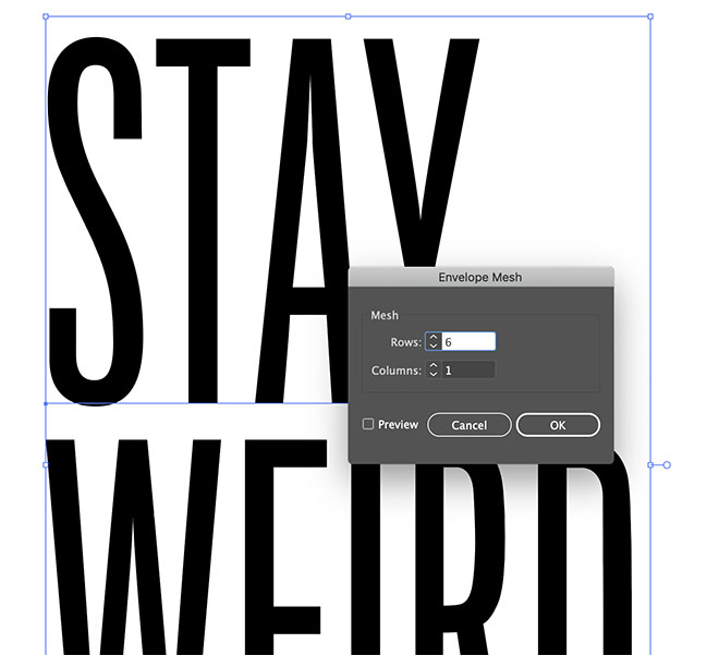
Configure the mesh settings to form a grid over your artwork. I chose 6 Rows but 1 Column to allow for most of the distortion to be horizontal.
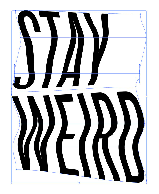
Use the Direct Selection tool to move each point—or row of points—to warp the artwork. Moving rows closer or farther apart helps squash or stretch the artwork similar to the effect of moving the paper while scanning.
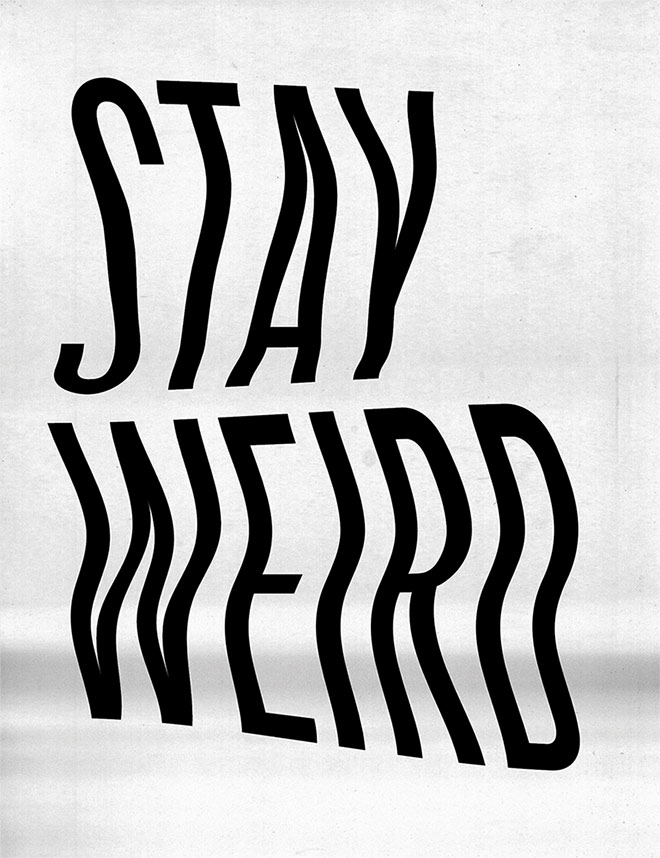
Photocopy textures can be placed within Illustrator, or the design taken over to Photoshop for further editing to enhance the photocopied aesthetic.


Good advise. Thank you for the inspiration.
Thank you Michael!
Beg your pardon, that’s how we did before photoshop … nothing new at all, just the old fashionned “look mom no computer” way to do it.