This post was originally published in 2015
The tips and techniques explained may be outdated.
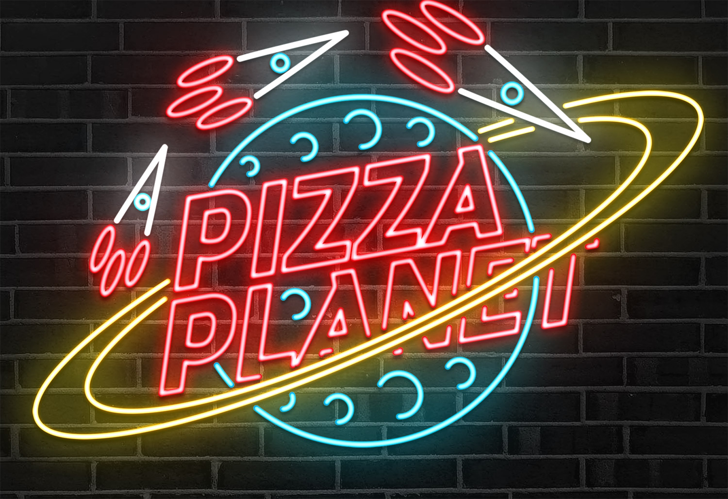
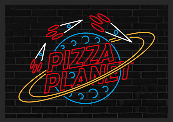
Last month I posted a showcase of incredibly realistic neon signs that were made using 3D software. I’m much more of a 2D guy so I wanted to have a go at producing a similar neon effect using Illustrator and Photoshop, but with the addition of movement via an animated GIF. Follow this tutorial to see my process of how I created a fun neon sign for Pizza Planet, using Illustrator’s vector tools to create the initial sign layout, then Photoshop to bring it to life with vibrant layer styles and framing for the animation.
The neon sign effect we’ll be creating makes use of Photoshop layer styles to create the colourful neon glows, as well as a darker layer that depicts the lights being turned off, which comes into play when the sign is animated to add an extra level of realism. Neon signs rely on the bending of tubes to form the shapes of the design, so we’ll use Illustrator to craft the vector paths so no two lines intersect.
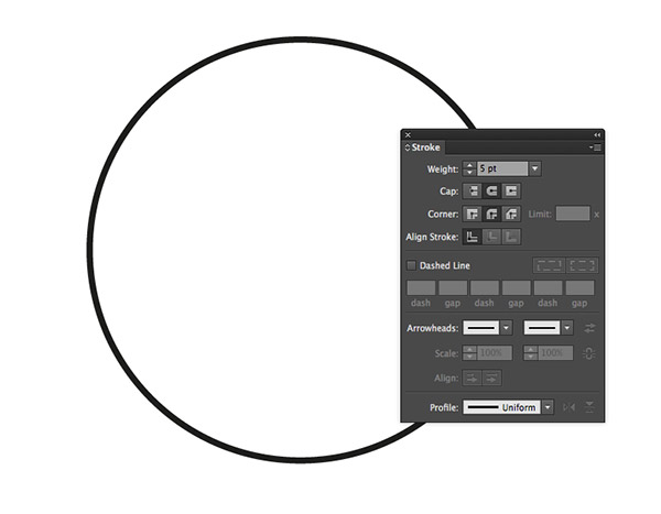
Open Adobe Illustrator and create a new document. Draw a circle on the artboard with the Ellipse tool, then clear out the fill, leaving just a black stroke. Change the Stroke settings to 5pt with round cap and round corners.
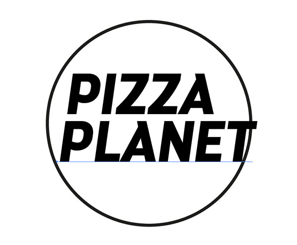
Use the Type tool to add any text for your neon sign. I’m using a font named Darwin for Pizza Planet.
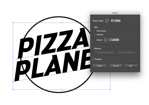
Scale the text to sit centrally but break out of the circle, then Shear it by -10° vertically using the Object > Transform > Shear option.
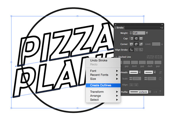
Clear out the fill colour of the text and add a black stroke using the same 5pt size, round cap and round corner settings. Right click and select Convert to Outlines.
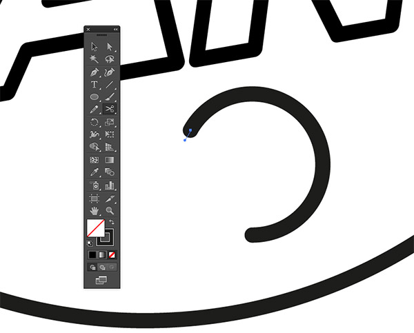
Draw a small circle and clip the path with the Scissors tool in the upper left area. Use the Direct Selection tool to delete the path from the bottom point to this new cut.
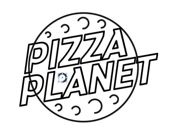
Make copies of this shape and scale them to fill out the empty space within the circle to represent the craters of the planet.
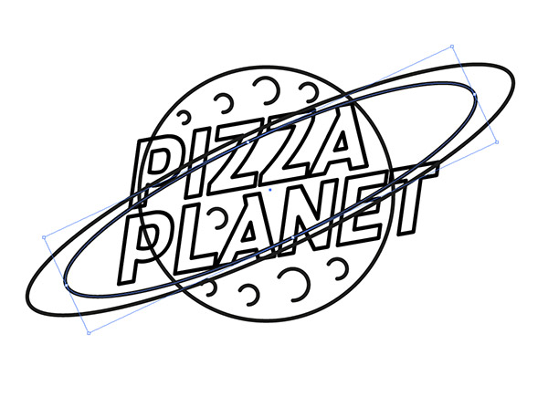
Select the main planet circle and press CMD+C followed by CMD+F to Copy and Paste in Front. Hold the ALT key while stretching and squashing the shape to form a ring around the planet, then duplicate the shape and scale it down slightly to fit within the original.
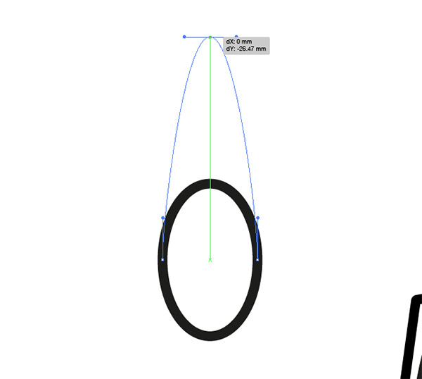
Draw an oval somewhere on the artboard, then drag the top point upwards with the Direct Selection tool to stretch the shape.
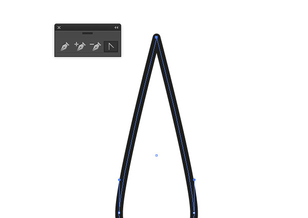
Use the Convert Anchor Point tool from the Pen tool group to remove the bezier handles and leave a sharp point.
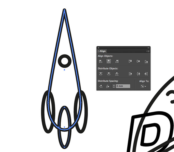
Add other circles to the shape to build a simple rocket. Use the Align panel to centralise all the elements by giving the main rocket body an extra click to make it the key object.
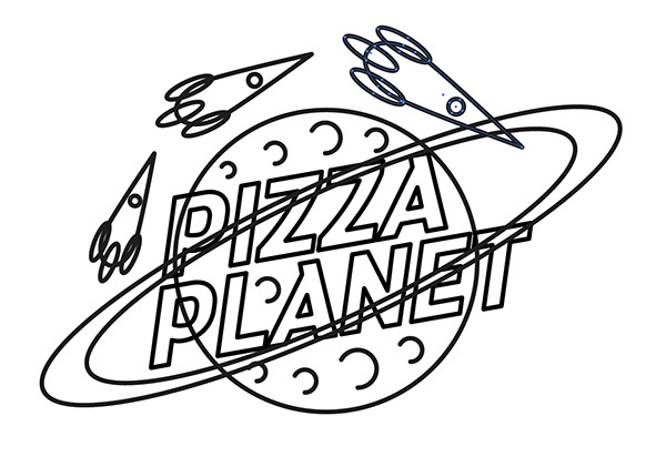
Make two extra copies of the rocket and scale and rotate each one into position to orbit the planet, becoming slightly larger each time.
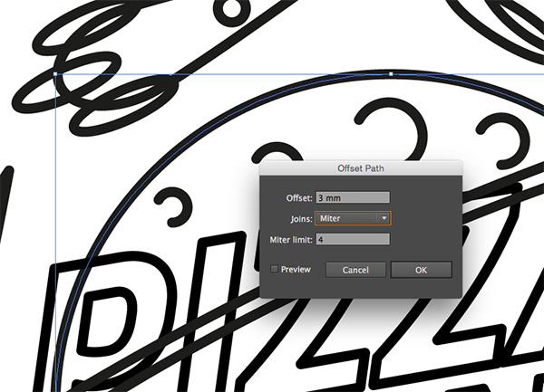
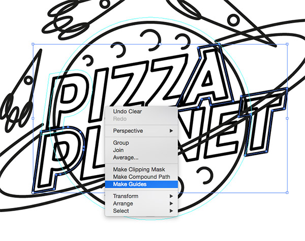
The design currently has lots of paths overlapping each other, so let’s create more of a typical neon sign layout. Select the main planet circle and go to Object > Path > Offset Path. Enter 3mm.
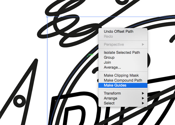
Right click on the resulting offset path and select Make Guides. Now would be a good time to ensure guides are visible (CMD+;) and locked (CMD+Alt+;).
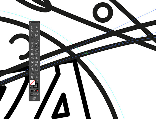
Use the Scissors tool to snip the paths of the planet’s rings where they intersect with the new guide. Using Smart Guides (CMD+U) makes it easy to snap to this area.
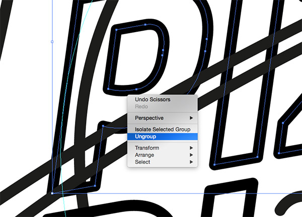
On the other side, the letter P overlaps the planet outline too, so Ungroup the text in order to select this letter individually, then add a 3mm offset path.
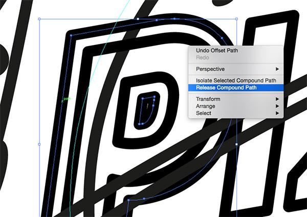
The letter P in particular will require one extra step in order to create a guide. Right click and select Release Compound Path, then delete the inner portion of the bowl before turning the main outline into a guide.
Snip the planet rings where they cross this offset path of the letter P, then delete the unwanted portions of the paths.
The same technique will be used throughout the design to remove any intersecting paths, but for the lower section of the rings, the text will need modifying to allow the rings to surround the planet.
Ungroup the other text elements and add an offset path to the first and last letters, then create guides from the results. Remember to release the compound path of the letter P to be able to make it a guide.
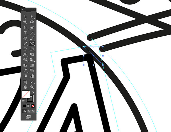
Use these new guides to snip any paths that cross over each other and remove the overlaps all around the design.
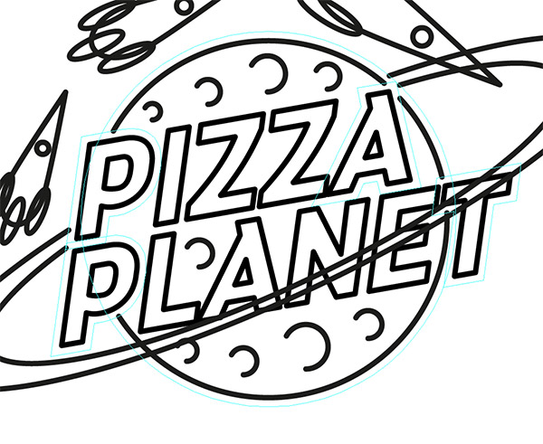
For the area where the rings overlap the text, extra guides need creating from the ring paths themselves.
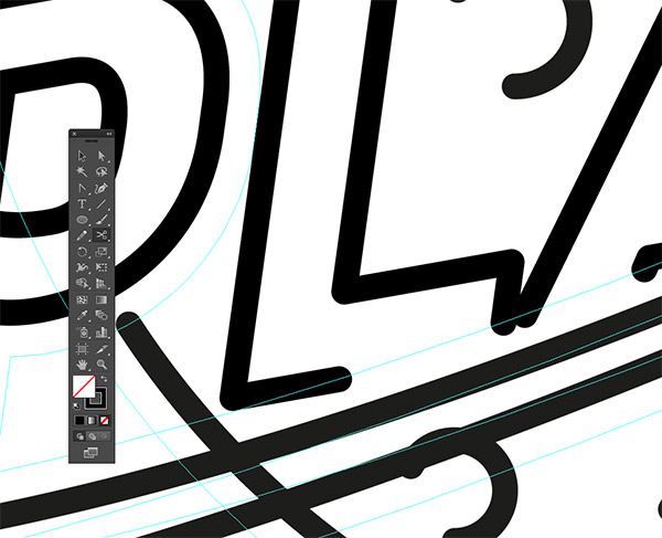
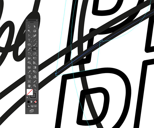
Use the Scissors tool to clip and delete any areas of the letters that go beyond the guide lines.
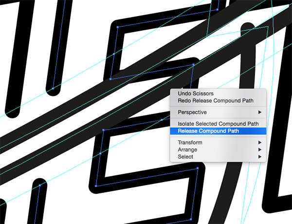
It’s sometimes necessary to release the compound path of letters in order to select and delete just the desired portions of the path.
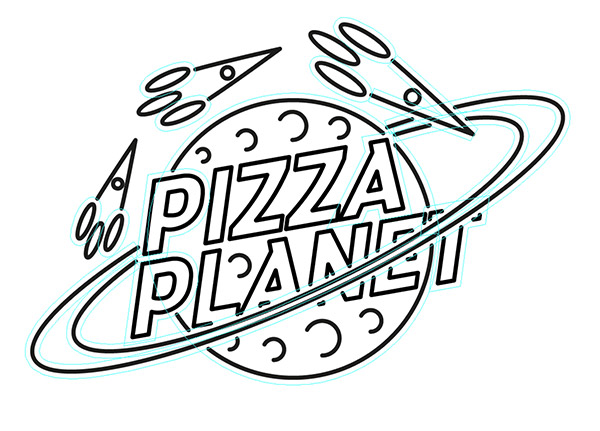
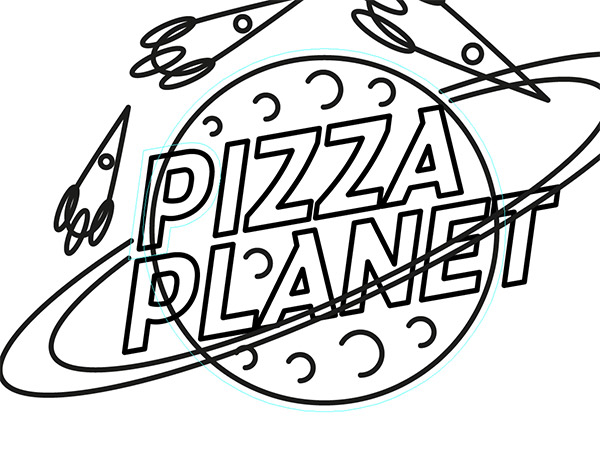
Once all the overlapping paths have been removed, the design begins to take on more of realistic a neon sign look.
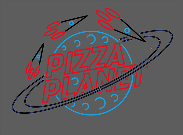
Select all the paths that make up the different sections of the design and change the stroke to a bright colour, such as blue, red, yellow or white.
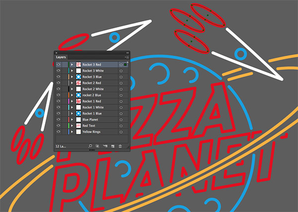
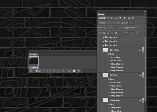
Separate the different colours onto their own layers by using the Select > Same > Stroke Color menu, followed by the Copy and Paste in Front commands. Give any portions of the design that will be animated their own layers, like the elements that main up the three rockets.
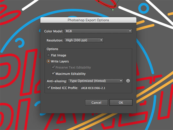
Go to File > Export and change the file type to Photoshop PSD. Make sure the Write Layers option is checked.
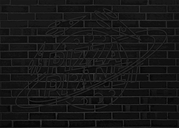
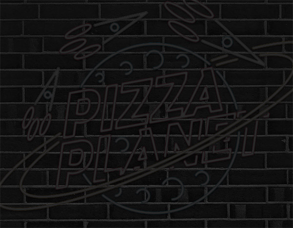
Open the exported PSD in Photoshop and expand the canvas slightly. Fill the background with black and add a brick texture.
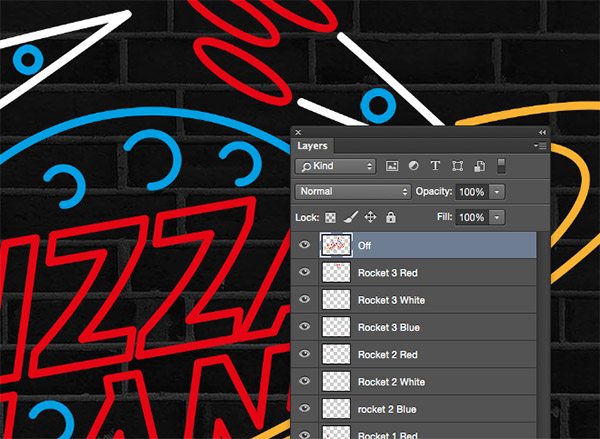
Select all the neon sign element layers and press CMD+J to duplicate them, followed by CMD+E to merge them into one. Rename this layer to ‘Off’.
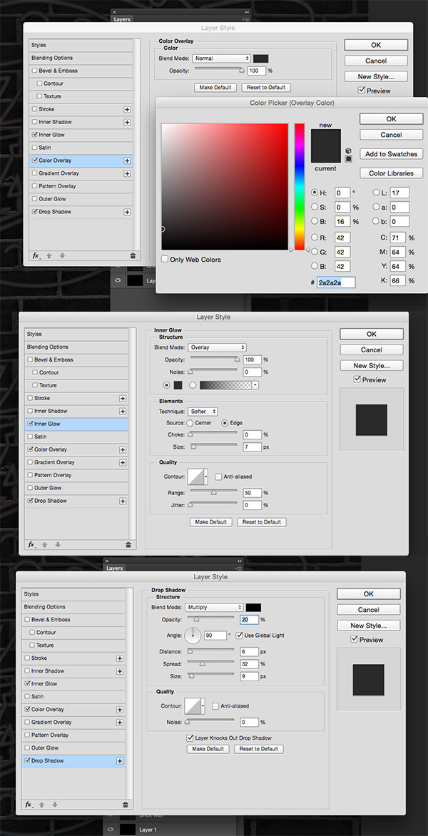
Add a series of Layer Styles to give this layer a tube like appearance with no illumination, namely a Color Overlay, an Inner Glow and Drop Shadow.
Place this dark layer at the bottom of the layer stack. It will be hidden by the illuminated versions but visible whenever any of the animated portions of the design are turned off.
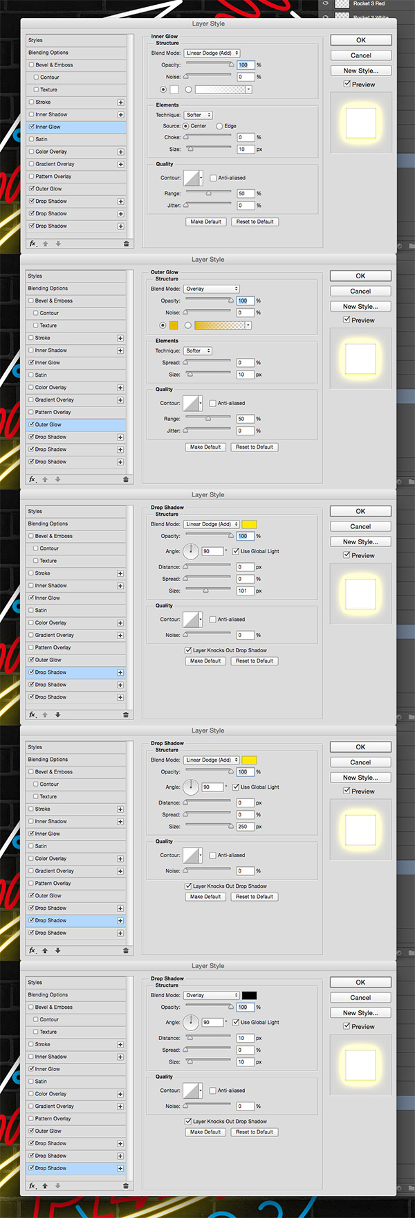
Bring the first neon layer to life with a series of Layer Styles. Add an Inner Glow to add a bright white centre, an Outer Glow to cast a coloured aura, followed by additional Drop Shadows to overlay more glows at various sizes.
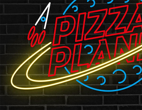
All these layer styles combined produce a fairly realistic neon light effect with glows that interact with the brick wall background.
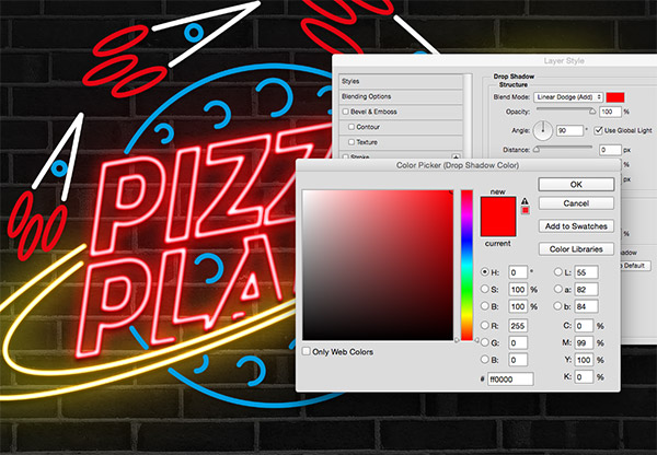
Copy and pate the layer style onto the next layer, then edit the settings to alter the colour of the glows to match the element.
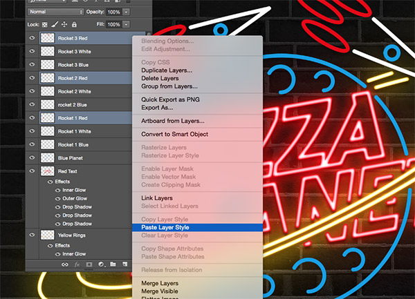
Save time by pasting the same layer style onto any other layers that use the same colour neon.
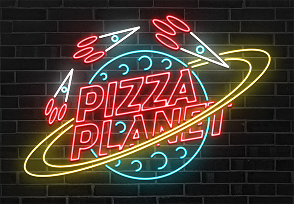
Once all the layer styles are in place, the neon sign begins to look pretty good, but some simple animation can really bring it to life.
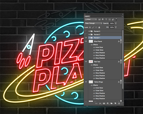
Group all the elements that make up each rocket shape so they can be easily toggled on or off for the animation.
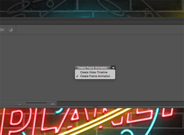
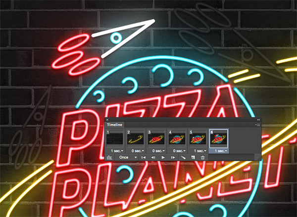
Make the Timeline panel visible from the Window menu, then create a New Frame Animation.
For the first frame, turn off all the illuminated neon layers to leave the dark tubes against the brick wall background. Change the duration of this frame to 1 second.
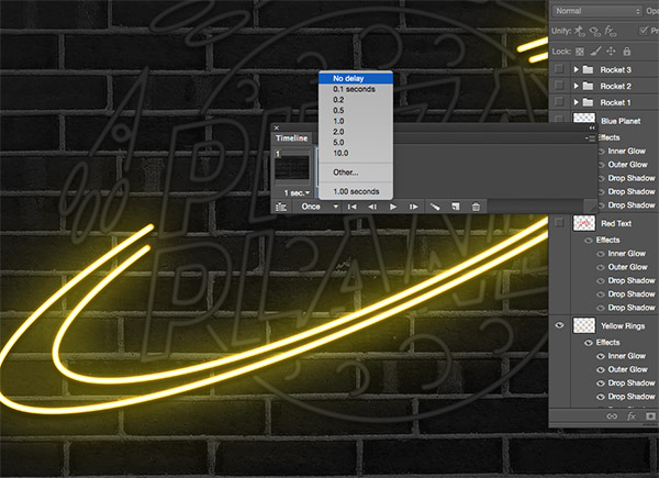
Add a new frame and turn on the visibility of the first neon layer. Add no delay to this frame so the light immediately flicks on.
Add two subsequent frames with no delay to add the red and blue neons to the sign, each one immediately flickering on to illuminate the sign.
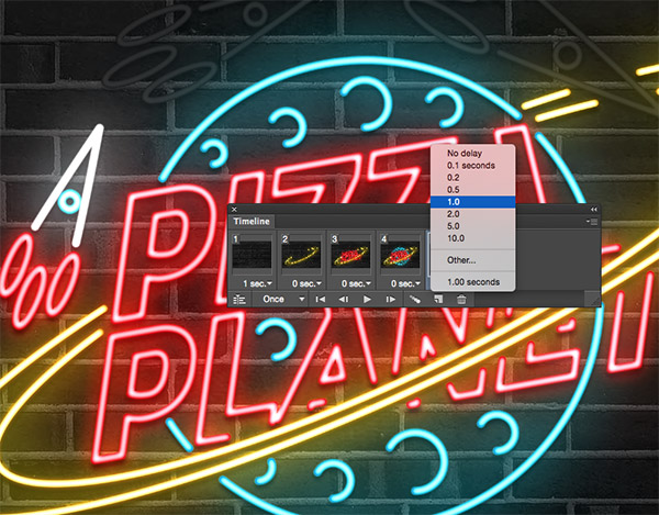
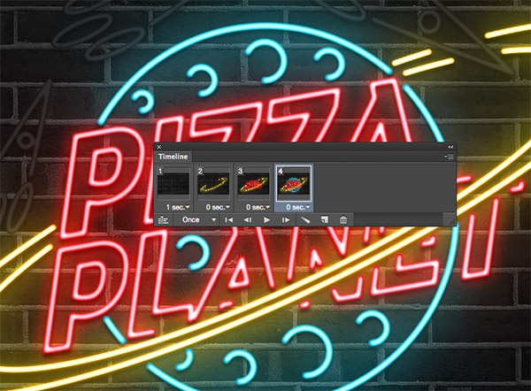
In the next frame turn on the visibility of the first rocket layer and change the duration to 1 second.
Turn the rocket group back off in the next frame and turn on the second rocket layers to give the impression of a moving rocket ship.
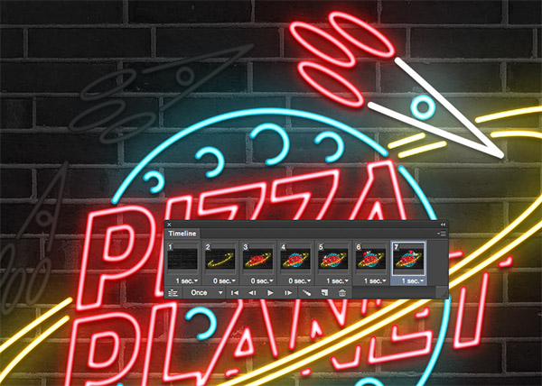
Create another layer and toggle on/off the layer groups to make just the final rocket visible.
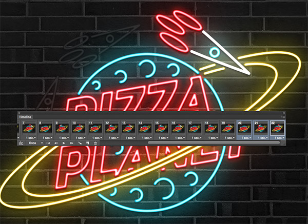
These last three frames can be duplicated to extend the animation. Or alternatively, the animation could just comprise of these three layers to infinitely loop without the initial ‘turning on’ effect.
The final neon sign effect can then be exported as an animated GIF for web use, or transferred to video software to create a better quality loop.
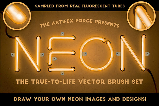
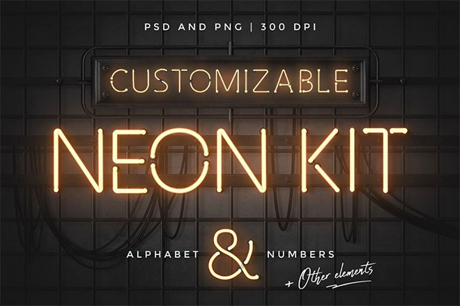
Want more? Check out these great related products
The following resources cost a little money, but I definitely recommend checking out these premium design resources that produce a similar neon effect.
Neon Text Layer Styles & Extras
Neon Realistic Brush Set
Neon Alphabet Kit

Cool use of multiple drop shadows, I’m going to give this a try.
WOAH! This is sick! Thanks for showing! But personally for me it would be easier in a 3D program :) But still, this is really cool!
Wow.. this is great!
really cool and very effective, I will defo be using this in the future! :)
Thanks \m/
Nice job.. I Like it
Thanks Chris for the tuts, it’s cool.
This is another excellent tutorial Chris. Do you mind if I share a link with my contacts on LinkedIn?
This is awesome! Thanks for sharing!
Wow sooooooo nice.Thanks Chris for sharing
Thanks Chris this is an awesome tutorial – will keep this bookmarked as I think this will be very useful for e-shots and the like
Creating animation effect is not a easy job but your step by step tutorial is very helpful to teach beginners about these kinds of attractive effects. After visiting your couple of tutorials i found theme very helpful and simple to understand. Keep it high and keep teaching people via tutorials.
thank you for sharing
hello, i don’t know how to add aditional drop shadow effect. it only let me do it once.
me too! Please tell us :)
As a Graphic designer i think its really great tips for me. Really i read your post attentively.Thanks a lot for your Informative post
Fantastic Tutorial Admin. You Are Greate It is very helpful and most beneficial for making another animated banners and much.
Really great creation and wonderful photoshop tutorial.. thanks for sharing and step by step details
Very useful,thank you.
loved this tutorial, but when I try to save in GIF format it doesnt save like an animation, its just a picture! Help please
This tutorial saved my day, thanks for sharing the psd, i bookmark you.
wooow good thank you for this post
Como puedo añadir más efectos de “Drop Shadow”, solo pude hacer un efecto.
Gracias
Thank you for this tut! My looks amateurish LOL but it was fun making it! https://www.facebook.com/ari.aula.arikae/posts/10206805160021317?pnref=story
Great post. I’ll definitely try this out for some of my designs.
So cute
Thank you very mutch
http://www.uploadhomes.com
A very thorough tutorial. Thanks for sharing!
This is great, but how are you adding multiple drop shadows on one layer?
very nice
thanks.
hy please provide us the video tutorial please.
hy for this one please provide us the video tutorial…. thanks