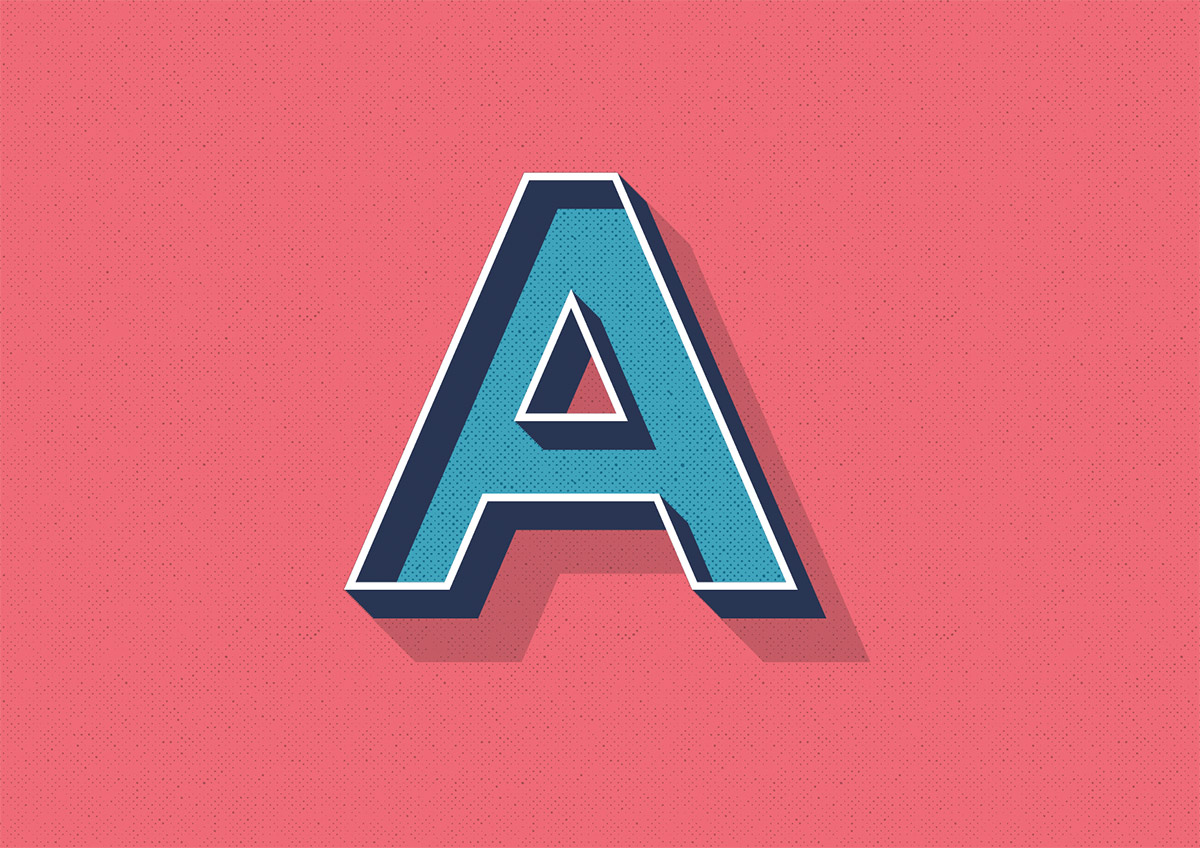
Many of the text effect tutorials I produce for Adobe Illustrator and Adobe Photoshop tend to require the text to be permanently set, which means if the wording needs changing, the effect would have to be created all over again from scratch. In today’s tutorial I’m going to cover some useful tricks that incorporate the Appearance panel in Illustrator to create a Graphic Style that works with live text. See how a range of fills and strokes can be layered to produce a trendy retro style text effect, while retaining the ability to alter the wording and change the font.
The text effect I’ll be creating in this tutorial mimics the popular retro style with a faux-3D appearance, flat shading and some subtle halftone texturing. While this design uses a mix of blues and reds, the effects can be layered and modified to produce a range of colourful graphic styles that can be applied to text elements with a single click.
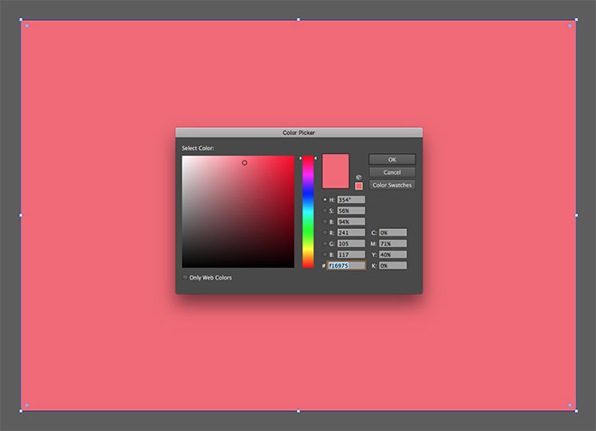
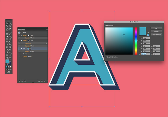
Begin by creating a new document in Adobe Illustrator. I’m using a generic A4 sized document with the RGB colour mode and ruler measurements in Pixels. Draw a rectangle to cover the artboard and apply a colour fill, such as #f16975.
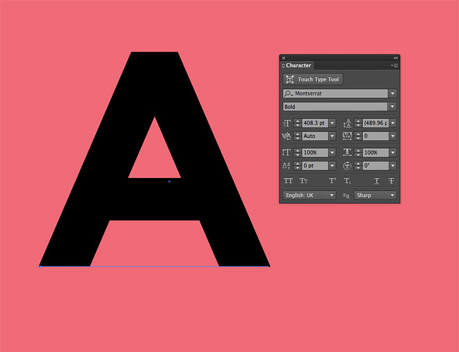
Use the Type tool to create a letter or word in your preferred font. I’m using Montserrat, but the typeface can be changed once the effect is complete.
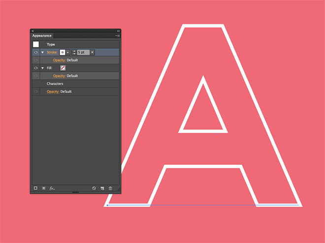
Clear the default fill that is applied to the text, then under the Appearance panel, add a white stroke with a weight of 5pt.
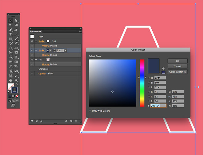
One of the wonderful features of the Appearance panel is multiple fills and strokes can be applied to an element. Click the Add New Stroke icon, then configure the colour to #293454. Drag this blue stroke below the first white stroke in the Appearance panel.
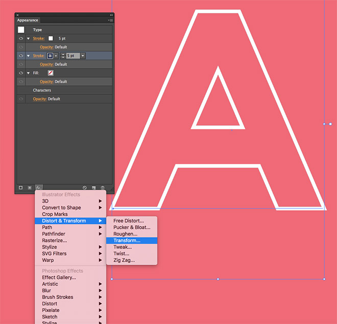
Effects can also be added to each individual fill and stroke in the Appearance panel, which allows you to get really creative with your text styles. Apply a Transform effect to the blue stroke.
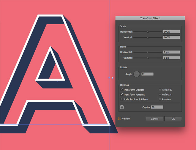
Configure the options to move by 1px horizontally and vertically, then enter 20 in the number of copies. Click the Preview icon to see how this stroke now gives the text basic a three dimensional appearance.
Change the existing fill to a lighter blue colour such as #39a4be. This fill should be positioned underneath the two strokes in the Appearance panel, so much like layers, the other effects will sit on top of the blue fill.
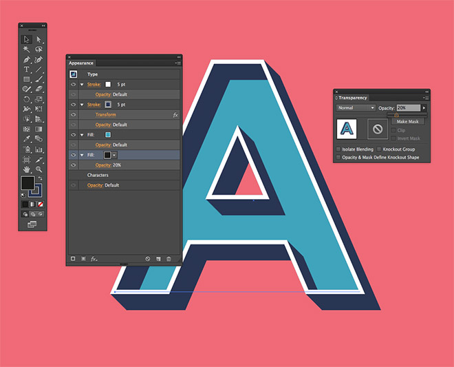
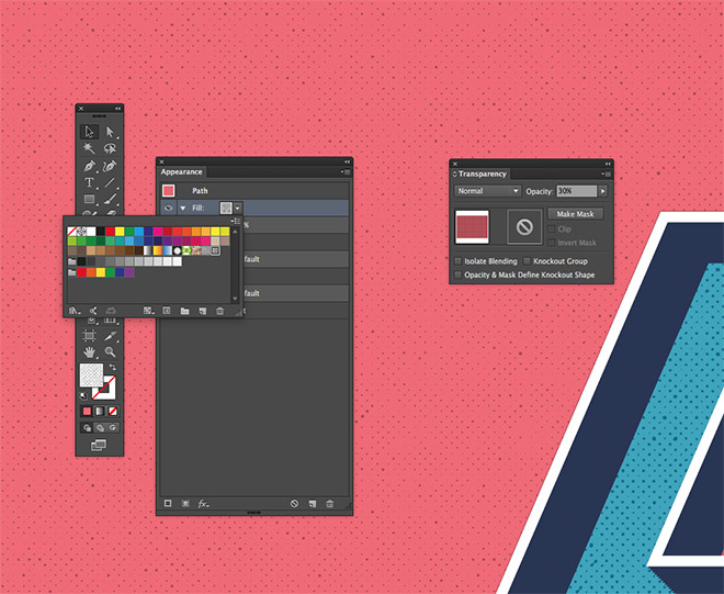
Add a second fill by clicking the Add New Fill icon in the Appearance panel. Drag it underneath the blue fill, then change the colour to black. Under the Transparency panel, reduce the opacity to 20%.
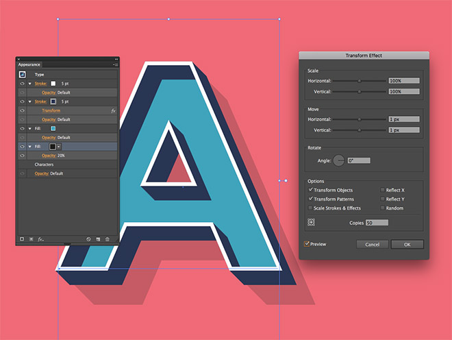
Click the effect icon, then go to Distort & Transform > Transform. Enter 1px under the horizontal and vertical Move settings, then apply 50 Copies. The result is a long shadow effect that is created by offsetting this transparent black fill.
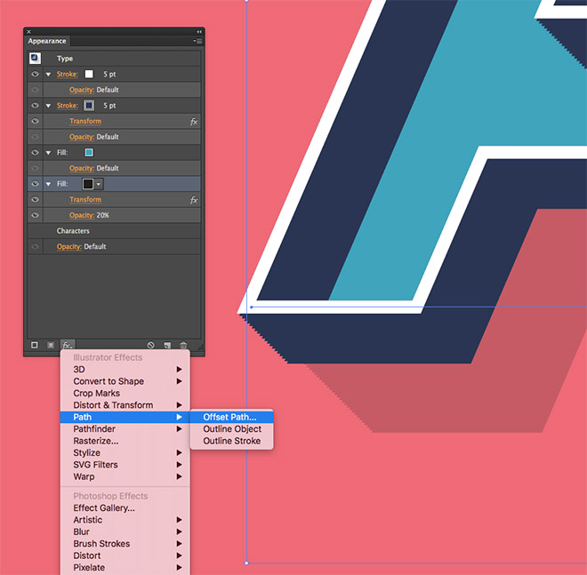
Currently the edges of the shadow don’t line up with the extended width of the strokes. To fix this, add an Offset Path from the effects menu.
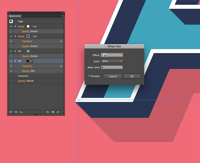
Alter the offset amount until the shadow fill is thick enough to transition smoothly with the existing text outline, which in my case was 3px.
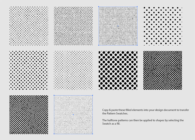
Download and open my free distressed halftone patterns. Select and copy a couple of the graphics, paste them into the main document to transfer the pattern swatches.
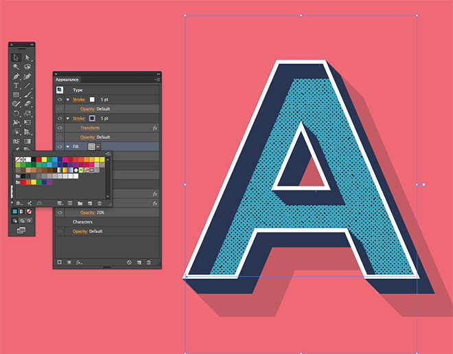
Add a new fill to the text element and choose one of the distressed halftone patterns from the swatches selection.
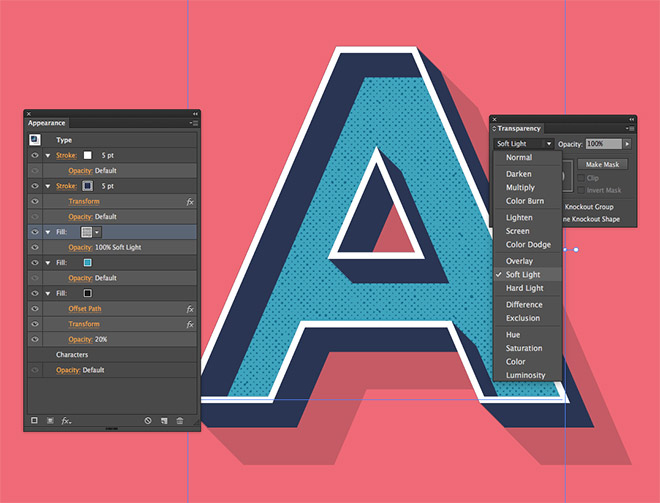
Change the blending mode of this halftone pattern fill to Soft Light to tone down its impact and blend it with the blue colour underneath.
An additional halftone pattern fill can also be added to the red background rectangle. Select the other pattern swatch when configuring this element’s fill in the Appearance panel.
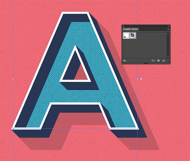
To save the appearance of the text so it can be applied to other elements with just a single click, add it as a style by clicking the new icon at the bottom of the Graphic Styles panel.
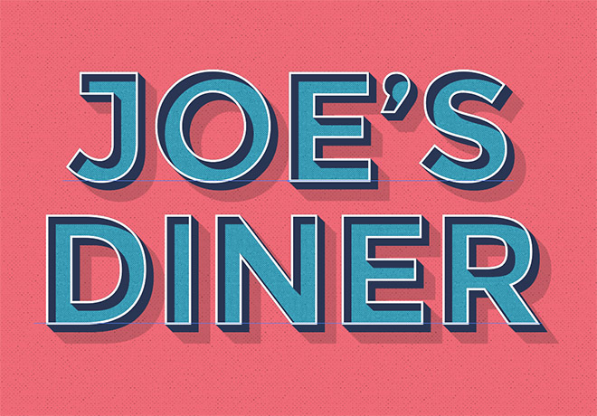
Since this entire effect is made using fills and strokes within the Appearance panel, the text element remains live so its contents can still be edited. This makes the technique perfect for titles and other type elements that may be frequently edited or changed.

It is awesome, love the results :)
Thank you!
Great tutorial, thank you.
Thanks Alexander!
I love it! Thanks a lot :)
Glad you like the tutorial, Meldon.
This is so great. I am loving all your tutorials and other stuff.
That’s great! Thank you
Really nice tutorial. But a little disappointed. I thought the subject was “How To Create an Edible Retro Text Style”.
Ha! Warning, snacks needed while re-creating…
Nice and a great website at all what an illusion best idea and best creativity
Thank you, appreciate it!
Nice and great creativity you guys are going very creative love this
Glad you liked the tutorial! Thanks for your comment
Chris, you’re on fire this year, awesome stuff.
Thanks Mike! Really appreciate your comment!
Nice tutorial but when I apply the graphic style to new text, the lighter blue does not show up. Is it because I’m in CS5? The original letter I created (and yours as well) I can use, change and it looks fine.
I believe I realized what had happened. The new text was too small a point size to carry the effect. I took my original letter ‘A’, copied it the reduced its point size and it still retained the effect. I then saved that smaller ‘A’ as a new graphic style and it worked.
Glad you sorted it Richard!
Great Chris!! Fantastic… as always!!
Glad you liked it Gus!
Thank you again. This is yet another wonderful tutorial. I feel like you should get commission for all the work I get hired to do. BUT, I have a wife and kids who already get 99%, so there really wouldn’t be much left over for you.
Seriously though, my family relies on my art to have a home, food, school etc. Your site & your tutorials keep me creative, which allows me to continue to make money being a designer. So thank you Chris.
excellent!
so FUN and FUNctional!
Awesome tutorial. I always learn so much from your tutorials. However, I can’t figure out why my stroke and shadows are jagged. I’m working in CS6.
You are amazing! What a great tutorial. I always learn so much from you.
I have read almost all post and all the post have full detials from starting to end. Really nice.
Hi Chris, I’m having a problem applying the blue stroke. The image shows that you don’t have the “transform objects” or “transform patterns” boxes checked but mine is requiring me to have at least on of them checked. Do you know how I can fix this?