
This post was originally published in 2013
The tips and techniques explained may be outdated.
Beautiful patterns can be easily created by duplicating basic shapes with a simple colour scheme. This tutorial explains the process of creating a trendy chevron background pattern using Illustrator’s vector shape tools. We’ll then take the design over to Photoshop to add some extra polish and really bring the pattern to life with subtle gradients and texture effects.

Here’s the final abstract geometric background pattern we’ll be creating. It’s made up of a simple tessellating shape which alternates through a warm colour scheme and is given some texturing treatment in Photoshop to bring it to life with subtle detail. This kind of abstract pattern design can look fantastic when applied as a background to all kinds of digital and print work.
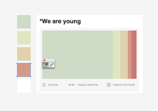
The first step when creating a design with a limited colour scheme is to draw up a series of swatches to form a palette. Here I’ve picked out a cool mix of hues named We are young from ColourLovers. Draw a series of squares in Illustrator and use the Eyedropper tool to Shift-Click and take a sample of each colour from a screenshot.
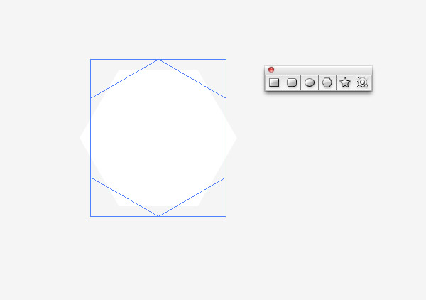
Select the Polygon tool from Illustrator’s flyout shape menu and alter the number of sides to 6 using the cursor keys while dragging out the shape. Use the Shift key to keep the angle straight, then rotate it by 45° so the two straight edges are at each side.
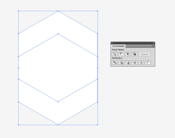
Hold the ALT and Shift keys and drag out a duplicate. Overlap the shapes leaving a thin chevron shape at the top, then select both objects and hit the Minus Front option from the Pathfinder tool to punch out the overlap from the original shape.
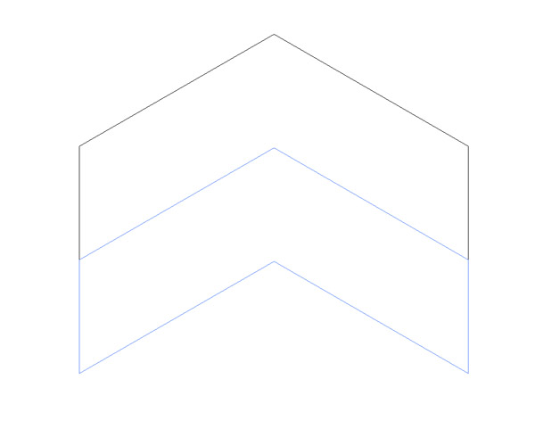
Use the shortcut CMD+Y to activate outline mode then ALT+Shift+Drag a duplicate of the chevron and align it perfectly to the underside of the original. Outline mode will make it easy to see the exact alignment of the paths.
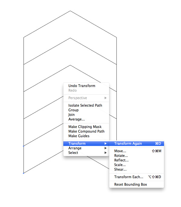
Repeatedly press the shortcut CMD+D to “Transform Again” and repeat the duplication to form a series of five accurately aligned shapes.
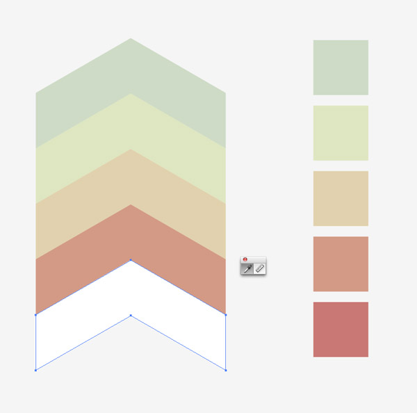
Grab the Eyedropper tool and change the fill colour of each shape to match the colours of each swatch from the colour scheme.
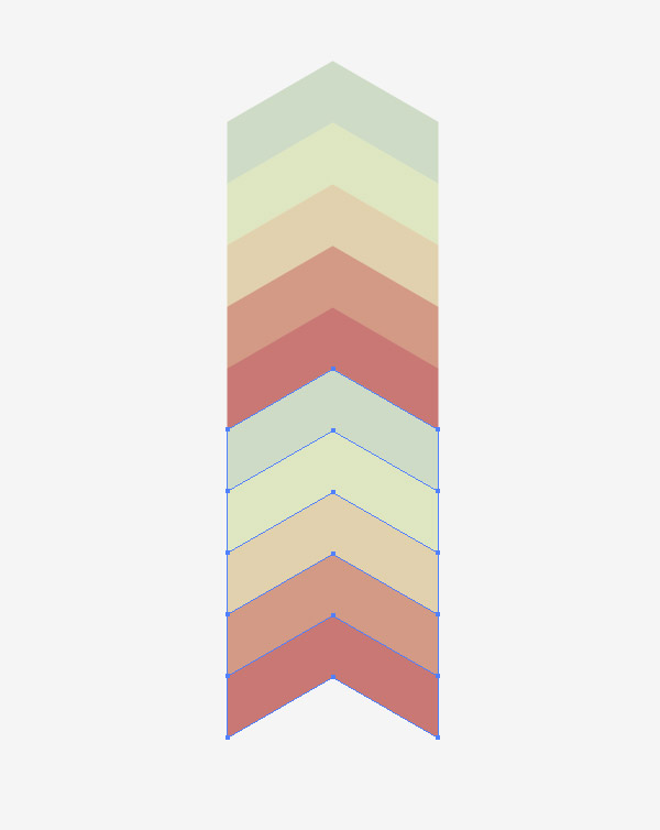
Group the collection of coloured shapes then ALT+Shift+Drag another copy aligned perfectly underneath. Smart Guides (CMD+U) or Outline Mode (CMD+Y) can really help make sure everything is lined up exactly.
Select the two vertically aligned groups and ALT+Shift+Drag a duplicate off to the side, aligning the two vertical edges.
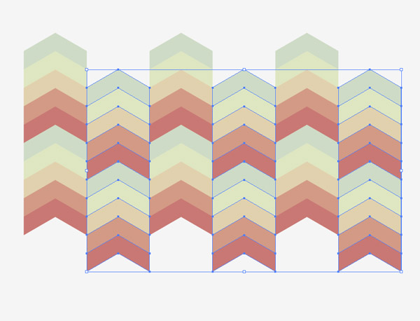
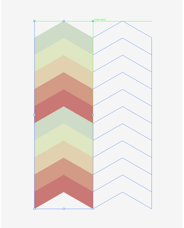
Press the CMD+D Transform Again shortcut multiple times to form a complete row of shapes, then select each every other column and move then downwards to alternate the colours.
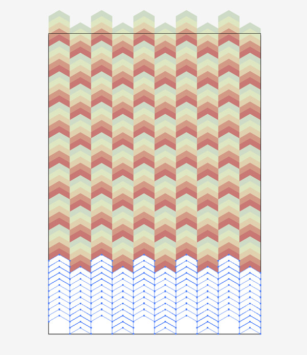
Continue duplicating the shapes to expand to fill an entire canvas of your desired size. A repeatable swatch could even be created to automatically fill areas of any size.
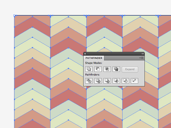
Draw a rectangle outlining the artboard, then draw a large selection around the entire design and hit the Crop button from the Pathfinder tool to trim everything to size.
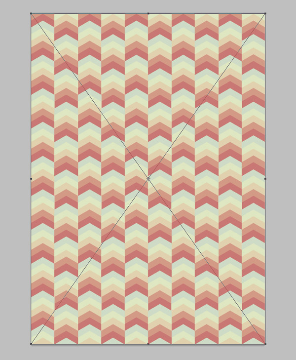
The basic geometric pattern is complete, but let’s paste it over to a Photoshop document to give it some extra polish.
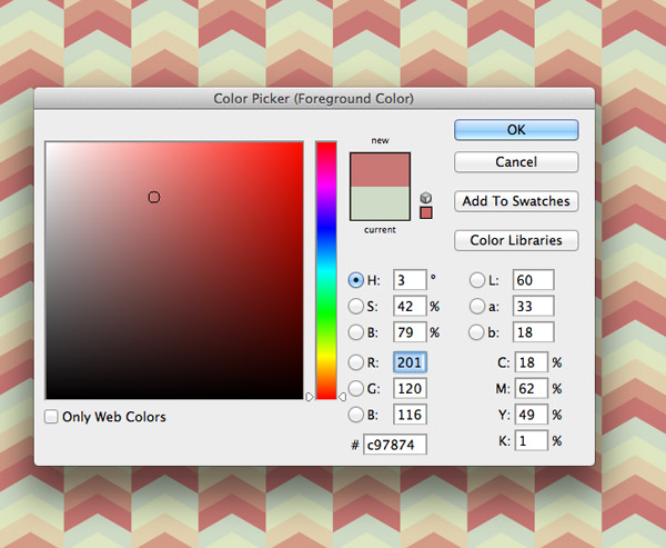
Set the value of the foreground colour to one of the design’s swatches using Photoshop’s Color Picker.
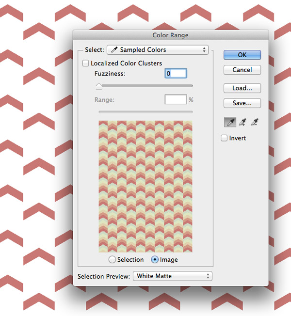
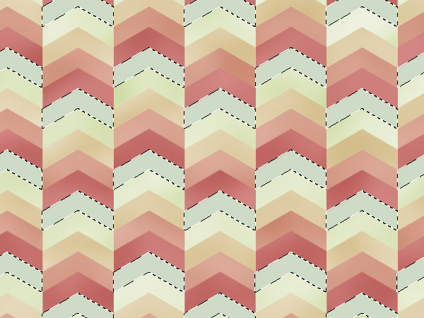
Head to Select > Color Range and set the selection to Sampled Colors. Adjust the Fuzziness slider to zero then hit OK. Copy this selection from the original artwork and paste the shapes onto a new layer.
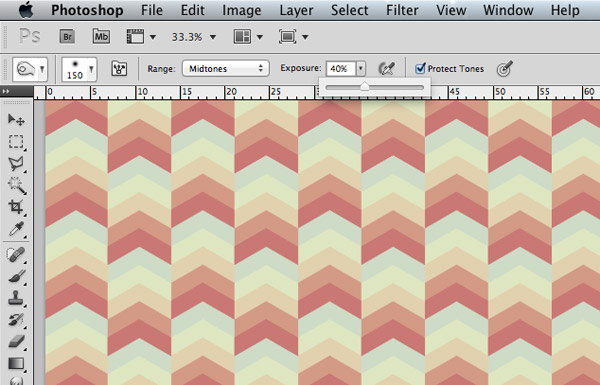
Set up the Burn tool with a medium sized soft brush with the Range set to Midtones. Alter the Exposure to around 40% and make sure Protect Tones is checked.
Frantically scribble all over the canvas using the Burn tool to darken random areas of just these clipped shapes to add some colour variations.
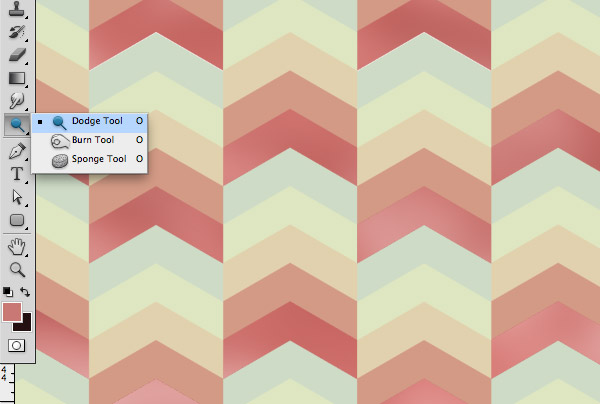
Set up the Dodge tool with the same settings then scribble over the artboard again to brighten random areas of the shapes.
Change the Colour Picker selection to the next swatch and continue the process of copying the shapes onto a new layer and Dodging/Burning to add subtle gradients.
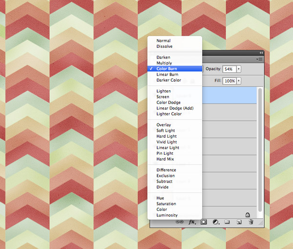
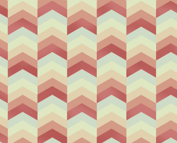
Open up one of my free coloured background textures and paste it over the design. Press CMD+Shift+U to desaturate the texture then change the blending mode to Color Burn. Alter the opacity to around 50% to tone down its impact.
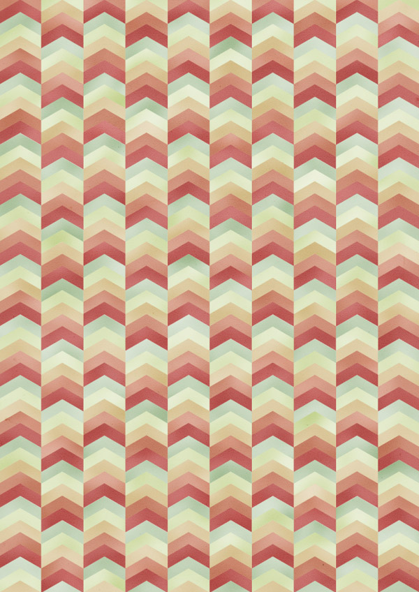
The addition of the colour variations from the Dodge and Burn tools and the subtle texture overlay really adds an extra level of detail to the pattern and eliminates some of the repetitiveness. This kind of abstract background looks fantastic when used as part of a book cover design, a funky website background or as a series of stationery prints.
Excellent tutorial Chris! The dodge and burn steps make such a difference. Thank you for that.
That was so awesome!! Thank you so much!! Your tutorials are the BEST! I always look forward to them!
Awesome Chris!Your tutorial always ‘weird’ way of doing it…keep it up..
Thanks.
Thank u so much Chris! <3
Loved it, i always learn a lot from your tuts
Brilliant graphic!
The extra work in Photoshop really adds that extra bit of detail.
Awesome.
Always love the abstract pattern tutorials.
Wonderful tutorial! I always learn when I come to this blog, thanks for sharing!
Great graphic! The tutorial is so detailed, thanks for sharing!
Nice one! Thanks for this. I could write a novel on what I learned along the way, primarily because a lot of other little challenges cropped up and I had to consult the wonderful people on the internet to figure out stuff.
http://www.flickr.com/photos/simiansays/9876999614/
With an FB banner for multi-purposing purposes ;-)
http://www.flickr.com/photos/simiansays/9868300476/
abstract is always interesting..hope abstract art is as easy as creating abstract display backgrounds :P
I just discovered how useful adobe illustrator can be, so im going to save this for later. Thanks for the tutorial :)
Hi Chris! Love your end result of this tutorial.
I’m a bit of a beginner and I’m stuck on the step in Photoshop – “Set the value of the foreground colour to one of the design’s swatches using Photoshop’s Color Picker.”
How do I do this?
Thanks. :)
Oops no I’ve figured it out but now I’m having trouble with the burn and dodge tools. Nothing seems to be happening when I use them, any tips? :)
Beautiful work and very detailed instruction, thank you Chris :)
I like this. :) I’m gonna try to replicate my own version without reading :D
Thanks so much for this tutorial. I got stuck a couple of time, but worked it out. lol. But don’t take that as criticism, this project is only my 2nd attempt at using Illustrator! Total noob!!
Thanks again x