This post was originally published in 2013
The tips and techniques explained may be outdated.
I recently shared some tips with a subscriber about how to create a nautical star design in Illustrator, which then prompted me to research traditional nautical star and compass rose layouts and construct an ornate design of my own. The process makes use of lots of simple but really useful techniques in Illustrator to build up layers of detail. Follow this step by step guide to create a detailed black and white compass rose illustration with various symmetrical pattern effects.

Traditional compass rose illustrations are often made up of intense detail which paired with the symmetrical layout creates a really eye pleasing piece of artwork. We’ll use those classic nautical compass designs as inspiration for a vector illustration of our own and make use of simple shapes to build up ornate patterns.
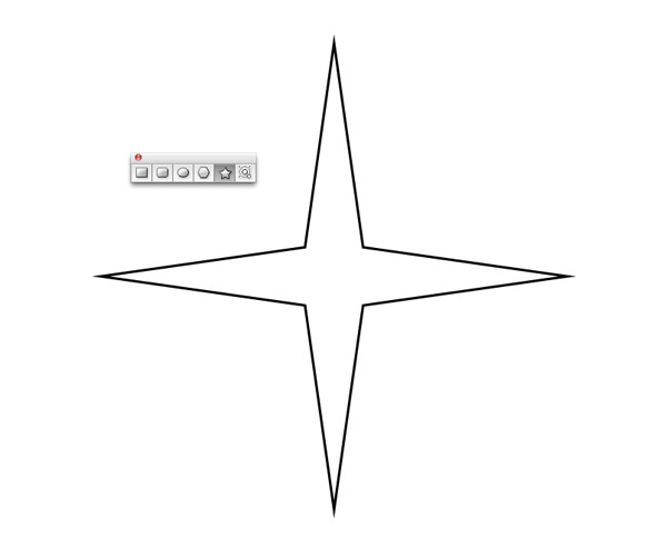
We’ll begin with the main four point star. Use the cursor keys to adjust the number of points while dragging out the shape with the star tool. Also alter the angle of the points by holding the CMD key while keeping the shape square with the Shift key.
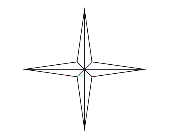
Turn on Smart Guides (CMD+U) to allow the cursor to snap to anchor points then use the Line tool to draw intersections between each inner and outer point of the star.
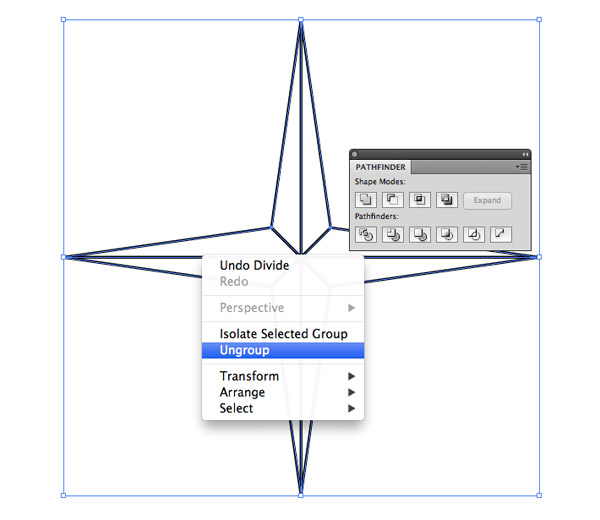
Draw a selection around all the objects and click the Divide option from the Pathfinder palette. Right click and Ungroup the elements until every shape is individually selectable.
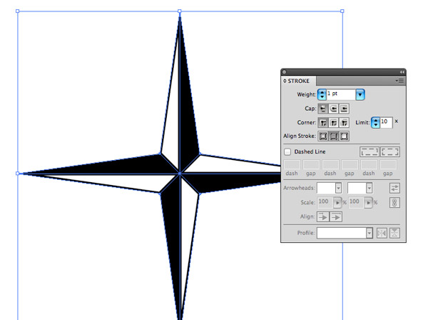
Select and fill each segment of the star with either white or black to create an alternating colour scheme. Give every shape a black stroke but align it to the inside to retain the star’s sharp points.
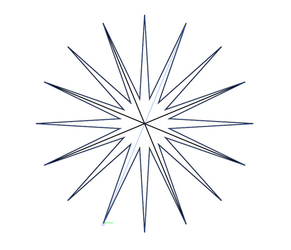
Draw another star, this time with 16 points and much more acute angles. Make sure this new star is marginally smaller than the previous so the north, east, south & west points don’t overlap. Repeat the process of drawing intersecting lines and dividing up the shapes to form another star design.
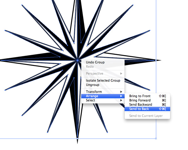
Group the elements of the two objects together then align them centrally. Use the shortcut CMD+Shift+[ or use the right click Arrange menu to send the 16 point star to the back of the stack.

Draw a small circle and align it to the end of one of the end points. Hold Alt and drag a duplicate to decorate each point of the star. The Smart Guides will help easily snap the centre of the circle directly to each anchor point.
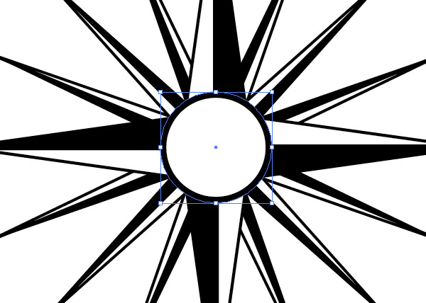
Hold the Alt key and begin drawing a black circle from the centre of the stars. Copy (CMD+C) and Paste in Front (CMD+F) a duplicate, change the fill colour to white then scale the new circle down in size slightly while holding the Alt key.

Elsewhere on the artboard draw a small vertical line with a 1pt stroke. Hold Alt & Shift and drag a duplicate off to the site. Repeatedly press the shortcut CMD+D to “Transform Again” to form a series of evenly spaced lines. Remove the stroke from the last line to leave a naked path.
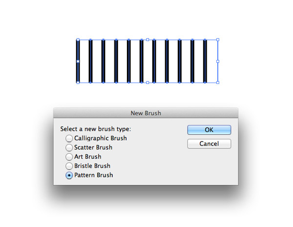
Draw a selection around the series of lines then click the “New” icon at the bottom of the Brushes palette. Select Pattern Brush from the options.
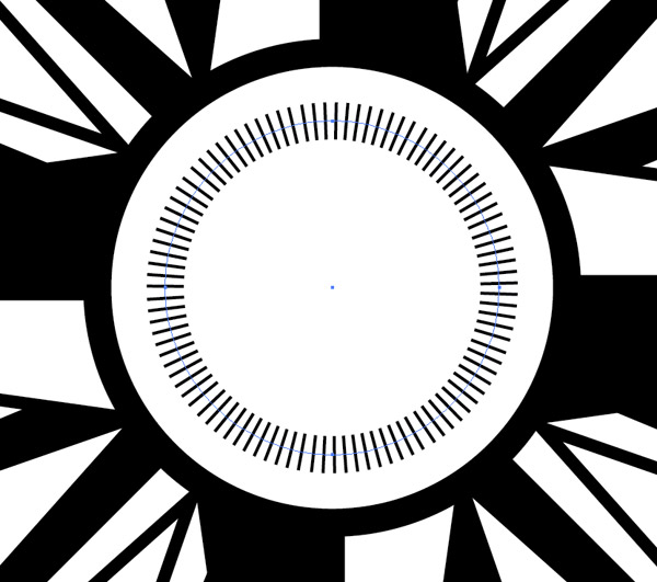
Duplicate one of the centre circles and scale it down slightly. Apply the newly created brush as a stroke effect to see the series of lines repeat around the circumference of the whole circle.
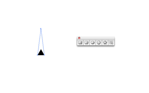
Begin drawing another shape with the star tool elsewhere on the artboard. Reduce the number of points to 3 then hold the Alt key to reset the angles to produce a tiny triangle. Drag the topmost point vertically with the Direct Selection tool while holding Shift to extend the shape.
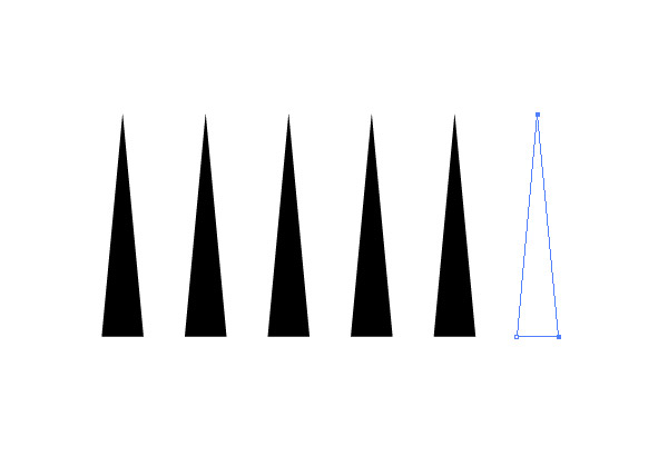
Create a series of evenly spaced triangles using the Alt-drag, CMD+D technique. Select the top and right points of the last triangle and delete them before creating a new Pattern brush. Leaving this empty point allows the brush pattern to repeat with even spacing.
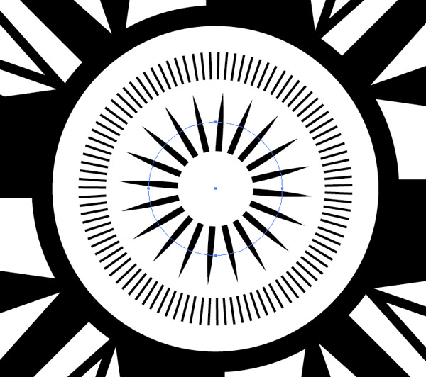
Create another circle in the centre of the design and add this newly created triangle brush to the stroke to create another simple but effective pattern.
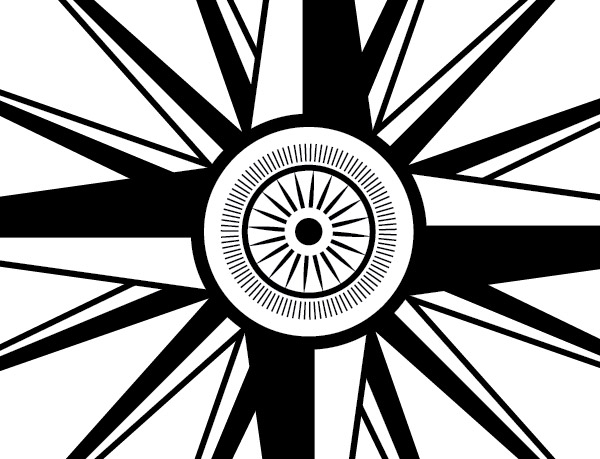
Continue adding detail using basic circular shapes with either a solid fill or stroked appearance. Remember to alter the stacking order of filled shapes using the Arrange menu or the shortcut CMD+[ so they don’t hide the other elements.
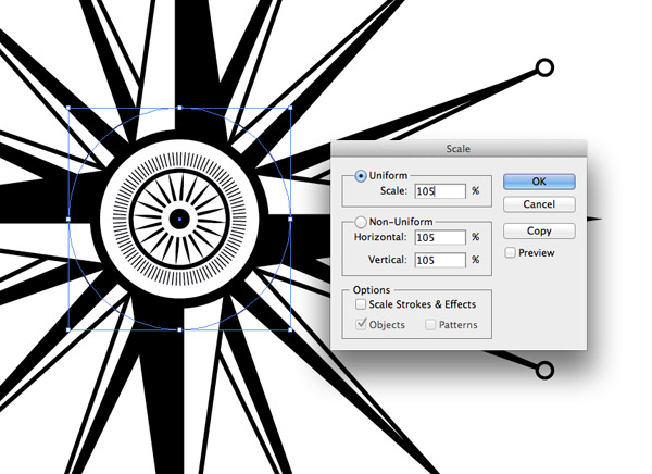
Hold Alt and draw a larger circle with a 1pt stroke and no fill from the centre of the design. Hit CMD+Shift+[ to send this shape to the back, then go to Object > Transform > Scale and enter 105%. Click Copy to create a slightly larger duplicate.
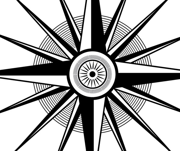
Continue pressing the CMD+D shortcut to repeat this transformation to create a series of concentric circles. Simple effects like this create intricate detail when the design is viewed without magnification.

Draw new circles or copy and paste existing shapes and continue building out the design adding various effects using fills, strokes and patterns. The easiest way to keep the elements stacked correctly is to send each new item to the back (CMD+Shift+[) or Paste Behind with the CMD+B shortcut.
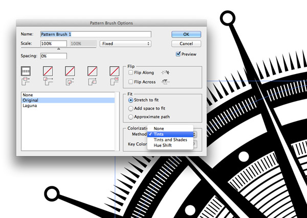
Double click the custom patterns in the Brushes palette to edit their properties. Change the Colorization Method to Tints to allow the stroke colour to alter the pattern’s colour. This will allow you to overlap white patterns over black circles to add more variations in details.
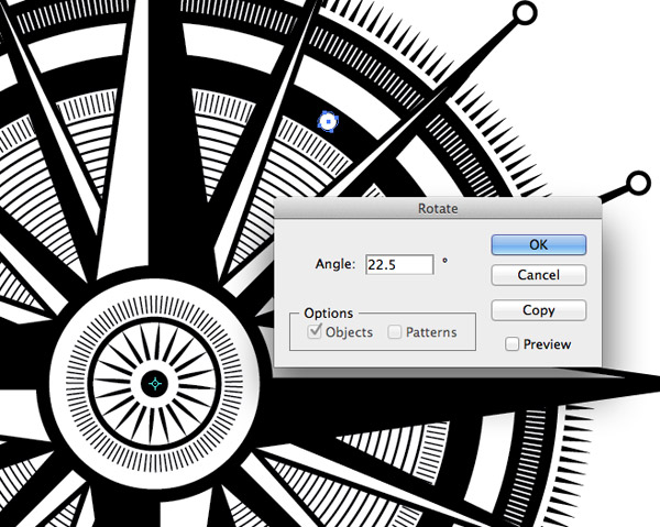
To create evenly spaced elements around the design select the Rotate tool, hold Alt and align the pivot point to the centre of the design. In the options box calculate the angle by dividing the number of elements by 360°, so 16 elements = 22.5. Hit copy to create the first duplicate then press CMD+D to repeat the effect.
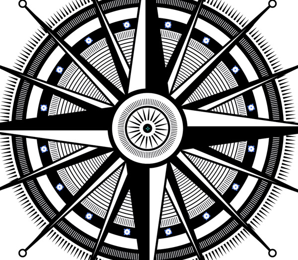
Individually each element is created from a simple solid shape, a stroke or a custom pattern but as they’re combined and built upon they together form an intricate decorative pattern.

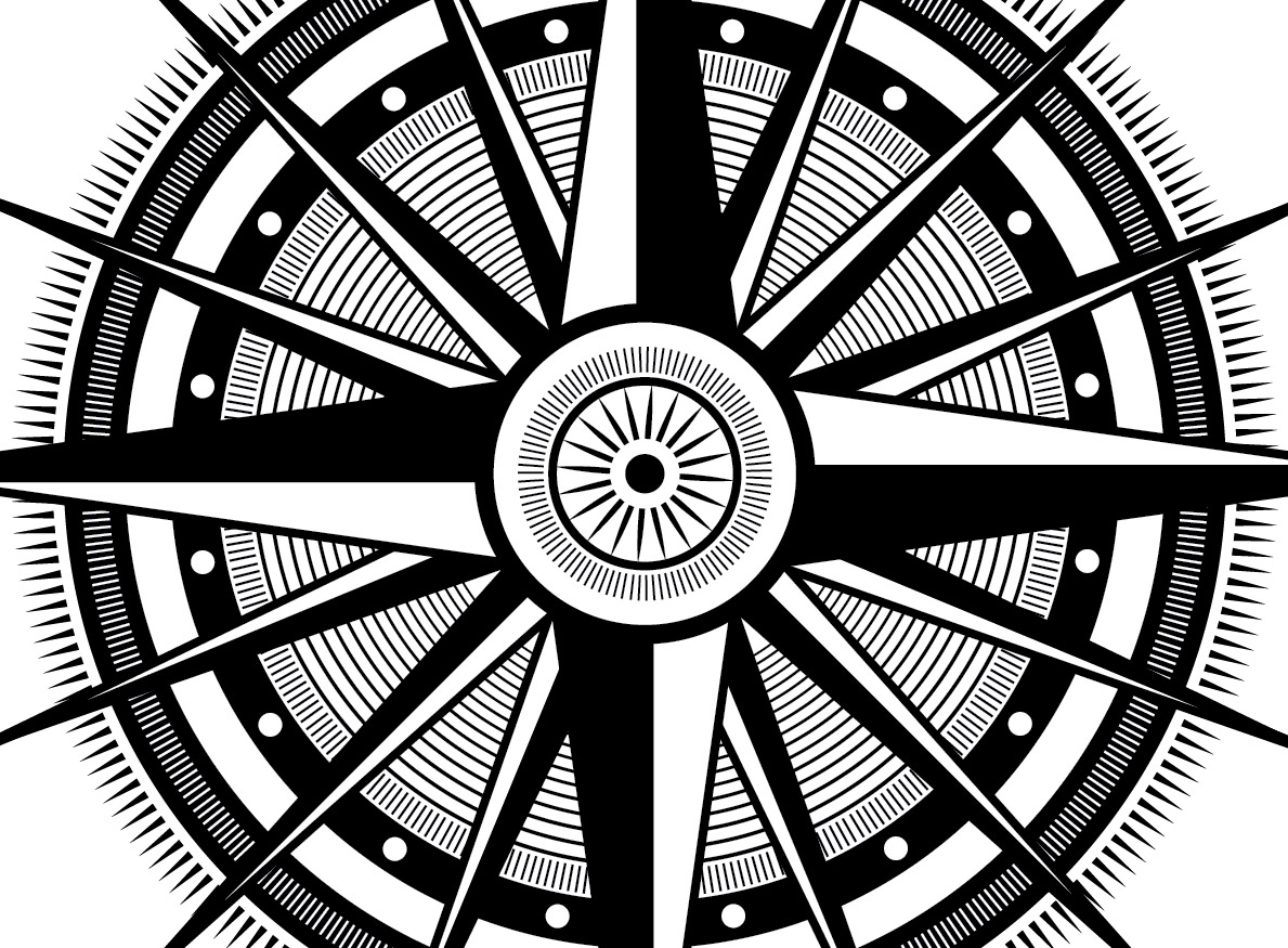
Use these simple techniques to create a symmetrical compass rose design with ornate detailing. There’s no rules or order to the elements, simply build up the design with various circular shapes and effects until you’re happy with its final appearance.


Love all the techniques portrayed in this tut to achieve the final artwork. Very useful indeed to recall upon these classic AI tools and techniques.
Cheers!
One point (no pun intended), is that when drawing the centre lines for the 4 and 16 pointed stars in the initial steps, use the thinnest lines possible. This is because the line is actually only the edge of the black segment and not really a line at all. This way the segments will be more even than they are above where the black, because of the thickness of the centre line, eats into the white segment.
Nice tut, Gonna try this weekend :D
This looks great! Can’t wait to tear into this.
Thanks for this tutorial! Quite handy for cartographers too.
why do not you record a video with the tutorial? would help. thank you!
Nice Tut Chris, Great for illustrator and design beginners like me!!
Wonderful tutorial! So much detail!
Tutorial is handy and easy to understand. I gonna check it out .
AWESOME!! Nice way to use some tools from AI! Thanks Chris!! You fuc##ng Rule!!!
Curious to know how long something like this takes you…from concept to completion! Thanks.
Awesome tutorial Chris. Your tutorials has given me so much as regards learning the AI interface.
I totally nailed the tutorial. Thanks
Chris
Your tutorials are really helping me get to grips with how things work in Illustrator.
Made me smile when I finished this and your clock tutorials :)
Thanks
Hi, when dividing and ungrouping the sections it doesn’t seem to work in mine and I don’t understand why, can you help?
Thank You.