As I outlined in one of my recent video tutorials, I’ve been using car photography as a creative outlet lately. It’s a great opportunity to combine my hobbies of Photoshop, photography, and driving my Ford Mustang into one fun activity! In today’s tutorial I’ll share my photo editing process and explain how I take a basic car photograph and transform it into an inspiring automotive portrait by compositing a new background and blending the car with its new environment, using a variety of techniques in Adobe Photoshop.
Watch the video
Subscribe to the Spoon Graphics YouTube Channel
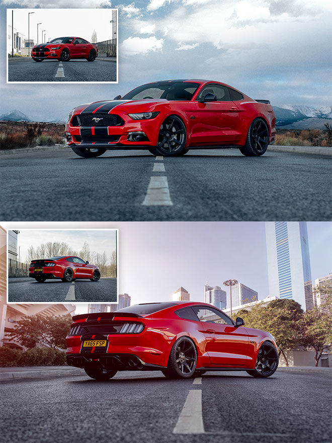
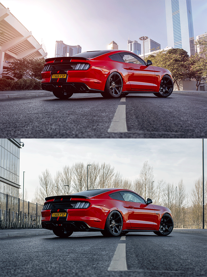
Compositing a new background dramatically transforms a bland and boring setting into a much more visually appealing location that can help enhance the mood or atmosphere you want to achieve with the photo. These two photographs were both taken on the same empty road, but with the magic of some Photoshop editing, one is now set in a cold mountainous region, and the other in an exotic metropolis!
These Photoshop compositing techniques can be applied to all kinds of photo subjects, but they are particularly effective for automotive photography. Whilst cars are a relatively easy subject to work with, reflections are the biggest factor that determines the suitability for a composition. Using a Circular Polarising Filter on your camera can reduce the majority of reflections in the car body and windows, but any leftovers can either be edited out using Photoshop’s stamping tools, or incorporated into the theme of the new environment. For instance, this photo has a warped reflection of a building along the side of the car, but it will complement the new city location.
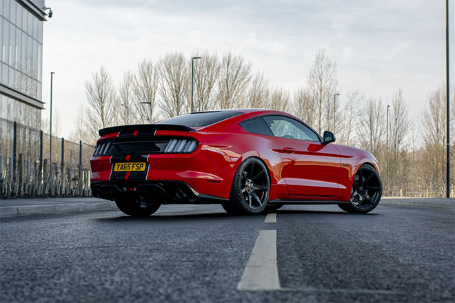
Download the image from your camera and make any necessary post-processing adjustments to correct the overall tone and colour balance.
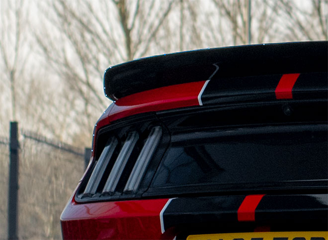
In order to place the car onto a new background, it first needs clipping out. Use the Pen tool to trace around the car outline, staying a couple of pixels away from the edge to avoid capturing any slithers of the backdrop in the selection.
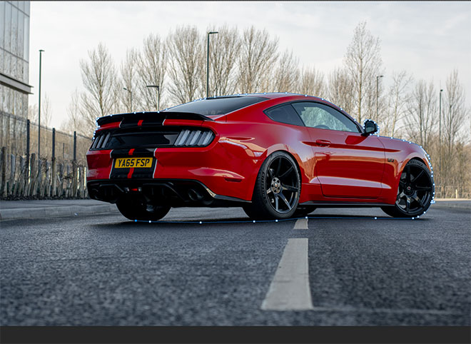
Roughly create the path along the bottom of the car, then follow the outline to the starting point to form a continuous path.
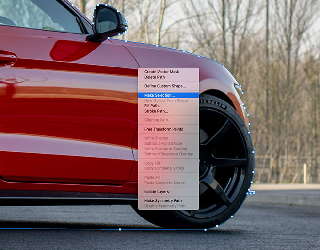
Right click and choose Make Selection, then Copy and Paste the clipping of the car onto a new layer.
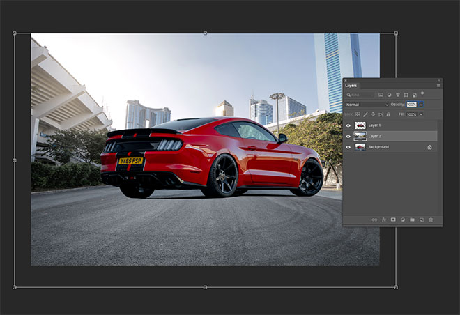
A new background can now be pasted between the original Background layer and the new car clipping. The new scenery photo must have been taken at a similar angle and resemble the lighting of the scene. This image of a Road In The City by Jimmy Yan on Shutterstock features a road receding into the distance in the same direction as my original photograph, and the area is shaded just like the initial location.
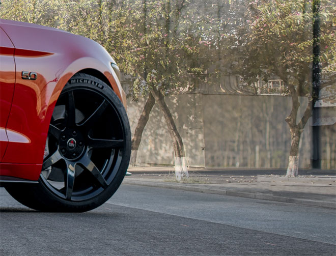
To accurately match the angle of the scenes, reduce the opacity of the new background layer and move it into position so the horizon lines overlap.
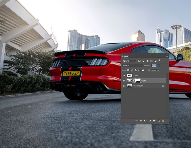
The compositing process becomes much easier if the original road is preserved in the final edit, since the car is already realistically positioned with the correct shading and angle. Apply a Layer Mask to the new scenery layer and begin painting with a soft black brush in the mask to erase the foreground to bring back the original road.
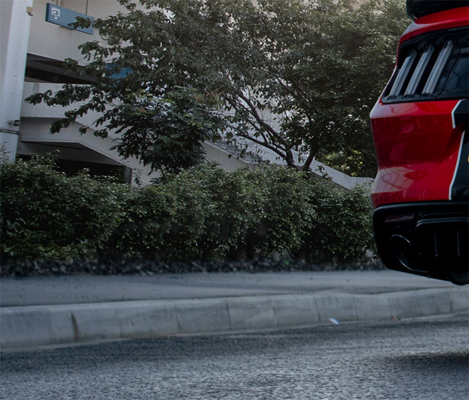
Kerbs or sidewalks are convenient features of almost every road photograph that can be used as a seam to blend the two backgrounds. Adjust the size of the brush and use the X key to switch between black and white to erase and restore the mask.
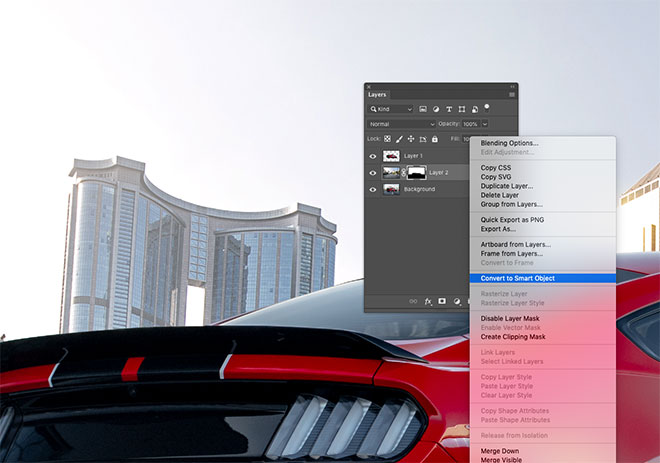
The new background will need some adjustments to make the composition more realistic. First convert the layer to a Smart Object so any filters are applied non-destructively, so they can be edited if necessary.
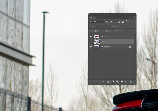
Toggling off the new background layer to compare it with the original shows a difference in the depth of field. The elements in the background of the original image are considerably blurry, whilst the stock photograph was taken with a much smaller aperture.
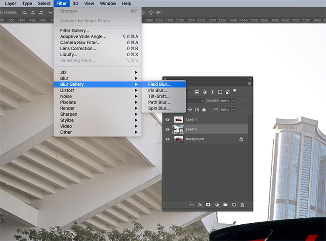
Make a mental snapshot of the blur amount from the camera image, then toggle back the visibility of the layer and go to Filter > Blur Gallery > Field Blur.
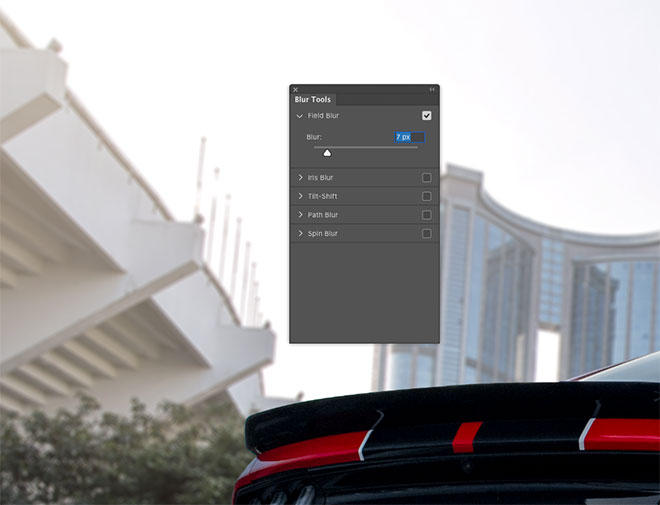
Increase the Blur value to mimic the depth of field effect of the original image. Typically this will be a relatively small value of under 10px.
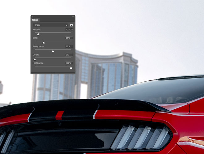
The Blur Gallery filters have some additional tools that are useful for matching the appearance of the two photographs. The car shows some subtle ISO noise, whereas the background is much cleaner. Increase the Grain Amount slider to simulate some noise in the background too.
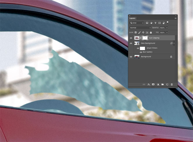
The car was clipped around its outline, but the area within the window still shows the original backdrop. Apply a layer mask and use the brush tool to erase the unwanted portion to reveal the correct background. Using a moderate hardness setting for the brush tip helps avoid an unrealistic hard edge.
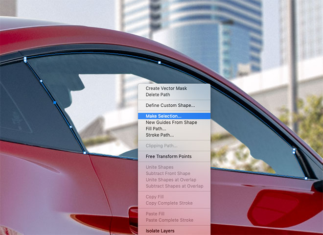
The area through the glass wouldn’t be so bright and clear, so draw a path around the window with the Pen tool and make a selection.
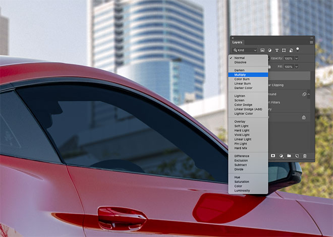
Add a new layer, then fill the selection with a colour sampled from the nearby window. Change the blending mode of the layer to Multiply to allow the background to show through.
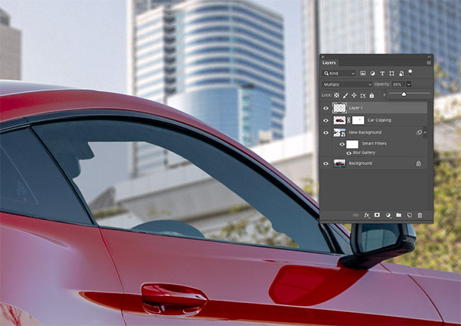
Reduce the opacity of the window overlay layer until the background looks like it is being realistically viewed through glass.
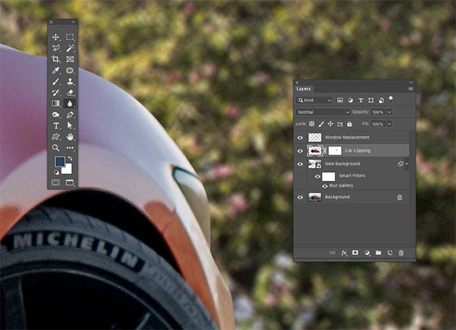
Viewing the image up close shows the car with an unrealistically hard edge from where it has been clipped with the Pen tool. Select the car layer, then activate the Blur tool.
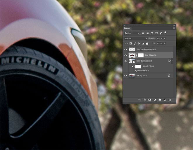
Reduce the strength of the tool to around 50-70% in the toolbar, then using a small brush, paint around the edge of the vehicle to simulate the natural lens blur. The edges farthest away require more blurring than the foreground.
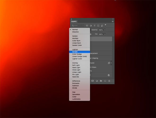
A great way to finish off an image with some natural color grading and lighting effects is using my light leak overlays. Open one or more files then copy and paste them into the document and scale them to size. Change the blending mode to Screen to make the dark background invisible, allowing the colourful portion to interact with the image.
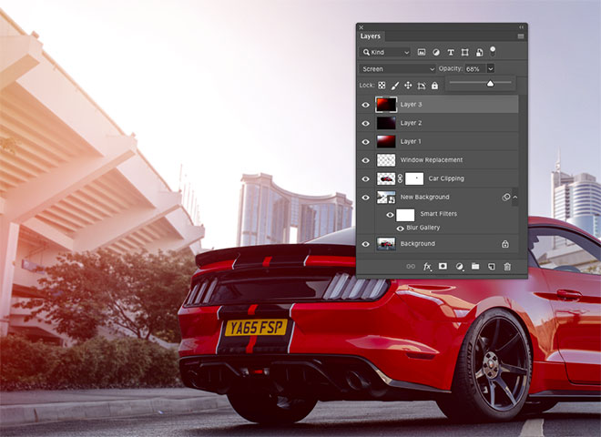
Reduce the opacity of the layer to adjust the impact of the overlay. Layering up overlays can add some vibrant light casts across the image.
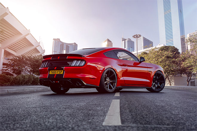
The final result is a much-improved photograph with stunning background scenery that enhances the atmosphere of the picture. Preserving the original road ensures the car remains grounded realistically on the asphalt, then subtle lens blur and ISO noise effects match the visual traits of the new stock photograph with the original image.



My kind of reading! LOL Very cool! Your car is sweet! The transformation is awesome!!
Thanks!
Thank you Su!
Very good
Thank you!
Very nice tutorial.
Your site is fantastic !
Always keen to see new posts in my mailbox.
Also the products to design at discount prices are great !
Awesome Chris.. Your articles are really very helpful!!
Hello Chris,
Thank You So much for such a useful piece of content. Your article contains such a piece of useful information and very helpful for me.
Cheers
– Aman Kumar