I’ve been secretly working behind the scenes on a redesign of Spoon Graphics since June, but after 4 months of hard work and a little help from a friend I’m proud to introduce my website’s new look. Previous redesigns and refreshes have been quite conservative evolutions, but I think this new design takes a leap forward into modern web design while retaining the original character of the Spoon Graphics brand from 2007. Let me take you for a little tour and show you what’s new!
Responsive… Finally!
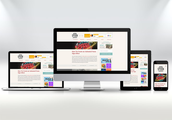
When I last redesigned this site in 2012 I documented my thoughts about responsive design. I decided that due to the nature of the content I post (long articles with lots of images), the inability to pinch and zoom would cause more of a usability issue with users having to frantically stroke their device to reach the bottom of the page. But now Google penalises sites that aren’t mobile friendly, so I was left with little choice but to go forth and responsify. I hired my designer friend and Battlefield comrade Matt Kersley to help build a responsive framework from my PSD design concept, upon which I could add the general styling to finish off the design. You’ll now see different layouts for mobile, tablet and desktop views depending on the viewport size.
Key design features
Some of the page elements have been influenced by earlier designs to maintain some consistency, but there’s a bunch of key features of this layout that make version 7 quite a radical redesign:
Hero feature images
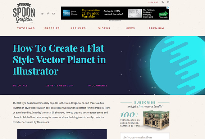
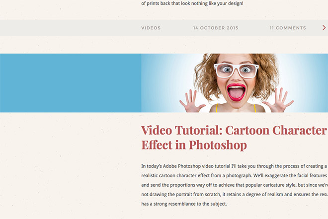
The biggest change for version 7 is the introduction of the large hero images for each post, which was an idea I had from the start so the whole redesign was actually based around this one feature. It contains a large post thumbnail image, a supersized title and the post meta information, but the coolest part is it picks the colours for the background and typographic elements from the image itself to generate unique colour schemes that complement each post.
Backgrounds that bleed
I have as much of an interest in print design as I do digital design, so one idea I had was to incorporate bleed into my website design by extending certain backgrounds right to the edge of the page. Not only does this fill out some empty space on large resolution monitors, it also reinforces the custom colour schemes for each post. It’s easy to skim the page and see where the various sections start and end.
Revamped social shares
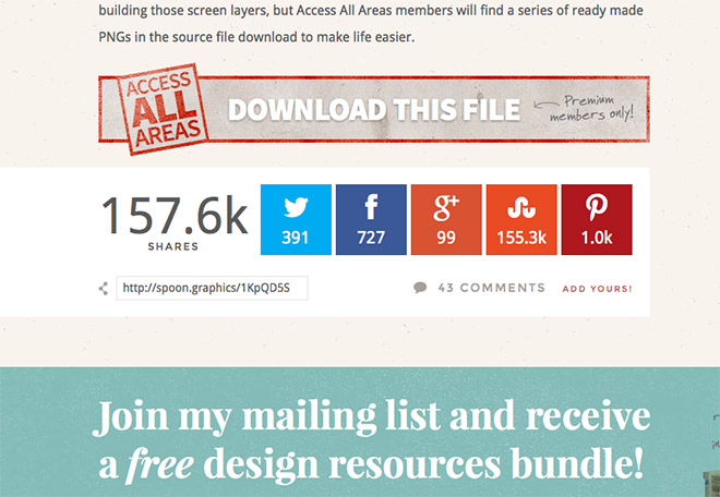
With all my tutorials and design resources being free, my blog relies on a steady flow of traffic to generate revenue. Having posts shared on Twitter, Facebook, StumbleUpon, Pinterest, etc are the best ways my posts get seen by others, so I made use of a premium social plugin to create a more eye catching and consistent series of social buttons. This plugin also adds up the total number of shares, which I got Matt to customise with a cool counting animation to visualise the success of each post. Custom spoon.graphics shortlinks are also provided, so it’s easier than ever to recommend my content with your friends!
Prominent sign up forms
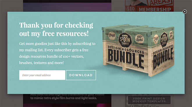
My email newsletter is the best way to keep up to date with all the content from Spoon Graphics, over 70,000 people are now subscribed to receive notifications of new posts. My free bundle of design resources has been a great incentive to persuade people to join, but it’s now so big at almost 600mb, the old product box mockup from the old design just didn’t do it justice. The bundle has now been upgraded to a massive wooden crate, which is virtually delivered to your email inbox when you sign up! Hopefully this will recruit more first time readers into the Spoon Graphics community.
A matching newsletter too!
My newsletter has been revamped to complement this new design too. It also features a large header image and all the same typographic styles as the main website to provide a consistent brand image.
Next post popups
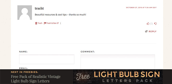
With 8 years worth of content, there’s plenty of stuff for new visitors to check out. To prompt users to browse my other content, the next post banners now pop up from the bottom of the page when the user has finished reading the current article. These banners are also colour coordinated to the content they’re promoting, so they clearly stand out and differentiate themselves from the rest of the page.
Is anything broken?
Testing was done in the major browsers to ensure everything was looking as it should, but if you see anything that doesn’t look quite right it would be a great if you could let me know. A screenshot would be super handy too! Let me know your thoughts on this new design down in the comments. Do you love it? Hate it? Would you have done anything differently?
And very nice it all is too! My only reservation (and it might actually grow on me – I’m not sure), is the next post popup is a bit on the large size. If it were me, I might limit it to on the bottom right corner. But hey ho, the rest is ace!
Thanks Brin! I added the little close icon as a last minute fix last night, but I might revise it a little more if it becomes annoying when reading comments
Slight tweaks, looking great Chris! Ahh you never disappoint. Beautiful as always.
Thanks Jorden!
It’s great to have your comment as one of the first again, it’s almost a tradition with every milestone or redesign post haha :-)
Haha yeah, ive been slacking lately but I still keep tuned into see whats going on!! Life is just catching up on me haha :)
Hey, Chris! So glad to see the site went responsive! First saw the update on my phone and everything looked/worked great!
The Next Post pop-up was the only thing that feels out of place to me. My instinct was to close it as soon as possible just to regain the use of that space again. Maybe it’d be better to work this feature into the actual layout of the site? I guess continue to test it out and see how it does.
Love everything else! Glad to see the blog is continuing to evolve and grow. :)
Thanks for the feedback Brent! I’ll see what I can do about the popup, it’s definitely the consensus that it’s a bit too intrusive as it is.
Hey Chris, really nice work on the redesign. It’s great to finally see a responsive design for SpoonGraphics (and very nicely done too) :)
Thank you for your kind words Jon. I think a responsive design is well overdue :-)
Really nice! Great work! and i love the new font! What font did you use?
Playfair Display as the modern serif,
Montserrat as the geometric sans,
Droid as the body text.
All free Google Webfonts
I advise you Fontface Ninja Chrome extension for this purpose ;). Really useful to find out what fonts are used!
Impressive new stuff. Looks fantastic and works just like a gem! Congrats!
Thanks Roberta, it’s good to hear it’s all working as it should!
Nice redesign! I have to echo everyone else’s sentiments about the “next in news” at the bottom. At a glance it looks and feels like an ad- I wanted to close it right away without even looking at the content. Another comment suggested making it smaller and sticking it in the bottom right corner – I think that’s a great idea.
Yeah it sounds like some little tweaks are required. Maybe a smaller slide in from the bottom corner is the way to go, or placed in a static position on the page.
Hey Chris! I really like the tweaks you added to the site (like the new photos).
I agree with the others about the next post pop-up at the bottom. I think if it wasn’t as obtrusive to screen space it wouldn’t be as “in-your-face” (especially on mobile). Another recommendation would be to maybe add a ‘scroll to top’ button? Some of your tutorials are quite lengthy and it would be nice to be able to zoom back up to the top and continue exploring. Other than that it looks great :)
Thanks Hannah, a scroll to top button is a great suggestion. I’ll look into working one in somewhere
Very pleasing on many levels; congratulations on a job well done. First enjoying this new look on my smartphone and must say it’s a lovely experience with the exception – as noted by others here – of the Next Post indicator, which seems intrusive in its current iteration. No doubt you’ll come up with a satisfying alternative. Meanwhile, bravo!
It’s good to hear the smartphone version is looking good. I’ve only been able to test on an iPhone, so it would be interesting to hear if it’s working on other models
Wouldn’t the Google Plus logo be also updated? Just asking.
That’s a good point actually, it’s built into the social plugin I purchased so hopefully an update will address that sometime
Awesome!! Love the new look, and yay finally fully responsive! The whole site is pretty sleek now and I happen to the like that the next post pop up covers the full bottom bar area.
It’s good to hear voices fighting in favour of the next posts popup! Does it still look ok on mobile do you think?
Chris, very nicely done. Happy to see the responsive upgrade as well. I’d love to hear how the new subscribe forms and the “next up” slide-in perform for you. Love that you manage to maintain the character while constantly upgrading. The full bleed images are a nice touch. Cheers.
That actually reminds me, I should reset the stats on the newsletter forms to compare the number of sign ups with the new design
I love your new bundle box and you holding it shows how heavy it really is. I just miss mousing over your pic at the bottom and a drawn mustache and glasses pops up over the portrait.
It’s funny to hear that you actually tried clicking my face to see a moustache and glasses. I wanted to include that little easter egg again but the scaling image made it a little more difficult
Love it all! Especially on mobile, its all smooth and flowy and doesnt lag up the device like some sites do. The only issue i have is with the pop up bar that, once my keyboard is up, i can only view about 1/4 of the page. But this issue is only a problem when adding comments. :)
I never even considered how the popup would look when the keyboard was visible. That was a bit of an oversight on my part!
I really love the fonts you’ve chosen
Congrats in you new design. I like it a lot. Are you trying to emulate Matt? Keep doing you good work. I enjoy the whole site. Está muy bueno…
From Sunny Puerto Rico
Hi Chris,
I’ve been following your blog for a few years now and I’m a big fan of the content you post! I really love your site’s redesign, especially the hero images (and matching newsletter), color coordinated banners and the backgrounds that bleed. I’m a huge design geek and I can see all the effort put into this amazing design. :)
I was just about to ask you why your blog is not responsive till now and what I got this morning stopped me to compose a mail. Very nice change.
Very well done! Now I love your site even more!
LOVE IT! So much clearer! The reading experience is awesome! The typography looks more lively now :) Droid & Playfair. I also liked how you kept the look similar to your previous version. It’s recognizable! Kudos to you and Matt! :)
the redesign is awesome! Only thing that sticks out for me is the alignment on the next post pop up, at the right side of the image when it’s over the comments it doesn’t quite align with the right side of the comment section. Put a link to the image as my website so that it doesn’t get filtered out of the comment, it’s hosted on DropBox.
The site looks awesome and works great even from my mobile!
I like you the new look. Suggest you add a “Move to Top” icon.
Great new look, To be honest, you have your own folder in my outlook, your an inspiration and certainly generous with your freebies – and you keep me in touch with the good old UK as im now living in Thailand, KrupKoonKap!!! (Thankyou lol)
I like you the new look
good job Chris! it looks so fresh, I like the big header image!
OMG I do love the “one side only full widht” elements, it’s a brilliant idea!
And the responsive version is really nice too. Well done!
Just amazing Step! and Yes I also love the comment section lol its just really good and I think footer is now amazing! :)
Super job ! The new look is great !
I began to follow you when I began my journey in the vector world some years ago and I want to say : Thank you so much for all the tutorials, materials and precious advices you provide :-) They are really helpful for a hobbyist like me.
Keep on the good job !
Very nice blog can you examination.
http://trireklam.blogspot.com.tr/2015/10/kullanci-dostu-arayuz-tasarim-olusturmak.html
It looks really good. I haven’t been here in a while and for a moment i thought i was in the wrong place.
That is fantastic Article. After reading this complete article, I have a bookmark of this site and visit on this again and again. Thanks Admin for making this site and Thanks for Published Article Everyone.
I love the way you interpret the text. said quite attractive. it up for me a lot of things
now ur site is more smooth in speed and color.. like it much. congrat chriss.
cheers.. Tubplus