
I can’t believe it has been 3 years since the last redesign of this blog, but over the past couple of months I’ve been working on version 6 of Blog.SpoonGraphics. I went through many concepts for this one ranging from complete overhauls to subtle realignments, but I settled with something roughly in the middle with a new layout that retains the brand and style of the original 2007 design.
Some history

Since its creation in 2007 this blog has worn pretty much the same outfit, with slight adjustments and realignments being made every 6-12 months. The last redesign in 2009, despite looking very similar was a complete rebuild from scratch with updated code and lots of finishing touches added to the layout. That version lasted pretty well over the last few years, but I started to feel like a complete overhaul was needed and began working on various design concepts for a fresh look.
This time I wanted to go for something completely different, but part of me wanted to preserve the large header illustration with it being a recognisable feature of this site and the subject of many fan emails. I tried to mould it into numerous concepts but it just wasn’t working, so in the end I decided to scrap it and start fresh with a new layout.
What’s new?

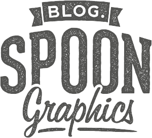
This blog has always had a kind of retro/vintage theme with the browny/beige colour scheme and paper textures. After trying out a few completely out-of-the-box designs I decided it would be best to stay true to this theme, so I took it back to square one and developed a new vintage style logo to tie it all together.

I really wanted to widen the content area, but I was a bit worried about the 5 years worth of content that had already been scaled to the old 450px layout. I decided to bite the bullet and widen the main column to 600px, so all posts from now on will feature much larger screenshots and imagery. Those old posts based on the 450px layout don’t actually look too bad, they just sit centrally on the page while the body copy extends to the full width.


The new design is really just an evolution of the old layout. Pretty much everything is still in the same place, but with simple restyling.
Ermahgerd it’s nert responserv

One of the main dilemmas I had was whether or not to make this blog design responsive. From my own browsing experience I often find responsive designs more of a nuisance than a benefit (with exceptions). Almost all my posts are very long and made up of multiple images. With a responsive design those images would be scaled down and you wouldn’t be able to zoom in to see the details in the tutorial screenshots. Plus with everything permanently zoomed at 100% you would be forever stroking your device to make it to the bottom of the page.
Instead of going for a responsive design I just optimised little parts of the layout for mobile, such as adjusting the text resize to avoid orphans on titles and lists. Double tap the main column and it zooms in to provide pretty much the same layout I would have designed for mobile viewports anyway, except you can zoom out to scan the page or to find something in the sidebar or footer (which would otherwise be relocated or removed entirely on a responsive design). Don’t want the distraction of the page clutter? Hit the “Reader” button in Safari for a nice clean mobile optimised version of the page. It’s almost as if Apple designed their devices to be used this way…
Still testing!
I’ve done my best to get the design to display properly across all browsers and devices, but I don’t have the ability to test them all. If you come across any glaring errors I’d love to hear from you (a screenshot would also be super handy!). Let me know your thoughts on the redesign down in the comments. Is there anything I’ve missed or anything you would have done differently?

Sexy!!
Looking great Chris, I much prefer the larger content area you have on this site now.
I’m kind of glad you haven’t went down the responsive route, mainly because, if anyone is doing a tutorial, they are going to be on a desktop anyway.
Loving the new look Chris, this site doesn’t need to be responsive.
Keep up the good work :)
Very nice and clean layout! congrats!
I have to admit, I like this a lot more than I expected; part of me thinks there is a bit much going on, but this is surpassed by the design’s ambition and being completely fresh at the same time.
And as for it not being responsive; I like the courage of being anti–responsive as I have a similar philosophy towards responsive design; while it helps accessibility it doesn’t mean every site is best suited for Responsive Design. So yeah, this works better on a fixed format basis. :-)
This is a great design. I’m really digging the entire look and feel. Header is great!
Good job on the new design, I really like the new logo and sits really well. Love the texture in the header and footer too.
Interesting thoughts on the responsive side of things. Glad to see a different angle on it instead of “everything has to be responsive”.
Good work mate.
Nice redesign! I love what have you done, well done Chris.
Cleaner, much less distraction and the vintage/retro style is also much more subtle than the previous version :).
Nice work Chris! I’m glad that you decided to keep a familiar look with the colors and textures. The wider content area was a good choice.
This is gorgeous. I love it! :D
awesome!!
Very nice work! In-fact, I prefer the new-look.
Is there a WordPress build tutorial in the pipeline?
I love this new design!
And I was about to ask “why u no use responsive?!” but I figured you had your reason and I understand your decision NOT be responsive!
Great job man, the design is dope!:)
Like the redesign. Great job on keeping the focus on the content. I especially like the menus and category layout.
Nice!!!!! :D
Hi!!
Greetings !! I love these blog!! Thanks for sharing !!
I have a question … what’s the name of the font that you use in the word “graphics” of the new logo?
Thanks and please keep working like that always !!!
XOXO
Jajajaja sorry i just found the tutorial ^_^
It’s awsome!!!!!
Love these blog!!!!
@Dany Mojica
It’s “Freehand 575 BT” :).
Very good friend !
The new design is much better and more streamlined. Love the new look and logo.
Looks great – Clean – fresh – and still super cool.
Retro for the win. I love the retro look and feel you pull it off really well.
Super Duper Cool!!
:)
Lovely!
Beautiful re-design!!
Nice job! A lot cleaner than the previous one. Always enjoy your site.
Amazing, I just love it! :D
Awesome work Chris, glad to finally see this live :)
Well done Chris. Great work. Love the new tweaks & design. You’ll be pleased to know it displays perfectly on a Kindle Fire HD!
Wonderful redo of the site. Looks professional and clean. Easy for reading and viewing your awesome content.
It looks really cool. It looks old school. LOVE IT!
Love the new website design! The retro look is elegant with a touch of hip.
If other browsers add the reader feature, we might be saved from the worry of responsive design.
All you need to do to get the Reader to work is to wrap the written content in an
<article>tag; for example…an article! Then your written content including any images will be rendered in the Reader. ;-)Though I would never say Responsive design is a worry; I only see it as a solution, and it’s easier than you think, so as you keep things simple. :-)
Nice work Chris… I like the wide content area and browny colour scheme. Paper textures gives it different look. New vintage style logo is simple and nice… Well done…
Chris this looks brilliant, you’ve done a great job. Kudos!
Great looking redesign…! Love the graphics and the color layout…the font type and colors are a great feature also.
I love new design is pretty nice, congrats Chris!
I’ve been waiting for this redesign for year, I even commented on some article that I cant wait to see it redesigned.
Content area was really too small, even this one isnt big enough for my taste :) However I do like everything you make, this one isnt different…
It looks great! Very clean and straight forward! Thanks!
Su
Looks really nice, little disappointed about the non-responsiveness of the website as blogs are for reading and that will be a difficulty on a smaller devices and not as enjoyable on bigger screens.
Saying that, I don’t know what your user base is like and whether you get a lot of mobile device or large screen traffic.
Good job anyway.
Beautiful execution, Chris. Love the new modern look, very well done.
I really like this clean and fresh design, Chris! And it still feels much like your home.
And one of the things I like best is the option you took as for mobile bowsers. I just wish you bring us some tutorial about it, please. I find it’s the best solution as I also find responsive is, often, a nuisance.
Congrats! It looks clean and warm but to the point and clear. Great job!
This new design is killer man. Like someone said earlier in the comments, this site is mainly tutorials and you’re not going to be working with Photoshop, or Illustrator from a phone lol
Awesomeness!
Hello Chris,
It’s a really nice design that you made, but I feel like you lost something from before.
The last one was really unique and it was impossible to mix up with another one. (I really loved your last header :) ).
Anyway some improvements were needed and like Steven said the wider content is a good choice.
Best,
very nice man! love it
A very refreshing redesign, much cleaner.
Hello! Very cool redesign!
What the font used in the title “Version 6”?
thank you in advance for your reply! :)
This is amazing!
You never cease to amaze me with your work, this is why i think you are the best designer i have ever known!
Much better this version. So clean :)
Love it
Good work
Chris, you did an amazing job! Looks sexy, man! Keep up the great work!
Roland from Hungary
My fav so far!
As always great work. A great example of how things should be done. Inspirational and depressing at the same time. If you see what I mean.
Hi Chris,
Thank you for all your effort you put in your website & blog!
I’m a steady reader of all your posts and appreciate really every single one.
I know how hard it is to find time and energy for own projects like blog posting and creating tuts. Therefore I really have to thank you that you are doing a a big benefit for all of us – your readers!
Stay motivated and keep on going! ;)
Best regards,
Alex from pixellovers
Like the retro feel of the site.
Chris, The new design is a credit to you – I think you’ve done a great job. I like that i can still recognise it as the blog.spoon site, but with a bit of added ‘flare’.
Admitedly – I expected nothing less from you – but I was still pleasantly suprised upon seeing the new design!
Cool! Recently ordered a cover on Facebook on the website http://www.etsy.com/shop/ZhmentusGraphic, but now I realized that I can do myself! thanks
perfect and elegant! much better than before. Good job Chris.
This is sweet dude! I love responsive sites but this layout actually works really well!
The colour palette is easy on the eyes and overall it makes for an easy read.
Good job Chris!
One thing I’m noticing on the iphone though is your footer not extending 100%. Was that intended?
Oh and nice bookmark icon! ; )
Very slick redesign! can you tell me what fonts are you using for the logo?