Every now again I’ll get busy with a design refresh of Blog.SpoonGraphics. I’m proud to release this latest version (V5), along with some extra cool features I’m looking forward to developing. As many people know, this blog has been around since April 2007, let’s take a look at what’s new!
(Another) Design refresh
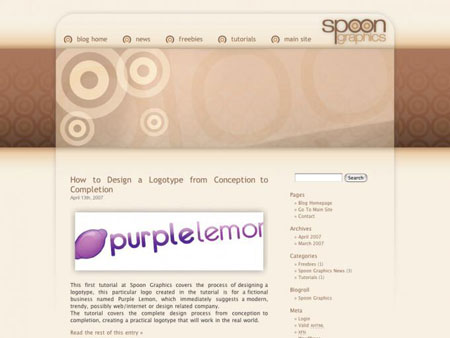
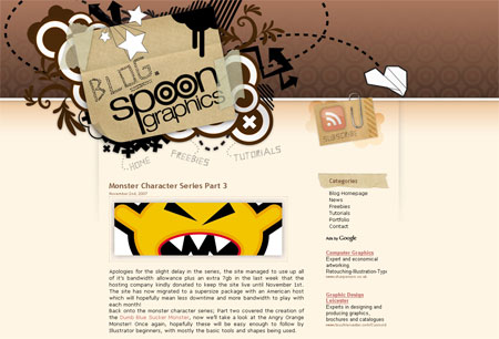
I just can’t help getting bored with the design of my own sites, and sooner or later I’ll get the urge to rebuild the whole theme from scratch. The last update was back in December 08, so that version lasted the whole year. Nowadays the redesigns are more like design refreshes, as they retain the main layout, colour scheme and the famous header illustration. Here’s how it’s changed over the year:
April 2007
November 2007
August 2008
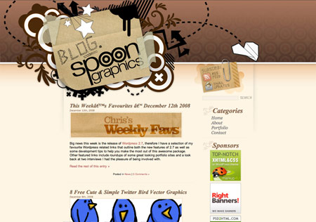
December 2008
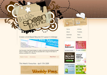
December 2009
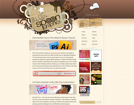
So what’s new in this version? Well, I took the design right back to the PSD concept and rebuilt the design and theme with a few extra little touches of detail. Little things like the background texture and the revised colours of the header illustration are amongst the changes.
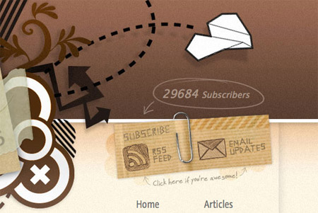
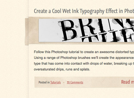
I’ve also added some extra little touches in the form of header strips that run behind the main article images, and beneath certain page headers to help spice up the page and separate content into clear sections.
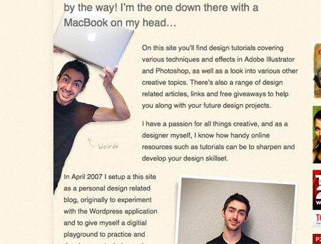
The about page here on Blog.SpoonGraphics has always been a kind of after-thought. So this time I’ve spent some time working on the page design itself, adding some extra imagery and content in there.
New Members Only Section
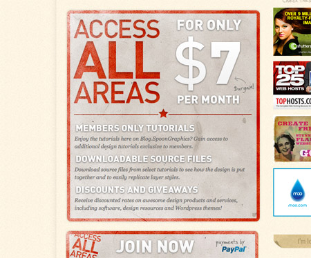
Over the past few months I’ve been laying out plans to extend the site into an additional members-only section to run alongside the usual free content I publish each week. After lots of development I’m proud to finally release the Blog.SpoonGraphics Access All Areas membership scheme. As a member, you’ll gain access to exclusive members-only tutorials, premium files & resources and a stack of discounts for some awesome design related products. Not to forget the ability to download the source files from select tutorials.
At $7 (~£4.30/€4.80) I’ve aimed to make it super value for money, so that members can easily make back their membership cost in seconds. To kick start the Access All Areas section, I’ve released a premium WordPress theme. With a name of Retrospective it’s built around one of my favourite styles of design, so I hope there’s a bunch of you who can find a good use for it!
Keep an eye out for the upcoming premium content, there’s stacks of discount coupons for some awesome design related products and services that I’ll be publishing over the next few weeks, and I’ve got a few ideas for some handy design tutorials and resources.
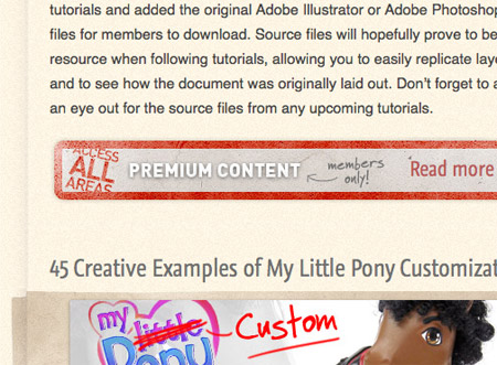
Sound good? Find out more about Access All Areas, or if you’re sold already, go ahead and join.


Hey Chris, congrats on the membership and redesign it – looks great, though of course I’d expect nothing less from you.
All the best for the future!
the first thing i notice here the thumbnail redesign, its getting eye attraction. and premium services are welcome and cheap too ;),
-=-==- iam changing my theme redesign today.(its a premium theme, just i edited for user freindly) have to learn create and code from scratch.-=-=-=-=-=
please this type of tutorials will be useful if you put this in line25.com
All the good wishes and merry xmas :D
Very nice Chris. Good job on the redesign. I can see some even bigger things in the future of Spoon Graphics.
I will definitely look into subscribing! Keep up the great work!
Really like what you’re doing and the idea with Members-only content. I hope it works out well for you!
All the best Chris!
Really nice redesign. If you are a designer and do lots of design projects, its very hard and difficult to get time for own website and work on it. You lucky to manage this :)
I’m liking the new look and nice work on the premium content, you always have a high quality of work on here and over @line25.
Cheers for a good year of posts :)
I’m love the style.! So cool design:) Hope the tutorial.
I don’t like your entire post not showing up in my RSS feeder!! :(
Looks great Chris!! Love your attention to detail and subtlety of the design makes it really shine!
Very nice! The changes look awesome, subtle but awesome! I love how your plane was diving down before but is now up in the air! cool :)
Maybe I don’t visit often enough Chris, but your changes are always so subtle I hardly notice them. I love that you’ve embraced your brand and never stray from it. Instead, you take notice to the things that need improvement, ignore the things that aren’t nearly as important, and stick you what’s gotten you this far.
You really understand the value of hitting it hard with great content and then welcoming new users and getting them to kick off their shoes and stay for a while. That’s what has made this blog what it is. Love it man, keep it rolling!
Great design work – new inspiration is always useful and appreciated.
Thanks
Eoin
Thanks for that. Also, feel free to browse my new site http://koocha.com with lots of design stuff collected from Internet
Nice work Chris!
About page is really awesome and I love this noise background texture….
Brilliant! The new version is really standing out! I loved the subtle shadows! Keep up the good work!
hey Chris, good job man… little improvements make the biggest difference. I know I always notice the detail on a website over anything else…
The updates look good. I love the new details.
Very nice refresh Chris and good luck with all of your new features!
You are very talented man Chris :) I’m your fan. I love your work and the idea how you mix and match colours and shapes. I’m also a designer will little experience but huge ambitions :)
Again, great work :)
Love the new redesign, spent a little while playing around the site figuring out all your changes. Good luck with the membership area.
This enhanced version is looking nice. You are not disturbing the exiting look and feel to enhance it. It’s a great branding job. Nice move.
I think in april 2007 ( first design is not bad… ) you can only finish this template.. Maybee is will better…
Thanks for show your history, this is interesting.
Looking good. Though the jpg compression in the header etc. kinda disturbs me now that I noticed it.
Love the little updates, they always make the biggest impact!
How have you achieved the backend to your new premium download member section? is it handed coded or is there a nice little plugin for wordpress?
Cheers
Chris, you manage a very good balance of shrewd business strategy and GREAT design, with some very good usability rules firmly adhered to. Keep up the good work.
Very nice progression Chris. I really like the look of your site (love the kraft paper use – it gives it such a powerful contrast). Looks great!
Hello there guys
How do you add font to the page just like spoon graphics has, i heard that it only works in Internet Explorer But i am using Firefox and it works ?
Tell me what you think of my website too guys i designed it myself its not finished thou
http://www.snailtags.com
Please Be nice