In this week’s roundup of creative goodness, we have a modern website layout tutorial; a fabulous Adobe Illustrator character tutorial; a roundup of the grunge theme in web design; a prediction of upcoming design trends in 2010; and an overview of current iPhone App website design trends.
Six Revisions
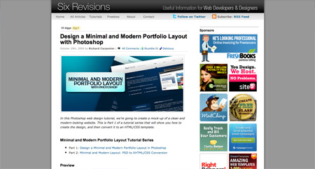
Six Revisions host this great Photoshop tutorial that covers the process of building a great looking modern portfolio website layout. Learn how to use various layer styles to create subtle interface effects.
Ai Monkey
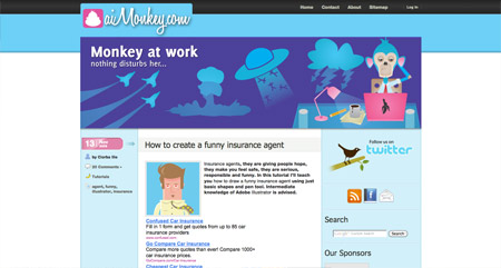
Ai Monkey is an awesome new blog I recently stumbled across. It’s based on the topic of vector graphics and Adobe Illustrator, and is already packed full of some fantastic tutorials. This particular tut shows you how to create an amusing insurance agent character.
Spyre Studios
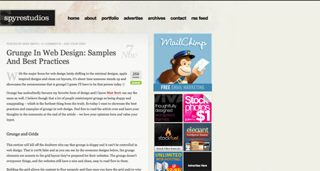
If, like me, you’re a fan of rough and grungy design this post is packed full of inspiration. Spyre Studios host this great collection of samples and discussion about the grunge design style.
Web Design Ledger
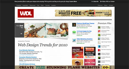
With 2009 coming to an end there’s talk of what design trends are in store for 2010. Web Design Ledger post this collection of items that we’re likely to see more of in the new year.
Web Designer Wall
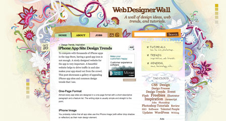
Web Designer Wall takes a look at some of the trends that appear in iPhone app website design, giving a description of common elements as well as a fantastic roundup of examples.


Great list. I will get on this list one day, it’s one of my goals for the new year ;)
Nice roundup. Funny thing is, they’re all in my favorites.
Nice list. I really like WebDesigner Wall.
Very nice websites. I especially like Web Designer Wall.
Good list, thank you!
The Spyre/grunge link is cool–like my websites a trifle “smudged.”
Thank you, Chris for this site!
P.S. My first message here
Hi Chris, thanks for sharing these great links, especially the iPhone app trends!
Very nice list, thank you
Anyone else tired of the layout like Six Revisions has? I see it everywhere now. Content in the left hand and little boxes showing affiliates in the right hand column. It’s even used here. I feel like I’m visiting the same sites all the time. Maybe it’s just the constraints of using a CMS, but I just can’t help but feel tired of the same look on the blog sites.
This is Extremely good
Hi Chris, your blog is my absolute favourite read for inspiration, tutorial and taste! Thanks so much. Toni
I will get on this list one day:) In a meantime I’m adding only quality content on blog about design.
I bet, when in the beginning on your blogging career you, Chris felt extremely proud seeing your blog mentioned somewhere else in the blogosphere.
Now it must be nice feeling to have so many loyal followers :)
Hope soon the student will surpass her master (:
Well done Chris
Hopefully I’ll get In your weekly favourites one week!
This is Extremely good
Hi Chris, your blog is my absolute favourite read for inspiration, tutorial and taste! Thanks so much. Toni
Hello Chris, Thanks for putting up this . I know several people will search for this and find it useful in the future.