Videos
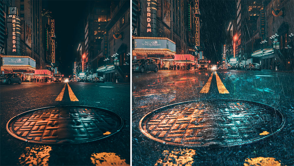
In today’s video tutorial we’re going to use the power of Photoshop to change the weather by making it rain within a photograph. We’ll incorporate various tools and filters to not only create a downpour of raindrops, but also make adjustments to the image to give the appearance of a wet surface with reflections of the surrounding environment. This effect works best with street images set at night because the darker backdrop helps make the raindrops visible, and the hard asphalt roads and pavements can be adjusted to create realistic puddles.
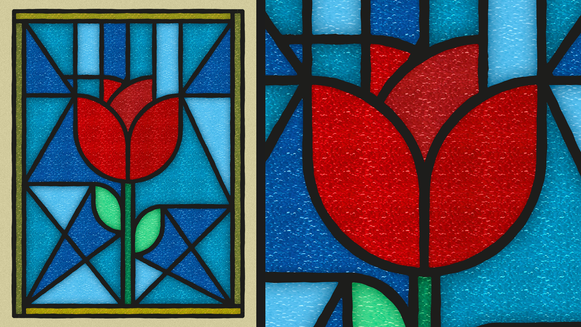
Follow along with this tutorial to learn how to create a stylized illustration with the appearance of a stained glass window, where the artwork is segmented into several coloured shapes. I’ll first show you how to create the simplified illustration style by using Illustrator’s shape tools to draw a rose graphic. This vector art alone is a nice, bright, flat illustration style, but I’ll then show you how you can transform your artwork into a realistic stained glass window with the help of a fantastic resource from The Artifex Forge.
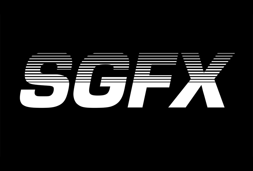
I’m not entirely sure what to call the text effect I’ll be showing you how to create in this Adobe Illustrator tutorial, but it’s the kind of futuristic text style you might see on old VHS tapes, old sci-fi movie titles, or maybe even classic sports or tech brand logos. The best name I can come up with is ‘futuristic gradient speed lines’! The process of creating this effect is quite simple, but it includes some must-know techniques that can be applied to all kinds of projects in Illustrator. I’ll first show you how to permanently apply the effect to some text but stick around to see an alternative method that keeps the text editable.
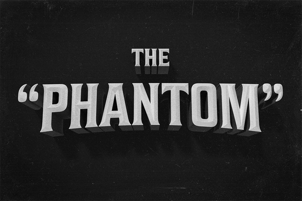
In today’s video tutorial I’ll show you how to create a vintage movie title text effect with the help of Photoshop’s 3D tools. This style of classic film titles is reminiscent of old black and white movies from the 20s, 30s and 40s. Most of the hard work is done by Photoshop’s 3D functionality. Just some configuration of the settings is all that’s required to produce the three-dimensional effects and the chamfered text face, along with low key lighting and shadows.
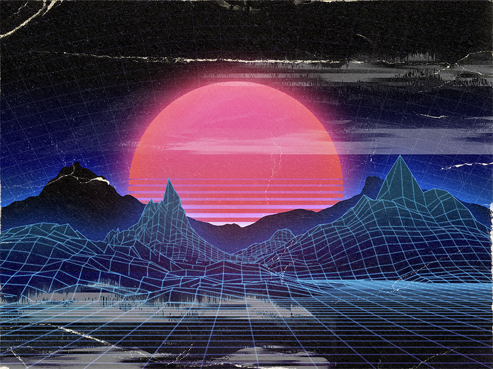
Today’s video is a reproduction of last month’s written tutorial on how to create your own retro landscape scenes with the help of a huge 80s inspired toolbox named NeonWave. Sci-fi landscape scenes featuring Tron-style grids, mountain scenes, and a vibrant sunrise is a popular aesthetic that is associated with art and design from the 80s. The artwork I will be creating in this tutorial has been made using just a handful of items from NeonWave. I’ll show you how to compose the elements, produce complementary elements from scratch, and apply the all-important lighting effects directly in Photoshop.
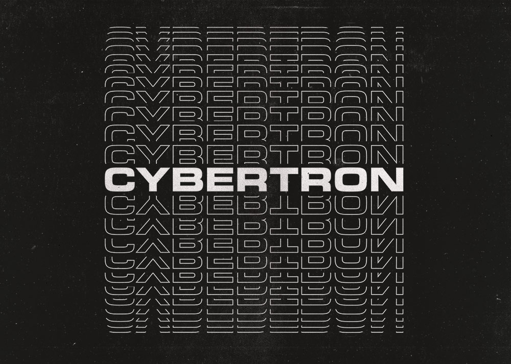
Follow along with today’s Adobe Illustrator tutorial to create a simple but effective text effect with somewhat of a retro vibe, featuring stacks of text elements that are progressively spaced further apart. It reminds me of the kind of design you might see on an old VHS tape box or an ad for an 80s technology brand. Illustrator’s Blend Tool will be used to create the basic effect, but I will also show you a trick to alter the spacing of the text with a cool easing effect and show how variations of the artwork can be created by combining different combinations of solid and outlined text styles.

