Tutorials
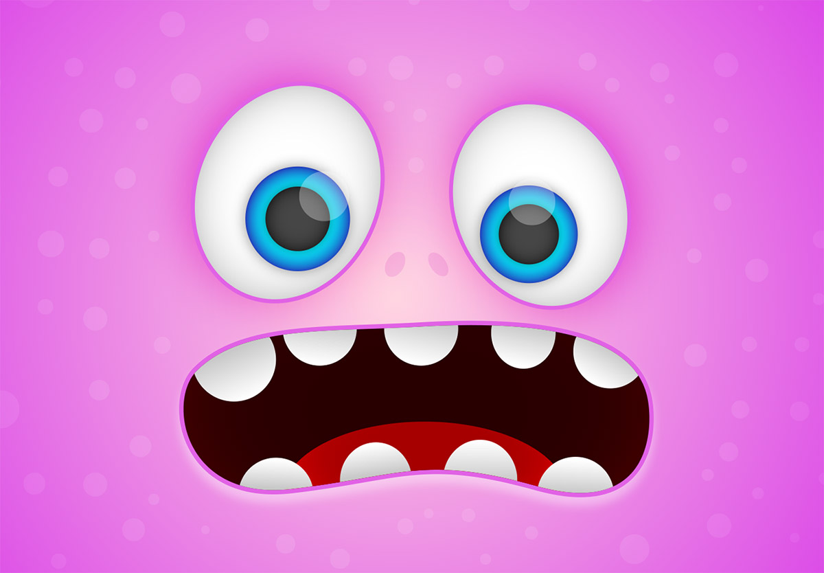
In today’s Adobe Illustrator tutorial we’re going to combine simple shapes with colourful gradients to create a fun cartoon style monster face. We’ll just concentrate on creating the main facial features which emerge from the background in this tutorial, but you can use the same techniques to illustrate almost anything. Keeping things simple not only helps make this tutorial good for beginners to get to grips with creating vector artwork in Illustrator, but this simplistic and stylised effect lends itself well to cool avatar graphics, product skins, or even stickers if you were to crop the artwork into a circle.
Textures are a common addition to vintage style logo designs and type designs. Designers use them to mimic the aesthetics of old prints and handmade art to give their digital artwork more of a tactile appearance. There’s a number of techniques that can be used to apply textures to your designs in Adobe Photoshop, using built-in filters and effects, or tools such as textures and Photoshop Brushes. In today’s tutorial I show three ways you can distress your logos and text, each resulting in a slightly different appearance.

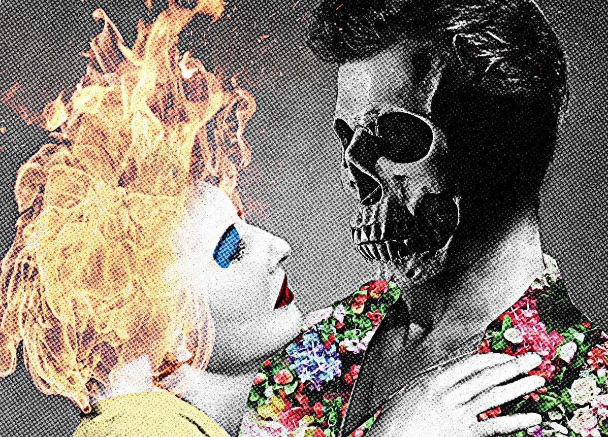
Today’s we’re going to have loads of fun creating an abstract—and quite surreal—collage style piece of artwork in Adobe Photoshop. This kind of art style has been popular for years, although originally it would have been made using traditional photomontage techniques with photographs, magazine images and newspaper clippings, all cut apart and reassembled using scissors, glue and photocopiers. These days we can use digital techniques to make things without even getting our hands dirty! Plus there’s a wealth of source material readily available in the form of stock imagery that we can pick and choose from. If you browse Google or Pinterest for some examples of surreal collages, you’ll see there’s literally no limits to what you can produce. I personally love the ones with comical outcomes that are made with completely random combinations. For this Photoshop tutorial, we’ll use a selection of free stock images along with basic Photoshop compositing techniques to create a fun abstract piece of artwork. Traditional artists sometimes used paint or pastels to add colour to their work, so we’ll do the same with pixels. Then to mimic the analogue reproduction methods originally used, we’ll distress the result with some effects that mimic bad photocopy prints with high noise and harsh contrast.
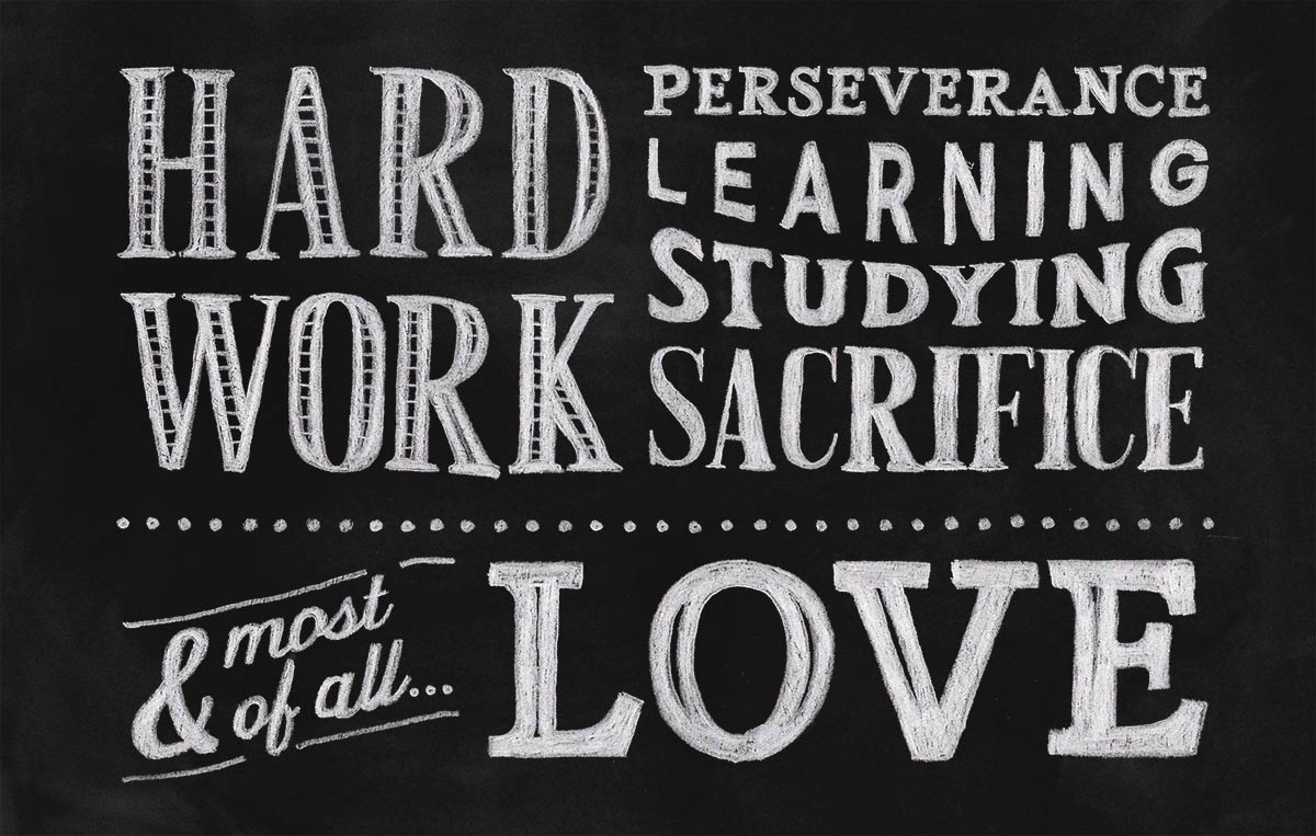
Today we’re going to take a look at creating a chalk lettering effect, just like the trendy menus you see in bars and cafes, or the quote murals all over Pinterest. We’ll use the digital power of Adobe Illustrator to plan out our typographic quote design with fonts, which allows us to experiment and move elements around. This isn’t something you can do with chalk, without rubbing it out and starting again! To achieve the most realistic effect possible, we’ll then make use of some analogue tools to capture the natural irregularities of hand made art.
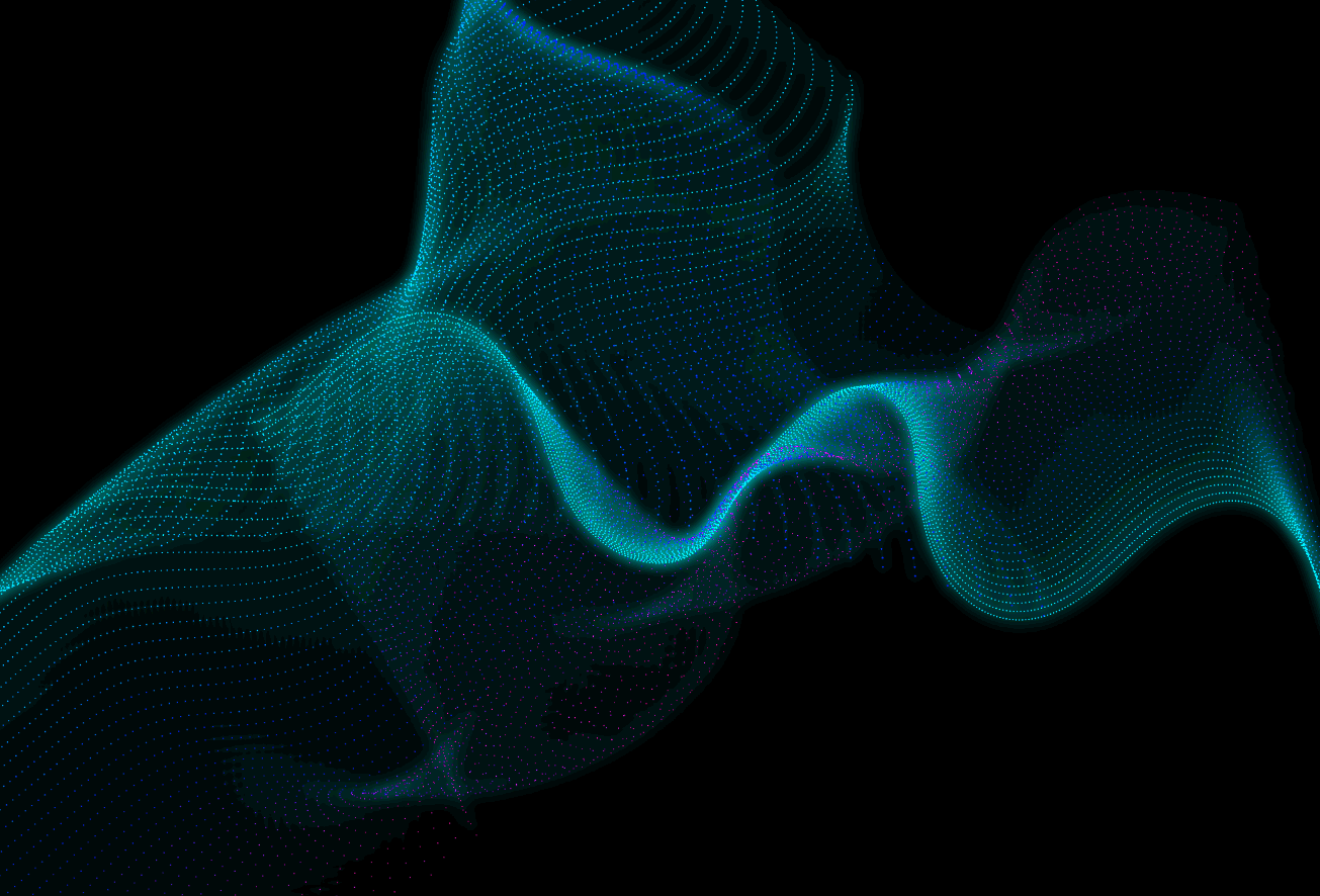
The blend tool in Adobe Illustrator is often used to create abstract wave graphics, but I’ve been experimenting with some additional adjustments and discovered some handy tricks to create sci-fi inspired digital particle waves. This kind of imagery perfectly complements hi-tech interface designs with colourful data visualisation effects, or it could be used to create abstract art in its own right. We’ll create the initial effect in Adobe Illustrator, where I’ll show you a few options for randomising the result, then switch over to Adobe Photoshop for some extra colour enhancements to really boost the vibrancy.
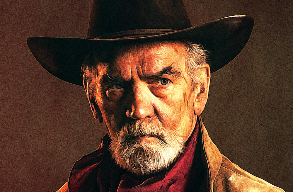
In today’s Photoshop tutorial I’m going to show you a mix of filters and adjustments we can apply to a photograph to mimic the retro style airbrushed painted look associated with classic film posters. Imagine the poster art for original Star Wars trilogy, the Indiana Jones movies, and pretty much any action/adventure film from the 80s! They all feature incredibly life-like depictions of the the actors and characters, which are almost like photos, but they have a clear hand painted appearance with subtle brush strokes, outlining marks and quite high contrast with vibrant colours.

