Designing for print can be a minefield for beginners. There’s so many easy mistakes to make that can have a serious impact on the quality of your final prints. With print runs also being very expensive, these mistakes can prove very costly. Hopefully today’s discussion about common beginner mistakes to avoid will help prepare you with the crucial knowledge required to correctly set up a design for print.
Know the difference between RGB & CMYK

The most obvious mistake that newcomers fall victim to is the misuse of RGB and CMYK colour modes. RGB (red, green & blue) is an additive colour system where light is used to mix colours; the more light you add the brighter and more vibrant the colour gets. When working on digital designs you’ll often be working in RGB mode because that’s how your monitor works, but the problem arises when we’re creating a design for print using a RGB based tool.
CMYK (cyan, magenta, yellow & black (key)) is a subtractive colour system where inks are mixed to create a range of different hues, much like mixing paint as a traditional artist. The more ink you mix the darker the colour gets. The spectrum of colours that can be produced by light is much wider than the range achievable by ink, so our design applications have a special CMYK mode to limit the “gamut” of the colours we have available when creating a design that will ultimately be printed.
Failing to select the CMYK colour mode and instead creating your designs in RGB may result in you selecting awesome colours that just can’t be reproduced in print (without special inks). If you don’t realise this early on you’re going to be in for a surprise when your prints come back all dull and muted.
Watch your CMYK color values
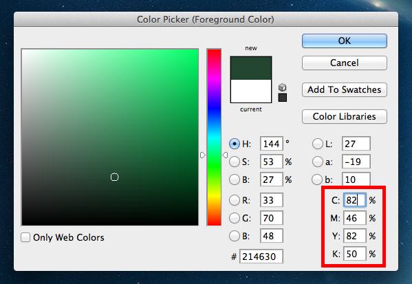
We’ve already talked about how the typical CMYK color model gets darker as you add more ink. In the printing process this is done using an offset lithographic printing press (or a digital printer for small runs). This machine lays down a coverage of the four inks of cyan, magenta, yellow and black over the same area of paper to overlay the inks and create a much wider range of colours. Tiny halftone screens determine how much ink from each plate is applied across the print.
In our design applications we can easily select colours using the color picker tool as well as ready made swatches and adjustable sliders for the C, M, Y & K values. You must keep in mind that colours that use large amounts of cyan, magenta, yellow and black will quickly become oversaturated and any total values containing over 280% coverage may result in ugly muddy colours and set-off (when the ink remains wet and transfers from one sheet to another). Our computer applications might show the colour looking fine on screen, but in reality prints always appear darker than your original design.
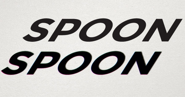
Using mixtures of multiple inks will also result in potential fuzziness, especially when applied to fine artwork such as text. If those four C, M, Y & K plates are just slightly misaligned (known as registration), your text will appear blurry and difficult to read. Perfectly sharp text can be created by using just one process colour value, so 100% K (black) will be as crisp as you can possibly get.
Don’t use Photoshop black
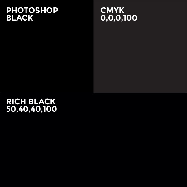
Open Photoshop and hit the D key to reset the foreground and background colours to their default values. Select the black that has been generated for you, it looks… black, right? Now look at the CMYK values that colours is made from, you’ll find 75% cyan, 68% magenta, 67% yellow and 90% black (300% total coverage). This is a lot of ink to put down on paper. Always manually set your black appropriately. This could be 0,0,0,100 for that crisp black for text, however this doesn’t look great when used as a background colour with it looking more like a dark grey than black. Instead you might opt for a “rich black”, of which there’s many recommendations, but 50,40,40,100 is a popular choice. This addition of other colours darkens the black to provide a much deeper colour, but it’s still well within the coverage limit.
Read more about designing with black
Keep an eye on your font and line weights
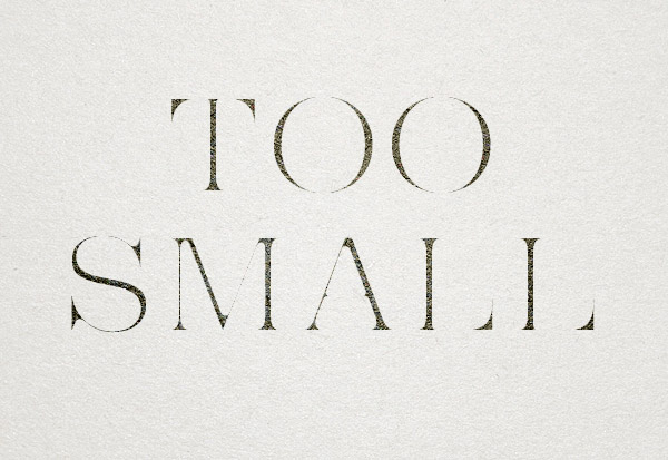
Those halftone screens in the printing press do a great job of controlling how much ink is placed onto the paper. They work by simply using a lower density of tiny dots in areas that don’t need much coverage. The trouble is you also lose detail when you try going too small, so tiny text and fine hairlines in your artwork are the first elements to become illegible. A limit of 6pt text size is the rule of thumb, but it all depends on the style of your typeface. Helvetica Ultra Light will probably disappear at much larger sizes due to its super fine lines! Keep this in mind when setting any small print within your designs.
Set the correct resolution
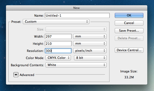
On your computer the resolution only really alters how large your image physically looks on screen, whereas in print resolution determines how sharp and crisp your designs will appear. 72ppi is the usual figure for web images, but in print 300ppi is the standard. The more dots or pixels you can put in every inch the more detail the overall image will retain when the image is reproduced in ink.
Make sure all your artwork is created at 300ppi, that includes all images and photography. If you happen to throw in a 72ppi image into your 300ppi working document it will appear tiny because it will be resized accordingly. You’re going to need massive images to fill most documents at 300ppi, so random images from the web just aren’t going to cut it.
You can’t scale a design up in resolution, so make sure you set the document size correctly to begin with to avoid having to start from scratch.
Read more about image resolutions
Don’t forget the bleed

Resolution isn’t the only crucial factor when setting up a print design layout. You’ll also need to remember to accommodate for bleed. Bleed is an extra margin around the edge of your design where any background elements that touch the edge of the page are extended slightly. This allows for slight inaccuracies when the printed sheet is trimmed to size, so cutting through that buffer of colour will avoid leaving any thin white strips of paper along the edge of your print.
The actual amount of bleed you require will differ between print supplier and project, so be sure to select a printer beforehand and acquire their specs.
Learn how to set bleed in your print designs
Kern, proofread and spell check

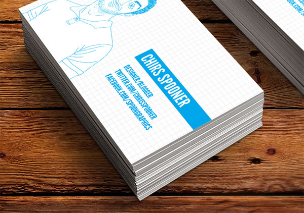
Typos suck! Despite proofreading this blog post there’s probably a couple of errors that still slipped past me. Fixing mistakes is easy on the web, but imagine how devastating it would be if you take delivery of your 5000 prints only to find a glaring error staring right back at you on every single one! Mistakes in print can’t be rectified, so take your time to check for ugly kerning, misuse of em/en dashes, curly quotes and the usual there/their/they’re errors that aren’t picked up by spell check. The image above is fake by the way… That would have sucked big time!


Great tips Chris. I’ve actually experienced the final example. I remember taking over a design post from another designer and sending the artwork (completed by the previous designer) for a business card to the client for one last check before sending to print. I don’t know what made me open the artwork again after the client had given it the OK, but I’m glad I did as their name was spelt wrong. Needless to say I wrote a firm email to the client asking them to check EVERYTHING in the artwork.
It would have probably been cheaper and easier just to get them to officially change their name if the print went ahead!
This is Awesome, Thanks!!
For spell checking I use prolexis, a great tool for checking typos & automatic typographic enhancements. Anytime I forget to use it I left typos in my layouts!
Great stuff Chris. I’m a web designer but was asked to produce a printed programme for a local football team. With no experience whatsoever in designing for print I think I made all of these mistakes plus a few more!
I had no idea that Photoshop black was so bad, I use it all the time! I’ll make sure I don’t in future.
Haha don’t worry, we’ve all been there!
A lot of printers probably can handle Photoshop black, but the theory behind the total coverage is definitely worth knowing.
Another awesome article Chris. I bow to you, my jedi master. It sadly happens that I’ve broken more than half of the rules when creating my print designs…
I have one question though.
I was doing my prints in RGB in photoshop, then I converted it to CMYK. And then, because I didn’t like the paleness of one blue, I took the Hue And Saturation Adjustment Layer, tweaked the settings, applied it only to that blue layer, and the print result looked better than without the HueAndS.adj.layer.
What have I done actually? Did I let the print to layer more ink on that blue so it appears richer? Did I shift the CMYK to a more blueish blue?
Thank you!!!
Thanks for the kind words Jan!
When converting to CMYK Photoshop does its best to match RGB colours to the closest value in CMYK, but as you discovered, having control over the actual colour you want gives you the the best result.
The Hue/Saturation adjustment will have tweaked the cyan, magenta and yellow values to create a richer blue, but one that’s still within the ‘gamut’ of CMYK.
Hi,
You should have added, converting text to shapes, since if you are not using regular fonts, could lead to problems with the print
All of this are good examples for novices and even veterans….mispelling and typing mistakes are veeeeery common!!
Nice post Chris!!
I arrived at all this the “old” way. I did print first and then migrated to web. Ugh! All the fonts I could no longer use and all that. But, most of my print experience was for web presses and they are a wholly new set of problems and oddities. But, you are correct in this posting. Getting the difference between RGB and CMYK is a “leap” which, once done, you “get it!” and before that you never quite understand it. Nice article.
Great post. Wish I had this 6 months ago when I made the jump from web to print!
Especially as a self-taught designer (it was only a hobby before I got employed as one), it’s good to be reminded of the basics.
Great tips! Cover many problems I’ve incountered in the past!
One thing about print I still struggle with is the addition of photographs. Any advice on that?
I’ve had web clients in the past ask me to put together magazine adds, and come accross issues like the amount of ink required being too thick etc.
Any advice on how to set up photographs for print?
Hi Matt,
‘ink being too thick’ is commonly referred to as exceeding Total Ink Limit – measured in total percentage of CMYK.
Generally you would be aiming for no greater than 300% for offset printing on a coated stock. Ask your client what stock/paper they will be printing on, as a matter of fact this is one of the very FIRST things a print designer needs to know. ie. “What print production method/process is going to be used, and on what substrate”?
The answer to this question will set the scene for how you construct your design – There are definite “limits” to printing on paper, golfballs, mugs, t-shirts, the sydney opera house etc. Web design has much less limitations.
Don’t be afraid to ask the client – a ‘good designer’ should gather, and be given as much info as possible prior to starting the actual design & layout.
Anyway, you can set up your ‘info’ palette in photoshop to show you the cmyk & total ink of your images.
Fixing your issue? – well you will need to do a bit of research regarding the use of GRC (Grey Component Replacement) and UCR (Under Colour Removal). In essence, you need to remove some of the ‘neutral’ CMY component and replace with Black. Resulting in less ink down and more detail in the shadow areas.
If you get stuck, I’m happy to give you some help – not sure how to do it on this forum though.
Cheers, Steve.
Awesome tips Chris! I have encountered a lot of these in the past. Now learning the best steps to take when going from digital to print.
I don’t know how I came across your Blog Chris. But It has been the best one I have ever read. I am a Printing Technology major from the Fullerton College class of 2012. While taking the course I also took a Web Design class. So I am a true beginner.But every thing that I have read from you has been very helpful.
Thanks,
Dave
Great read Chris, thanks a lot.
Very thorough and something I can pass to my co-workers around here. Often times I am asked why certain colors on the screen look muted in print. I try to explain to them, but not quite like this.
Much appreciated.
Steve
I use Photoshop since the year 2000 and had a VERY hard time with all these things you point out, so I had to learn the hard way.
The best thing for me in this article is that it shows me that I’m glad I’m still a begginer.
I learned WHY I should do things this way or that way.
Thank you so much!
Thank you, we used
nice remainder :)
Thank you! I took some notes from this one!! Love the tip about not going over 280%. Once again you give quality advice and information that is helpful in everyday design.
:-)
Hi Chris. I am currently taking an InDesign class and our assignment was to find a blog that was geared toward graphic designers. I searched and searched but kept coming back to yours. Your articles and tutorials are very useful and informative. I also appreciate that you share the patterns, textures, etc. Thank you. I will definitely be using your blog as a learning resource.
Some good tips. I’m just starting out selling prints of some illustrations I’ve done and it’s a minefield.
I thing I don’t get though is I create stuff in illustrator using CMYK. I then copy it as a smart object into photoshop to print. So far so good. Then I try to apply a vignette using lens distortion and it is greyed out until I covert it to rgb.
Also why are you still allowed to pick colours as rgb when your document is in cmyk mode?
Great tips Chris,
Esp the black colour one!
I had totally ignored that for sometime. Thank God none of my prints were spoiled.
Thanks again !
Great points Chris. I think every designer makes at least a few of these before learning the lessons. I’d also like to add being mindful of your fonts in AI, PS and InDesign. How they will transfer, what should be text or outlines and not working with raster text. Great work, this will surely help someone.
Great tip for proofreading. Read it backwards!
Just what I needed. Thank you so much.
The offset printing service is india is considered to be one of the most effective tools for advertising the business. These printing services are used for the creation of flyers, business cards and other promotional items.
If I can add another one, check your overprints. There has been one or two time that I’ve had text come out the wrong colour or completely disappear into a background because of this.
Thanks so much for this. I have experienced some of these.
Really happy I came across your site today. Thanks for the freebies too!
its was awesome, and help me lot as im beginner on the designing world that really helped me. so could share more knowledge about color theory and font family in designing …….
All awesome tips, have been following them without actualy knowing what to call them, but i have a question, i did a show where all my prints came out green, i checked all my colours where CMYK, PDF format was correct, what could have caused this?
Great information for designers! Having worked in prepress for over 15 years, I can vouch for the fact that these aren’t just “beginner” mistakesl – a lot of files from design professionals can be problematic for these and many other reasons. Be open to working with your printer to avoid any problems – they should be happy to give FREE advice on how to fix your files… just don’t take it too personally. Many designers get pretty huffy when someone says their files “might” not be exactly perfect! ;-/
I’ve worked in repro for a long time and seen all these mistakes, and many more, several times. It seems that it’s just not taught at design school – so many great designers just don’t understand the medium they’re designing for.
I do InDesign and design for print training if anyone wants help.
ppi is for print only, 72ppi standard for web images? you can use 1ppi, does not matter for web.
I’m a pre-press/graphic repro professional.
The standard term in the printing industry for image or halftone screen resolution is dpi (dots per inch) but it doesn’t really matter at all what you call it ppi (pixels per inch) or even epi (elephants per inch!!!).
The important thing to remember when you are creating graphic elements in photoshop for print production is to look at Image/Image Size/Document Size. (use Pixel Dimensions for creating web graphics).
What you should be aiming for is a resolution of between 280-300dpi roughly at the size (width/height) you envisage it will be printed in the final document.
There is no benefit going any higher, other than you can scale it up more if you had to, which is a lot of mucking about trying to work out if you have enough resolution. Also it makes the file unnecessarily large if you’re going to upload it. Anything under 280dpi and you will risk pixelation.
Finally, please please please do not create text heavy documents in photoshop – use indy or illy instead.
Sorry about the rant, hope I added something positive to the conversation.
Cheers, Steve.
Hi Chris, great article as usual!
I sometimes get issues with using the correct colour profile in Photoshop for screen images. Possibly would be the same when working with CMYK images in PS.
Would be great to get your thoughts and workflow ideas around colour profiles, monitor RGB etc.
Cheers, Rich
I so need this. Some of this was a refresher, and some I’m definitely guilty of, even now with 8 years experience! Thanks Chris.
Excellent post. I constantly have my web design clients trying to use a their website header as a letterhead. The colors never seem as they are on screen due to the CYMK-RGB conversion. This is a great solution to produce more vibrant and robust print material by simply adjusting a few values.
not to mention the resolution difference! ugh!
Thank you invaluable advice
Great article, It’s shocking how many ‘Designers’ there are out there who make all these mistakes and more. (I know a few) These are fundamentals for designing for print!
Good post, Chris. I “grew up” in a print shop (it was in the house) so I have a history with all these fundamentals. Another visitor mentioned the “convert to outline” trick that I was going to mention. I frequently run into projects that other designers have started, and I get to fix them!
Great informative tips to which we all as designers will have had issues with over the years of designing for print!!
Well! It’s awesome post for discussion. I think the important thing to remember when you are creating graphic elements in photoshop for print production is to look at Image/Image Size/Document Size.
I didn’t like the paleness of one blue, I took the Hue And Saturation Adjustment Layer, tweaked the settings, applied it only to that blue layer, and the print result looked better than without the HueAndS.adj.layer.
I would like to Say Thanks for sharing this post.
I’m a web designer primarily but also occasionally design for print. The biggest issue I have is colour. Something will look great on my screen in CMYK, then I print it out and the colours are duller than expected.
Is this because of the 280% thing you mentioned? I struggle getting an accurate representation on my screen as to how it’s really going to look and often end up disappointed.
well, you can’t just convert rgb to cmyk and save all the colors. it has not much to do with 280%… one can get great results even with 240% ink. Adjust your monitor, design in cmyk mode, use simpler colors like if u need pink try pure magenta, don’t do crazy mixtures, result even in pro print will be unpredictable:)
Thank you invaluable advice
It’s in reality a nice and helpful piece of information. I’m glad that you shared
this helpful information with us. Please stay us up to date like this. Thank you for sharing.
Extremely excellent post ! I was eager to see an interesting stuff like that. I must appreciate this remarkable post.
Thankyou so much for the information on the 280 %, a conversation i had with my last printjob makes so much more sense now! :-)
Nice blog!
Thank You and Appreciate!
All great tips for beginners. One More I feel is important to mention.
Always design at full Scale.
Design a print item with the canvas set accordingly. Don’t expect to be able to just simply enlarge you entire design when done to fit any dimension.
As a customer service rep turned designer and typesetter I can tell you it is great to see some designer-on-designer information going around. It’s hard to explain to web designers the intricacies of formatting a design for print production.
Most printers know this is a challenge and will simply upcharge the job or add a fee for prepress work, but if the designers meet us halfway it’s always that much easier on everyone involved.
Hi Chris,
I am currently in a graphic design program, and stumbled upon your website while browsing for design blogs. I love your site! It is so easy to navigate and full of helpful information. My instructors encourage the students to research working designers and design blogs that are outside the scope of our assignments. Your site is, by far, the best one I have found.
I just wanted to say thanks for such a great site!
Thanks Chris! Very good written advice :)
Hi, Great tips thank you! I have a question, I am designing a book cover using photoshop, my PDF looks wonderful on PC and MAC, however when I view the PDF from my phone, it is oversaturated. Any ideas why? My document in photoshop is set to CMYK, my colour settings are RGB: Adobe RGB 1990 and CMYK:US Web Coated (SWOP)v2
I like the valuable information you provide in your articles.
I will bookmark your blog and check again here regularly.
I’m quite sure I’ll learn lots of new stuff right here! Good luck for the next!
Haha…have I not read this article, I wouldn’t have known my mistakes when designing for print…especially using Photoshop Black….it’s a no-no.
Thanks for the share Chris!
Thanks for sharing your thoughts. I really appreciate your efforts and I will be
waiting for your next write ups thank you once again.
Great tips! Some I’d never heard before, and I’ve been working in print for 15 years.
One tip I’ve learned, when working in Photoshop, is to “View as CMYK” I think it’s under “Proof Colors” in the View menu (Cmnd Y). This allows you to see what the image would look like once the mode has been changed to CMYK while still working in RGB. There are many effects, etc that aren’t available when the mode is set to CMYK, so this circumvents that problem.
Our printers (I work for a newspaper) have very specific color requirements, and this was their suggestion for getting the best color results.