Whether you're a student designer learning the tricks of the trade, a web designer looking to delve into the world of print or an accomplished designer looking to broaden their knowledge, there's always something to be learnt when it comes to designing for print. One of those areas is how to approach using blacks in your design and knowing how it will end up when it comes back from the printers. Read on for a few tips and techniques on how to create artwork containing black.
Black is just black, right?
In the world of web where you're designing for the screen black is black, zero amounts of Red Green and Blue. There are no hidden gremlins to catch you out (apart from those percentages of people with the brightness and contrast levels completely out of sync on their monitors!)
When designing for Print however, the four colour CMYK process is used, where K (key) is the black ink alongside Cyan, Magenta and Yellow. But, there's slightly more to it than that!
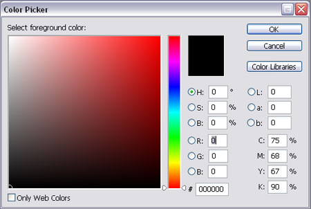
Selecting Black in Photoshop
The default black setting in Photoshop is not ideal for print. Open up the colour picker and select the black you are used to using on a daily basis, look closely at the CMYK values and you will notice it is made up of:
Cyan – 75%
Magenta – 68%
Yellow – 67%
Black – 90%
There are three main problems this could cause:

Issue one, importing into Illustrator or InDesign
Let's say you have created the above image in Photoshop using the default black, and you want to place it into your InDesign or Illustrator design document on a black background.

You open up the InDesign or Illustrator package, draw the square on the artboard, fill it with the black swatch and place the artwork onto it. All looks good and it goes to print.

What you didn't expect is that it would come back looking like this on all 1000 copies of your printed designs! The reason for this is that the default Photoshop black is made up of a mix of all four colours as mentioned above, whereas Illustrator and InDesign use the correct swatch of 0% Cyan, 0% Magenta, 0% Yellow and 100% Black. As you can see these two versions produce very different results.
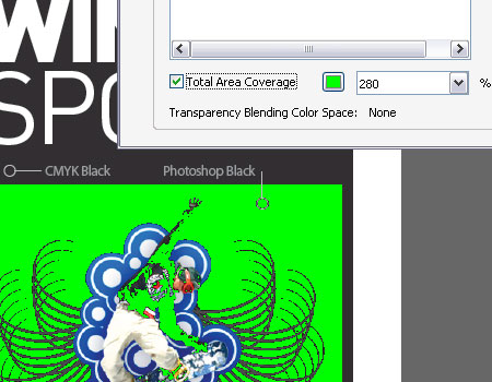
Issue Two, total ink coverage is 300%
Export your design as a PDF as use the Adobe Acrobat Output Preview tool to check over the file, if you turn on the Total Area Coverage option it will highlight areas with over 280% ink coverage as a potential overinking problem.
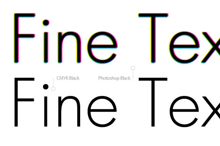
Issue Three, fine text will become fuzzy and illegible
If you have created text in Photoshop with the default black colour, particularly small typesizes or fine serif fonts, chances are they will return from the printers as very blurry or fuzzy and possibly missing any fine areas of type.
The reason being the four sets of ink are being placed over the same area, along with any slight mis-registration causes a loss of detail mostly noticeable on these fine areas.
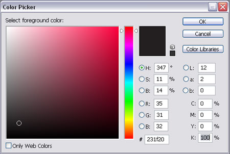
The solution for all three problems is to ensure you always select the correct black in Photoshop by entering the appropriate numbers in the Colour Picker.
Cyan – 0%
Magenta – 0%
Yellow – 0%
Black – 100%
By entering this combination you are specifying that you only want to use 100% of black and none of the other colours for this area of colour, resulting in the single pass of ink on this area.

CMYK Black Is Not Quite Black
CMYK black, or the 100K mentioned previously is great for text, allowing for a crisp and sharp reproduction. On large areas of flat black however, 100K doesn't really have much impact as black, more as a dark grey, especially when uncoated.
The solution to this is to add a little extra colour to the mix, this is known as creating a Rich Black. The two most common Rich Blacks are those adding Cyan or Magenta.
Rich Cool Black
Cyan – 40%
Yellow – 0%
Magenta – 0%
Black – 100%
Rich Warm Black
Cyan – 0%
Magenta – 40%
Yellow – 0%
Black – 100%
There are many more variations floating around, including 60% rather than 40% and some using a combination of all four colours.
Rich Black should ideally only be used on blocks of black and large titles as the two coats of ink will cause the problem outlined in issue three above on normal sized text.
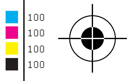
Don't Ever Do This
One point to remember is never use Registration Black on anything apart from printer's marks such as crop and registration marks. Registration Black is a 100% mix of all four inks and should not be used at all on content items, artwork containing registration black would likely be rejected by the printer.
The Five Blacks Summarised
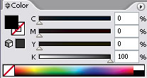
CMYK Black – 0C 0M 0Y 100K
The ideal black for text
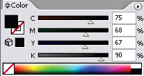
Photoshop Black – 75C 68M 67Y 90K
Rarely used, sometimes called upon as a form of Rich Black.
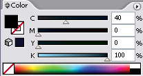
Rich Cool Black – 40C 0M 0Y 100K
Rich black with a slightly cool blue tint.
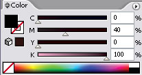
Rich Warm Black – 0C 40M 0Y 100K
Rich black with a slightly warm red tint.
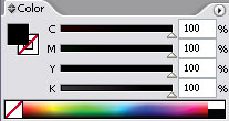
Registration Black – 100C 100M 100Y 100K
Used only for crop and registration marks.
Have you found a combination that provides a close match to true black? Post up your methods in the comments.


applause, please. great!
Wow….
This is great…
I’m from a web background and I’ve been asked to design several artwork for print…
Perfect timing :)
Great tips thanks!
My printer actually request a Rich black made of:
C 70
M 70
Y 70
K 100
it seem a lot – 310% – campared to your post but it actually looks great on paper …
Hi there, here in Rotterdam the Netherlands where i live and work my printer advised me to use for Rich Black when using Offset Printing in raster 70 – CTP (computer to plate) a mixture of 60C 50M 50Y 100K and it has worked fine for me for flyer’s and posters. Loved the article by the way keep up the good work guys…
Really interesting. I am actually working on a project right now that uses a black background. ive opted to use a dark gray instead to add a bit more depth to it though.
when printing rich warm black and rich cool black side by side, is it possible to see the difference? There may be an interesting black on black design idea there.
Thanks for posting up your personal uses of black, it seems like a lot of printers can handle high mixtures of ink, very interesting!
Scott, that could certainly be used to your advantage, maybe more towards combining a plain 100k black with a much richer mixture such as those mentioned in the comments about would give a definite difference.
Chris
Great! Thanks you!
great! thanks for the info, never knew!
I’ve found that one can use these different types of blacks to good effects, for example, I’ve made some ads that feature black and white photos that I purposely chnage in photoshop to a strictly 100% k and tehn I add elements on Photoshop’s default black and they stand out.
Once I made an ad that featured line artwork on photoshop’s black over 100% K covering the whole page, and it almost looked like I used an extra barnish ink.
You’re a champion! I work in Pre-press and we have designers sending us stuff all the time like this – it is great that there is someone out there letting people know this stuff… We prefer a C:40/K:100 breakup for a black shiner, and anything over 300% total ink limit is getting pretty heavy, and is likely to fill in.
Probably the next biggest problems with black are designs that have too little contrast and fill in when they hit the press – we prefer about 75%-80% detail against 100% K.
After that the next bad one is really fine reverse type against rich blacks – if the job is slightly out of registration, or the colour bleeds a tiny bit in porus paper then the text disappears.
Keep up the great work!
Great post.
Shir, your 310% rich black will print nice and dark, but it does have problems.
When you’re layering up so much wet ink on top of itself — particularly on shinier stock — your 70%’s often smudge and fill-in to become 95%.
If you think about it, a 70% dot is actually a solid block of ink, with 30% clear ‘holes’ in it, and it doesn’t take much for these holes to fill in when you’re overprinting it.
Printers choose 40% cyan or magenta because it’s the biggest dot that doesn’t touch it’s neighboring dots.
Often this filling-in might not be a terrible thing in itself, but the transitions from super dark black to *not quite so* black can result you visible steps that can cause big issues.
Those 40% cyan blacks will always be able to follow a smooth gradient back to 30%, 20%, 10% etc, without
leaving a visible ring or edge inside the black.
Hey, I found this through the design group writing project, and I’m really fascinated! I know absolutely nothing about print design, never mind design in general. I can’t wait to read more of your articles. :) I hope you win a prize!
This is a really good lesson for people starting out with photoshop. It took me a little while to get my head around using the colour values and not what I was seeing on screen.
This knowledge is essential if doing anything with newspapers!
Hi there – Great post. I will be linking to it from my blog today. Your users might also like this article – http://allgraphicdesign.com/graphicsblog/2008/01/30/best-of-black-and-white-graphic-design-layouts/ – it is ‘The Best of Black and White Designs’.
Thanks.
Rachel
I worked in Prepress for years and years one thing you can guarantee isn’t set up correctly in customer files, is the blacks.
Whenever i use the 0,0,0,100 black in illustrator i seem to have some very thin gery strokes around everything. When i use 100,100,100,100 black, they are gone. But according to this I should not use registration black. Then how do I make my strange “mini strokes” disappear?
I hope you didn’t learn this the hard way with the project you used as an example! Great breakdown on the different blacks (bookmarking on del.icio.us for future reference!). I didn’t realize “Photoshop black” had that different ink makeup! I’ve heard of using 100K and rich black (50C, 100K is what I use). The 100K is definitely not good as a fill color; it’s too thin-looking. You did a great job representing on screen the way the blacks look in print.
I was recently putting together an ad book for a tradeshow and one of the sponsors did something funky with their blacks. The printer halted the press and called us frantically asking if we wanted it fixed. At a price of $400 (US) we said no, it’s the sponsor’s fault. When looking at the final book, I can see the mistake, but I’m sure most people won’t notice.
great work…keep it up…
thank Q
Nice post! I work in pre-press and this is always a problem in customer’s files. I use C63 M52 Y51 K100 for rich black and never had a problem.
I think a overprint article will help also in understanding the print process.
Thanks.
I like using C40 M30 Y30 K100 for my rich blacks. Of course it matters on the final substrate, and what your pressman suggests.
Always good to ask the prepress guys prepping your film or your plates, and the pressguys running the fountains!
hi, Good Post!
i like the font of the banner “Designing with Black”…
where i will found this font? and, what is the name?
Help!!!
FANTASTIC GUIDE!
As a design student, blogs like yours are invaluable!
:D
Great information! Thanks.
A great piece of information not available so easily elsewhere. I had to dig through various expensive books to get this info at the beginning of my career. Still made many mistakes and learned by experience.
A great resource for design teachers as well.
I strongly recommend it.
I have read and tried the following from almost all the printers I’ve used:
C: 60%
M: 40%
Y: 40%
K: 100%
This has always given me crisp and dark areas of text as well as flat areas of black. It’s easy to see the difference when working in illustrator between 0, 0, 0, 100 and 60, 40, 40, 100.
Great so an old dog can learn new tricks all the time, thanks
In my 7 years in printing area the best of:
C 50
M 40
Y 30
K 100
Also you need a good printing machine to match the exact registration of colours.
Cheerz!,
Thank you so much for the guide!
I’m hoping to learn Photoshop and Illustrator and your guide really inspired me :D
Fantastic post. As a website designer I often get asked to design business cards and flyers. Just wish I had read this a few years back!
60, 40, 40, 100 RICH BLACK
0, 0, 0 , 100 BLACK (light) grrr
anything over 250 (when you combine all 4) is too much ink coverage, the ink will smear
and/or won’t dry fast enough so the job will stick together “Brick”
Great article, bookmarked for sure.
The Rich Black I’ve learned is:
C: 60
M: 40
Y: 20
K: 100
Anyone see issues with that approach?
I work for a printing company and the rich black that we make all the 4C black that is going to print offset is as Joe just wrote:
C – 60
M – 40
Y – 20
K – 100
You should check with your printer because not all machines print the same if you are going to be printing digital your printer may have a different formula they want used.
Definitely check with your printer to make sure the black your using is right for the paper type and printers they are using. If they’re any good they will advise you on registration issues, ink retention, etc. Great post
Great article!
wow, great article!
10x for the tips…
have so much to learn…
It’s really good to have someone like you writing articles such as this. I’m a first year multimedia student and things like this never get told to you before it’s too late. Cheers and keep it up.
I have been told by most printer’s to produce rich blacks as C-50 M-0 Y-0 K-100.
Only problem is if you do something like an outer glow on top… it can take on the cyan colour too much.
Thanks a lot, i’m a web designer who has had this problem before when collaborating with print-folk. It’s nice to understand it now.
@Albertonzo, if my eyes don’t deceive me, the font is Futura Light.
Doesn’t it depend on what other images are used? I often find when I am using other placed images on my black background it differs because of a different tone in the placed image.
Great article 10/10
This is a really good article, on a subject often over looked by most web designers. I have already bookmarked it as essential reading and will be telling others to have a read too. Great job!
Very nice work!
Как обычно, вебмаÑтер необычно опубликовал.
wow cool, really useful
Ура!, афтар зачетно накропал.