The 5 Worst Website Designs in the World
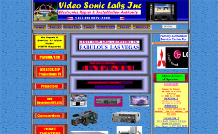
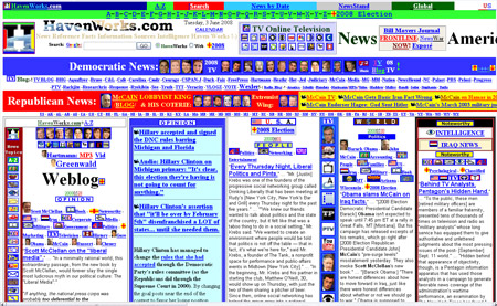
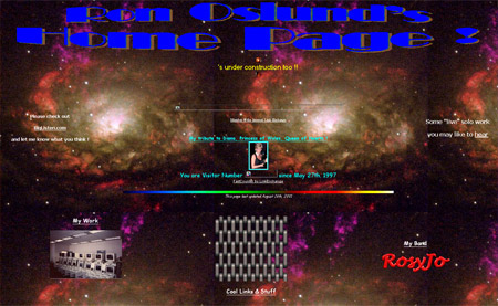
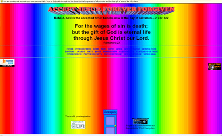
We often read and write articles showcasing the latest, best and most visually inspiring websites on the internet but we tend to forget those on the opposite end of the scale. In order to spread the love to the aesthetically unfortunate, here is an overview of five of the most terrible website design crimes on the net as discovered through the list of least victorious sites on CommandShift3.


Oh my god, I almost just threw up looking at them! Yup they are possible the worst!
Please don’t do this again !! Otherwise I’ll have to see my lunch a second time.
terrible!Kill this sites
In the bottom one, the rainbow background is animated too…
Hope you had small lunches.
ick.. they are pretty bad..
how about this one for size:
http://www.lingscars.com/
Excellent inspiration for my next site launch. Thanks Chris!
Have a great weekend. ;)
LOL, I’m afraid to find my webdesign site in your list ;-)
These sites stings my eyes !
It’s amazing how similar Ron Oslund’s page is to the early internet. the home page with the “cool links” and all? This is less a terrible site and more an archaeological find. It’s like when we find a fish we had assumed to be extinct for millions of years.
I laughed so hard I think I peed myself a little!
Good job on the worst list………
this is definitely bad, seriously bad. I used to work for a webhosting company, and these sites are cloned amongst a TON of the customers I had to talk to.
Lol simple the WORST!. I almost feel like redesigning them for free. How did you find these monstrosities!
Surprises me that none of them are using Comic Sans…
you missed this one! http://www.cyberdsignclan.com
Sadly, these are great websites to look at! Its so bad its good and entertaining!
Oh my god! Really untasteful work.
AHHHH!!! MY EYES! MY EYES!
@Andrew – that’s pretty funny. maybe someday there will be web archeologists! hopefully they keep sites like these buried though. deep.
Wow, these are terrible, and unfortunately way too common. I see bad websites, graphics, advertising all the time. It’s refreshing when you see some quality stuff.
They’re retro/vintage guys! pure art!!!! :D
haha! Where do you even start on a page with so much unorganized crap. Wow!
Excellent roundup. I wrote an article on my blog a while back about making horrible websites, and I think I’ll go ahead and edit in a link to this (for inspiration).
Yep, they sucks, but the last one is an absolute winner. There is so much interactivity between the website and my eyes. They heard of interactivity in rich web applications, but slightly missed the point :)
Oh dear, this reminds me slightly of my early “cool” designs with flash intros (downloaded) and “cool” javascripts (downloaded) and various other “cool” things that I had downloaded off various javascript *insert wretched site here* sites.
Aaah, happy days…
Wow, now these are some old skool sites. It´s realy annoying nowerdays seeing such bad designed sites it just hurts the eyes and the heart of a designer. Tho I have seen several other bad looking Websites.
Regards
the last one actually looks like the first web site i ever made in year one of computer science. factiod. http://www.tinman.ie
http://www.ryanair.com/site/EN/ is the most ugly webpage I regurarly get in touch with. Sigh.
A superb selection of sites, I particularly enjoyed HavenWorks.com. I feel it’s worthy of a written dissertation.
lmao…brilliant post!
I almost cant believe it…its like they tried their hardest to make them the worst websites ever.
Havenworks is my new favorite…by far.
hahah
Why isn’t this site on the list? Since when has shit brown ever been good taste???
It’s great to see people showing their love towards them, particularly the Ron Oslund Home Page which as mentioned should be preserved in a museum of classic internet milestones!
Hopefully in 10 years time my website will be worthy of such a list!
how much do they get paid doing those webbies?
i wonder…….
lol.
Sad to say….but I can remember a time when these would have been pretty cool sites. It wasn’t so much about good design and aesthetics, as it was LOTS of colors, cool backgrounds, and animated graphics. Thanks for the trip down memory lane. I still know of some people that still design about like this. Scary.
True, True! they sucks :D
Ok… were any of you able to stand the rainbow epileptic madness long enough to see the “Best Viewed in IE” .GIF? And I quote:
“Forget all the other browsers and down with the Web 2.0 net police.”
HILARIOUS! >_<’
A religious zealot AND totally out of touch with the world.
eyes, they’re bleeding…
So I was going to be like, “please, ive seen some pretty bad webpages, i bet i can out bad this list.”
But there would be no point. these were absolutely horrible. what were they thinking! atleast these websites look like something that you would never need to go to. I hate when legitamate companies have websites that are crap.
good job, or should i say, bad job.
OMG i just saw that metal chain square. remember when that was a stock wallpaper on computers. you couldnt even see what was on the desktop. at least its proof of progress!
Thank you for idea! I post it in my blog – http://promoinweb.ru/?p=158
I am from Russia.
OMG!!!that lings cars website was in our business GCSE last year!!!!! We thought it was so crap it was made up!!!
Holy lord.
I know I mostly suck at webdesign, but those guys can kick the shit out of me at it.
Incredibly T_T, I almost got chills from looking at those. :(.
http://www.arngren.net
:D
ah well, it’s not all that bad ;) lol, BARF!
:DDD looooool, incredible, tnx ahhaha
Those are horrid. It reminds me of like pre-2000 days when websites were garbage.
I’m glad website design has come a long, long way.
I actually wanted to see those sites at full view… umm… USE EXTREME CAUTION when openeing the last one with the rainbow bg… it may cause a seizure!!!! OMG it’s AWFUL!!
Turkish : Çok kötü
English : Very bad!
lol, OK those are by far the worst websites I’ve ever seen.
My EYES!! X_X Get me a doctor, quick!
Those “designs” are beyond bad!
But at least we know how NOT to make a website! ;)
Ha, I seem to remember a time when every website looked like the 4th one down.
and with little animated explosions and fires everywhere.
May be terrible looking but number 2 HavenWorks has a PR 5.. hhmmmmm lol
Hey I designed those. What’s wrong with them?
This one was of the original awful sites, http://webtekrocks.com/ I can’t believe it’s till up after all these years.