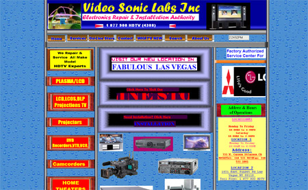
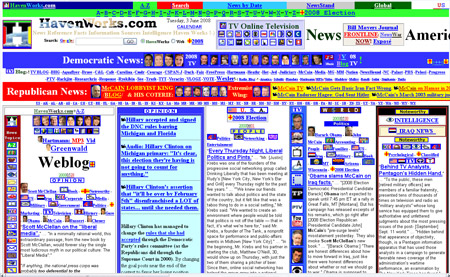
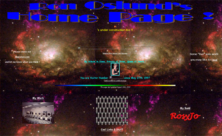
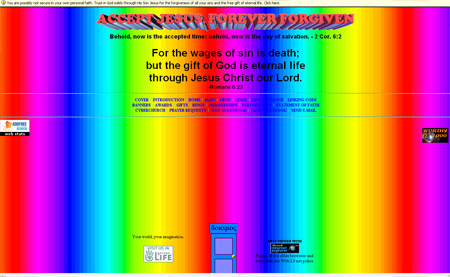
We often read and write articles showcasing the latest, best and most visually inspiring websites on the internet but we tend to forget those on the opposite end of the scale. In order to spread the love to the aesthetically unfortunate, here is an overview of five of the most terrible website design crimes on the net as discovered through the list of least victorious sites on CommandShift3.


Oh my god, I almost just threw up looking at them! Yup they are possible the worst!
Please don’t do this again !! Otherwise I’ll have to see my lunch a second time.
terrible!Kill this sites
In the bottom one, the rainbow background is animated too…
Hope you had small lunches.
ick.. they are pretty bad..
how about this one for size:
http://www.lingscars.com/
Excellent inspiration for my next site launch. Thanks Chris!
Have a great weekend. ;)
LOL, I’m afraid to find my webdesign site in your list ;-)
These sites stings my eyes !
It’s amazing how similar Ron Oslund’s page is to the early internet. the home page with the “cool links” and all? This is less a terrible site and more an archaeological find. It’s like when we find a fish we had assumed to be extinct for millions of years.
I laughed so hard I think I peed myself a little!
Good job on the worst list………
this is definitely bad, seriously bad. I used to work for a webhosting company, and these sites are cloned amongst a TON of the customers I had to talk to.
Lol simple the WORST!. I almost feel like redesigning them for free. How did you find these monstrosities!
Surprises me that none of them are using Comic Sans…
you missed this one! http://www.cyberdsignclan.com
Sadly, these are great websites to look at! Its so bad its good and entertaining!
Oh my god! Really untasteful work.
AHHHH!!! MY EYES! MY EYES!
@Andrew – that’s pretty funny. maybe someday there will be web archeologists! hopefully they keep sites like these buried though. deep.
Wow, these are terrible, and unfortunately way too common. I see bad websites, graphics, advertising all the time. It’s refreshing when you see some quality stuff.
They’re retro/vintage guys! pure art!!!! :D
haha! Where do you even start on a page with so much unorganized crap. Wow!
Excellent roundup. I wrote an article on my blog a while back about making horrible websites, and I think I’ll go ahead and edit in a link to this (for inspiration).
Yep, they sucks, but the last one is an absolute winner. There is so much interactivity between the website and my eyes. They heard of interactivity in rich web applications, but slightly missed the point :)
Oh dear, this reminds me slightly of my early “cool” designs with flash intros (downloaded) and “cool” javascripts (downloaded) and various other “cool” things that I had downloaded off various javascript *insert wretched site here* sites.
Aaah, happy days…
Wow, now these are some old skool sites. It´s realy annoying nowerdays seeing such bad designed sites it just hurts the eyes and the heart of a designer. Tho I have seen several other bad looking Websites.
Regards
the last one actually looks like the first web site i ever made in year one of computer science. factiod. http://www.tinman.ie
http://www.ryanair.com/site/EN/ is the most ugly webpage I regurarly get in touch with. Sigh.
A superb selection of sites, I particularly enjoyed HavenWorks.com. I feel it’s worthy of a written dissertation.
lmao…brilliant post!
I almost cant believe it…its like they tried their hardest to make them the worst websites ever.
Havenworks is my new favorite…by far.
hahah
Why isn’t this site on the list? Since when has shit brown ever been good taste???
It’s great to see people showing their love towards them, particularly the Ron Oslund Home Page which as mentioned should be preserved in a museum of classic internet milestones!
Hopefully in 10 years time my website will be worthy of such a list!
how much do they get paid doing those webbies?
i wonder…….
lol.
Sad to say….but I can remember a time when these would have been pretty cool sites. It wasn’t so much about good design and aesthetics, as it was LOTS of colors, cool backgrounds, and animated graphics. Thanks for the trip down memory lane. I still know of some people that still design about like this. Scary.
True, True! they sucks :D
Ok… were any of you able to stand the rainbow epileptic madness long enough to see the “Best Viewed in IE” .GIF? And I quote:
“Forget all the other browsers and down with the Web 2.0 net police.”
HILARIOUS! >_<‘
A religious zealot AND totally out of touch with the world.
eyes, they’re bleeding…
So I was going to be like, “please, ive seen some pretty bad webpages, i bet i can out bad this list.”
But there would be no point. these were absolutely horrible. what were they thinking! atleast these websites look like something that you would never need to go to. I hate when legitamate companies have websites that are crap.
good job, or should i say, bad job.
OMG i just saw that metal chain square. remember when that was a stock wallpaper on computers. you couldnt even see what was on the desktop. at least its proof of progress!
Thank you for idea! I post it in my blog – http://promoinweb.ru/?p=158
I am from Russia.
OMG!!!that lings cars website was in our business GCSE last year!!!!! We thought it was so crap it was made up!!!
Holy lord.
I know I mostly suck at webdesign, but those guys can kick the shit out of me at it.
Incredibly T_T, I almost got chills from looking at those. :(.
http://www.arngren.net
:D
ah well, it’s not all that bad ;) lol, BARF!
:DDD looooool, incredible, tnx ahhaha
Those are horrid. It reminds me of like pre-2000 days when websites were garbage.
I’m glad website design has come a long, long way.
I actually wanted to see those sites at full view… umm… USE EXTREME CAUTION when openeing the last one with the rainbow bg… it may cause a seizure!!!! OMG it’s AWFUL!!
Turkish : Çok kötü
English : Very bad!
lol, OK those are by far the worst websites I’ve ever seen.
My EYES!! X_X Get me a doctor, quick!
Those “designs” are beyond bad!
But at least we know how NOT to make a website! ;)
Ha, I seem to remember a time when every website looked like the 4th one down.
and with little animated explosions and fires everywhere.
May be terrible looking but number 2 HavenWorks has a PR 5.. hhmmmmm lol
Hey I designed those. What’s wrong with them?
This one was of the original awful sites, http://webtekrocks.com/ I can’t believe it’s till up after all these years.
i can’t help but giggle like a school girl when i see these designs. TAKE ME BACK TO THE 80’s, Please!
oh my god it really strains eyes. Ive never seen such a worst designs in my life
can’t those folks at least get templates?
Wwwwow… http://webtekrocks.com/ – the client list is… I’m lost for words.
The sites above are just gruesome.
Sorry to make a double post, but I just thought we all could benefit from this:
http://webtekrocks.com/designtips.html
Remember! “Make sure to use color combinations that work.”
:)
I actually like them, this is inspiring, thanks.
Wow, these websites are awful. If you guys want to see more bad examples, follow this link.
http://websitesthatsuck.com/
For the love of god! There should be a public health warning for these sites, especially the dokimos one which should carry an epilepsy health warning! Crikey there is hope for me :)
@chris –
!! http://www.cyberdsignclan.com is better than I thought possible
Pure Filth.
These are the best websites i have ever seen! You have no taste!!! :D
oh god damn!
OMG Worst websites EVER!!!
It makes me wonder if the designers managed to graduate from school or play school even especially on the last one.
P.S. Jano, you have no taste judging by your MySpace styling.
Hehehe these are amazing! I mean, did you see how much info they could fit on one page!
Although you have to give it to the last rainbow oriatated site, they have a pretty clever little bar that comes down at the top like a firefox warning saying something about securing your faith. That was kinda cool!
I almost had a seizure.
But I did acquire a headache…
So good, it hurts.
joe maxo,si aki son tos guirufos!!!
Scary!
Here’s another! I believe this one wins the thread:
http://www.yyyyyyy.info/
Ð£Ð–Ð°Ñ Ñто не Ñайты а Ñ„Ð¸Ð³Ð½Ñ ÐºÐ°ÐºÐ°Ðµ-то
Ok these are really, really bad. My word my eyes are hurting just from glancing through them. Do people actually allow such rubbish on the web? Sheesh!
You totally forgot all kinds of frameset websites! lol
Oh dear!
damn, fortunately my first homepage did not include in the list, hahahaha lol.
Reminds me of my old time :D
hue… he… hee…
it’s so old time and bad template…
he…
its a fantastic reference of what NOT to do ever
Wow… these are so bad (especially havenworks), I’m tempted to contact their owners to give them some pointers. But that would be near impossible seeing as I can’t possibly find the page that holds their contact info. :P
Ronoslund only gets better when you click the links. I was drawn to the chain link looking image on the page, and what do you know? That page has the WHOLE BACKGROUND covered with that horribly busy design. And the stray pixels on all the logos add a nice Windows 3.1 touch to it.
And I’ve seen the last one somehow. One of my friends linked me to it, and I felt dizzy after I stared at it too long.
Hi, This is nineteen ninety seven, I’d like my webdesigns back please?
havenworks….Honestly though it does look like someone vomited onto paper, then turned it into html.
timecube.com
thank you…
http://wtap.com
that’s the local news website. . last time i went to it, it looked like the internet just threw up on it. . and then turned around and took a dump on it.
I just noticed this part of Havenworks (at the bottom).
“Support your local library. ;-)
!-! Nominated for Most Poorly Designed Website in the World by Digg.com
and “El peor diseño del mundo” by elMundo.es
Website Web Design: Web Design by Hermit ;-)”
1. I’m now convinced to support my local library. I don’t want kids in my area to end up being too stupid to figure out how to make a decent webpage. The person who made this was lucky that his inbred cousin Cletus got one of them “computer machines” and gave him a few pointers.
2. It’s sad how they seem to be bragging about their horrible website. Why would anyone want to go to a site that was designed in a way that it didn’t care about how difficult it is to navigate? It’s an insult to the site’s users, and I sure see no reason to put up with that.
3. Someone’s signing up for hate mail. If you click the “web design” link, it leads you to a page with more horrible websites probably designed by this “hermit” guy. Clicking his name leads to a page slightly better designed than the main one; they could’ve at least made the main page that bad.
thank you….
Rofl at the “poetry” in webtekrocks.com I love the part where he calls himself “..the grass you have penetrated with your javelin…” And the ego they have of their design skills is priceless.
Several of these sites were so bad ( see: http://www.yyyyyyy.info/ ) that my browser froze for several seconds while trying to load them.
Got to have the bad (er-very)in order to appreciate the good. Reading some of the replies I must say I haven’t laughed so much in ages, a very good post.
thank you…
You forgot to add Jacob Nielson’s http://www.useit.com for #6!
I am a web designer and Interactive Media Designer at The Art Institute of Pittsburgh, one of my professors used your site to show what a good site looks like. One site I might add to the worst website designs in the world is http://www.gamequarium.com/ and Phil I do agree http://www.yyyyyyy.info/ is possibly the worst I have ever seen.
it’s can’t be.
I would hate to be the designer of that site, leaving a comment on this forum – “hey, that’s my site – d’ya like it?…no?”
Interesting design ! =)
I can’t decide which is worst, maybe the final (rainbow) one. Infact, they’re just as bad as each other.
Sites that came in mid 90’s are all look like these. Everyone is still in learning curve of HTML …..and web design/style is not even introduced yet. I bet there are still thousands of them lying around in the interwebs. Probably abandoned by the creator.
thank you…
“Jason Says:
July 10th, 2008 at 3:39 pm
You forgot to add Jacob Nielson’s http://www.useit.com for #6!”
Um, Jakob Nielsen is one of the industry’s leading usability experts. He doesn’t use flashy images (or any at all for that matter), Flash, or Photoshopped graphics and backgrounds. Just simple and straight-forward HTML and CSS.
I think when you have the type of quotes about you from leading media outlets and when you have the type of knowledge and education Mr. Nielsen has, you can pretty much make your site look like you want to and the rest of us can deal with it.
http://www.useit.com/jakob/
If you can do better than that Jason, by all means, post your qualifications and portfolio for everyone to see.
Oh, wait… you didn’t provide a link.
Wow. That last one proves exactly why churches why churches are emptying across the Western world
OMG! I could barely look at the sites you’ve presented…
Oh my god! forgive us! :) One of this awful sites offers me use ie for better view but i dont like any better view rest from you :)
Thank you for sharing….
Thank you for sharing…
Design?? Where?
LOL! Funny designs. Poor users of this website.
Ouch! They hurt the eyes.
http://www.huntgraphic.com/moto.htm
BAD! BAD! BAD!
This is one list I definitely don’t want to be on.
How about arngren.net. That should be on the list as well.
What about this one?
http://www.debuyst-cycling.be/index2.html
I’ve came across many blog topics with the title “x worst web site designs ever made” but honestly this one lives up to its title.
this looks definitely like the worst I’ve ever seen (or made).
This is really worst site I saw.
http://sellingweb.blogspot.com
I was reading up on art licensing, and after reading an interesting article I went to this lawyer’s website only to be very disappointed.
http://www.jjkaufman.com/
I was slapped in the face with a horribly designed website, and ironically I can’t read the copyright on the bottom which copyright is what the guy specializes in!
thank you nice sharing nice site
This sites are not ugly… they simply are old…
;)
OMG. Wow. The second one even flaunts it’s hideousness at the bottom. There is even a link to the Web Designer page http://havenworks.com/web-design/ which contains more of the worst Web Designs in the world!
I hope it won’t be de next trend ;)
LOL
that doesn’t even make any sense!
HIIIIIIIIIIIIIIIIIIIIIDEOUS!!!!!!
LOL! indeed rob, web design was very different in 1998 :)
WTF did you find those – it shocks me too think how many halfway or just plain horrible websites you must have surfed to before making your final choice of these 5 truly shockingly disgusting piles of code. You probably deserve a medal for submitting yourself to such torture…
how they can get sponsors?…