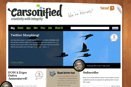
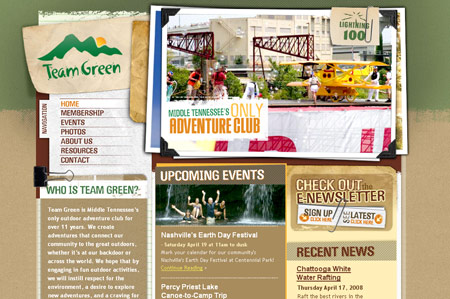
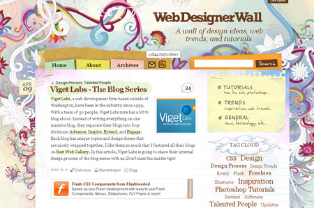
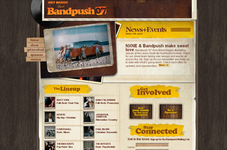
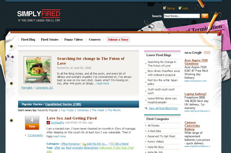
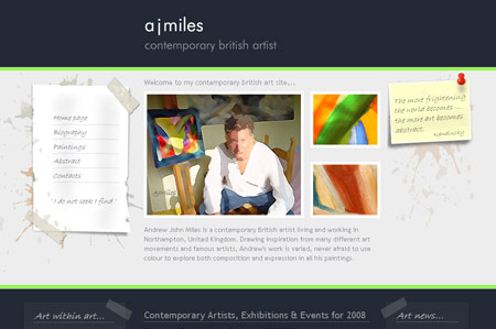
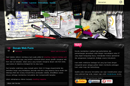
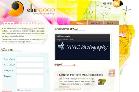
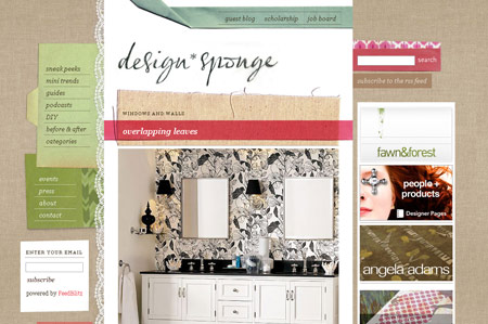
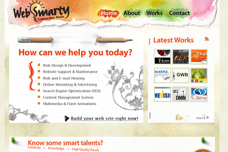
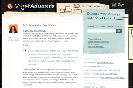
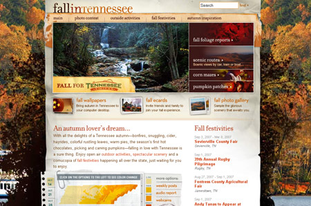
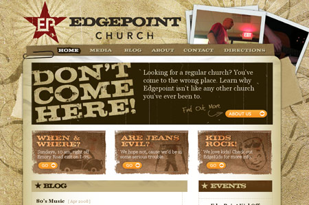
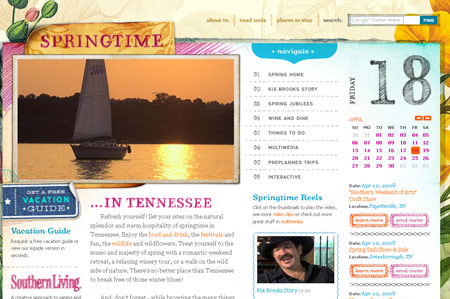
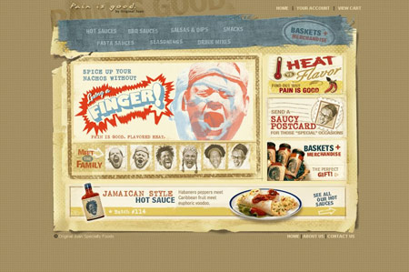
One of my favourite ‘styles’ in web design is one that takes inspiration from traditional media such as paper and cardboard. Using scans and images of paper provides an informal, cut-and-paste collage feeling to the design giving the site more of a personal and hand-crafted image – quite opposite to the clean and shiny trend of other web design styles. Here are 25 good examples of this super cool paper based effect put into practice.





That looks pretty awsome :D
I love the site you did for revolution Chris! Pretty cool!
Ive been seeing this style around a few places and I really like it. I just posted some free paper textures on my blog if anyone is making a site like this they might come in handy. http://www.digital-artist-toolbox.com
Wow these are really great…I am totally in love with the Tennessee ones…they have those crazy background treatments I’m always on the lookout for these days. Strangely, they aren’t featured in the portfolio of the company that made them. I wanted to see exactly how many mini-sites they’d done for TN.
Hmm. Why isn’t your site on the list?
Thanks to all for the comments,
CarrotNetwork: I wondered if anyone would notice that I sneaked that one in haha! It’s actually a site I recently made for my partner’s driving school along with the printed work and car graphics.
DAT: Nice collection of textures you have there, definitely a good resource for created this type of style.
Brandi: I agree, the large background certainly makes for an eye catching design. Large background photographs is also another style that has been becoming more popular recently.
Hi Chris! Yes, I am so taken with that background technique that I recently wrote a post about it here: http://pixelswithpigtails.com/noted/bold-sassy-website-backgrounds/
Of course about 2 days later the much more popular Noupe website did a huge version of the same idea:
http://www.noupe.com/design/63-impressive-website-background-images-trends-resources-and-tutorials.html
So it goes!
Sweet list Chris. Another trend I definitely like. I particularly think the combination of paper/wood/large background on sites is always impressive. I’m currently making a studio site using those elements. Thanks for more inspiration!
You know, that Ebugogo.tv is DEFINITELY inspired by WebDesignerWall…a lot of elements are very similar looking.
thank you.
@Adrian: Was just thinking the same thing…
Wow and I just noticed the background image on bandpush is the same from electricpulp. I spend too much time on the internet…
Great list. Web Designer wall still blows me away when I first saw it. He also shares with some of the techniques to create his website. How I wish I had such good workdpress and css skills so that I can do something more for my blog.
I dont mean to sound pretentious. But I think that my personal site would fit nicely in your collection. Let me know what you think http://www.travisneilson.com
btw: i found your site through good-tutorials.com, i was just browsing but i bookmarked this site. good job.
These are fantastic! I’ve seen many such collections, but I love seeing the handmade style taking off and the direction that web design is going. I also really like the Free People Clothing site. I think they change it every quarter or so (or maybe every time a new catalog is released?). I’ve taken to grabbing screenshots because it seems like every time I go back, they have a new look!
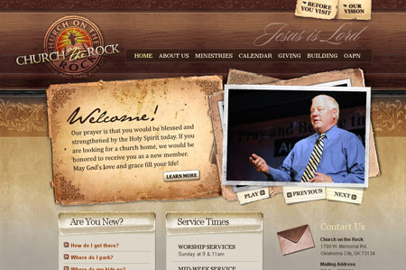
I noticed quite a few churches on here, too. I think it’s great they are starting to take web design into consideration.
How do you find sites like this??
Wonderful selection!
I think it’s nice to take a break sometimes from so much digital stuff. That’s what I tried when i designed my illustration web site, scanning materials such as Canson paper and working with Conte. Pretty much running away from the digital look.
Very Inspiring web designs.They are certainly a welcome change from the usual web templates.
Thanks for the recognition on the bandpush site…We really appreciate the love. keep it up.
Amazing work!!
all websites are really beautiful
Here is a site I did that was book-inspired. There is really something to having a webpage behave like physical media.
http://www.lindstromliterary.com/
Really really cool websites! I love the paper / cardboard design!
While not technically paper inspired, the Trapper-Keeper motif on the blog over at x-entertainment.com is what initially inspired me to start learning CSS all those years ago…
http://www.gurselcoskun.com
Beautiful
hepsi cok güzel(all of so well)
you forgot my site :) http://nikibrown.com :)
i love this site.
Love it. This type of design brings so much more warmth to a site.
Wonderful selection!
wow! i would like to add one .. check this out http://aisyahrozi.com
These look really great, check http://www.developflash.com if you’d like to find out more about online design tools
Digital Scrapbook Designer blogs have tons of examples of the paper style
http://www.ChristinaReneeDesigns.com
Check out the gallery here for many other examples:
http://www.MyScrapbookArt.com
Great list. Showcased it on my site.
thanks for posting… i like it very much… very inspiring sites.
Juricks2Web – http://www.juricks2web.com
is there any information about this in other languages, maybe german or other else?
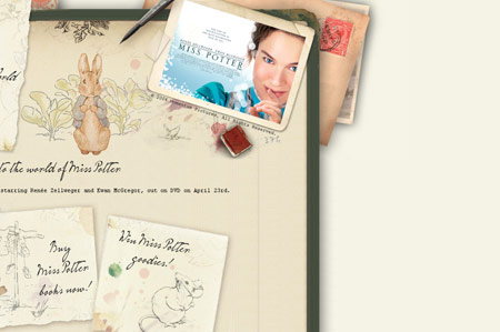
I like the Miss Potter and Church on the Rock designs, followed closely by A.J.Miles.
Very nice collection! Wish to see more like this.
Great list, Web Designer Wall has always been one of my favorite designs.
I recently launched my new design site Arbent and it’s accompanying blog Arbenting with a torn paper layout you might want to check out.
wow! Great list. very very thank you!!!!
it would be better with other languages support, but thanks..
I got an attack alert from one of the links above:
http://www.peterrabbit.com/miss_potter/home/index.cfm
Good collection! Big thanx.
from Russia, with love :)))
super cool. love it :)
Thanks for sharing!!
Very, very cool!
Very cool web pages. I just designed my first for a Mystery Shopping (<– See Site) Company called BestMark.
nice site
Well cool. Great selection, so much inspiration
Nice Collection! Love it!
Gopal
productivedreams.com
Check out my site using some of the same ideas. It’s a work in process, but I’m pretty happy with the way it looks so far.
Wow, soon you find this type of Graphic in My Website
wowww.. what a beautifull designs. Great work
well may be my site can be listed in the near future http://www.sibersonik.com
i did a ‘paper themed’ site too, not as good as this little lot though, they’re awesome. :)
http://www.sheltnetwork.com/
Here’s a paper-based site for when the recession gets really bad:
http://www.thebrowncorporation.com/
Anthony ;-)
haha that’s brilliant
show this: http://www.goedeckeundgut.de