This post was originally published in 2013
The tips and techniques explained may be outdated.
Illustrating with basic linework not only results in some really cool artwork, it also makes the job a lot easier! Instead of painstakingly drawing every detail, simplifying the object into its basic form and using just a single stroke weight produces a stylised pictogram effect. In this tutorial I’ll take you through the process of using this basic linework technique to create a cool motorcycle illustration.
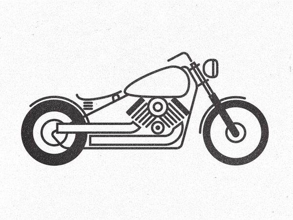
The motorcycle illustration we’ll be creating is actually based on the custom motorcycle project I’ve been working on in real life. To create the illustration, every feature of the reference photograph is simplified and drawn using the most basic of shapes and lines to produce the stylish pictogram effect.
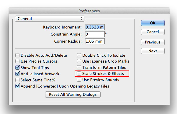
To make life much easier when creating artwork with a single stroke weight go to Illustrator’s Preferences and turn off Scale Strokes & Effects. This will allow you to scale elements while keeping the same stroke weight.
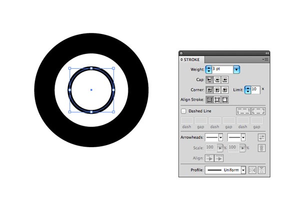
Draw a circle on the artboard with no fill but a black stroke. Choose a stroke weight that you’ll continue throughout your illustration, here I’ve gone with 3pt. Copy (CMD+C) and Paste in Front (CMD+F) a duplicate of the circle and scale it up while holding Alt & Shift. Increase the stroke weight to represent a fat rear tyre.
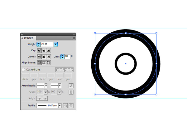
Repeat the steps to create a front wheel, although for this wheel use a smaller weight stroke to represent a thinner tyre but increase the whole wheel size to match the diameter of the rear. Use guides to gauge the sizing.
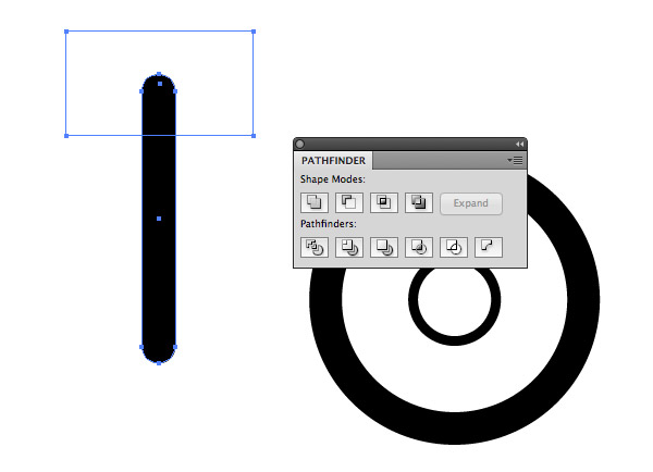
Draw a long thin black Rounded Rectangle and full corner radius. Add a temporary rectangle to clip away the top portion with the Pathfinder’s Minus Front option.
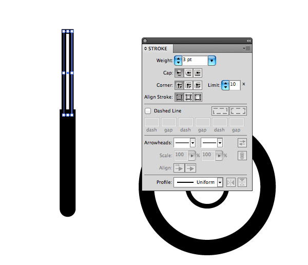
Align a normal rectangle centrally within the rounded rectangle. Give this shape no fill but the 3pt stroke weight.
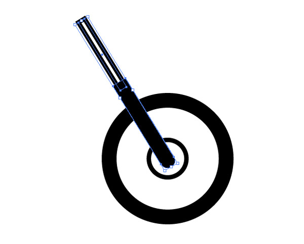
Rotate the two rectangles and position them over the front wheel hub to represent the motorcycle suspension forks.
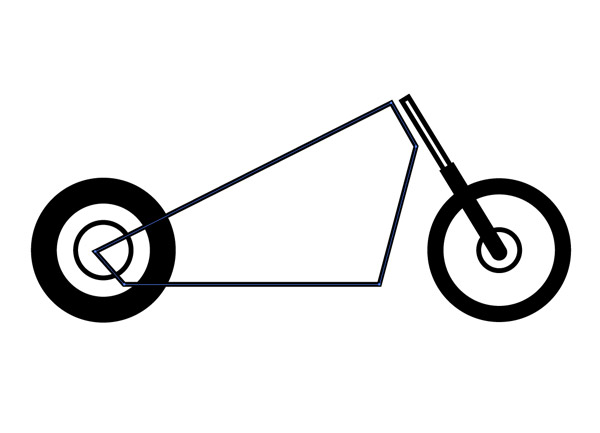
Use the Pen tool to draw the rough outline of the motorcycle frame with straight lines.
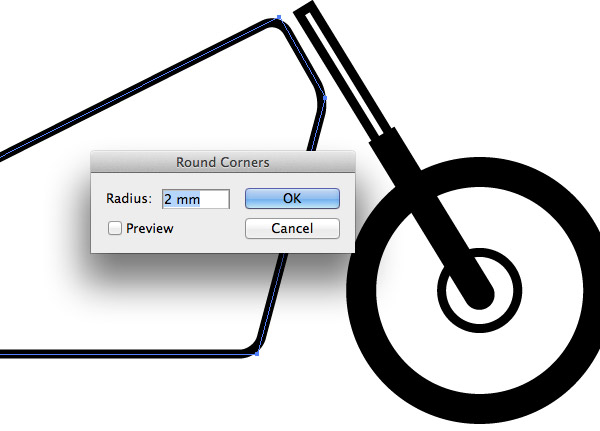
With the path selected, go to Effect > Stylize > Round Corners. Adjust the radius until the sharp corner angles are converted to smooth paths.
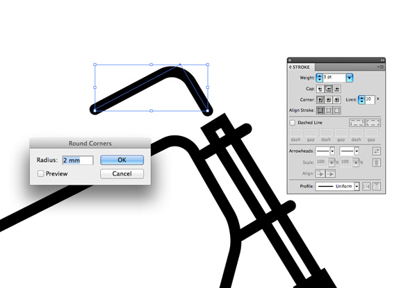
Use the Pen tool to add some basic detail to connect the frame to the forks and to construct the handlebar. Select the Round Cap option under the Stroke menu to smooth off the ends of each line.
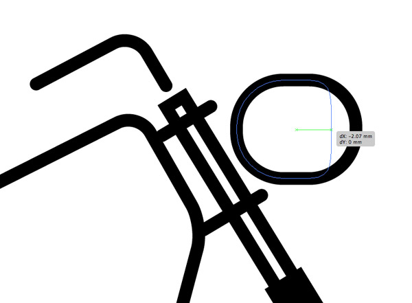
Draw a small Rounded Rectangle with maximum corner radius to represent the headlight, then select and drag the right most points and move then inwards using the Direct Selection tool. Stop just as the right edge becomes straight.
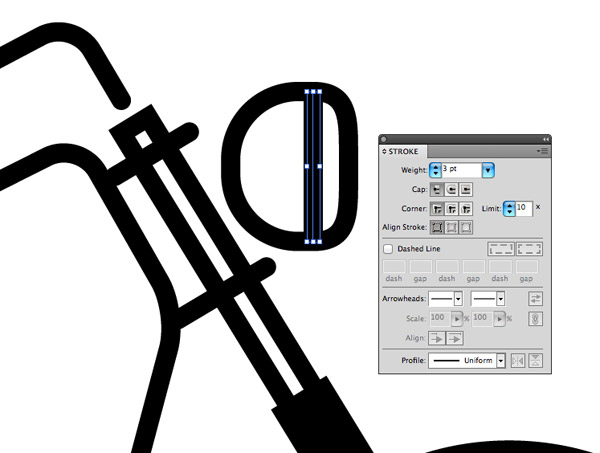
Add a single line to add a touch of detail to the headlight, using the same 3pt stroke weight for consistency.
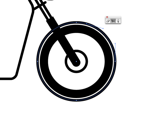
Copy/Past in Front a duplicate of the wheels and alter the stroke to 3pt. Scale it up slightly then clip the path using the Scissors tool just after the uppermost point.
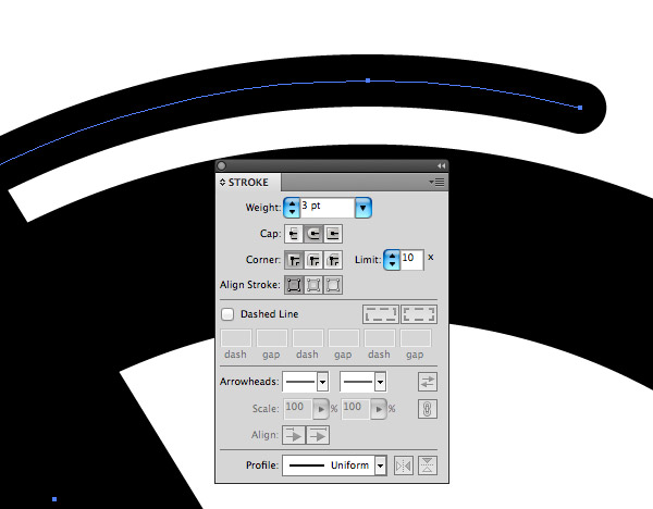
Select and delete the right and bottom points to form a stylised fender or mudguard. Alter the stroke settings to give the path the round cap appearance.
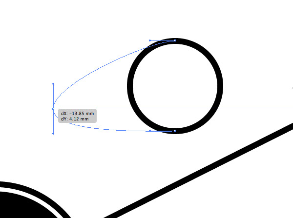
Construct the fuel tank from a basic circle by manipulating the left most point using the Direct Selection tool. Give the tank a white fill and move it into place on the motorcycle.
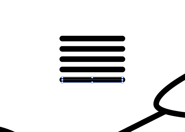
Draw a single horizontal line with the 3pt/round cap settings, then hold ALT & Shift and drag out a duplicate directly underneath. Repeatedly press CMD+D to produce a series of evenly spaced lines.
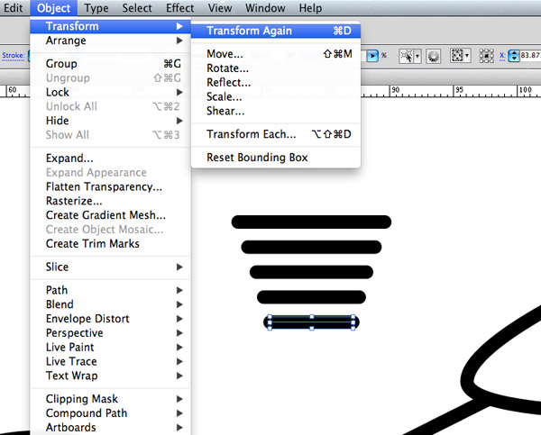
Select the second line and scale it down in width while holding the ALT key. Select the third line and press the CMD+D shortcut twice to make this line slightly smaller. Repeat the process but use the shortcut incrementally more each time to create a series of lines descending in size.
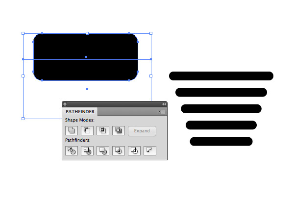
Draw a Rounded Rectangle the same width as a top line, then use a temporary rectangle and the Pathfinder to cut the shape in half to produce a straight bottom edge. Align this shape over the series of lines.
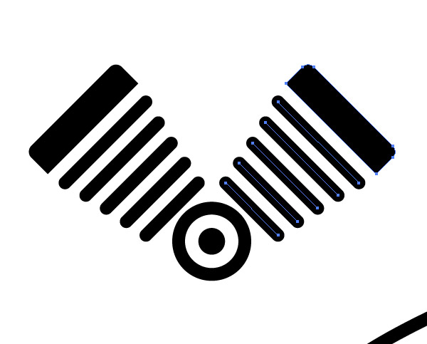
Duplicate and rotate the complete set of shapes to produce a V-Twin engine layout
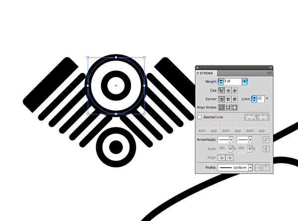
Create a basic air filter graphic using two concentric circles. Use a white fill colour to allow the shapes to cleanly overlap the other shapes.
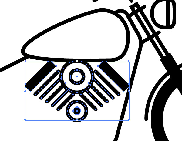
Scale and position the engine into place within the motorcycle frame.

Use a circle to achieve a flowing curve for the exhaust pipe. Add a cut with the Scissors tool then delete the unwanted points.
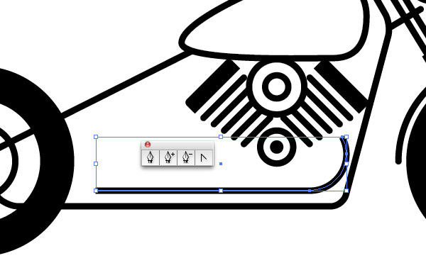
Extend the path using the Pen tool. Click the open end point to continue the path then place another point while holding Shift to create a straight line.
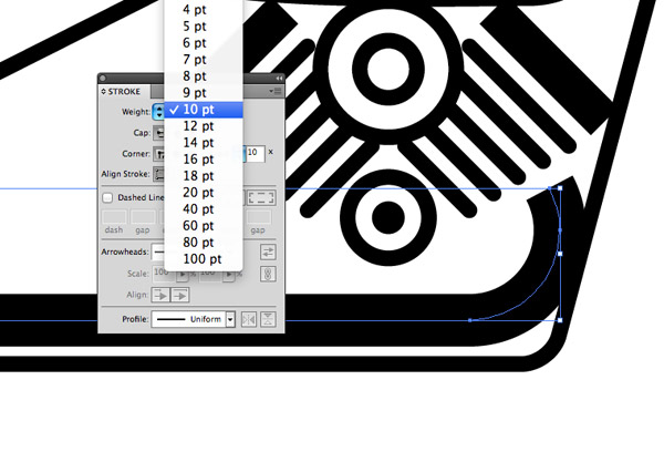
Increase the weight of the stroke to around 10pt and remove and round cap effect to create a fat exhaust pipe.
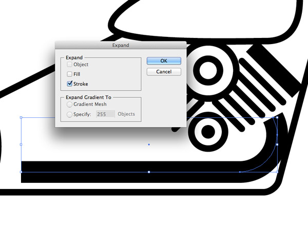
Go to Object > Expand and select just the Stroke option. This will convert the path into a solid shape.
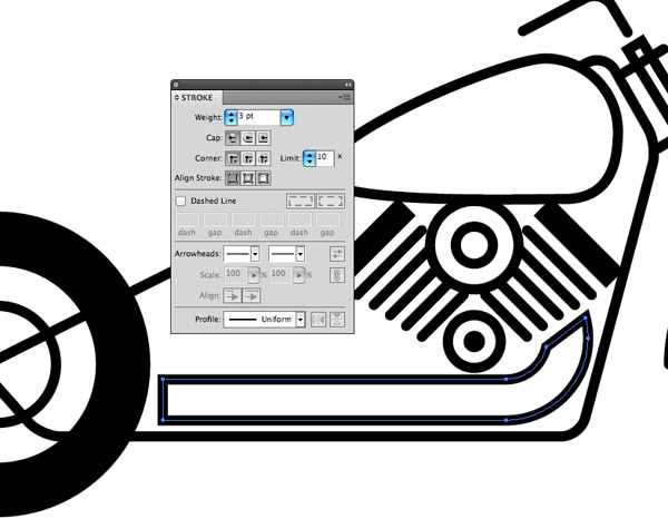
This solid shape can now be given the 3pt black stroke appearance to match the styling of the illustration.
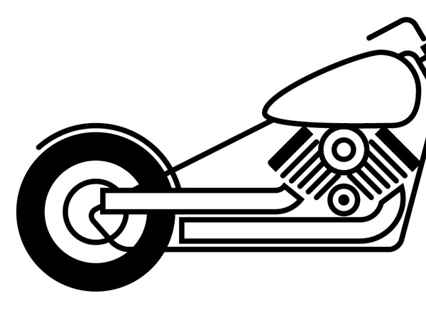
Repeat the process for the rear exhaust pipe. Use a white fill to allow the shape to overlap other illustration elements.
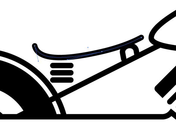
Finish off the illustration by constructing the seat using basic lines. Simplifying objects to the point where they’re floating in space can really help capture the stylised pictogram theme.
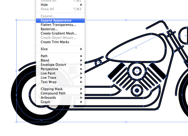
Now let’s clean up out linework. Draw a selection around everything and go to Object > Expand Appearance.
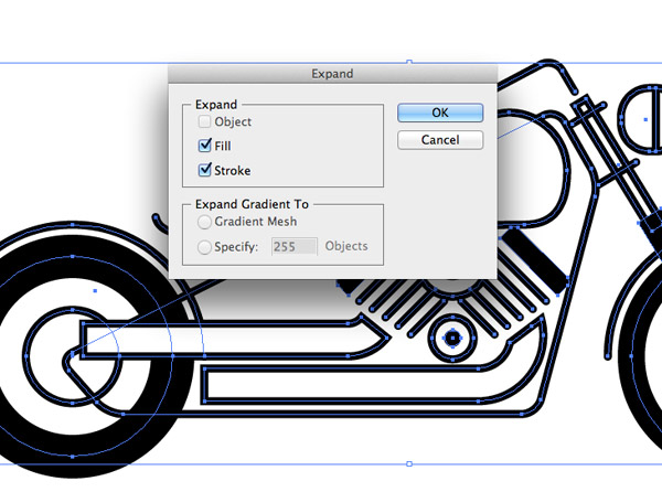
Next, head back to Object > Expand. Both the Expand Appearance and Expand commands will convert the strokes to solid shapes.
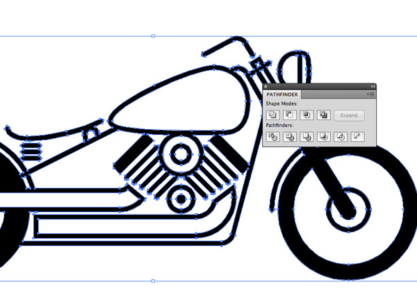
Hit the Merge icon from the bottom line of options in the Pathfinder palette to clear out any intersecting paths where the various shapes overlap.
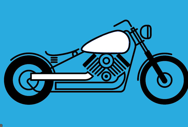
Place a coloured element underneath the illustration to see the shapes that still have a white fill. Right click and select Ungroup then delete the individual white shapes produced by the Pathfinder.
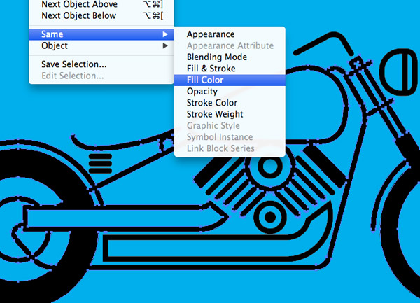
Thanks to the Pathfinder all the negative space between elements are solid objects which messes things up if you try to change the colour of the linework. Select one of the black objects and go to Select > Same > Fill Color.

Press CMD+X to cut all the linework to the clipboard, then draw a selection around all the invisible leftover pieces and hit delete.
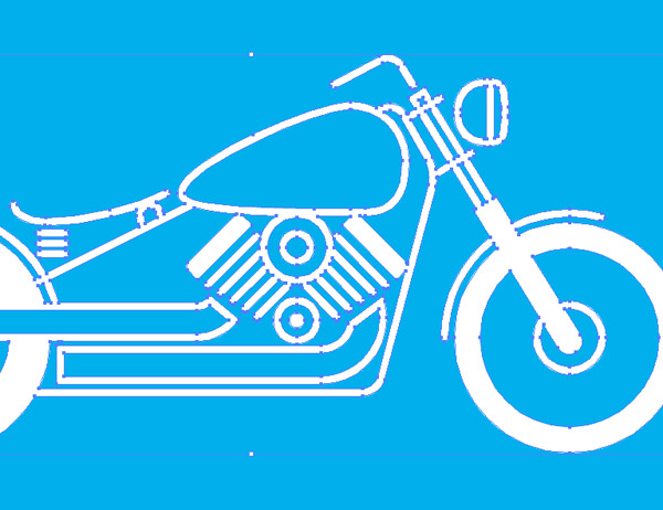
Paste the linework back in and group the elements together. These elements can now be safely given a different fill colour without the negative space also being affected.

The final illustration is simplified enough to give it the stylish pictogram effect, but retains enough detail to help keep it recognisable as a motorcycle.


Thanks for the tutorial, I can wait to try it out. My fiance and I ride, and I can think of a few ways to use this. THANKS!
wow, nice =)
Hi Chris, great post. This post has actually helped me deal with a major issue i’ve been struggling with since i stared using illustrator. I’ve always had a problem when scaling artwork with diffrent stroke widths. By just showing the option in the preferences menu where we’re supposed to uncheck the “scale strokes & effects”, i instantly knew tha the solution. Tried it out and voila, my strokes scale just right. Gotta get back to the rest of the Tut. Cheers!!!
Thanks! I’ll be using this tutorial. How did you get the letterpress look at the end?
Nice tutorial, also elegant style! compliments!
Always a joy to see you do your thing!
Keep it up!
Thanks for the tutorial, this presentation is fascinating! Seeu
This looks great! Loving the retro fun stuff right now. Hope to expand it to other areas I’m working on. Thanks Chris!
This is what i call creativity…!
Thanks for sharing this helpful article!!
This article is really elementary and make it simple for the novice designer who are in need of source of inspiration….
Thanks alot..!!!
Thank you, I’ve just finished. Looks quite nice.
Thanks Chris, had fun working through this tutorial. Keep them coming :)
I really love your illustrations and tutorials! I was wondering if you could explain how to get that texture of the final piece?