This post was originally published in 2014
The tips and techniques explained may be outdated.
Adobe Illustrator is the perfect tool for creating abstract art with basic shapes and lines. In today’s tutorial I’ll show you how to create this geometric stripy line effect with a custom Art Brush. It’s an effect that looks fantastic yet it’s pretty easy to make, plus it’s a technique that can also be used to create cool logos and typography.
Watch the video
Subscribe to the Spoon Graphics YouTube Channel
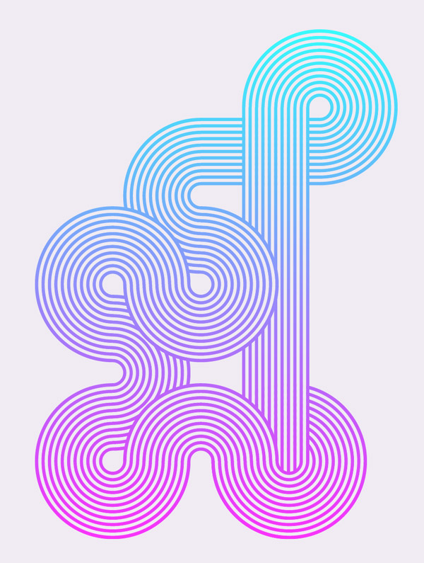
The artwork we’ll be creating is this interwoven stripy line effect. It’s a really simple process but it can be used to create some really cool designs. We’ll be using it to create a bright and colourful poster, but it also looks great when used to create intricate logo symbols or custom typography.
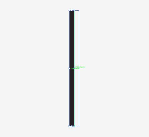
Create a new document and use the rectangle tool to draw a long thin shape with a black fill. Turn on Smart Guides (CMD+U) then hold ALT and Shift while dragging with the mouse to create a duplicate. The Smart Guides will make it easy to perfectly align these shapes side by side.
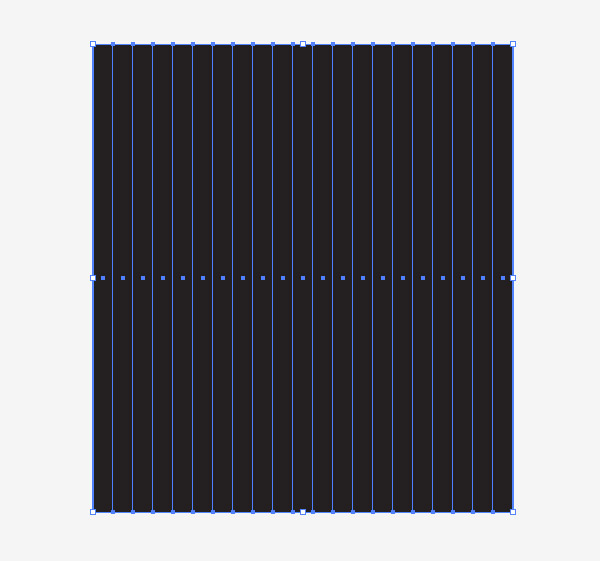
Repeatedly press the shortcut CMD+D to “Transform Again”, which repeats the duplication and creates a series of perfectly aligned shapes.
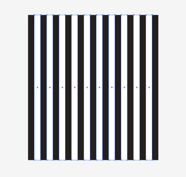
Select every alternate rectangle shape and change the fill colour to white to create a stripe pattern.
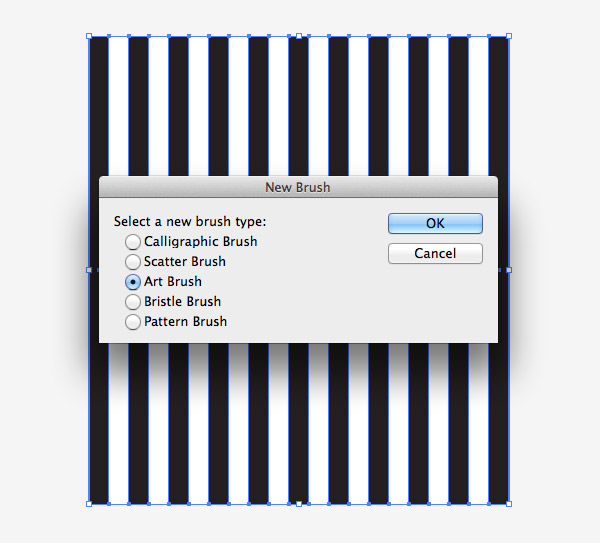
Click the “New” icon at the bottom of the Brushes panel to create a new brush. Select the Art Brush option. Ensure the flow of the brush runs vertically in the settings, then click OK.
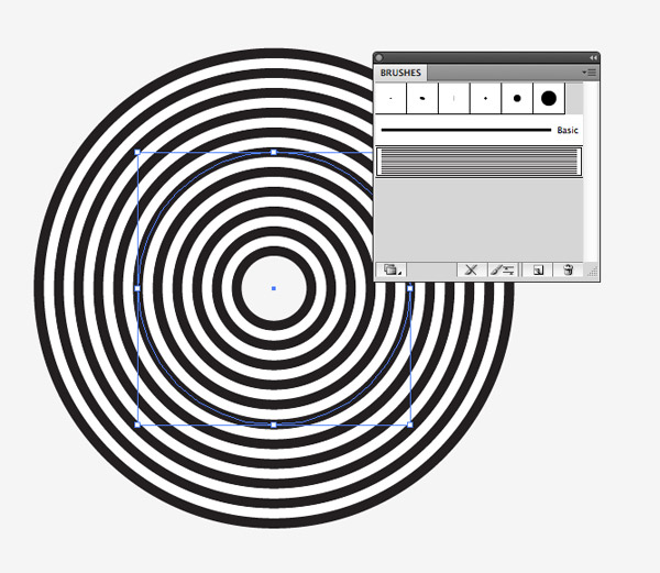
Draw a circle somewhere on the artboard. Clear the fill and stroke settings then apply the new stripy brush. Pro Tip: Turn off “Scale Strokes and Effects” in Illustrator’s Preferences to allow shapes to be transformed without affecting the brush pattern.
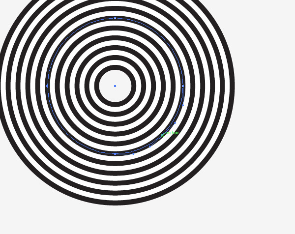
Use the Pen tool to add an anchor point between two existing points then press the delete key to create a 3/4 circle.
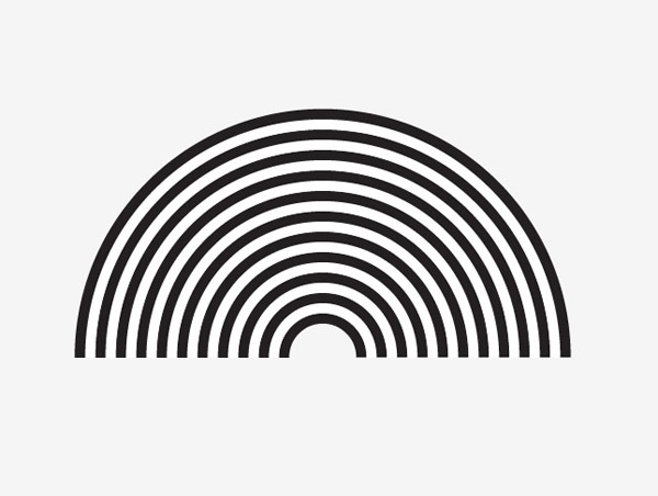
Duplicate this 3/4 circle shape then use the Direct Selection tool to delete the lowermost point to create a 1/2 circle.
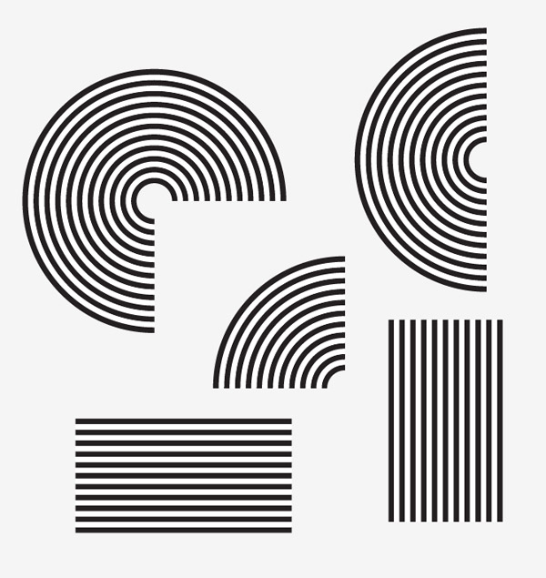
Create a duplicate of the 1/2 circle then delete another point to create a 1/4 circle shape. Also apply the brush effect to a horizontal and a vertical line to round off a collection of building blocks.
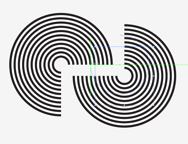
We can now begin building our designs by copying and pasting the various ready made shapes. The Smart Guides will make it easy to snap them together to perfectly align the stripy lines.
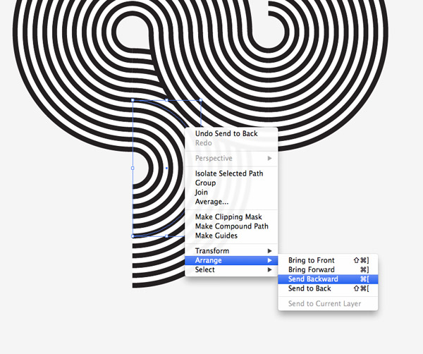
In places where the shapes overlap, you have the option of adjusting the stacking order. Use the shortcuts CMD+[ and CMD+] to shift the elements above and below each other.
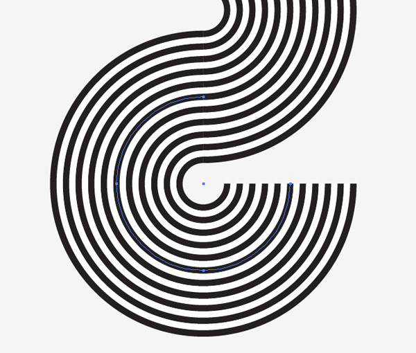
When the shapes are aligned perfectly the stripes will flow seamlessly from one shape to the next.
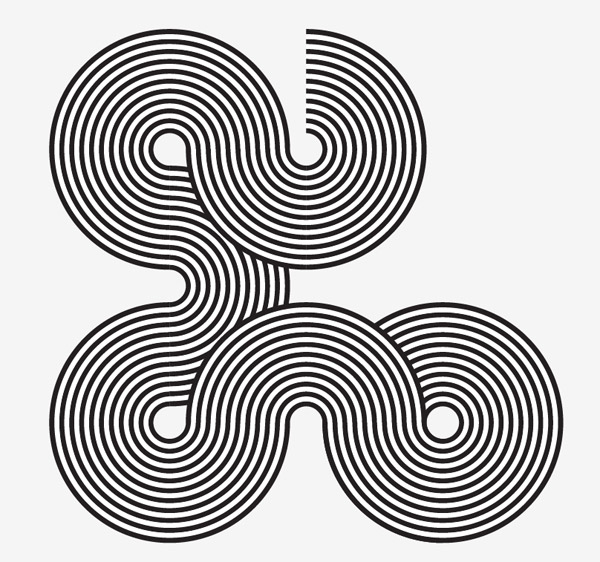
Continue to extend the illustration by adding extra elements. Remember you can rotate the shapes to alter the direction of the lines.
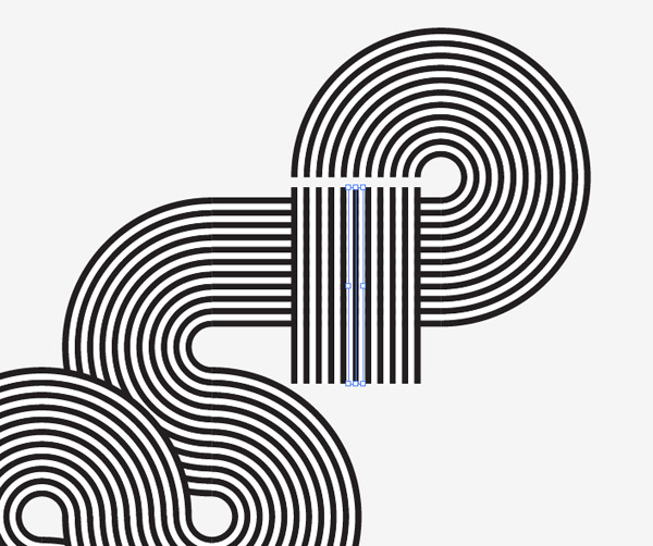
Use the straight paths to extend the illustration horizontally or vertically. These shapes can be stretched to any size.
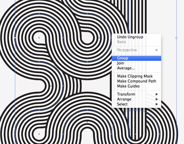
Once your illustration is complete, select all the individual paths and combine them into one group. Press CMD+C to make a copy of the artwork.
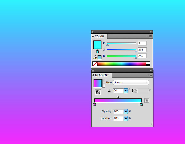
Elsewhere on the artboard draw a large rectangle and add a gradient fill. Select two bright colours that will produce a vibrant gradient.
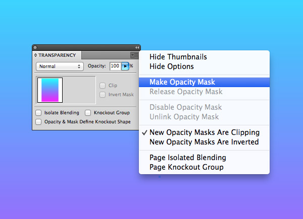
Seelct the gradient rectangle and choose the Make Opacity Mask option from the Transparency panel’s fly out menu.
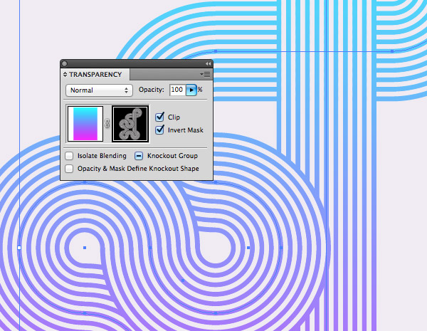
Use the shotcut CMD+V to paste in the stripy lines artwork into the opacity mask. The black and white colours will show and hide areas of the gradient fill to clip the colour to the shape of the illustration. Click the square on the left in the Transparency panel to exit out of the mask editing mode.
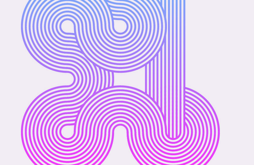
The final geometric stripy line artwork looks great with a vibrant gradient applied, but the technique can also be used to build some fantastic looking typography or logos. When building the initial brush, try changing the colour of each shape to create a multicoloured stripe effect!


Great tutorial, Chris! It’s amazing what can be created in Illustrator with relative ease.
Chris,
Thanks for the tutorial! With your help, I learned a new design element in less than 30 minutes. I look forward to more great tips in my inbox.
Sam
I learn more and get inspired whenever I receive your e-mails, thank you Chris!
Joana
Thank you, Chris. This is a fantastic tutorial. Your blog is so helpful. Always excited when I get your emails!
Very nice as always Chris!
Cheers to you .
So cool! Best one yet. Thank you!
very good one, thanks Chris.
oh! Off Course!!! Totally seamless idea!!! you curious dog, this is a great way to use Ai…
i stuck on phase that says “create a new brush” so i select the stripes and made a new brush, and selected the art brush, now what? what does it mean to “Ensure the flow of the brush runs vertically” ? i try to select the up arrow and select ok, but nothing happend to the stripes and it didn’t changed to a circle…
please help :\
I have a gap in my circle when the brush pattern is applied. Any idea why.
I have the same issue as Richard. Looks like a real thin slice of pie has been removed from my circle. I assume that this has something to do with the paths not being perfectly aligned, but cannot seem to correct the problem.
Path alignment NOT a factor. I can’t seem to pinpoint the exact problem. I tried varying:
number of lines
line height
the direction I drag the cursor to make the circle
and possibly other parameters (I tried so many things.)With the SAME brush sometimes I get a gap and sometimes not.
So I guess my advice is keep making circles until you get one with NO gap. (Shrugging.)
I’m running into the same “sliver” issue. Thanks for the tutorial!
Great tut, trying this one tonite.. Thanks
“Ensure the flow of the brush runs vertically in the settings…” try the setting “bottom to top” it worked for me.
My passion for work with Illustrator was born here with your tutorials! Thank’s as ever Chris!
Cool tutorial. I can get to the point where I have the 3/4 shape, and it looks perfect. However when I try to make the 1/2 shape, the brush effect gets messed up somehow.
The shape without the brush is indeed a semicircle, but with the brush it gets warped. Only 30 degrees or so looks good. I would attach a picture if I could.
I don’t know why this is happening as the circle and 3/4 circle look fine. Any suggestions?
Figured it out. Enabled “Scale Proportionately”, and it looks good now.
Crap…that’s not it either as it thins the stroke (but the semicircle is no longer warped).
Great tutorial, I am also having the missing segment issue, I’ve changed the stroke direction and tried both vertical option without success, as the anchor points are deleted it is not leaving a clean sharp edge in the centre – any other suggestions?
I’ve figured it out – you must have a stroke colour eg black applied to the circle, when there is no stroke colour applied that creates the missing segment
Actually… the more I play with this it looks like it has to do with the size of the circle – you have to make sure that when the brush is applied that the circle doesn’t appear to have an empty space in the middle – like a donut.
Chris,
Thanks for this and thanks for making learning Ai fun!
Micki
Thanks, nice tutorial. I am a web designer and i was stuck with a client, who after reading your tutorial i am quite sure he was asking for such a thing… i will gonna try it for sure.. and hope my client will gonna like it. Thanks again.
Thanks for sharing this tutorial. I am not familiar with illustrator but i will have to do some work for my boss.
Thanks to your tutorial, i will probably succeed in. (Sorry for my english)
Thanks for this tutorial! It helped me with a problem I was stuck on… It didn’t occur to me use a transparency mask in this way :D
Does anyone know why the opacity is mask isn’t working? Just appears a black box after i click “create opacity mask”
I had the same problem but figured it out: create the mask, click on the black box, then paste your figure in. And then it should be colored.
using AI CC
Once ive created the new brush and use it! It gives me a non-full circle. about 93%
Great tutorial. Spoongraphics is one of best place to learn illustrator. Am regular reader of your blog and am featuring your articles on my blog so that my readers can also approach the best stuff. We’ve featured it here at http://bit.ly/1vG8kC0. looking forward for more informative and cool stuff.
Thanks for sharing this tutorial. I am not familiar with illustrator but I’ve tried many tutorials from http://thedesignpixel.com/useful-adobe-illustrator-tutorials.html
Great job ! I have done one :)
Thanks for a nice tutorial Chris, had loads of fun! Here’s my attempt to be creative http://www.jonern.com/uploads/2014.07.09._tutorial_preview.jpg
I had the same issue with a slice missing from my circle when I applied the bush. It appears that using the round rectangle tool takes this issue away. Previously I used the elliptical tool. If you just arrow down while drawing your rounded rectangle you’ll eventually get to a circle. I hope this helps others as I was very frustrated at that point.
You should arrow up instead of down. Sorry for the confusion.
Very nice tutorial. The stripy line effect can be very useful for typography designs. I have see it in action and it looks really good.
I’m having the same issue with the “missing slice” of my circle. I’ve already tried everything said above but still can’t make it word. Anyone?
I’ve figure this problem out. In art brush options, I changed the minimum width value to remove “the small slice”.
Excellent job Chris!