Ever since I created the showcase of Unique Packaging and Label Designs for Whisky Bottles I have been wanting to have a go at creating some kind of liquor bottle label design of my own. I also have a resource in my collection that I have been eager to make use of, which would be the perfect tool for creating a Victorian style brand design complete with ornate flourishes. Follow along with this Adobe Illustrator tutorial to create a vintage logo for a whiskey bottle label. I’ll show you how a layered typeface and its bonus assets can be used to quickly build great-looking artwork without the need to illustrate the ornaments or lettering by hand.
The artwork I’ll be creating in this tutorial is an ornate logo design for a fictional whiskey bottle label. The entire design is made using the Java Heritages typeface, which I feature in my All-Time Favourite Fonts Collection, which saves Spoon Graphics readers 50% off this typeface I will be using in this tutorial, and four other of my favourite fonts I regularly use in my projects.
Get 50% Off My All-Time Favourite Fonts Collection
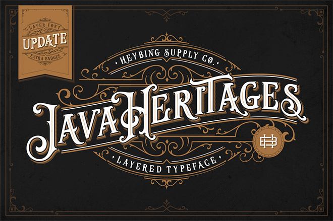
Java Heritages is a clever multi-layered type family inspired by vintage signage. By layering up the additional variants, you can quickly apply drop shadows, inner shadows and inline effects to your text, which would otherwise only be achievable by manually modifying the type. Also included in the font package is a collection of ornament elements, which can be used to easily build a composition of decorative flourishes to create insanely detailed vintage effects.
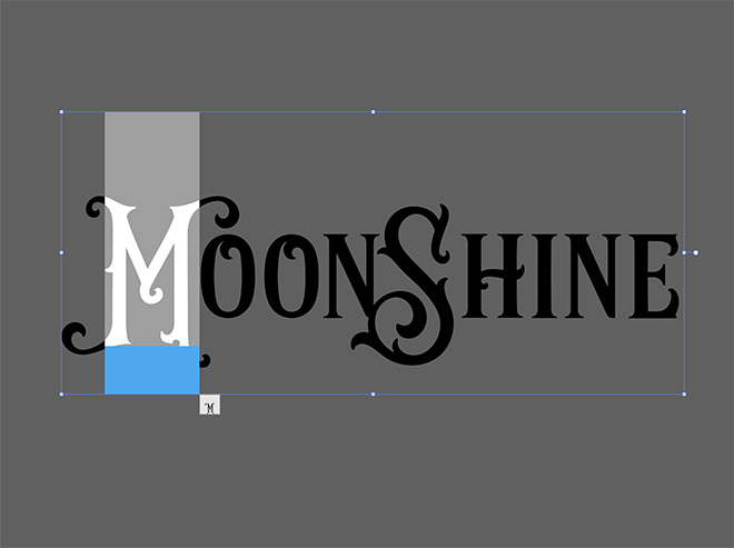
To begin creating your vintage whiskey bottle label design, open Adobe Illustrator and create a new document. Since we will be using white as a fill colour, I prefer to work in the empty grey area beyond the artboard. Java Heritages has two sets of stylistic alternates. By highlighting each character, you can see the alternative glyphs available for each letter.
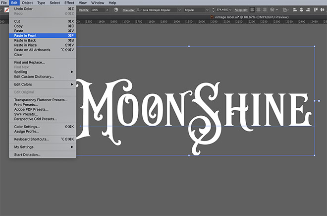
Choosing alternative characters adds decorative effects that are usually traits of hand lettering, rather than a font! To make use of the layering feature, go to Edit > Copy, followed by Edit > Paste in Front.
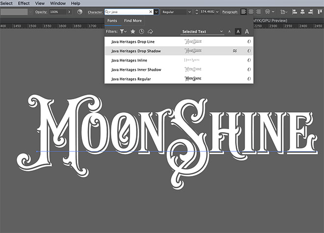
Highlight the duplicate text element, then change the font to one of the variants of Java Heritages, such as Drop Shadow. Alone this particular font version would be illegible, but when layered over the Regular variant it produces an effect that would usually have to be created manually.
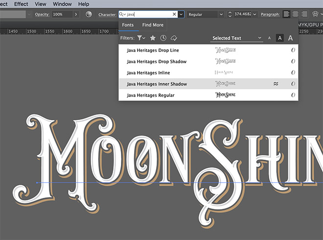
Paste a new text element for each font effect and choose the new font style. Changing the fill colour of each font generates different colours for each part of the effect.
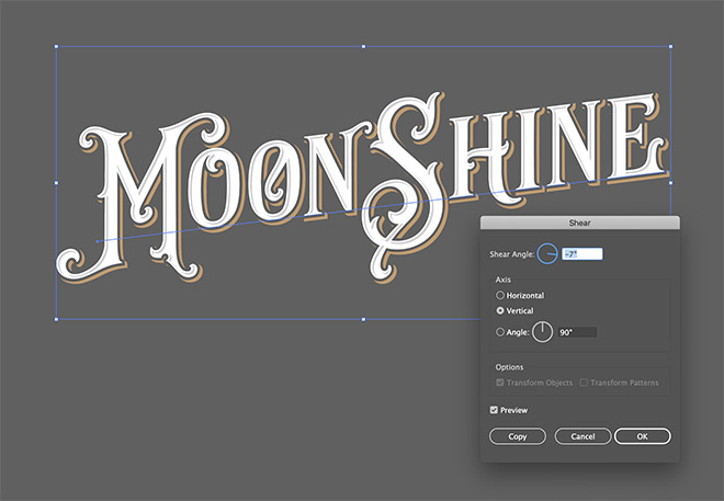
To give the text some additional flair, go to Object > Transform > Shear. Click the Vertical option, then enter -7 degrees to give the text a rise effect.
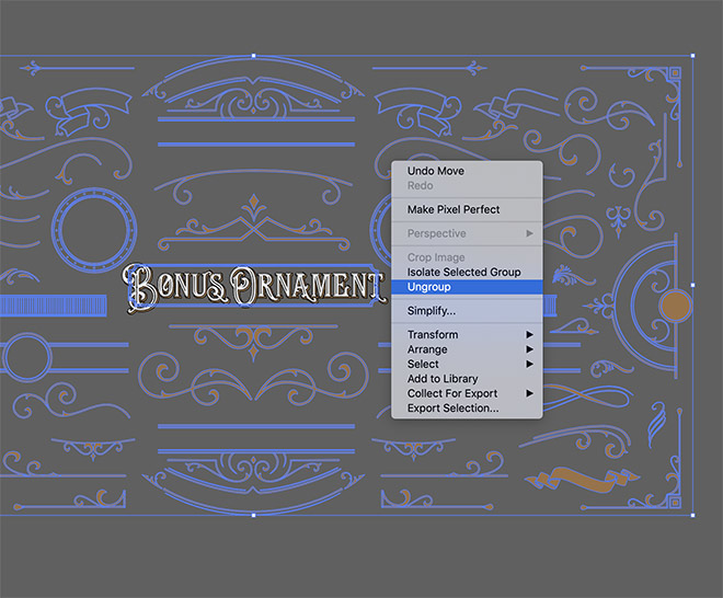
Included in the Java Heritages package is a collection of bonus ornament elements, and ready-made badge layouts. These elements can be used to quickly build intricate designs without the need to illustrate each decorative shape first. It’s necessary to break apart the elements to they can be selected individually, right click and choose Ungroup.
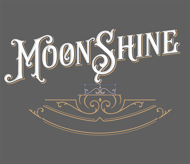
Copy and paste, or hold the ALT key while dragging an element to make a duplicate, then position it near the main text element. Begin building an ornate frame around the text by placing several elements.
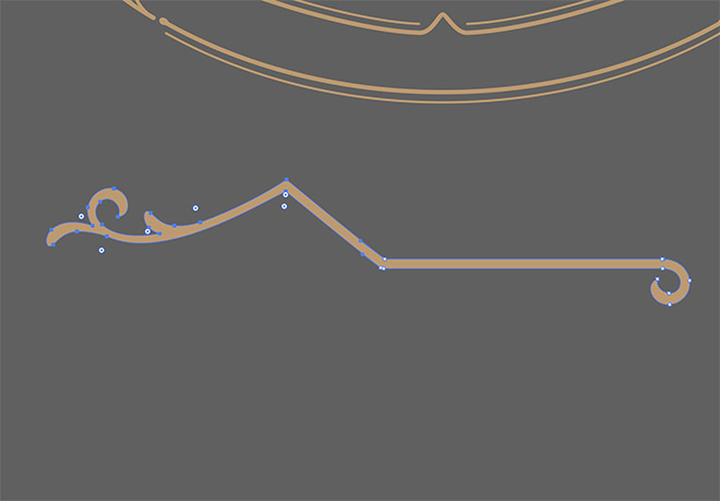
All the elements are vector graphics, so you can customise them further with Illustrator’s tools. Use the Direct Selection tool to delete the points that form an unwanted portion of a flourish.
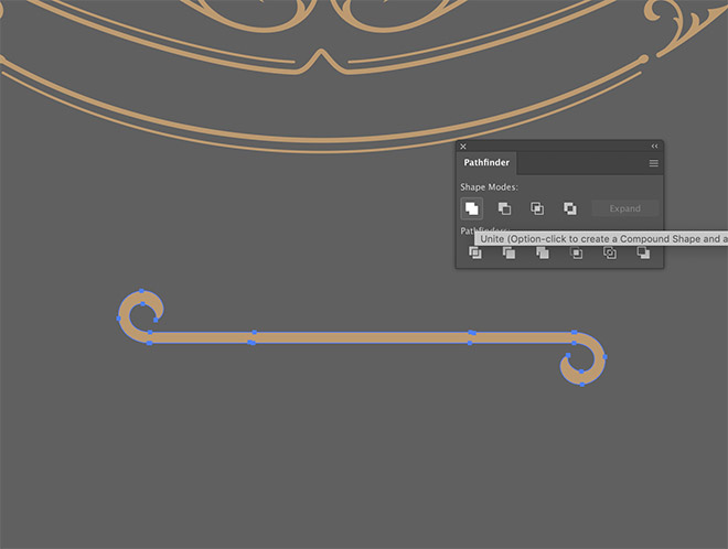
This entirely new piece can then be created by copying and rotating the leftover paths, then joining them together using the Pathfinder’s Unite button.
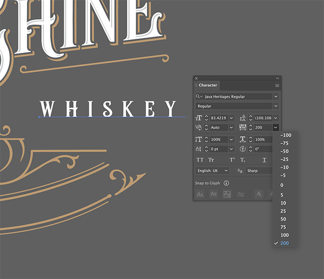
The Regular Java Heritages font also works well for smaller text. Typing in lower case creates smaller caps, then extending the tracking helps add some style while making it easier to read at small sizes.
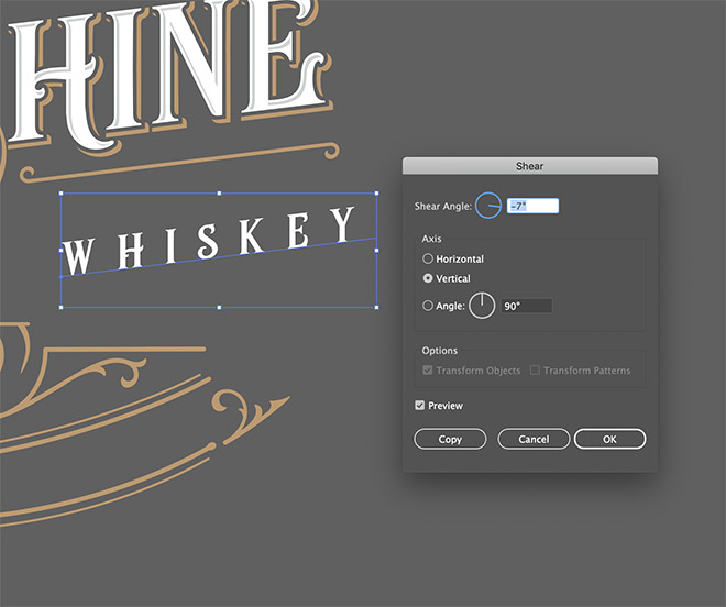
Add the Shear transformation to give the text the same rise effect so it runs parallel to the main brand name.
I find it is helpful to place some key elements, then begin filling in the empty space with additional flourishes.
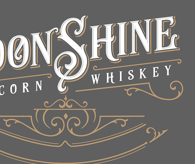
The Direct Selection tool can also be used to extend the straight edge of some of the ornate elements. Select just the points that create the end cap, then drag them while keeping the angle the same.
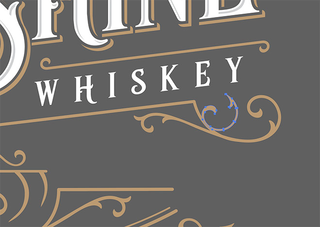
Adding a smaller decorative flourish to an existing element is a great way to customise them further and to make your design look more detailed.
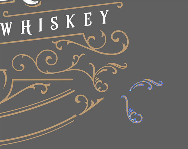
Combining several elements is a great way to extend the ornate flourishes so they take up more space. Here you can see how two additional pieces are added to the end of a longer twirly element.
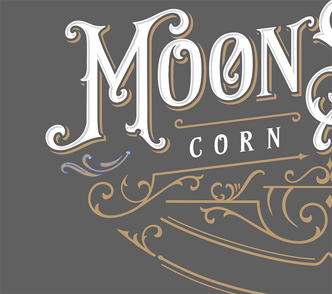
Any gaps within the layout can be easily filled in with a small decorative element. Just drawing this particular element from scratch would be quite a lengthy task, so it’s really handy to have a collection of ready-made assets available for immediate use.
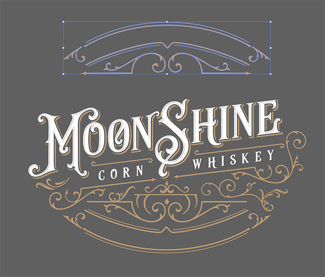
Elements you have already used can still be used elsewhere in the design. Rotate them by 180 degrees, or even flip them under the Object > Transform > Reflect menu so they aren’t as recognisable.
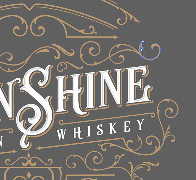
Continue building your ornamental composition to decorate the text. Try to follow the curves and outlines of the letters so the decorative elements complement the text.
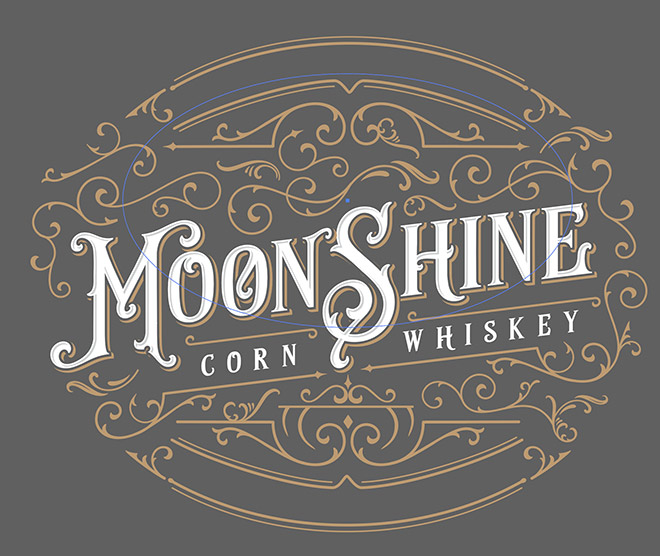
To make use of the space within the decorative frame, use an Ellipse with no fill or stroke to draw a path that follows the curvature of the elements.
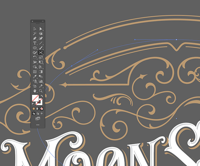
Use the Scissors tool to cut and trim the circular path so it fits within the decorative element. Use the Direct Selection tool to select and delete the unwanted portion.
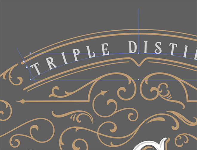
Hover over the path with the Type tool to see the Type on a Path option. Use the Direct Selection tool to adjust the handles to correctly position the text.
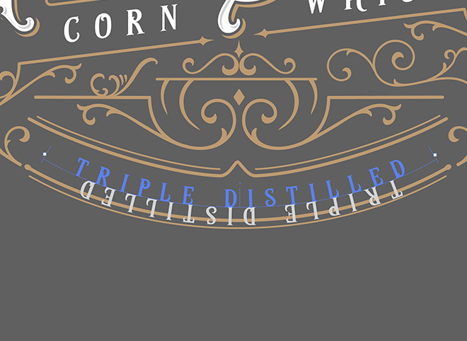
Copy and Paste this Type on a Path element and position it on the same decorative element at the bottom of the layout. To alter the text orientation, drag the handle to the other side of the path using the Direct Selection tool.
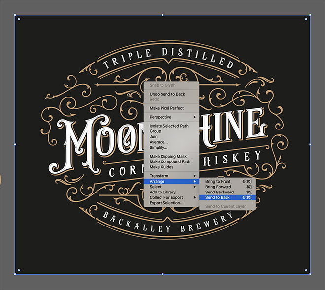
Once your design is complete, give it a suitable background by drawing a rectangle with an appropriate fill colour. Place it underneath the main logo using the Arrange > Send to Back menu option.
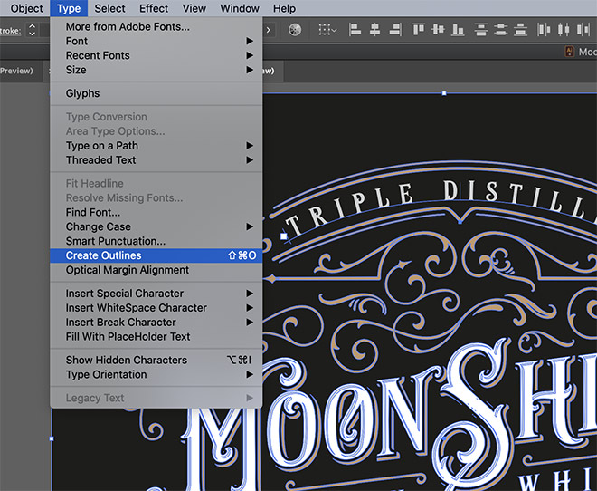
It’s a good habit to outline your text to preserve the appearance of the design even if the font isn’t available. Make sure you make a copy of the original live text version just in case you need to edit the wording.
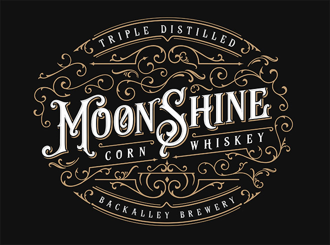
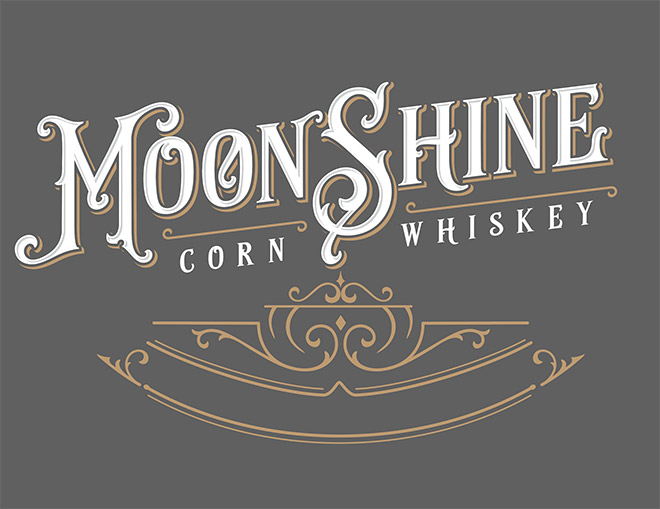
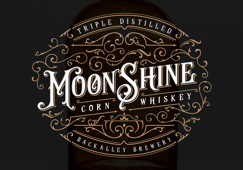
The final result is a detailed vintage brand logo with Victorian style ornaments and flourishes. The layering feature of the Java Heritages typeface makes it easy to create unique text styles, while the ready-made vector assets are a huge time-saver when it comes to building a decorative frame around your design.



This is great!.
I got the font for free including the extras and made an ornate logo with the name “Silver Bullet”
How cool! I like this! Thank you!
Hi Chris -realised I’ve been reading your blog for 10 years – still really great content and site as good as ever – thanks!