This post was originally published in 2013
The tips and techniques explained may be outdated.
I recently put together a little vintage style poster to let my friends know about a karting event I’m organising for my stag do. I know lots of my readers are also big fans of the retro style and I had loads of fun creating the design, so I thought I’d share the process as a tutorial to give an insight into the techniques used. We’ll use Photoshop to put together the poster layout with various textures and brushes, but also switch back and forth to Illustrator to create the typographic elements.
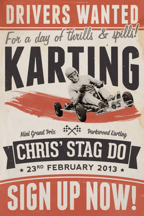
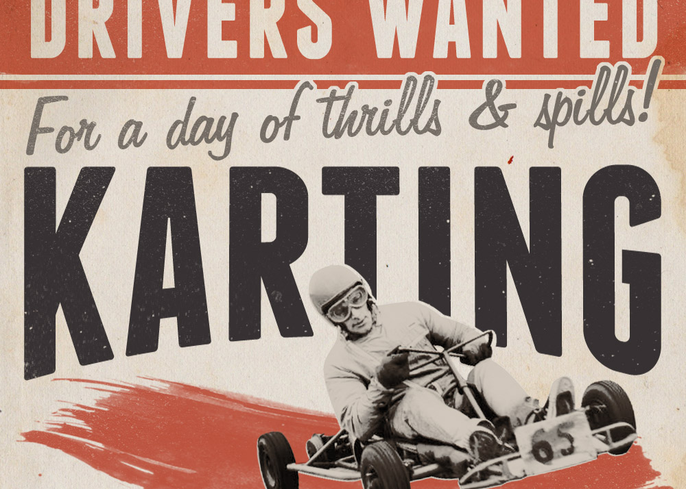
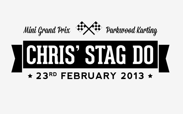
Here’s the little poster design I put together for my karting event. I initially had no plans of making it public, but I’m pretty proud of how it turned out and I know some of my readers will be interested in how to create the retro style. Before getting started, it’s worth gathering some inspiration from Google images for various retro and vintage race posters to pick out common styles.
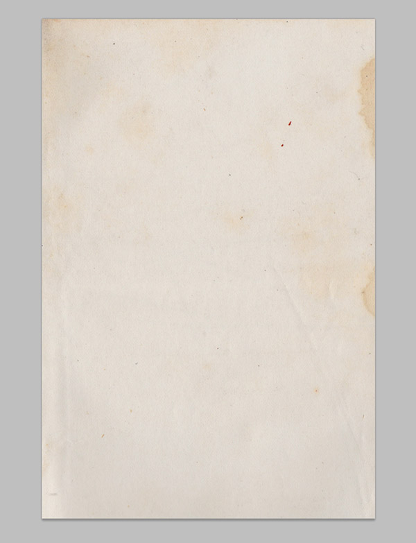
All old school posters from the 50’s & 60’s that have survived until today will have aged and feature yellow tones and various stains. To represent this in our design and achieve that aged appearance we’ll use a paper texture file as a background. This particular texture is available from LostandTaken.com
We’ll begin at the top and work down, starting with the red banner. Rather then fill a selection with red I used a watercolor Photoshop brush to generate more detail and texture.
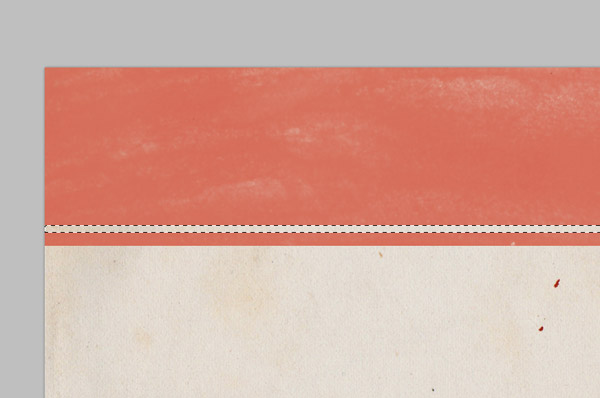
Use the rectangular marquee tool to square off the banner and create a little stripe along the bottom edge. Change this layer to Multiply to allow the paper texture to show through the red ink.
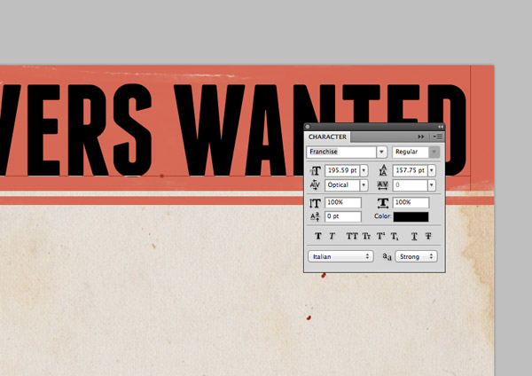
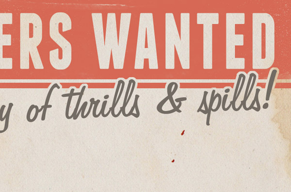
Enter the text “Drivers Wanted” using the powerful Franchise font. Scale it to fill the banner area while sitting centrally on the page.
CMD-Click the thumbnail of the text layer to load its selection, then add this selection as a Layer Mask to the red banner layer. The Layer Mask might need inverting to produce a knock-out effect. The original text layer can now be deleted.
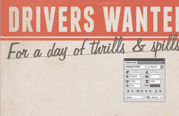
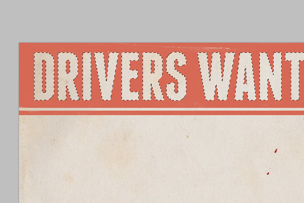
Typographic elements on old poster designs often continue a sentence but are set in a variety of type styles and layouts. Lay out the next line in a cool script font and set it at a dynamic angle overlapping the banner slightly.
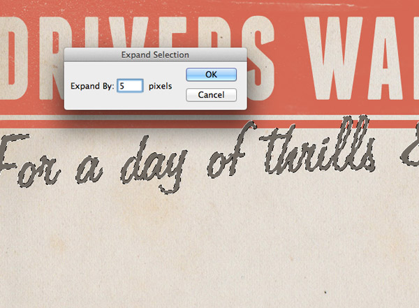
Load the selection of this text by CMD-Clicking the layer thumbnail, then go to Select > Modify > Expand. Enter 5 pixels in the options window.
Select the Layer Mask for the banner layer in the Layers palette, then fill this expanded selection with black to erase this portion of the banner and create a cool offset border effect.
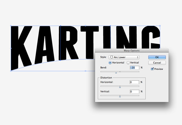
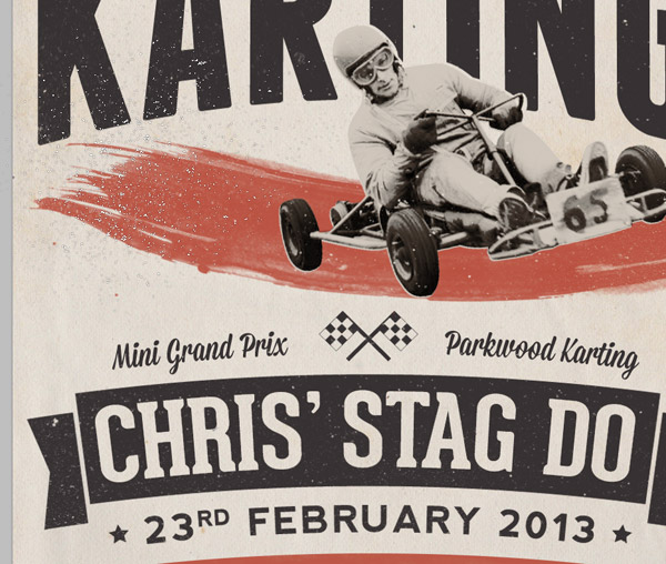
For the next typographic element we’ll need to switch over to Adobe Illustrator. Enter the word “Karting” using the Franchise font, then go to Object > Envelope Distort > Make with Warp. Add an Arc Lower effect at around -20%.
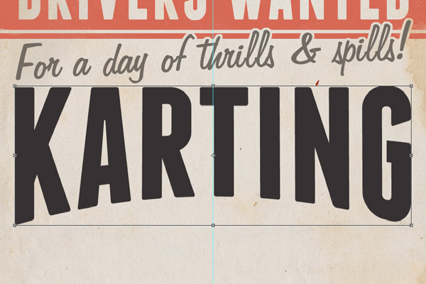
Copy/Paste this element into the main document and scale it to size. There’s no harm stretching the text slightly to bring back its elongated appearance.
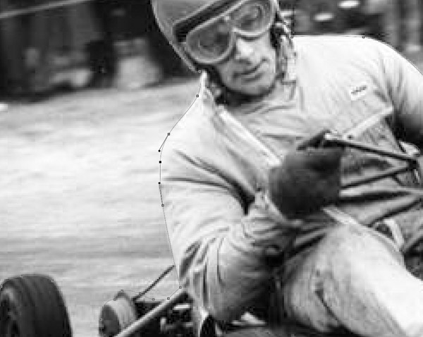
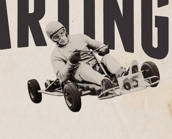
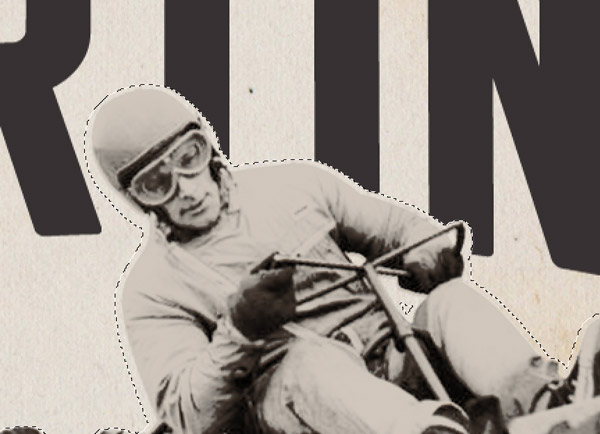
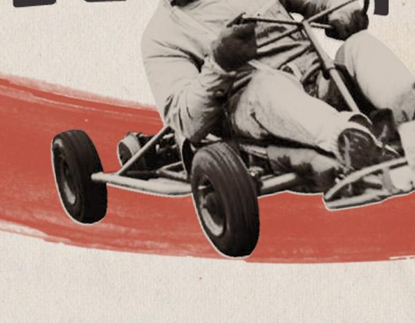
I originally had no plans to make this design public, so I was a little naughty and pinched an old vintage karting photo from Google Images. For live projects royalty free or stock imagery should always be used. Use the Pen tool to clip out your chosen image by drawing an outline around the main figure.
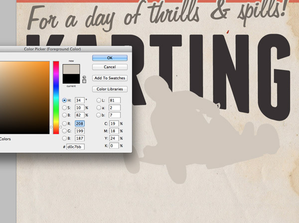
Paste the clipping into the main document, but load the selection and fill it with a light beige colour. Being a retro style design we’ll try and recreate some of the old screen printing effects seen on those classic posters.
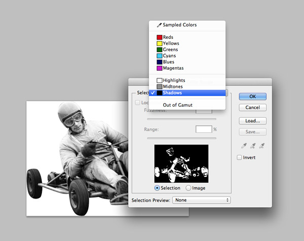
Create a temporary new document and paste in the photo clipping. Go to Select > Color Range and select the Shadows option. Copy this new selection and paste it into the main poster document.
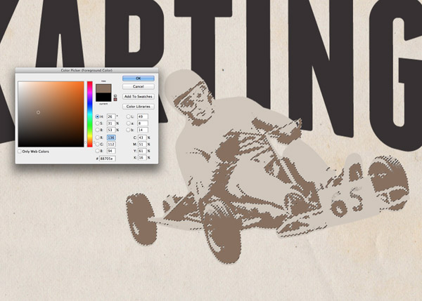
Align the shadows clipping to the beige outline, then load the selection and fill it with a mid-brown.
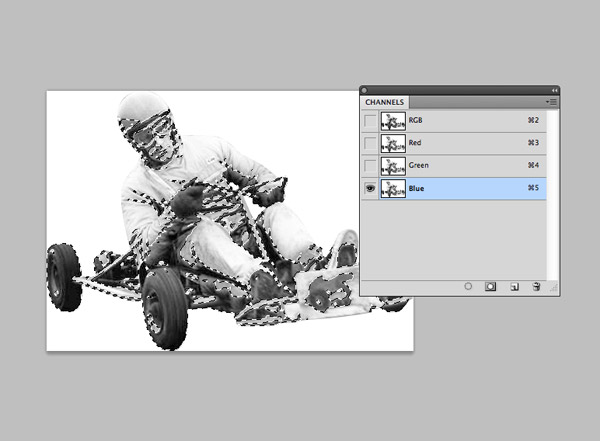
Switch back to the temporary document and load the selection of the Blue channel by CMD-Clicking the thumbnail. Invert the selection then copy this final clipping.
Paste and align the channel clipping with the previous layers and change the blending mode to Multiply.
Load the selection of the main outline, but nudge the selection off centre slightly so the outline isn’t perfectly aligned. Add a Layer Mask to the Karting text layer and erase this portion of the type by filling the area with black.
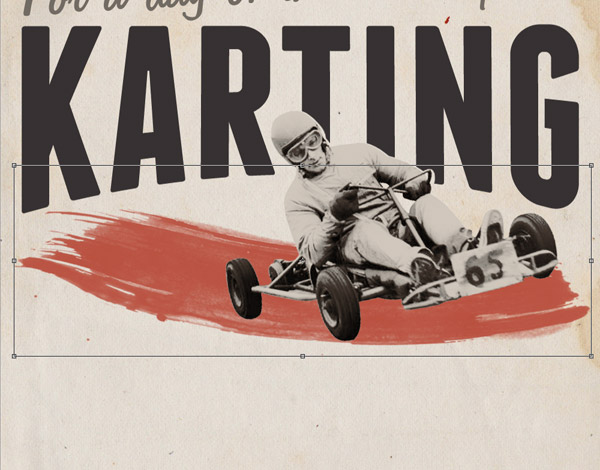
Add a streak of red using one of the watercolor brushes then scale/stretch it to fit the width of the poster.
The old printing techniques used to create these classic posters often exhibited mistakes and inaccuracies such as mis-registration. Simply offsetting the layering of the elements can create an authentic retro effect.
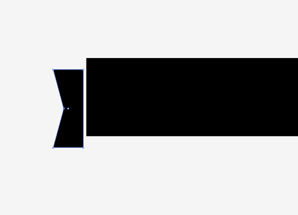
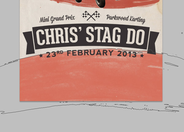
Switch back over to Illustrator to use the powerful vector tools to create a banner. Begin with a rectangle, then create end pieces by adding an extra point with the Pen tool and moving it inwards with the Direct Selection tool.
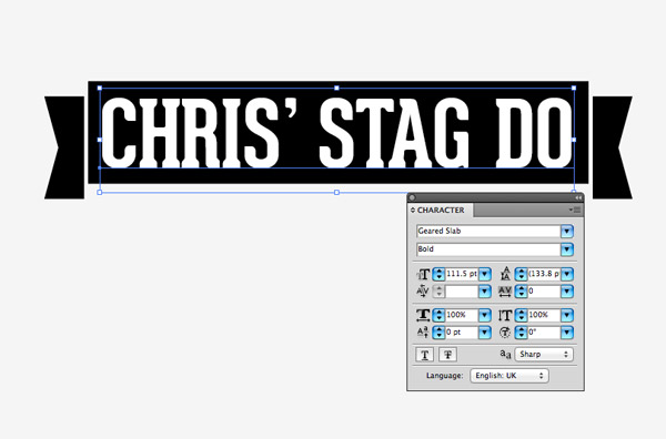
I chose the Geared font to lay up the textual content within the banner.
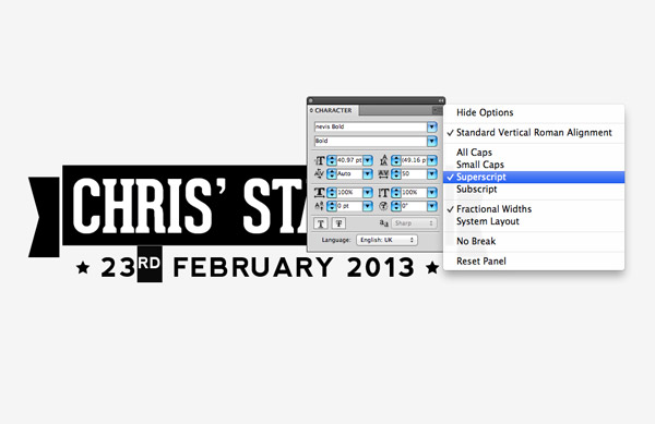
Nevis is another great font that works well with retro style designs. The date was laid out underneath the banner with a couple of star shapes.
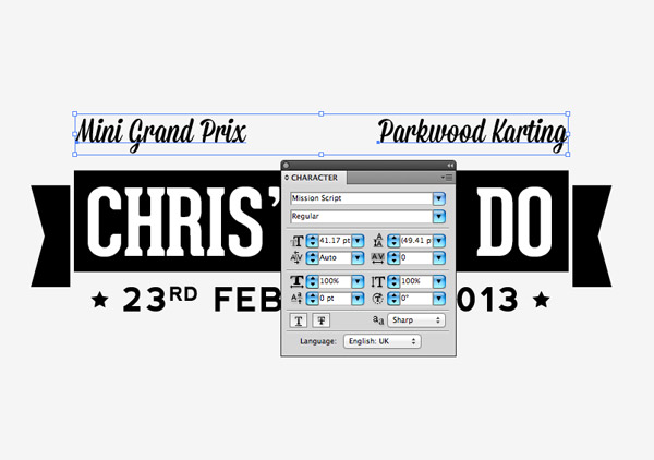
Retro style posters wouldn’t be complete without an abundance of script fonts. Here I’ve chosen the Mission Script font to add some details above the banner.
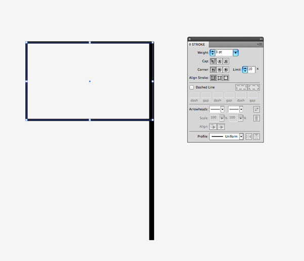
Being a race poster it makes sense to draw up some chequered flags. Use the rectangle tool to draw the basic outline of a flag using a stroked and a solid shape.
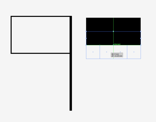
Turn on Illustrator’s Smart Guides (CMD+U) and use the snapping to align a series of squares. Three rows of four squares works well.
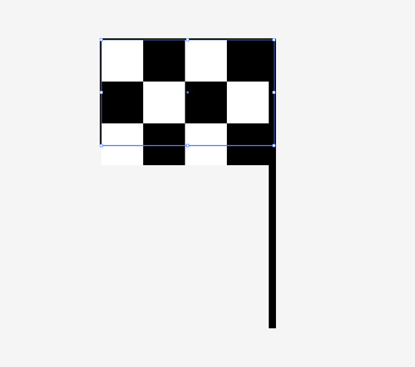
Change the fill colour of each alternating square to white, then move the whole block into position over the flag elements. Adjust the size of the flag outline shape to snap to the dimensions of the chequered blocks.
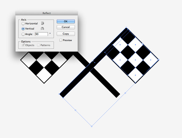
Rotate the flag by 45 degrees then Copy (CMD+C) and Paste (CMD+F) a duplicate. Go to Object > Transform > Reflect and choose the Vertical option then position the duplicate flag so it crosses the original.
Move the flags illustration into place on the typographic layout. Make any final adjustments to align the elements centrally.
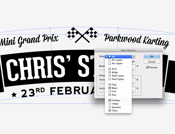
Draw a selection around all the objects then add an Envelope Distort Warp. Select the Arc option and set the bend to 10%.
Paste the layout into the main document and position it centrally in the lower portion of the design. Use the Magic Wand tool to select and delete any white fills from the text and chequered flags.
Create a footer for the poster using the same method as the top banner, using a watercolor brush to paint a strip of red.
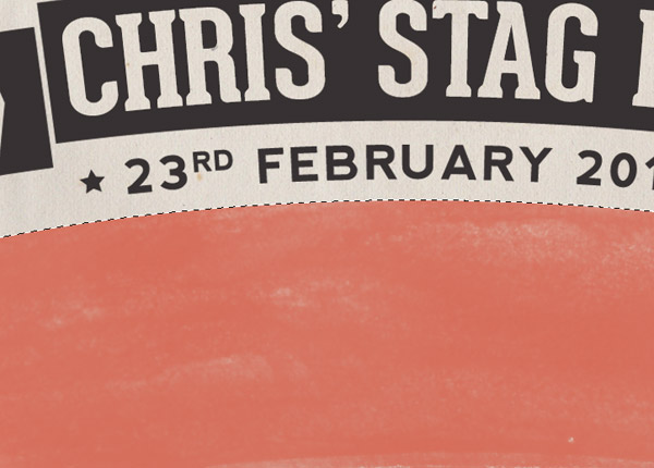
This time use an elliptical marquee to trim the footer to size with an arc matching the shape of the typography.
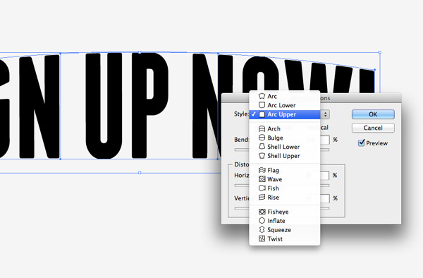
Switch over the Illustrator one final time to add an Envelope Distort with an Arc Upper style to a block of “Sign Up Now!” text using the Franchise font.
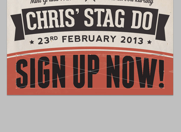
Paste and scale this block of text into position in the poster document.
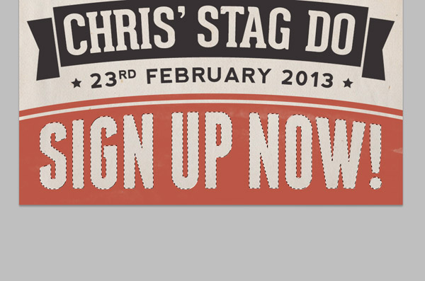
Make a selection of the text and add it to a Layer Mask to erase the text from the background strip.
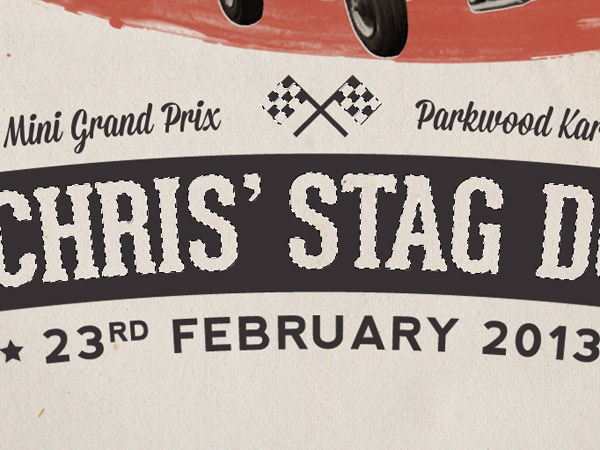
Group all the text elements together then add a Layer Mask. Use a couple of subtle grain brushes to distress the type and add to the aged appearance of the design.
This leaves the retro style race poster complete. The basic colour scheme of red and black ink, as well as the recreation of the print inaccuracies helps represent the style and quality of old school posters.

you’re genius Chris…
Amazing Chris… thanks for sharing.
Nicely done Chris!
Wonderful, simple and striking design…
Brilliant tutorial, great finished poster design, very old feel to it.
Love the style! You really got the retro feel in this one.
Really love the design and the tutorial!
Interesting tutorial Chris, keep up the good work!
You are so the man. Nice output & tutorial, as usual.
Cool thanks for sharing love this!
This is amazing! I´ll use the Idea for my daughters confirmation-invitation. What a word :)
Cool outcome, love the red brush stroke in the middle and the choices on fonts. Thanks for this tutorial.
Very cool!
Thank you very much.
I dont understand it clearly.
CMD-Click the thumbnail of the text layer to load its selection, then add this selection as a Layer Mask to the red banner layer. The Layer Mask might need inverting to produce a knock-out effect. The original text layer can now be deleted.
wow it,s really attartive race Poster.Amazing tutorial, great complete poster design.
Hi Chris,
My compliments of this post.
It’s a very good tutorial.
I’ve shared the article!
Greetz from the Netherlands,
John Seomer
Amazing Chris….i like it too much :)
Nice. I was going over the written instruction and when I got to creating the checker flag part, you side “Illustrator.” Although I am an Ai user, I will tackle this. I’ll just need to figure out where and how PS works.
Ooops. I guess I didn’t read it correctly. Chris clearly stated he will be using both AI & PS to complete this project. Thanks for the tutorial. This was my first attempt at using PS.
Here is my retro poster I made for my Mt. Fuji Night Climb Round-Up this year.
http://img.photobucket.com/albums/v645/duceduc/themes/fuji-night-climb-roundup-2013_zps2ce973b7.png