This post was originally published in 2013
The tips and techniques explained may be outdated.
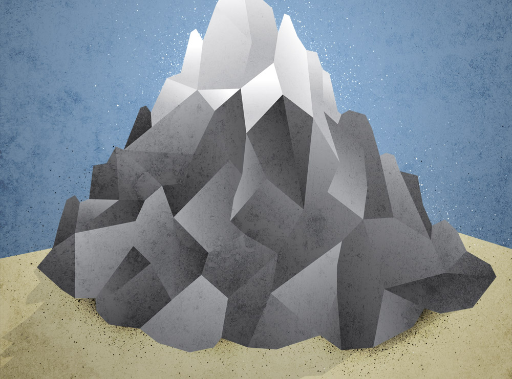
Low poly art would usually be made with 3D applications such as Cinema 4D to build three dimensional models, but we can create similar styles in two dimensions directly in Illustrator. Follow this tutorial to create a cool low poly mountain illustration using vector paths. We’ll add gradients to simulate a 3D effect then take the design into Photoshop to polish it up with cool textures.
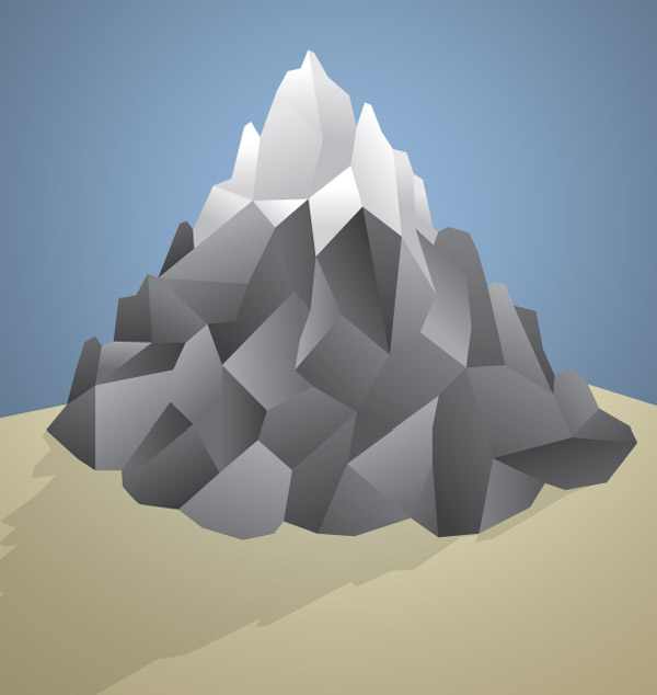
Here’s the final artwork we’ll be creating. The polygonal mountain will be created using Illustrator’s accurate vector tools then brought into Photoshop for some texturing to really bring it to life.
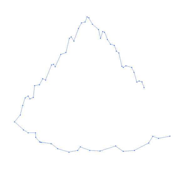
Create a new Illustrator document and draw a rough mountain outline using the Pen tool. Make single clicks to generate straight lines between each point and follow a curved path for the bottom edge to help with its 3D appearance later.
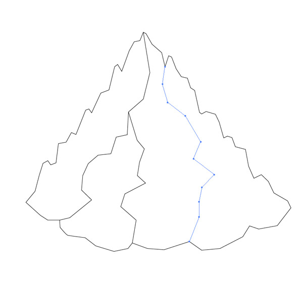
Deselect the outline shape then add intersecting lines running from upper to lower points. Use Smart Guides (CMD+U) to make it easy to snap to these existing points.
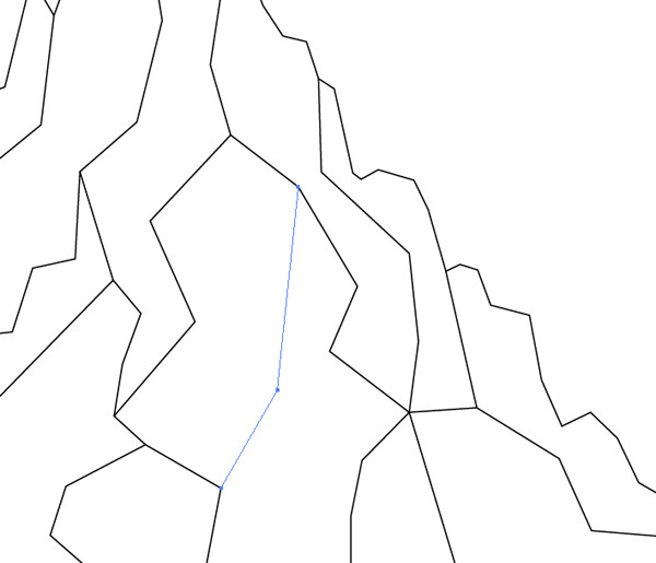
Continue adding intersecting lines between existing points to break up the shapes into smaller segments.
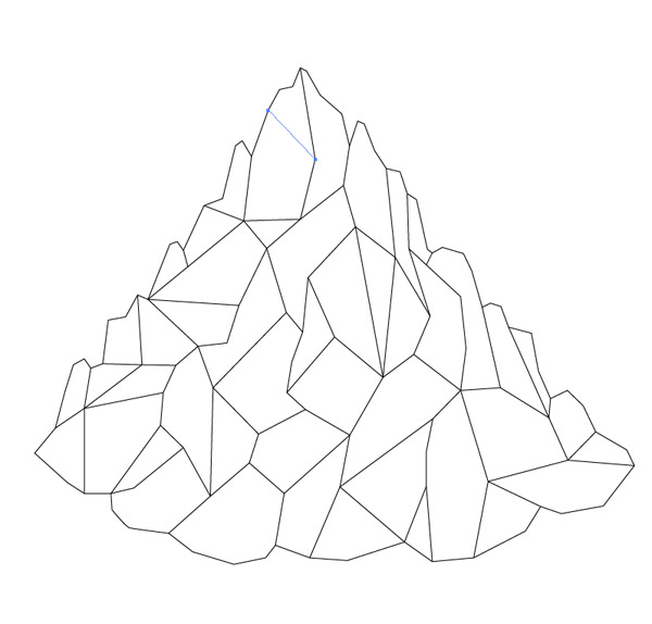
Eventually each new line will become shorter as the polygonal shapes get smaller. Don’t go for too much detail though as the illustration will lose its “low poly” theme.
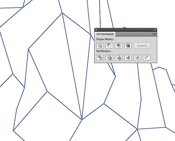
Draw a selection around all the linework so far then click the Divide option from the Pathfinder palette to intersect all the lines and create individual shapes.
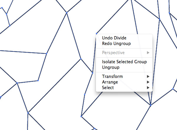
Right click and choose Ungroup in order to select the individual shapes created from the Pathfinder.
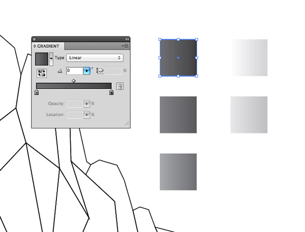
Fill some temporary squares to the side of the artboard with various gradients. I’ve gone for gradients of black between 70-90%, 60-80% and 50-70%. Then some lighter gradients from 0-20% and 10-30%.
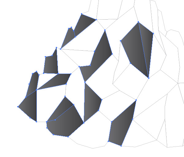
Hold Shift and select a series of random shapes from the mountain artwork. Use the Eyedropper tool to apply the first gradient fill.
Select a number of the remaining shapes and apply the next gradient fill, then finish off with the lighter shades.
Make any adjustments if too many of the same fills appear in one area or if one gradient appears dominant.
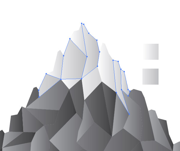
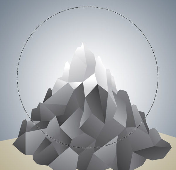
Use the lighter gradients to add a snowy peak to the top of the mountain, alternating between the lighter and darker options to add variations in tone.

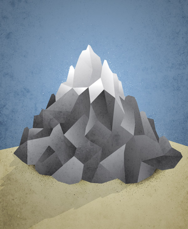
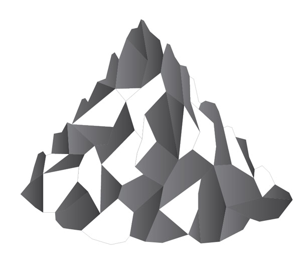
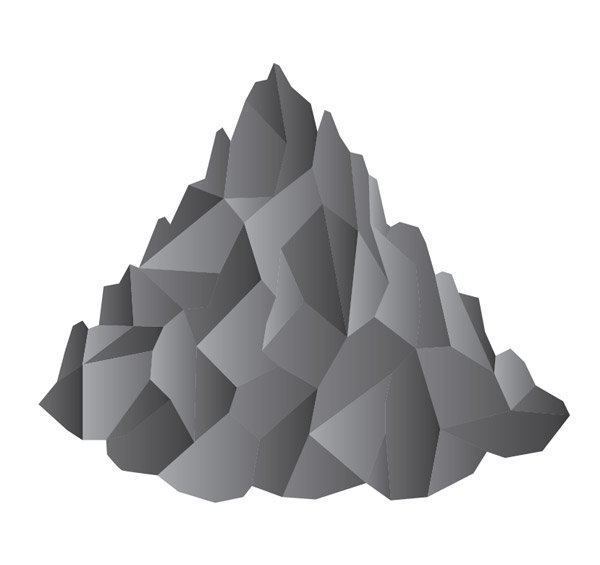
The addition of gradients really helps eliminate the flat two dimensional appearance but currently they all flow in the same direction. Use the Gradient tool to adjust the flow of each shape’s fill in a random direction.
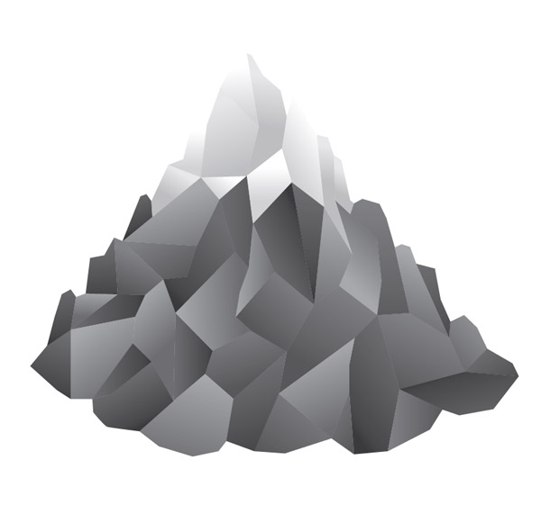
The varied gradients really adds depth to the illustration. Next we’ll take this vector artwork into Photoshop for some finishing touches.
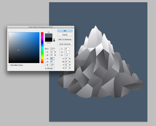
Paste the graphic into a poster sized Photoshop document and add a dark grey-blue background fill.
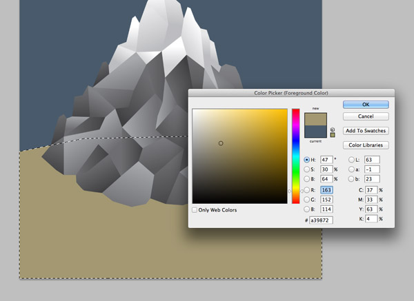
Draw a selection with the Polygonal Lasso tool and fill this area with a beige-brown to ground the mountain in the document space.
Use a large soft brush to add a white highlight on a new layer above the background but below the mountain graphic.
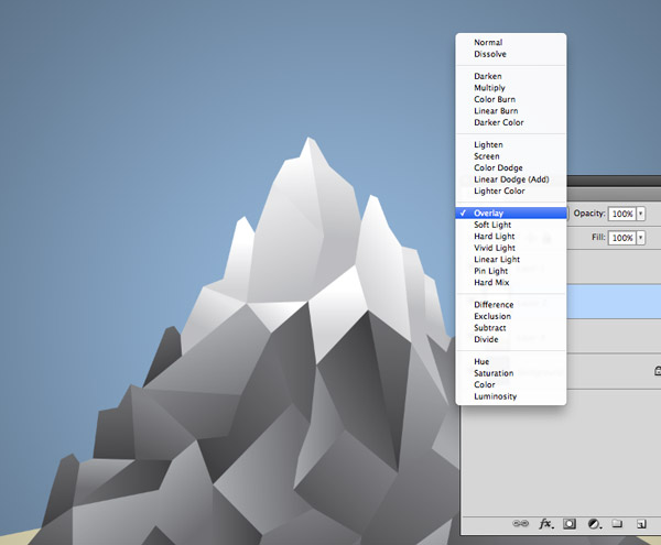
Change the blending mode of the white highlight to Overlay to allow the colours to interact and create a vibrant blue glow.
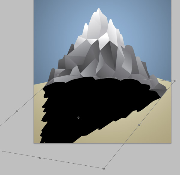
Duplicate the mountain graphic layer and add a black Color Overlay. Press CMD+T to Transform then select the Distort option to stretch the graphic into a long shadow.
Reduce the opacity of the shadow to 10% and position it underneath the main mountain layer.
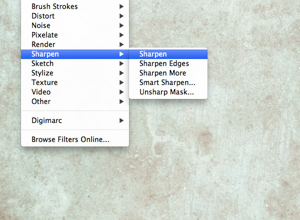
Open up a subtle grunge texture and paste it onto a new layer above all the artwork. Add a Sharpen filter once or twice to bring out the finer details.
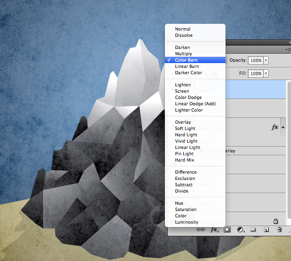
Desaturate the texture then change its blending mode to Color Burn to allow the texturing to interact with the artwork and create a nice tactile effect. Lower the opacity to around 35%.
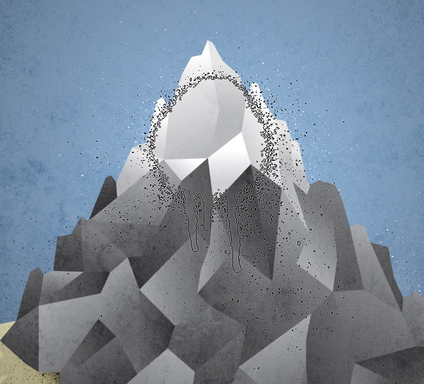
Grab a set of spraypaint brushes and dab a couple of spots of white on a new layer below the mountain artwork. Keep the main portion of the brush hidden behind the mountain to produce some light overspray around the edge of the peak. Repeat the process with black on a lower edge.
The Photoshop texturing really brings the illustration to life by eliminating the flat appearance of Illustrator’s vector artwork and the low poly effect itself is a really cool style that could be used for all kinds of designs.

you are amazing chris !!!
A really good tutorial and the finished design looks brilliant. Nice one Chris!
You’ve lost touch with modern design Chris, your recent tutorials are laughable..
Thats not a low poly design, it’s a poor imitation.
Mike’s tutorials and design portfolio blow everyone out of the water. Follow him to victory.
P.S. Awesome tut, Chris. Thanks!
While I do not agree with the tone, the man has a solid point. This is shite. Shading is inconsistent, the spray paint doesn’t add anything and the end result is not low-poly, it’s just something that wants to fit in with the cool kids but fails to do so.
Great tutorial! thanks Chris
I’m kind of succer to this style – thanks
It’s amazing, thank you for the tut :)
This is a great effect Chris, thanks!
Great stuff, thanks for the tutorial!
Chris, as always – another awesome tutorial. I love this type of artwork, but previously only did it with construction paper :P
I’m getting better with Illustrator thanks to stuff like this!
This is a great tutorial! Thanks for sharing!
you did excellent work with few steps and i must try now because you describe in detail. cool work Chris
Nice tutorial! Love the Color burn texture effect.
For some reason when I group the mountain some of the lines disappears… \:
When using the “Divide” option with the pathfinder, is there any way to avoid adding extra lines to the shape?
Hey Chris,
Thank you so much for sharing an awesome tutorial, I’ve used this technique and made some really amazing graphics.