This post was originally published in 2015
The tips and techniques explained may be outdated.
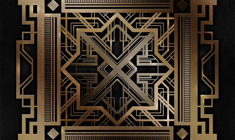
Art Deco is an iconic design style from the 1920s that was recently given a new lease of life thanks to the movie The Great Gatsby. Geometric, angular shapes and symmetry are some of the key features of the art deco style, which produce some beautiful graphic designs when used as backgrounds, frames and patterns. In today’s tutorial we’ll use Illustrator to create a detailed art deco pattern, then we’ll switch over to Photoshop to polish it up with shiny brass metal effects.
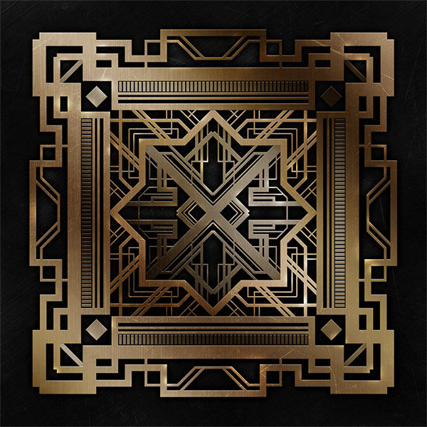
The design we’ll be creating in this tutorial is an intricate mix of angular lines to create a complex art deco style pattern. To really give it the extravagant Great Gatsby treatment we’ll use Photoshop to add realistic shiny metal and lighting effects. Use this tutorial to create frames and backgrounds for your art deco themed designs for classy wedding invitations, leaflets, business cards, etc.
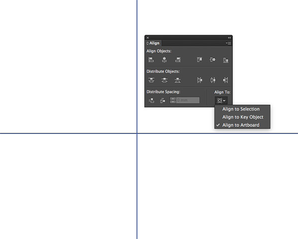
It is possible to create geometric designs directly in Photoshop, but since Illustrator is designed specifically for working with vector shapes, why not make use of its powerful tools? Create a new Illustrator document and begin by drawing a horizontal and vertical line across the artboard. Use the Align panel to centre them to the Artboard to form a perfect cross.
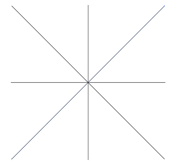
Copy (CMD+C) and Paste in Front (CMF+F) one of the lines, then rotate it by 45°. Hold the ALT key and extend the lines to match the width of the original cross. Copy and paste a duplicate and rotate it to intersect in the opposite direction.

Drag a selection around all the lines then right click and select Make Guides from the menu. Deselect everything then right click and select Lock Guides to avoid accidentally moving them.
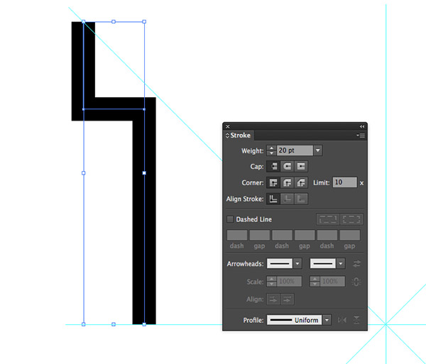
Select the Pen tool and remove the default white fill. Increase the stroke weight to 20pt and draw a path between the diagonal and horizontal guides. Hold Shift to keep the lines straight.
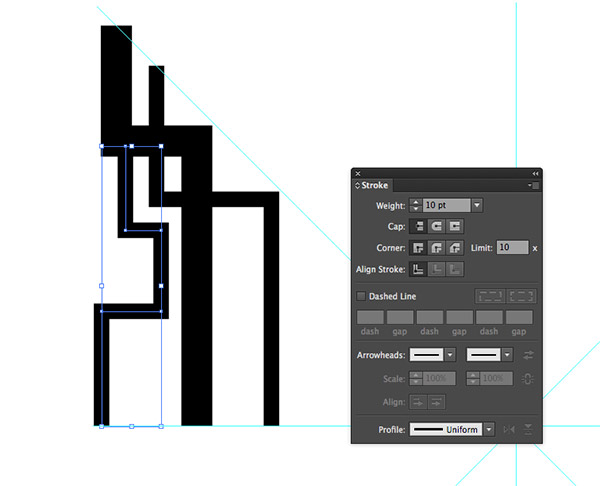
Reduce the weight of the stroke to 10pt and continue drawing lines that flow in random directions. Holding CMD and clicking the artboard is a quick technique to finish a path before starting a new one.
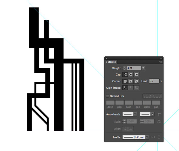
Bring down the stroke weight further, then use the Pen tool to add finer details. Remember to hold the Shift key to constrain the angles to 45° or 90°.
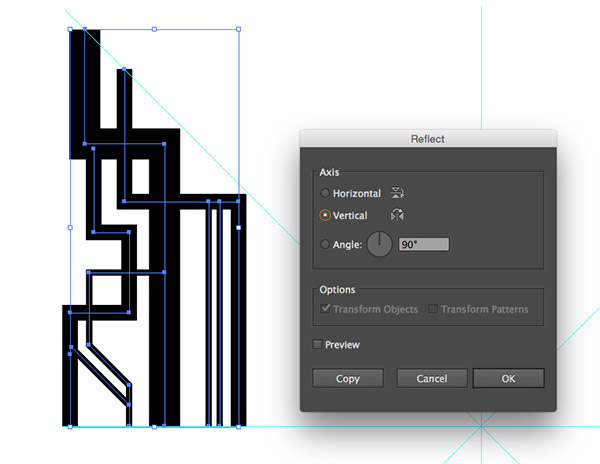
Select and Group (CMD+G) all the paths, then go to Object > Transform > Reflect. Select the Vertical option then click Copy.

Hold Shift while rotating this duplicate of shapes to 90°, then align them to fit within the next segment of guides. Turning on Smart Guides (CMD+U) makes it easy to line up the elements.

Make multiple duplicates of this group of lines and rotate or reflect them to create a symmetrical layout around the entire design.
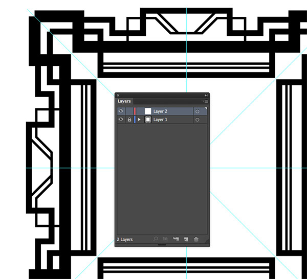
Open the Layers panel and lock the first layer so the elements cannot be selected. Add a new layer before adding the next series of shapes.
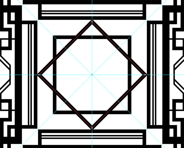
Select the Rectangle tool, hold the ALT & Shift keys then click and drag a perfect square originating from the centre of the guides. Give this shape a 10pt stroke, then create a duplicate (CMD+C & CMD+F) and rotate it by 45°.
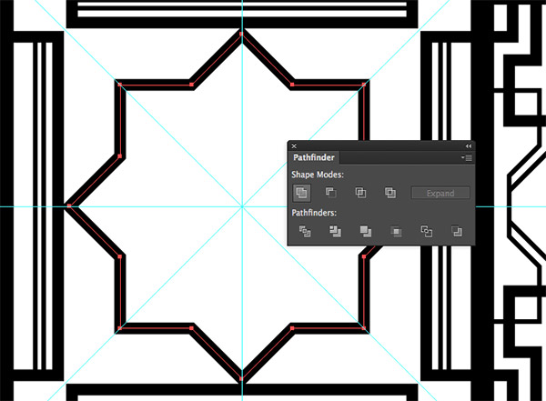
With both square shapes selected, click the Merge option from the Pathfinder panel to blend these shapes together to form an 8 pointed geometric star.
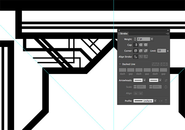
Switch back to the Pen tool and continue adding decorative elements between two guides. Use much smaller strokes for the fine details this time.
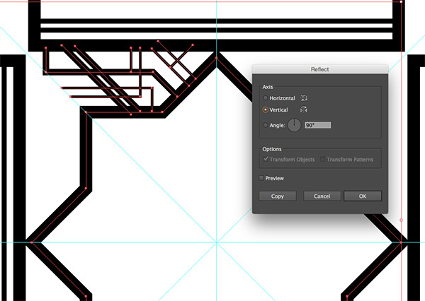
Press CMD+A to Select All. Only the elements on the unlocked layer will be selected. Go to Object > Transform > Reflect and select the Vertical option, then hit Copy.
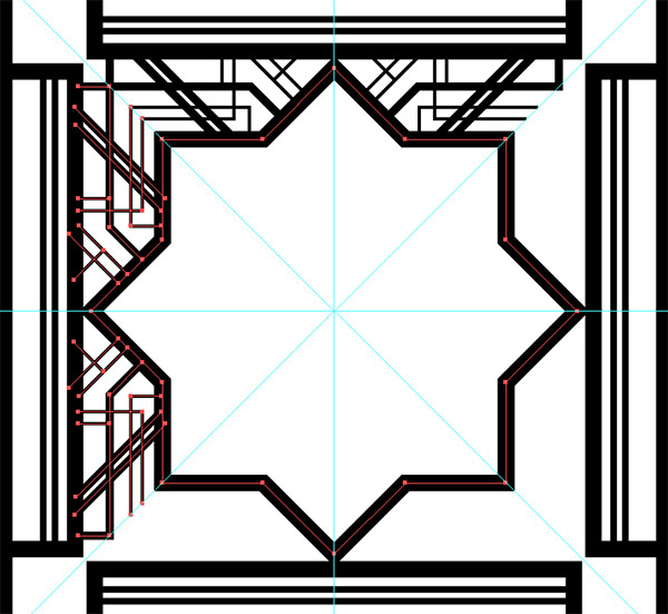
Rotate and position the duplicates of these elements to create another symmetrical layout.
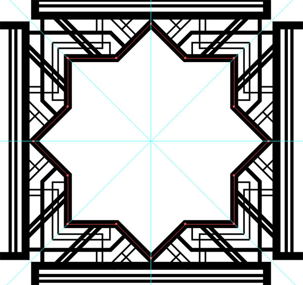
Duplicates of the centre star shape have been building up as we made copies of the elements. Select and delete the unwanted extras.
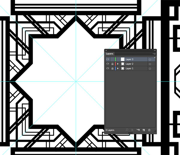
Lock this current layer and add a new layer for the next series of elements in the centre of the design.
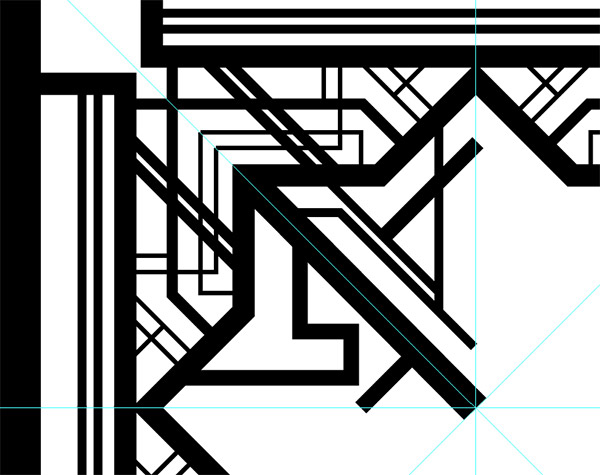
Use a mix of line weights to fill out the empty space. If you were designing this art deco pattern as a frame, outline areas where text elements could be added.
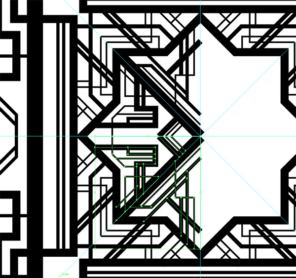
Once the space is filled, select all the elements and group them together. Continue the process of reflecting and rotating the shapes to fill the layout.

The intricate art deco style pattern is taking shape, but we’ll add one more layer for some finishing touches.
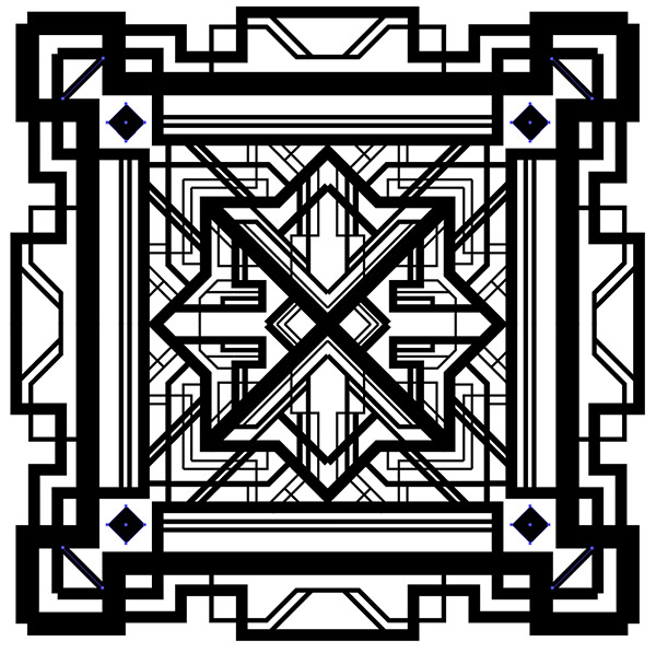
Draw a little square and rotate it to form a diamond shape. Position this shape in any empty space on all four corners of the design.
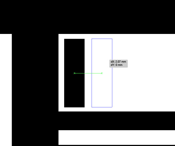
In the long thin empty areas of the layout, draw a small rectangle. Hold ALT and drag out a duplicate, leaving a small gap between them.
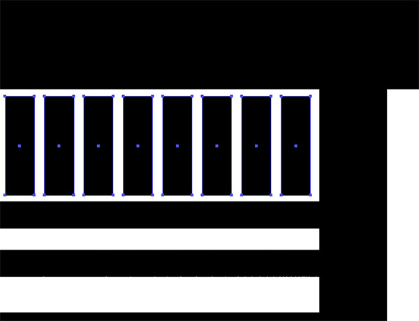
Press and hold the CMD+D shortcut to Transform Again, until the whole area is filled with equally spaced rectangles. The shapes probably won’t fit perfectly, so scale them down to leave an equal gap at both ends.
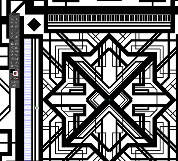
Copy (CMD+C) and Paste in Front (CMD+F) a duplicate of the lines, then select the Rotate tool. Hold ALT and set the pivot point to the centre of the guides, then hold Shift and rotate the shapes by 90° to fit into the other sides of the design.
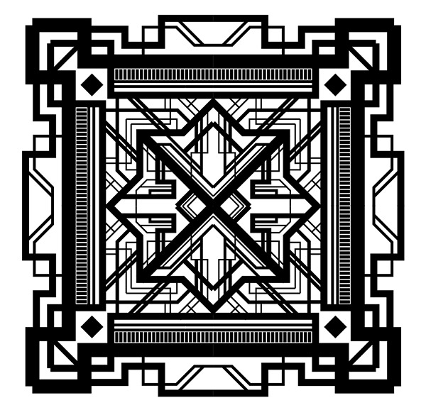
Despite being created from a few simple lines, the overall pattern is looking really complex and definitely captures the art deco theme. It looks a little boring in black and white though!
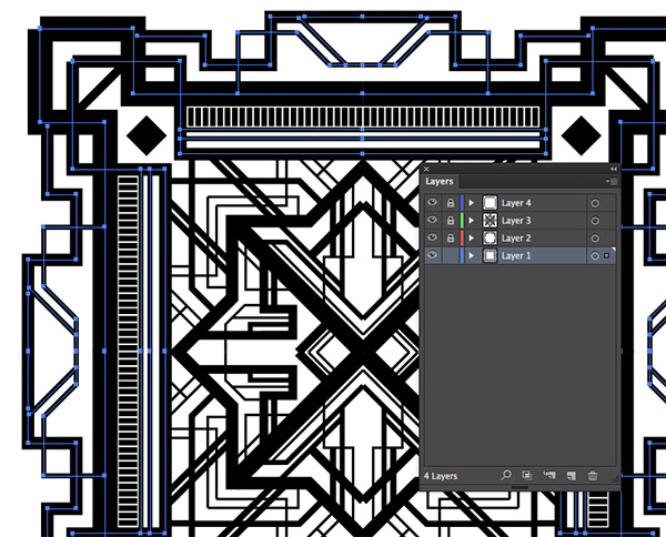
Unlock just the first layer of shapes and copy them to the clipboard, then open up Adobe Photoshop.
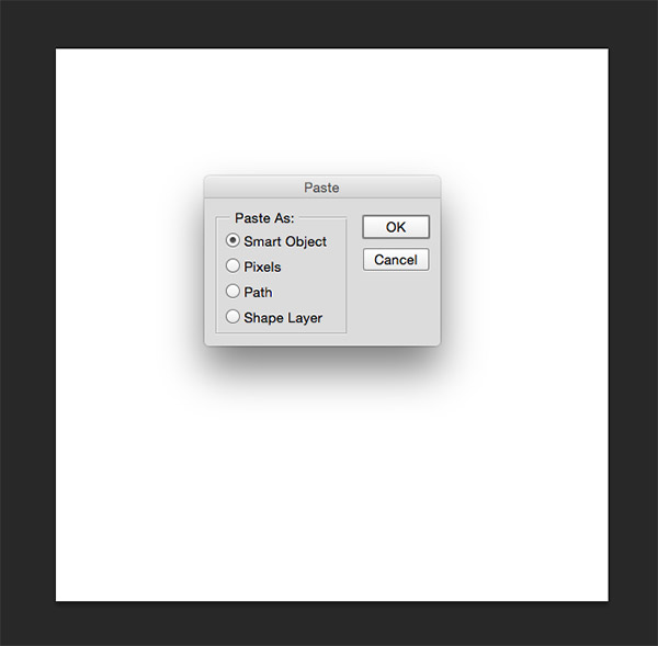
Create a new document, which will default to the size of the copied elements. Paste the elements as a Smart Object.
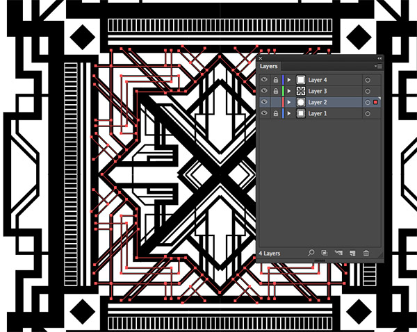
Switch back to Illustrator and unlock the second layer (re-locking the first layer). Select All and Copy these elements. Paste them into the Photoshop document.
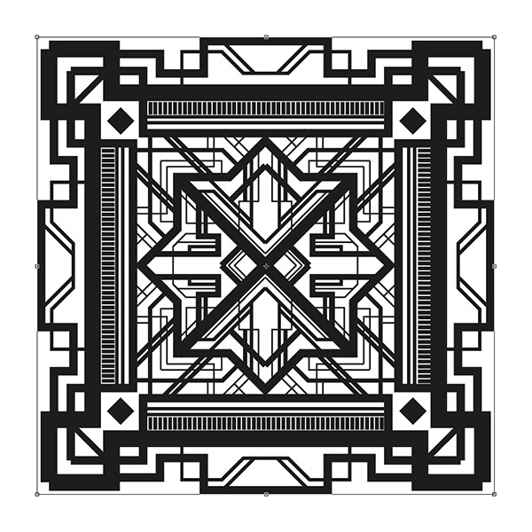
Repeat the process of copying each layer individually over to Photoshop. The scale of the Photoshop document will probably be much smaller, so enlarge the canvas and scale up all the Smart Object layers.
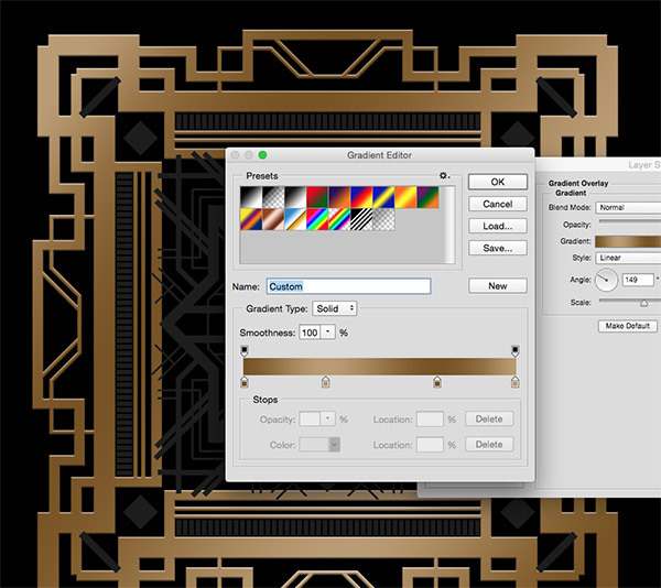
Give the background a black fill, then double click the first layer and add a Gradient Overlay Layer Style. Set up the colour swatches to alternating light and dark gold or brass tones. I’m using #775320 and #ba9c72.
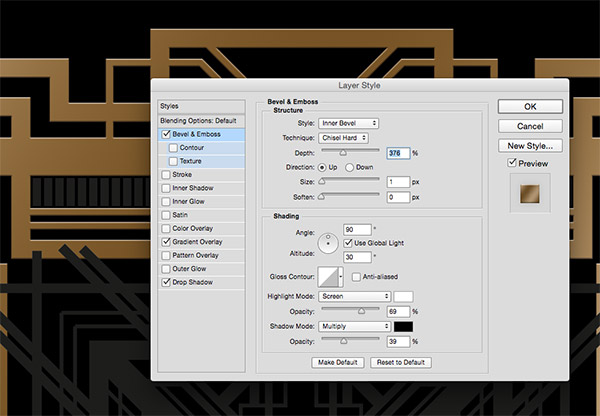
Next, add a Bevel & Emboss effect. Change the technique to Chisel Hard, adjust the size to 1px and alter the depth to suit.
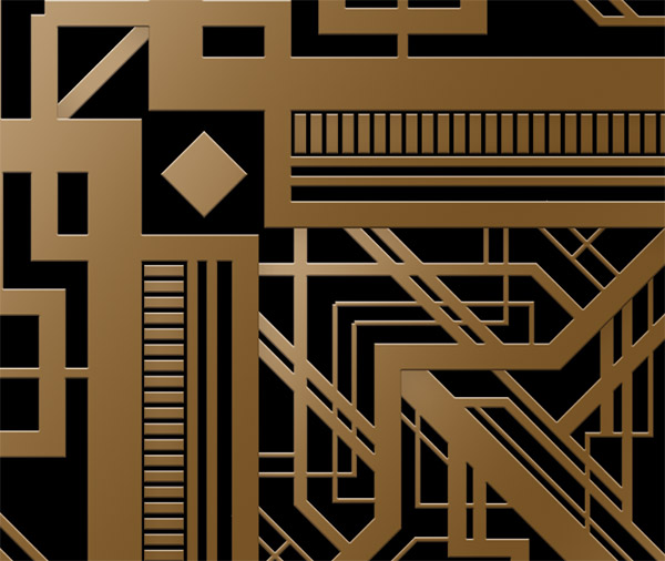
Copy this layer style and paste it onto the other layers. You might need to rearrange the stacking order of the layers to hide any overlapping elements.
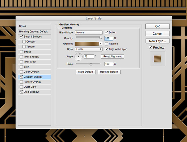
Edit the layer styles and alter the direction angle of the gradient to flow in a different direction for each layer to randomise the colours.
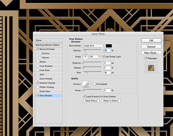
Add another layer style to each layer. Select Drop Shadow and configure the settings to Linear Burn with a large shadow size. Reduce the opacity to leave a subtle shading effect that helps lift the elements from the screen.
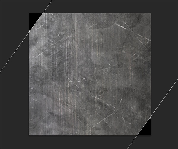
Find a scratched metal texture on the web and paste it at the top of the layer stack. Rotate the texture so the grain flows vertically.
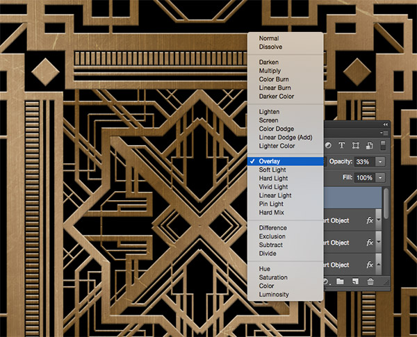
Change the blending mode of the texture layer to Overlay and reduce its opacity to around 30% to create a subtle texturing effect.
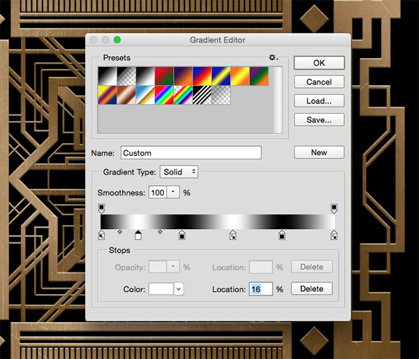
Create a new layer and select the Gradient tool. Configure an alternating black & white gradient and drag it out diagonally across the canvas.
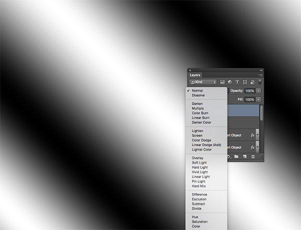
Change the blending mode of this new gradient layer to Soft Light and reduce the opacity slightly to 95%. This layer adds more lighting effects to give the pattern a shiny appearance.

Open the layer style properties of the pattern layers and adjust the opacity by varying amounts to produce slightly different tones between the elements.
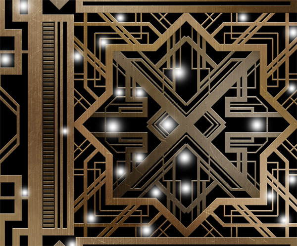
Add a new layer at the top of the stack and set up a small round soft brush. Add spots of white across the design in the empty space between the line elements, allowing just the soft edge of the brush to touch the artwork.
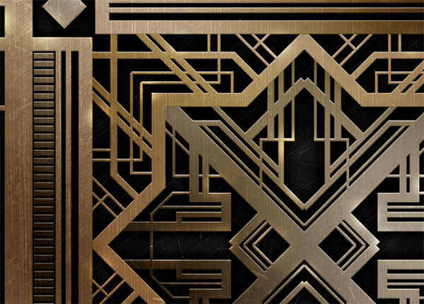
Change the blending mode of this white spots layer to Overlay to produce a series of subtle highlights.
The final pattern has all the geometric features of the art deco style and the classy metal effects from The Great Gatsby movie poster. Leaving the centre area free and just decorating the edges would create a beautiful frame to hold text elements, or complete designs like this could be used to fill the back of a business card or leaflet.


Hey, it looks good! I better show this to my boss. Hope he gives the go-signal to sign up in order to download the file. The 1920’s were a really artistic era.
nice
Oooh! Nice one, Chris! I love the effect. Will bookmark this and go through on it when I get home. Awesome
Really unique tutorial, thanks Chris!
Thanks for this amazing tutorial Chris!
Valuable article. It’s exactly what I was looking for
This is a rock solid tutorial Chris. Thanks!
Thanks Chris:
Absolutely Wonderful!!!
I shared with my Photoshop Community as soon as I got your email!
Roz Fruchtman
Hey man, this kind of tutorial should be on the video/youtube. Very hard to reading and doing that at the same time. Video would be nice.
It seems like you always know exactly which techniques I am curious about. Keep up the good work.
I’d love to see this modified as a stencil graphic that could be cut out and applied as wall art.
That’s really great pattern of gatsby. You know what, I am looking for this pattern. Well great filling to see this.
Create a Great Gatsby Style Art Deco Pattern is very effective for us. I thik its my 1st tutorial which is very helpful for me. I just shared this tutorial with my subcriber…
Hey man, this kind of tutorial should be on the video/youtube. Very hard to reading and doing that at the same time. Video would be nice.
An impressive art deco design, and a very helpful article. Thanks
PS – loving your website footer
GENIUS!!!!
Very helpful! wish everyone used these resources!
Useful tutorial.. The result of all this process is just superb best..
Great tutorial! I’ve used this technique for coffee-shop branding just for practice.