This post was originally published in 2011
The tips and techniques explained may be outdated.
I’ve recently been admiring the book covers of those military action thrillers, you know – Andy McNab and the like? So I decided to have a go at designing my own dramatic war torn scene in a similar style. Follow this step by step photo manipulation tutorial where we’ll be using stock photos, textures and brushes to produce an intense design.
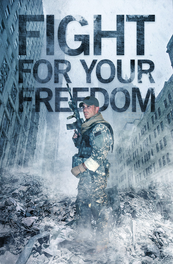
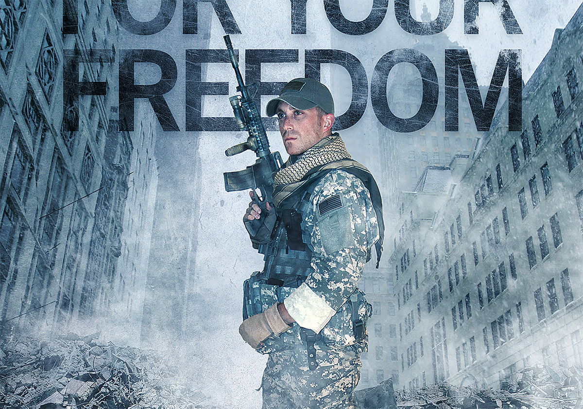
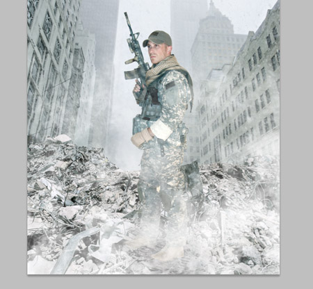
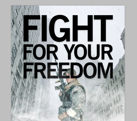
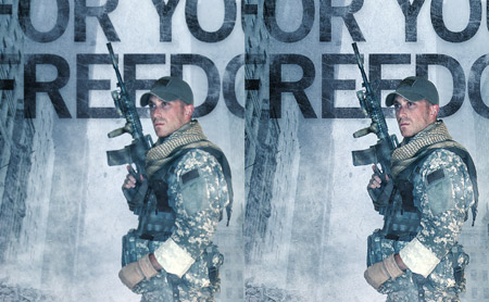
The design I’ve put together features a soldier standing in the streets of war torn Manhatten. The title ‘Fight for your Freedom’ gives an insight into the topic of this fictional book’s storyline. Overall I’ve given it a grungy feel with cold tones and lots of harsh textures.
View the full size action scene design
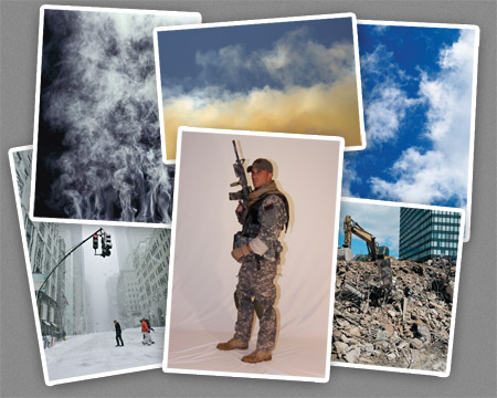
Being a photo manipulation piece, the first step is to source a bunch of stock photographs. I used the free library from DeviantArt for the cool soldier image, the free SXC.hu collection for most of the clouds and the thorough ThinkStockPhotos library for everything else.
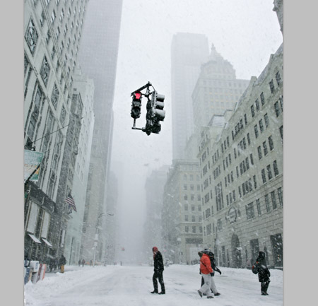
The main background is made up of a Manhatten street. This snowy scene is perfect for the cold feel of the design we’re building as the mist and snow flakes will help give the impression of smoky ruins. We don’t really want the traffic lights in the centre of the shot, so use the Clone tool to begin erasing out the supporting pole.
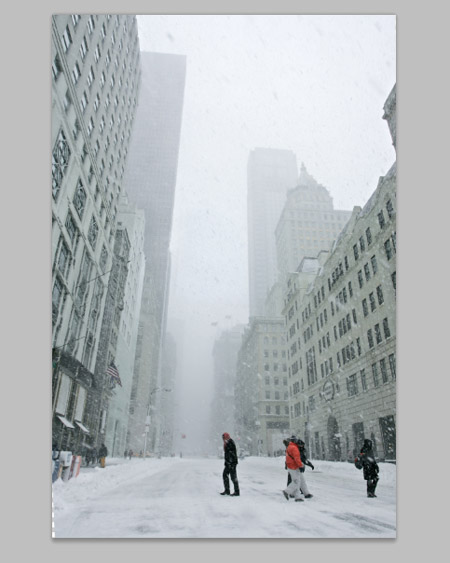
Copy a section from the snowy sky and paste it over the traffic light. Adjust the Levels to match the tones then erase the edges with a soft brush to blend the patch with the original photo.
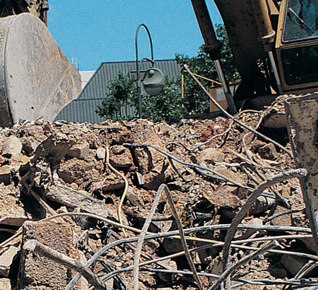
Switch over to the photo of a demolition site and begin tracing the outline of the pile of rubble with the Pen tool. The outline doesn’t need to be too accurate as we’ll blend and merge the image later.
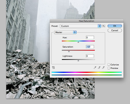
Use the Hue/Saturation adjustment tool to alter the tones of the rubble to match the tones of the background. A large amount of desaturation will soon bring the two to a close match.
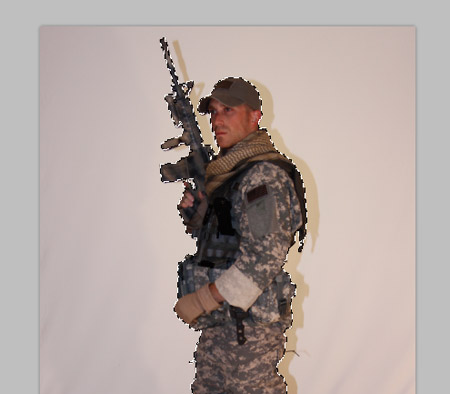
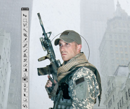
Save and open a soldier photo from DeviantArt user Nemesis-19. Carefully trace the outline with the Pen tool, then right click and Make Selection. Copy and paste this selection into the main document.
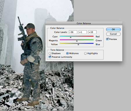
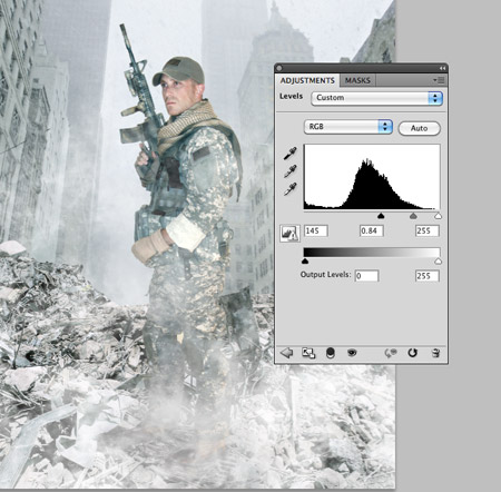
The indoor lighting on the solider doesn’t match the tones of the document, so open up the Color Balance window (CMD+B) and adjust the sliders for the Shadows, Midtones and Highlights. A large amount of cyan and blue will begin to correct the colours.
Open up the Levels adjustment window and clip the highlights to brighten up the image, then use the Dodge tool to lighten up areas of the solider such as the face even further.
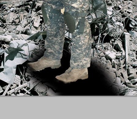
Add a layer mask to the solider and erase out portions of the boots to give the impression he’s stood within the pile of rubble, then paint some black areas on a new layer to act as shadows. Change the blending mode of the shadow layers to Soft Light and Multiply.
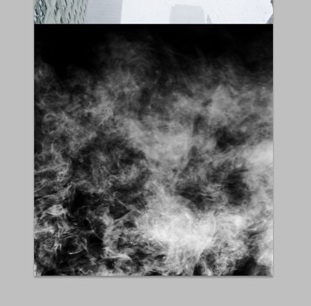
Paste in an image of smoke. Adjust the Levels to darken the blacks, then change the blending mode to Screen. The screen blending mode will turn the black areas transparent.
Paste in a couple more duplicates of the smoke image, each with a different position. As the smoke/mist build up it disguises the feet and helps them blend more naturally.
The tones of the legs are a little too light compared to the background, so add a Levels Adjustment layer to really darken down the image. Use the layer mask on the adjustment layer to limit the levels effect to just the feet and lower legs.
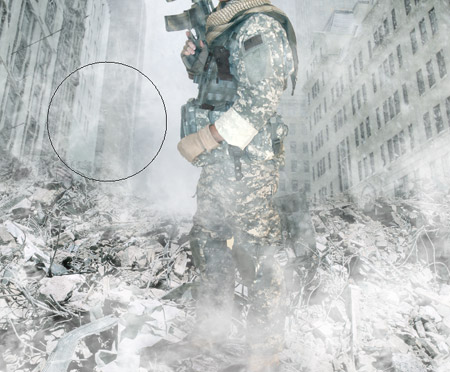
Add a layer mask to the rubble layer and use a soft brush to subtly erase out the hard edge. This will help it blend with the mist and fade into the background.
Paste in an image of clouds, desaturate and darken the levels. Change this layer to Screen, then position it under the rubble layer to give the impression of smoke/mist rising from the rubble surface.
Add a title of your choice to the design. Here I’ve adjusted the words Fight For Your Freedom to fit within the same width.
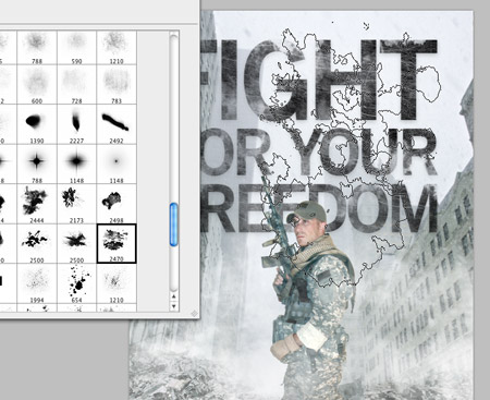
Add a layer mask to the text layer and begin roughing it up with a range of Photoshop brushes. Two sets I used were the subtle grunge brushes from WeFunction and the Ink Stains pack from WeGraphics (Available to Access All Areas members!).

Paste in a grungy texture, like this one from LostandTaken and adjust the Levels to create more contrast. Set the blending mode of this texture layer to Linear Burn at 50%.
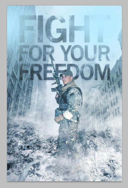
Fill a new layer with solid blue (#43586e) then set this layer to Overlay. This will give the design a cold and eerie blue colour cast to add to the dramatic theme. Add a couple of light blue splodges set to Soft Light to add some variation in colour and tone.
Paint a few splodges of black across the design to darken random areas to add variation in tone. Set this layer to Soft Light at 60%.
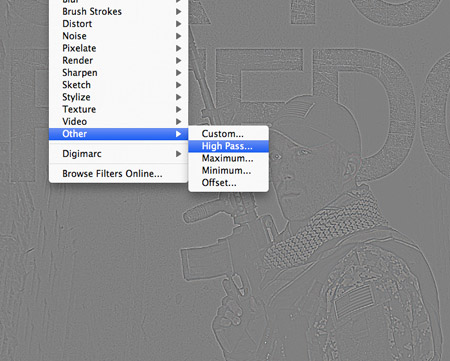
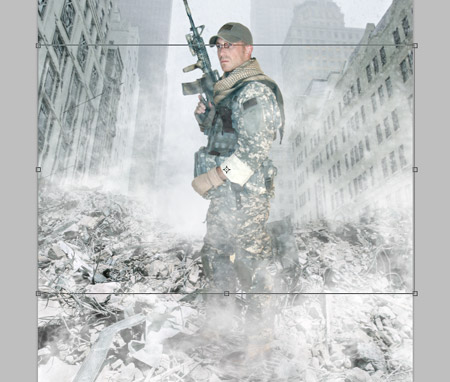
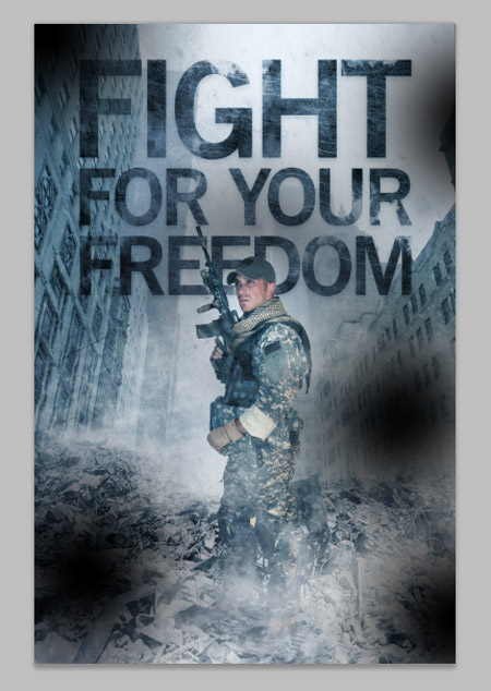
When you’ve finished adjusting the colours and tones of the image, press CMD+A to select all, then CMD+Shift+C to Copy Merged. Paste the copy at the top of the layer stack and go to Filter > Other > High Pass. Adjust the slider until the details of the design are barely visible from the grey background.
Set this high pass layer to Linear Light and reduce the opacity to suit. When comparing the two it’s easy to see how the high pass really sharpens up the design. Leaving the opacity fairly high will give the design that harsh feeling.
The final image is now complete. The basic collation of the various stock photos provides the basic structure to the design, but it really starts to come to life when the colour casts and different tones are added. The cold blues and harsh textures are really what give the design that dramatic war torn feel.
You have actually got the image looking just like it! And lovely use of textures!!!
hey stinky boy :)
Cool I will make mine one to be a superstar of hollywood haha but very nice tutorial !!
It’s cool..
But you could find better soldier photo. It’s not in the same angle as background is.
But effects you added is nice..
Regards,
Haris
Nice experiment! The effect added is cool..
So great !!
I think there too much smoke. But the result is very good.
Real brain power on display. Tnhaks for that answer!
The color adjustment of the guy actually doesnt match the color adjustment of the whole composition. you have a monochrome-looking background with a too red-faced guy imho. looks very placed.
Very disappointing. Not in the Chris Spooner tradition of quality work.
I like the text, but like some of you said, it is not a CHRIS SPOONER type poster. It seemed kitchy, and the soldier should be in action wearing a helmet with dirt on his face. I also noticed that most of today’s graphic design is Masonic/Satanic referenced and it’s a shame that WE, as graphic designers, are going along with it. In every arena, the GOOD FIGHT MUST BE FOUGHT, to defend the truth and share it with those who are lost. The Kingdom of God is at hand, that’s for sure. Now let’s be real soldiers and fight for our Creator.
Youve got it in one. Couldnt have put it btteer.
YaEtla yrlveegfoiev
great tut…
and i agree with karzoff… too much smoke…
but it still great!
Really nice stuff!
Thanks,
Oops! Wrong email.
Really nice stuff,
Thanks for the info!
I do like your site! this tut is far from impressive. Where are the guys feet? Hidden behind smoke because they didn’t seem to fit in the composition? subject matter is a turn-off: Men dressed in camouflage with guns is not how we fight for our freedom.
This is such a great intro into photoshop. I haven’t spent time designing like this in a while. Thanks Chris amazing work you have here, always loved your blog!
Maybe the quality of the outcome wasn’t that good, but there are some handy techniques in this tutorial don’t whine ;)
Very nice tutorial. Definitely gonna use that.
Photoshop has ushered in an era of new artisans, good work! What once was marble or clay is now manipulation of pixels. I’m consistently impressed by the hand of expert Photoshoppers…
Easy A!, nice Job Chris keep going.
marry me =)……please just think about it
hey me again, how was ur day….thinking bout u
Awesome Tutorial Chris! I learn’t a lot!
If you need anymore places to submit your tutorials, you can submit here: http://tutorials-share.com/
Cheers!
Looks gr8….!
Great tutorial, my biggest problem is usually getting some good quality images, so thanks for sharing the source!
Great tutorial, will try this one out! I love the dramatic effect you created!
Excellent Tutorial Cant wait to do this later, looks fantastic.
Excellent work Chris, keep them coming!
nicely done! loved the war-look on this one.
Very creative & detailed tutorial Chris, with an exellent use of textures and effects, Excellent !
Jeeez – some ppl need to chill out !!! if you don’t like it/agree to it …. close yr eyes/go elsewhere … or show us how well you can do !!! The title does say ‘create a dramatic action scene …what were you expecting; teddy bears??
close yr eyes/go elsewhere … or show us how well you can do !!! The title does say ‘create a dramatic action scene
Great common sense here. Wish Id tgohuht of that.
Great common sense here. Wish Id thgouht of that.
cool tut :)
Awesome tutorial.Thanks for sharing