This post was originally published in 2013
The tips and techniques explained may be outdated.
In today’s tutorial I’m going to take you through the step by step process I used to create a dark outer space themed poster named Lunar. The artwork combines textures and vector geometric elements to produce an intense layout showing off the beauty of the moon with high tech sci-fi style markings. We’ll be using both Photoshop and Illustrator to make the most of their different capabilities and combine the two different types of artwork into one cool design.
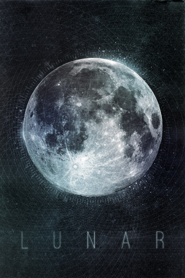
The design we’ll be creating uses a mix of heavy grainy textures and clear sharp vector elements to produce a cold dark poster based on the moon. We’ll use Illustrator’s powerful shape tools to easily create a series of intricate geometric elements which we’ll paste over to Photoshop in order to assemble the complete artwork.
Open up Photoshop and create a new document for your poster design. Use a cool Photocopy texture from Texture Fabrik as a background.
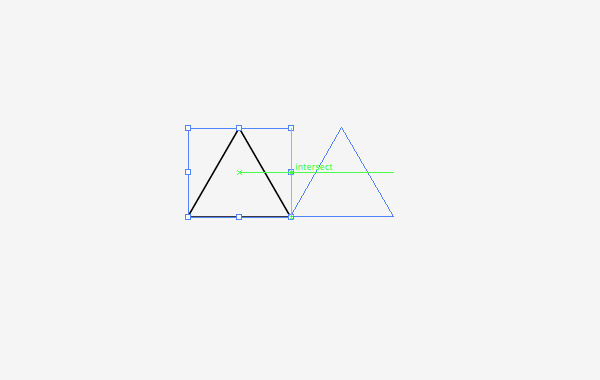
Switch over to Illustrator to create the first of many geometric elements. Use the Star tool to draw a triangle by pressing the down cursor key to reduce the number of points to three. Hold ALT and Shift while dragging out a duplicate and align it perfectly next to the original.
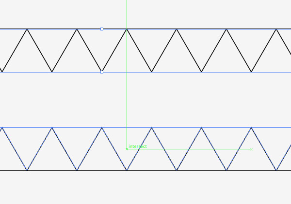
Repeatedly press the CMD+D shortcut to Transform Again and produce a complete row of triangles. Copy and paste a copy of the row, rotate it by 180° and fit them directly between the existing triangle shapes. Smart Guides (CMD+U) make it easy to perfectly align everything.
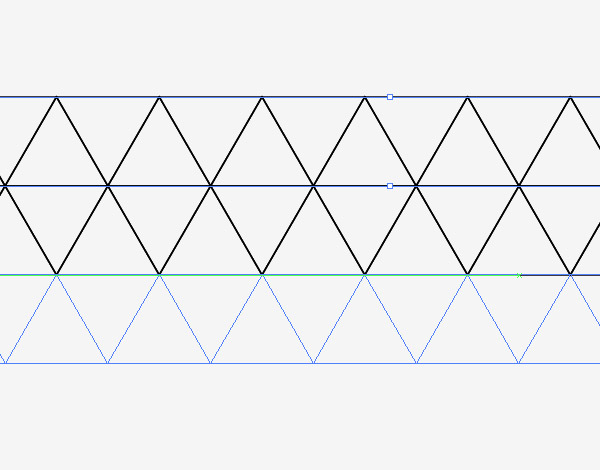
Draw a selection across all the triangles and drag out a duplicate, aligning the copies to the underside of the originals. Press CMD+D to repeat this duplication multiple times to create a page full of tessellating triangles.
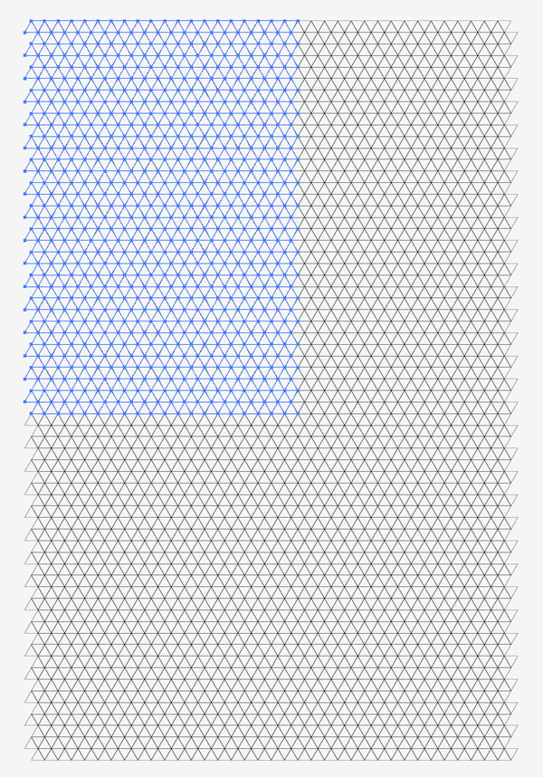
The area of triangles can be quickly increased by selecting a large portion and duplicating it to expand the pattern.
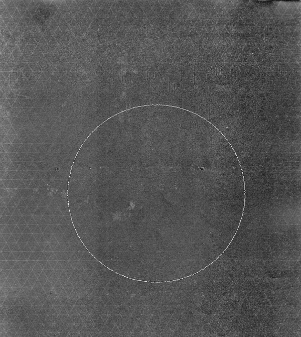
Paste the triangular pattern into the Photoshop document and hit CMD+I to invert the colours to make the linework white. Add a Layer Mask then erase away random areas with a large soft brush.
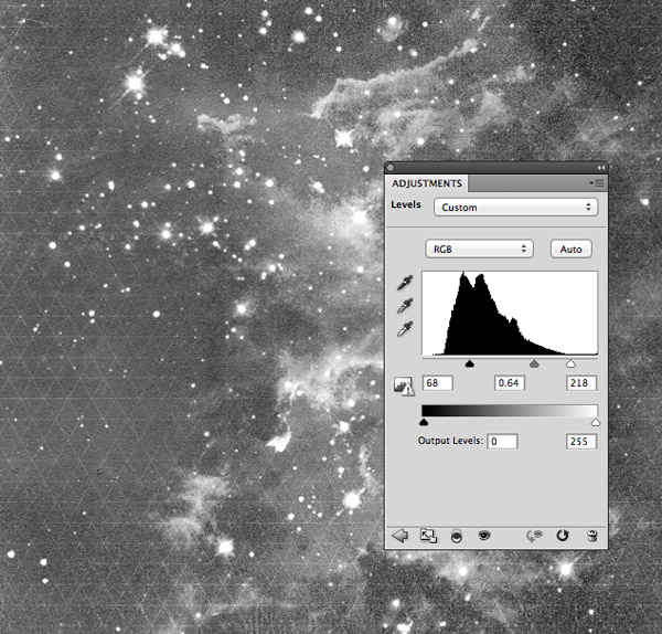
Download one of the public domain space images from NASA and paste it into the document. Desaturate the image, change the blending mode to Screen and adjust the Levels to increase the contrast. Reduce the Fill to around 23% to add more subtle texturing to the background.
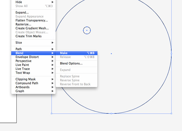
Switch back over to Illustrator and draw two circles, one small and one large, on the artboard. Select them both and go to Object > Blend > Make, then head back and alter the Blend Options.
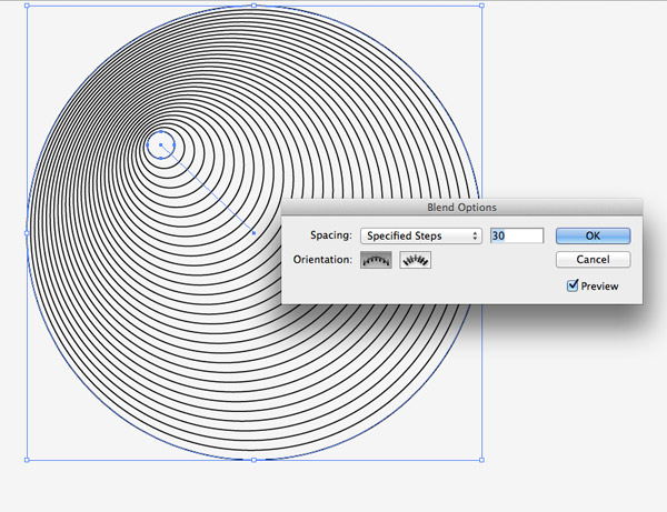
Change the drop down option to Specified Steps and adjust the number to create a series of concentric circles. Scale this shape up in size, take a copy then paste it into the Photoshop document.
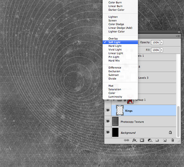
Position the circular rings to flare out from the lower right third of the poster layout then change the blending mode to Soft Light.
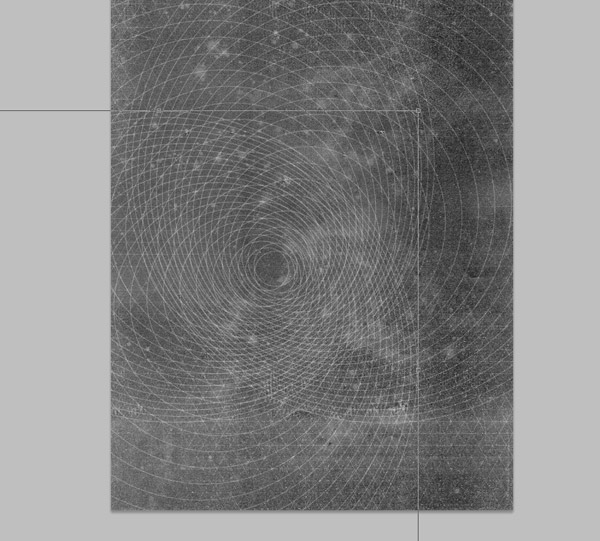
Press CMD+J to duplicate the rings layer twice then rotate the copies by 90° and 180°. Make sure that the smallest circle is aligned throughout all the ring layers.
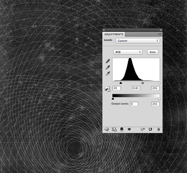
Add a Levels adjustment layer and increase the contrast of the artwork so far by darkening the blacks and midtones.
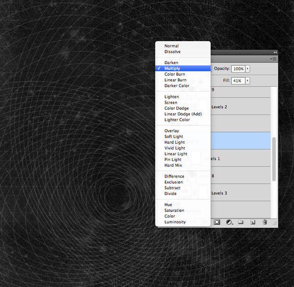
Fill a new layer with black then change this layer to Multiply and reduce the Fill to around 40%. This black overlay simply helps darken the background elements a little further.
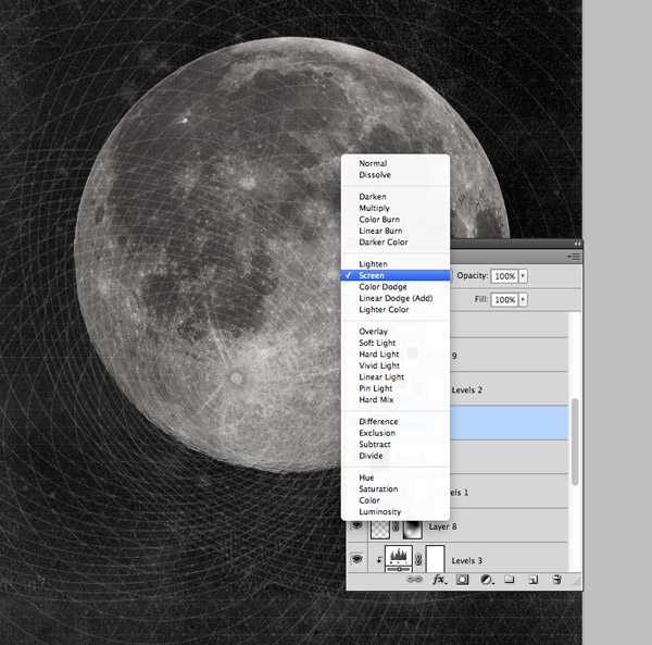
Paste in a high res image of the moon from Wikimedia Commons and change the blending mode to Screen to render the black areas transparent.
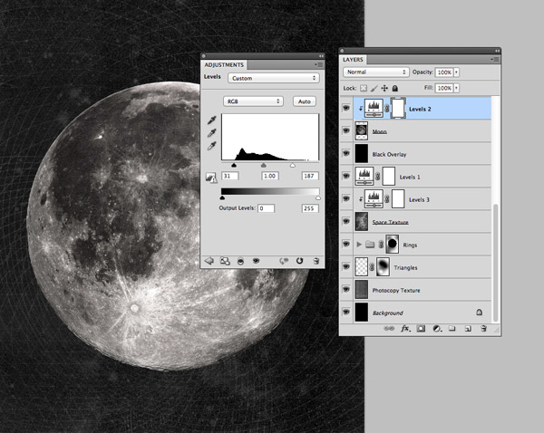
Add a new Levels adjustment layer and Alt-Click between the layers to clip it to the moon, then increase the contrast by darkening the shadows and brightening the highlights.
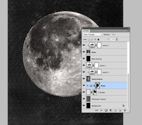
Group the three separate rings layers then add a Layer Mask. Draw a circular marquee around the moon and fill this area with black in the mask to erase the rings from this area.
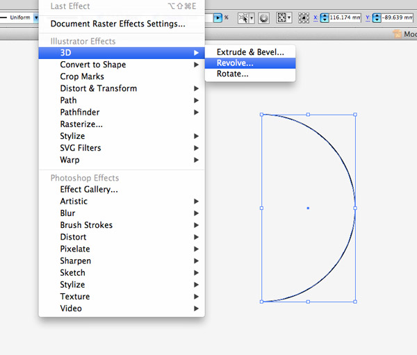
Switch back over to Illustrator and draw a circle on the artboard. Delete the left most point with the Direct Selection tool then go to Effect > 3D > Revolve.
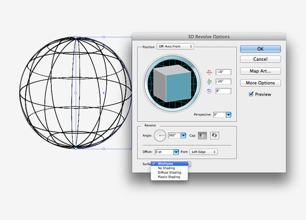
Change the Surface option to Wireframe to create a three dimensional linework sphere. Head to Object > Expand to convert this effect into a solid object and paste it over to Photoshop.
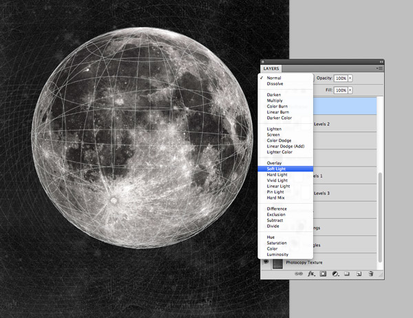
Invert and scale the wireframe sphere to fit over the moon then duplicate and rotate a copy to produce more intricate lines. Change the blending mode to Soft Light.
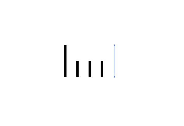
Back in Illustrator draw a series of evenly spaced lines. Make the first line longer then clear out the stroke colour from the last line to make it invisible.
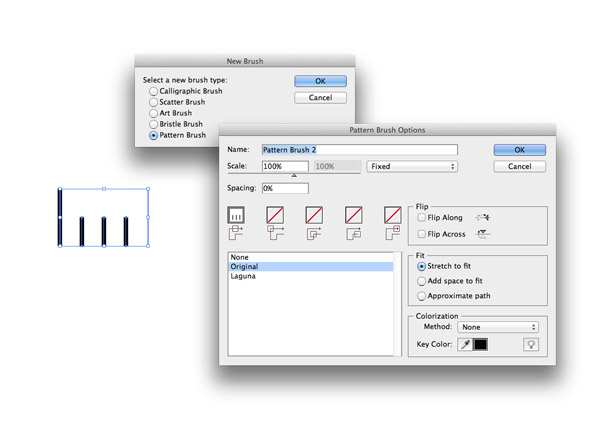
Click the New Brush icon in the Brushes palette and select the Pattern Brush option. Hit OK with the default settings.
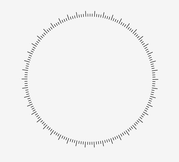
Draw another circle, this time with just a stroke and apply the newly created pattern brush to have the series of lines evenly spaced around its circumference.
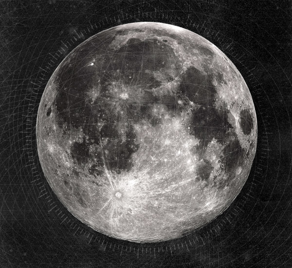
Paste this vector element over to Photoshop and position it to encompass the moon. Invert it to white then change the blending mode to Soft Light.
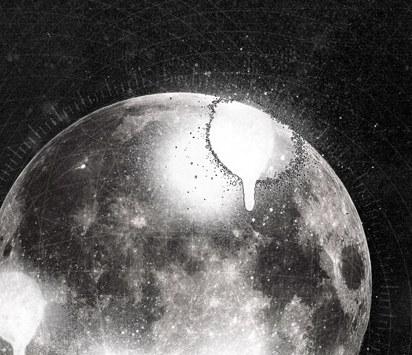
Create a new layer then use some spray paint brushes to add splatters around the moon area. Aim to add fine sprays beyond the edge of the moon but keep the main spray splatter within the central area.
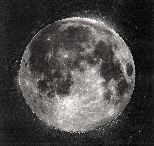
Add a Layer Mask to the spray layer and use the moon selection to erase away the central area, leaving the fine sprays around the edge.
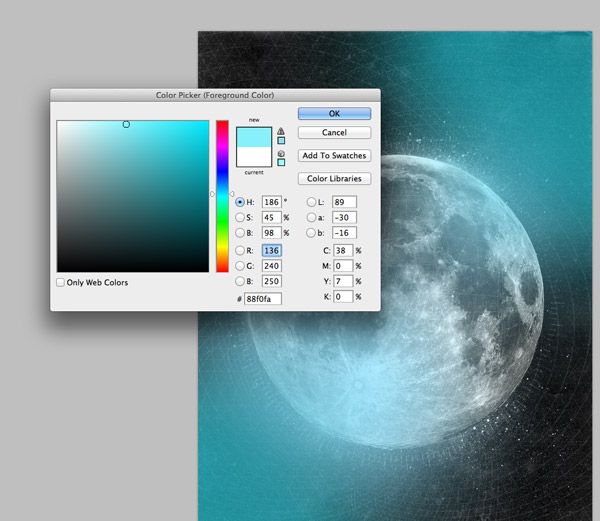
The dark mono theme works pretty well with this artwork, but we can add some subtle blue colour casts to intensify the cold space theme. Dab some spots of bright cyan on a new layer and change it to Overlay.
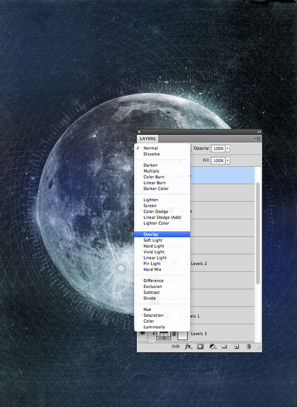
Add some more areas of colour using a darker blue and change this layer’s blending mode to Overlay too.
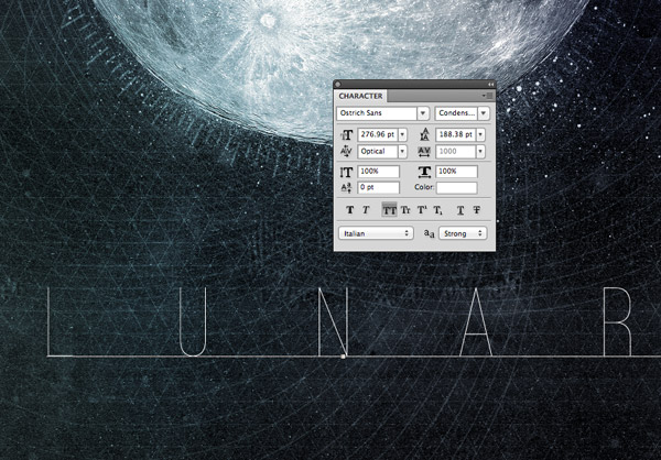
Finish off the artwork with some text. I’ve added the word “Lunar” using the cool font Ostrich Sans with a mega 1000pt tracking configuration.
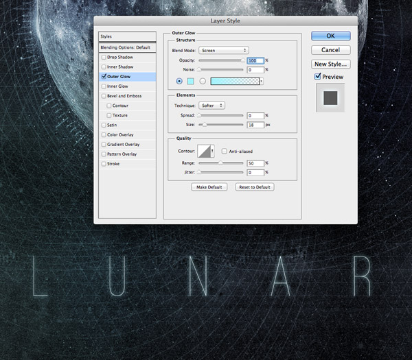
Set up a simple Outer Glow layer style using the same bright cyan colour to give the text a sci-fi appearance.

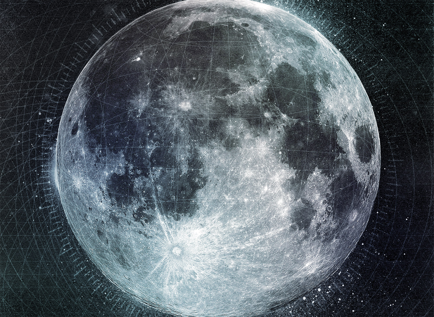
This finishes off our dark lunar poster design. The vector elements give the artwork a futuristic sci-fi theme while the high contrast and grainy textures really help intensify the design. The subtle blue colour casts then give the design an awesome cold outer space feeling.


Wow! Thank you Chris. This is magnificent! I’ve featured your article on our page. Be well!
[tf]
thanks for existing :)
Chris! It is Fabulous. Love the way you used Ps and Ai together .
Es fantástico esto que has hecho. Como mi inglés es malo intentaré hacerlo y traduciendo porque me gusta mucho este trabajo. Gracias por compartirlo
You are the man!! Love ur tutorials!! Hail from Brazil!!
Excellent Tut!! Thanks Chris
Superbe… merci infiniment…!
terrific tutorial. thanks for sharing.
didnt know about the globe revolve technique.
This is fantastic! Im trying to walk through this tuorial now, but i got to the 3D illustrator part, the option “expand” is greyed out, i tried “expand appearance” and that gives me the option to hit “expand” but when i do that the option “object” is unavailable. Any idea what im doing wrong? Thanks!
Expand Appearance will work just fine.
By the Object option is unavailable, do you mean the menu items below are greyed out (ie. Transform, Arrange, etc.)?
If that’s the case, you probably just deselected the Path (or Group, if it’s already Expanded). In Illustrator, clicking on the Artboard will deselect your selection.
The easiest way to tell if a path is selected is to open up the Layer panel. If you see a colored square next to the little circle ( | o #), it’s selected. If it’s not, just click on the little circle to select it.
Does that help?
Some pretty cool techniques, as well as amazing result!
Hi Chris, thanks for this cool tutorial!
It sharpened some of my skills again.
Cheers and keep up the good work!
Thank you Chris! Im rebranding and have been trying to figure out how to do this effect for a while. Really appreciate it. I tweeted it out :)
Loving this!
Keep up the great work.
Love how your techniques are so easy to follow :) the ctrl + i didn’t work for me but I used the saturation and worked fine
Nice concepts here Chris. Thanks for the encouragement to push the envelope
Very nice tutorial, thanks! I got some pretty neat results by playing around with the color mode for the blue bits, and trying out various different shapes.
You’re super talented Chris, you make it look easy!
very nice tut, thank you :D
UNBELIEVABLE WOW!
very helpful
Excellent work done Chris. This tutorial helped me a lot.
Thanks Chris! As a budding designer, there are lots of things that I haven’t thought of using. I would have never done the triangle and circular patterns. I hadn’t copied and pasted from illustrator and inverted the color. I learned a lot from this tutorial plus it looks great! It gave me a sense of accomplishment and a brief moment of happiness.
Thanks for the tutorial! learned a lot!
My version got really cool, almost the same as yours. I love it, thank you very much! I learned a lot
Hello cris, this was nice. I think it will helpful for me. Thank you.
hello. this was very nice. Thank U
Its stripes are recorded trademark in more nations and a trademark of Asics Tiger
and Onitsuka Tiger. The Middle School session will be on November 29 from 6:30 to
8:30 and will focus on the fundamentals. You need to plan out what you want to work on and what drills you
will use to accomplish your objective.
Amazing tutorial!!! You’re the best! :) Thanks!
Im having a problem pasting the triangles into photoshop. Its asking me how i want to paste them… as a path, pixels, smart object, or shape layer. Which do i choose?