This post was originally published in 2013
The tips and techniques explained may be outdated.
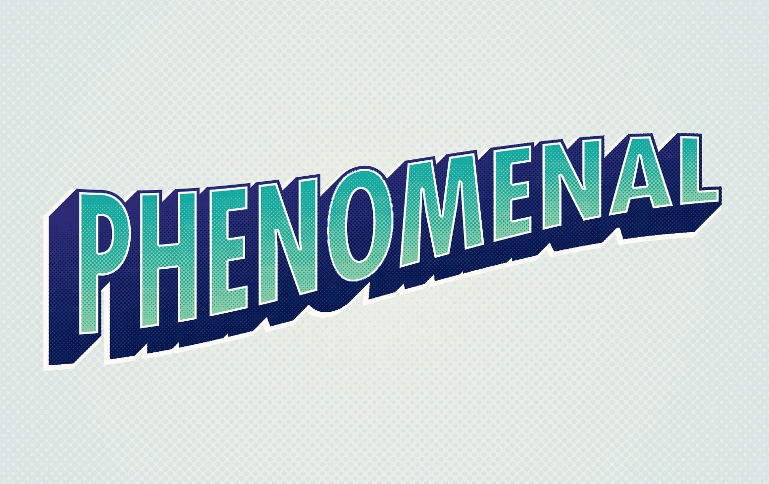
In today’s Illustrator tutorial we’re going to create a comic book inspired text effect your favourite superhero would be proud of. Learn how to create a basic 3D effect using the Blend tool and produce cool halftone patterns to give the design that retro screen printed appearance. These two techniques alone are crucial additions to your Illustrator skillset and can be used in all kinds of illustration and design work.
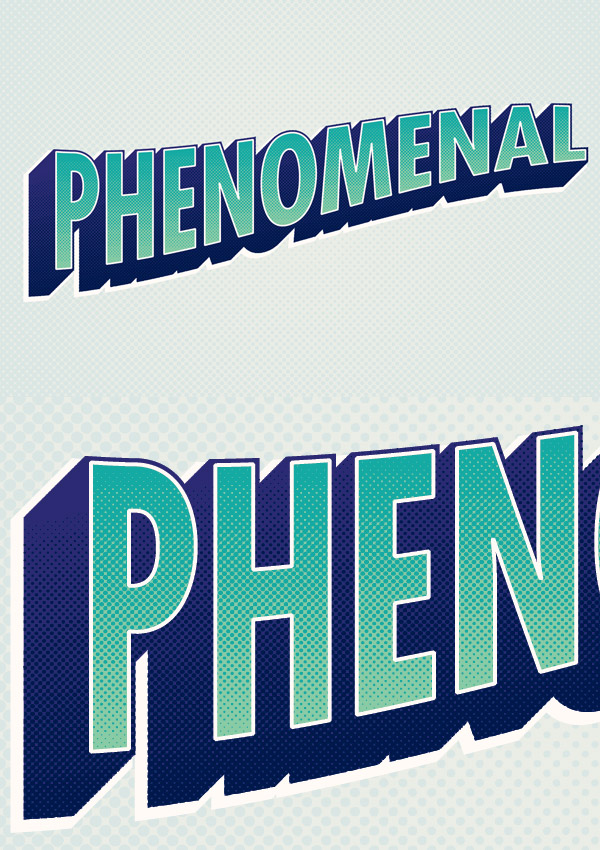
The text effect we’ll be creating is based on those retro comic book covers featuring bold titles, often with strong outlines and 3D style effects. Our example also makes use of subtle halftone patterns to add variations in colour and to mimic the visible dot pattern of the old fashioned screen printing technique.
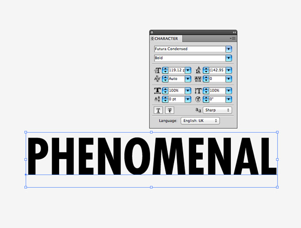
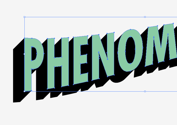
Open up Illustrator and enter some text with the Type tool and choose a tall, bold typeface. Here I’ve picked out Futura Bold Condensed.
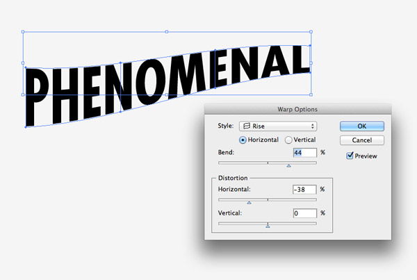
Go to Object > Transform > Warp and select the Rise option from the drop down menu. Alter the Bend by around 45% and adjust the Horizontal Distortion to around -40%.
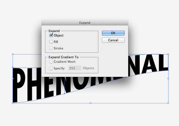
We’ll need to apply this effect permanently to continue editing the text. Go to Object > Expand and select the Object option.
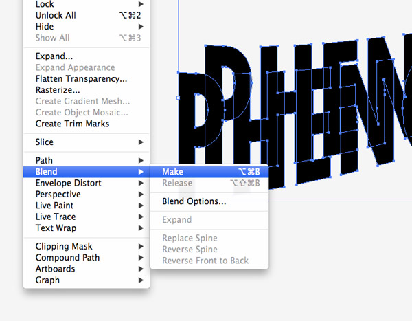
Select the text and hit CMD+C to Copy, then press CMD+B to Paste Behind. Move this copy of the text diagonally to the left then with both objects selected go to Object > Blend > Make.
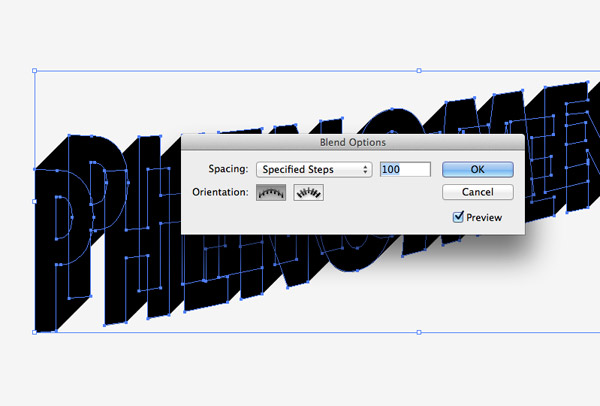
Head back to Object > Blend and select Blend Options to alter the settings. Change the Spacing to Specified Steps then adjust the figure to a crazy high amount to achieve a smooth transition between the two elements.
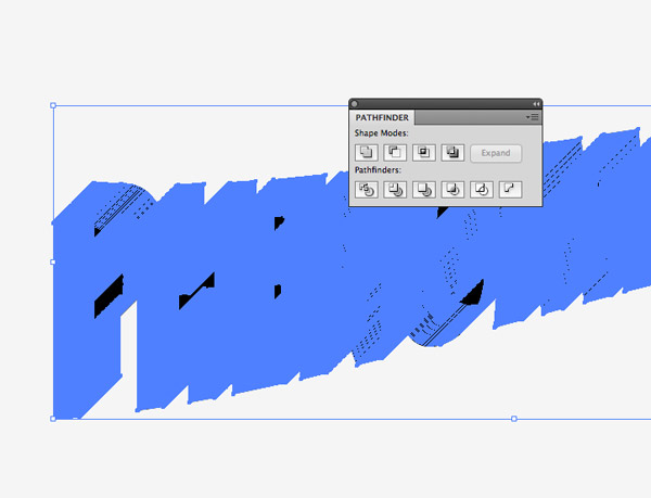
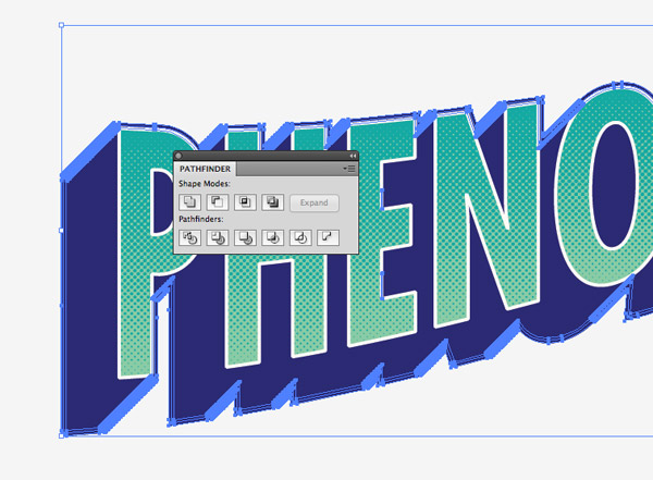
Go to Object > Expand to convert the blend into individual shapes, then click the Merge option from the Pathfinder tool to blend all the separate pieces into one shape.
The original text should still be copied in your clipboard. Press CMD+F to Paste in Front then change the colour to create a colourful front face to the 3D effect.
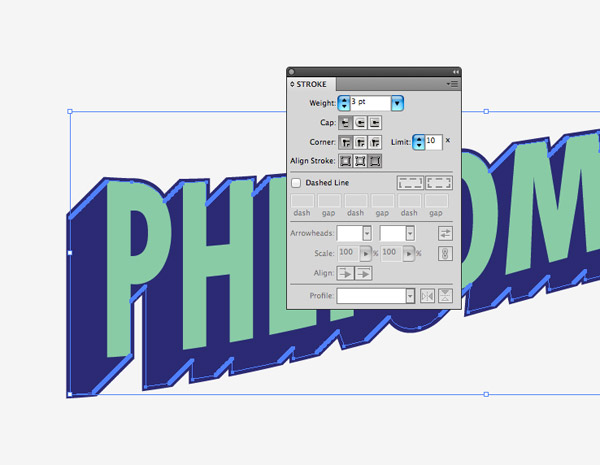
Select the blended portion of the text and apply a contrasting colour. Add a Stroke using the same colour then adjust the settings to around 3pt aligned to the outside.
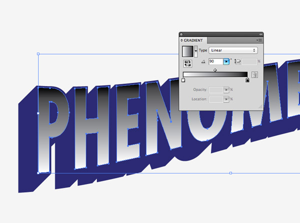
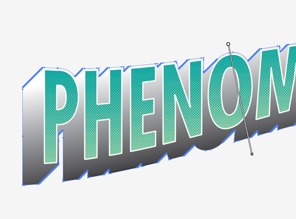
Copy and Paste in Front a duplicate of the text face then give it a black to white gradient fill. Align the gradient to flow vertically by adjusting the orientation to 90°.
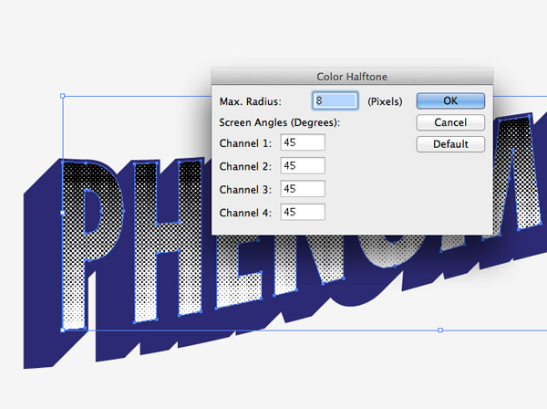
Go to Effect > Pixelate > Color Halftone and adjust the angles of the various channels to 45° so they all align to form a basic halftone pattern. Alter the Max Radius according to your document size, but 8 pixels should create a nicely sized dot pattern.
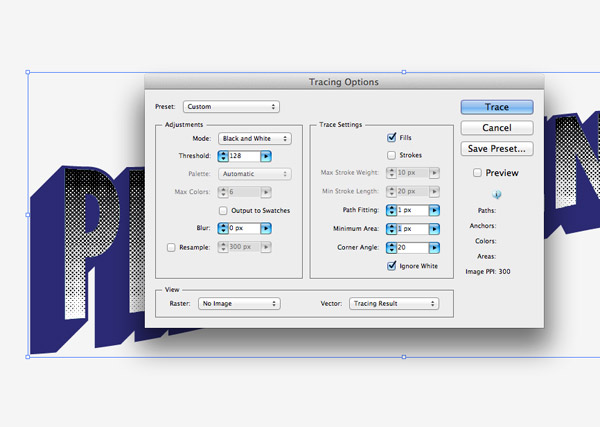
The Halftone pattern created by Illustrator is unfortunately raster based (it would be amazing if it actually made it in vector format!). This means we’ll need to use the Live Trace tool to vectorize it. Expand the halftone effect under Object > Expand Appearance, then go to Object > Live Trace > Tracing Options. Alter the Path Fitting and Minimum Area settings to 1px then select Ignore White.
In Illustrator CS6 Live Trace is now known as “Image Trace” (Window > Image Trace). The settings are named slightly differently but similar configurations can be applied.
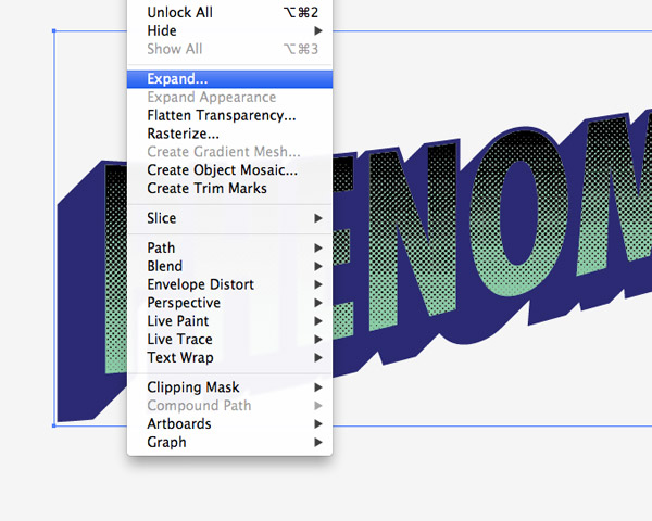
Expand the halftone pattern to turn finish turning it into a complete vector object.
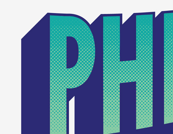
Change the colour of the halftone pattern to a slightly darker shade of your text colour to create a cool halftone gradient effect.
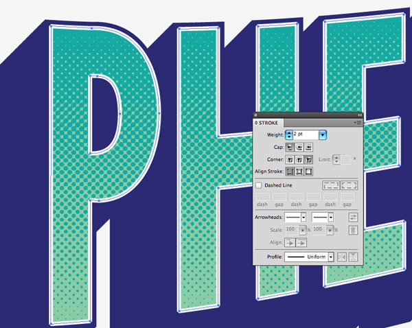
Copy and Paste in Front another duplicate of the original text. Remove the colour fill and add a 2pt stroke using an off-white colour selection.
Make a duplicate of the blended 3D area then go to Object > Expand Appearance to convert the stroke into a sold shape. Hit the Merge option from the Pathfinder palette to blend these two elements into one single object.
Add a black to white gradient fill to this background piece then alter the gradient flow using the Gradient tool so the colours flow naturally with the angle of the text. This time set the flow from bottom to top.
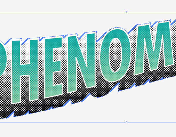
Apply the same Color Halftone effect then repeat the previous steps to Expand and Live Trace the effect into vector format.
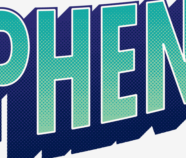
Change the colour of the background halftone to a darker shade to add more cool subtle gradient halftone effects.
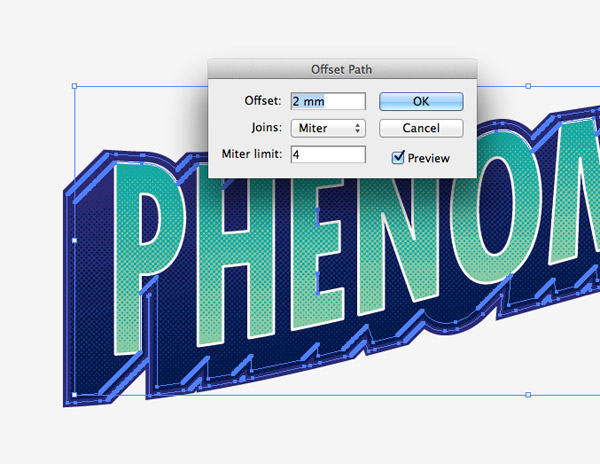
Select the 3D background area once again then go to Object > Path > Offset Path. Enter 2mm in the options then hit OK.
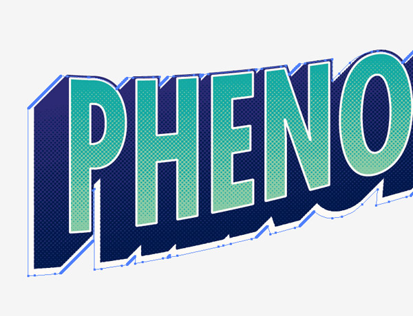
Remove the stroke effect from the new element then change the fill colour to the same off-white colour as the text stroke. Nudge this shape out of place slightly using the keyboard Cursor keys.
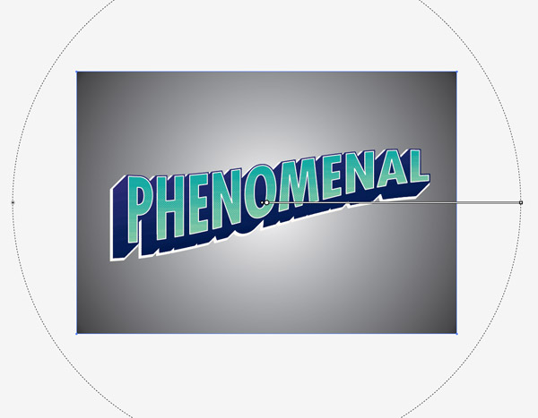
Draw a large rectangle as a background for the text effect and give it a subtle colour fill. Copy and Paste the element and add a large black to white radial gradient.
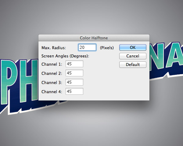
Add another Color Halftone pattern, but this time increase the radius to 20px to create a much larger pattern. Repeat the steps to vectorize this effect.
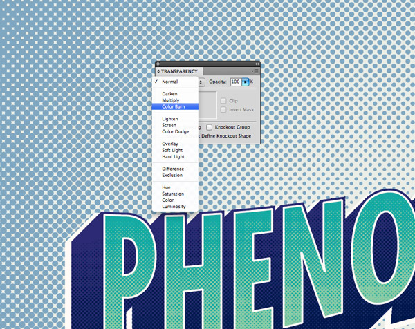
Give the background halftone pattern a colour fill then change the blending mode to Color Burn to allow it to subtly blend in with the background colour.
The final comic book style text effect looks great with the basic 3D effect and those cool halftone patterns. These two techniques are definitely worth remembering for your future projects. The blended text outline can be great for urban style logos, while halftone patterns are simply awesome for creating retro effects.
Awesome tutorial as always.
I always learn a new trick on your blog!
I was unable to the trace option after I did the half tone screen… did I miss something?
It looks like I missed a little step. Go to Object > Expand Appearance beforehand, then the Live Trace options should be selectable.
I’ve just updated the tutorial to include this.
nice tutorial!
but i dont know how to “ignore white” after the live trace options
on cs6
please help me
I also have the same problems,
how to ignore white><
Thanks for updating and really nice effect to learn.
Very nice tips. I wish to see more graffiti style artwork tutorial in AI.
Thank you Chris.
Thanks, Chris. I know I learned this a long time ago in CS3, but totally forgot it. Time for me to break out Illustrator and it try again for a greeting card.
Wow, this was a little bit harder than I thought so far. I had to play with CS6’s Image Trace, which replaced Live Trace. :(
I should really get with the times, I didn’t realise Live Trace had changed in the latest version!
Yeah, the replacement for Live Trace really sucks. I remember using Live Trace for the halftone effect in CS5 but now with CS6 and Image Trace, it’s taking a lot more effort than it should :(
Hello Chris, this is a nice tutorial, but I have a problem with it. After I create the halftone effects on the text, and I have done the Image live trace, I click expand, but then I can change the color of the vector. When i choose another fill color, the color is applied not only on the dots, but to all the reptangle. Is there something I missed ?
I meant than I CAN’T change the color of the dots vectorized, sorry
Hi Michele
Is the “Ignore White” button definitely being selected in the Live Trace settings?
Otherwise you should be able to select and delete the rectangular shape with the Direct Selection tool before changing the colour.
it is a very nice tutorial though. but i’m having trouble about the colors ;(
and the tracings. i am using cs5.5
i hope a bit more detailed steps? hihih
a great tutorial post. thank you Mr. Chris Spooner
Wow looks really nice and easy to do I was looking for something like the Captain Planet font and think this could be it. Thank you Chris x
1st time here.
nice-clean, splendid tutorial!
thoughts rolled on my mind:
0. for beginner/inter or advanced? me beginner;
1. a free font mention, like – Bebas Neue;
2. inCS5, Text Wrap: Object > Envelope Distort > make with wrap;
4. color selection cool!
5. blending is handy, started liking color halftone.
Thank you!
Thank you for no. 2! I’m working in CS6 and was trying to find out how I would go about this
I cant seem to change the halftone to any other color besides greyscale. If I choose purple, it changes it to a dark grey. I cant pick a color. Help!
I’m going to be another praising the tutorial but bemoaning the changes made to image tracing in Illustrator (I’m running the latest CC version). Having used CS3-5.5, the process outlined above would be significantly easier to accomplish with the previous menu layout.
I’ve tried tweaking the size of the object, the size of the halftone pixels and played around with all the new settings but every time the results are ropey –
1) the pixels are poorly defined (ie not neat circles)
2) the smaller black halftones (those at the bottom) aren’t converted at all, but the smaller white halftones (those at the top) are expanded and distort the edge of the shape
3) the final trace shifts and/or expands the result several pixels outside of the parent layer – this is particularly annoying as you need to edit all the individual anchor points to get them to sit flush and neat within the text
If you have any guidance on how to get around this (except spending half a day manually correcting the vector!) it would be a great help.
Really liked the tutorial. I also had a little difficulty with the CS6 change in Live Trace but I ended up with a piece I liked. Thank you for sharing!
For people getting confused with CS6 Image trace Step 6 in this article helps understand the difference in CS5 http://vector.tutsplus.com/tutorials/tools-tips/quick-tip-how-to-use-the-new-image-trace-in-adobe-illustrator-cs6/
I am having the same problem with changing the colour of the halftone. It seems that once the Gradient is transformed to half tone, the option to change the colour is gone. I believe it is at this point that it converts to greyscale. Cannot figure out how to change the colour of my halftone
Absolutely awesome tutorial. Respect Man. You have become my inspiration.
Keep up the good work
Awesome , very very cool article for beginner comic poster designers
My “Image Trace” does not have any options available =/
This is a really great tutorial. Very cool and exactly what I needed for a project. Unfortunately, if you have CS6 it actually doesn’t work at all. It’s a shame there isn’t an updated version of this tutorial.