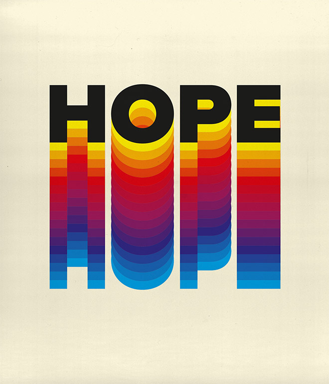
Follow along with today’s Adobe Illustrator tutorial to create a colourful text effect, which comprises of a stack of text elements that transition through the colour spectrum to produce a rainbow effect. This text style has somewhat of a retro vibe, with it being the kind of effect you might see on an old VHS tape box or brand identity for a 70-80s tech or media company. Illustrator’s Blend tool will form a core part of the procedure, but I will also share a useful tip that enables you to alter the wording of all the text instances at once.
Watch the video
Subscribe to the Spoon Graphics YouTube Channel
After seeing examples of similar retro text effects on Pinterest, I set out to figure out the most efficient technique for recreating this colourful text style in Illustrator that didn’t involve having to place each coloured text element manually, or result in an effect that could not easily be edited or updated. The process I’ll be sharing in this tutorial automatically generates a smooth colour transition and retains the live text, so the wording and font can be easily changed.
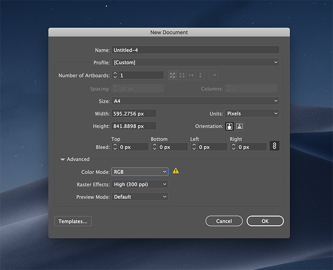
Begin by opening Adobe Illustrator and create a new document. Use any size to suit your final application, but ensure the RGB mode is set so the most vivid colours are available.
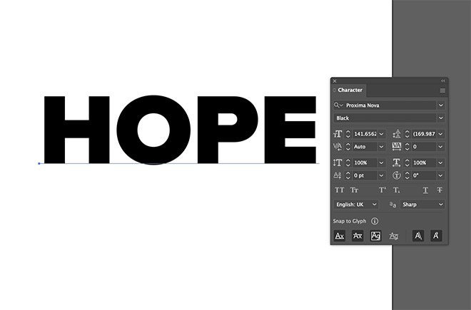
Set out your chosen wording as a text element with the appropriate font styling. I’m using the Proxima Nova Black typeface.
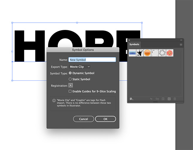
The key to ensuring the text can be edited without having to manually update every single text instance is to turn the element into a Symbol. Click the New Symbol icon in the Symbols panel.
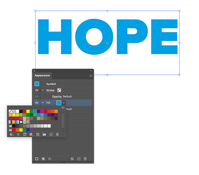
Once the text is contained within a symbol, it can’t be selected to change the fill like normal. Instead, click the menu icon at the top of the Appearance panel and choose Add New Fill. Choose a bright swatch.
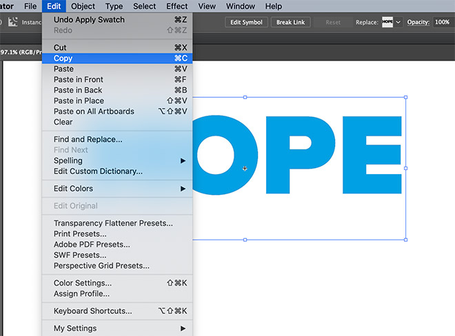
In order to place one extra copy of the text at the top of the rainbow stack, save a copy to the clipboard under the Edit > Copy menu. We’ll make use of it later.
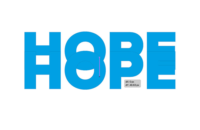
With the Move tool active, hold the ALT and Shift keys while dragging the text to create a duplicate. Position this copy around halfway down the orginal.
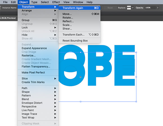
Go to Object > Transform > Transform Again, or use the CMD+D (or CTRL+D on Windows shortcut) to repeat the duplication to place another copy the same distance again.
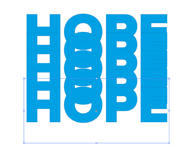
Repeat the CMD+D Transform Again command a few more times to create 5 elements in total, all stacked an equal distance apart.
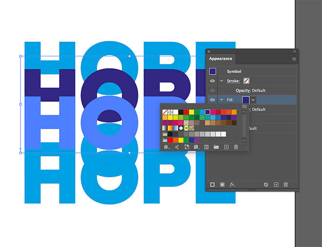
Select the second object and change the fill colour in the Appearance panel. Choose the next colour along in the colour spectrum.
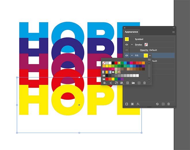
Change the fill colour for each of the remaining words. Choose the next major colour in the spectrum for each one. I’m just using Illustrator’s default swatches, but interesting effects could also be generated using custom colour schemes.
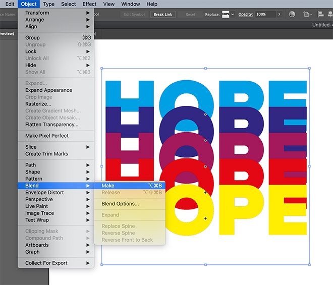
Draw a selection around all the objects, then go to Object > Blend > Make. Head straight back to the Object > Blend > Blend Options menu.
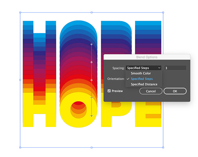
Change the Spacing setting to Specified Steps, then adjust the value to determine how smoothly the colours transition.
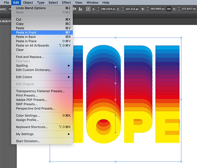
Go to Edit > Paste in Front to place that backup we saved to the clipboard earlier back onto the artboard.
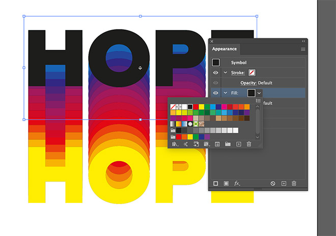
Change the fill of this text object to black in the Appearance panel.
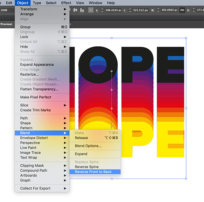
The stacking of the rainbow text is the wrong way around. Go to Object > Blend > Reverse Front to Back.
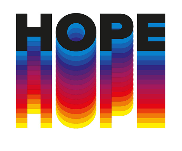
The black text now sits perfectly in place on top as the coloured instances below gradually change colour.
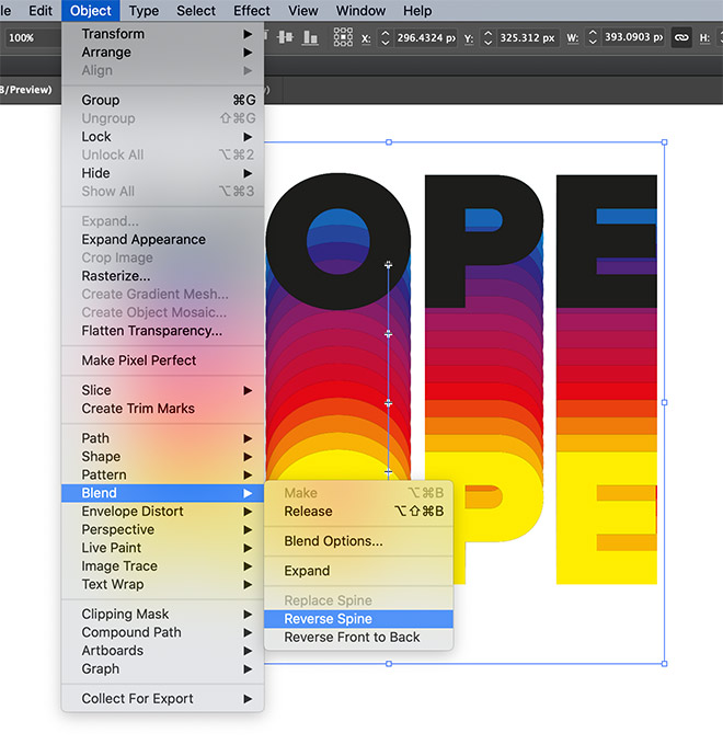
You can also see what the effect looks like with the colour spectrum in reverse. Undo the blend reversal then choose Reverse Spine to place the last colour first in the stack.
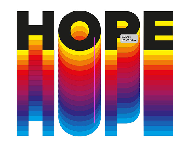
The black text is perfectly aligned to the top coloured text instance, but that means it is totally obscuring it. Move the black text vertically to match the spacing to make the brightest colour visible again.
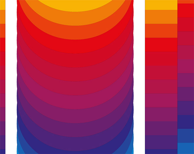
Because the original text element within the Symbol has a black fill, you can see a subtle glitch that causes a faint black around around the coloured text instances.
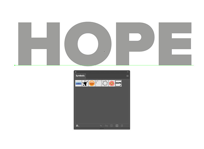
To fix the issue, double-click the Symbol and change the original text fill to a mid-grey, or better yet, remove the fill altogether.
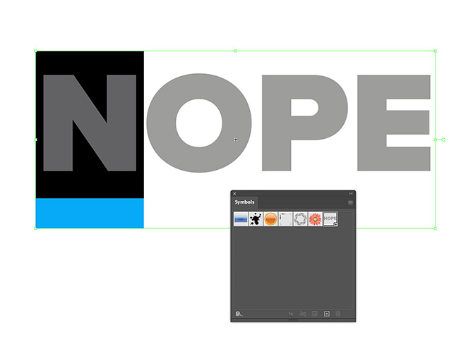
Here within the Symbol is where you can also edit the wording and font of the original text. When you exit back out of the symbol using the arrow icon in the top left, you will see the effect has been updated.
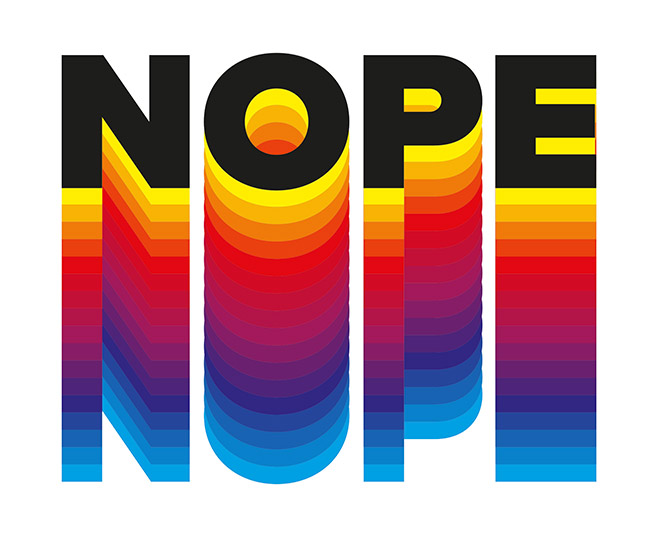
Converting the text into a Symbol right at the start means all the text instances are updated at once, rather than having to manually edit each one individually.
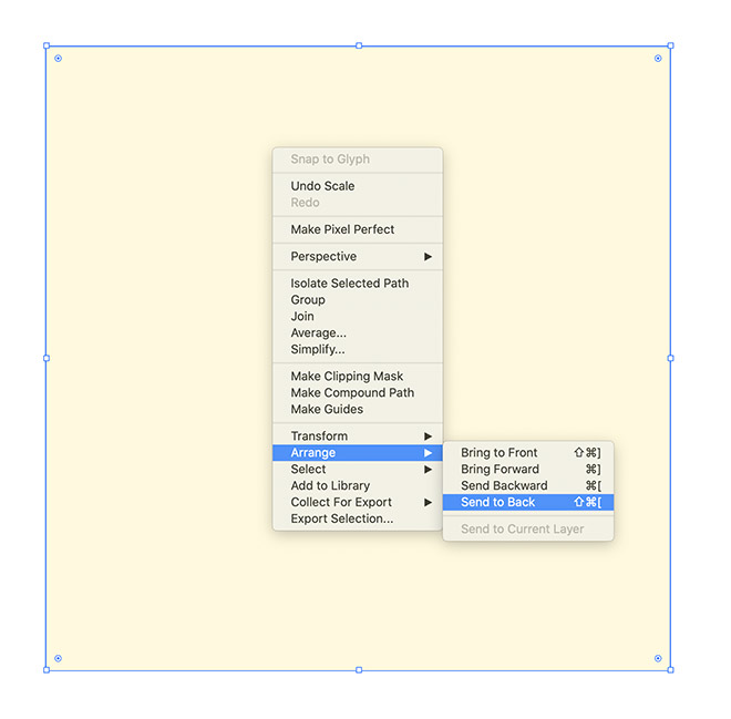
Draw a large rectangle to act as a background for the design. Give it a pale yellow fill, then right-click and choose Arrange > Send to Back.
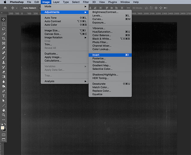
No Spoon Graphics design would be complete without the addition of a subtle texture! Download and open one of my Free Photocopy Textures in Photoshop. Go to Image > Adjustments > Invert to flip the texture to black on white.
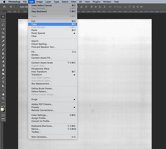
Go to Select > All, followed by Edit > Copy, then switch back to Adobe Illustrator and paste the texture graphic.
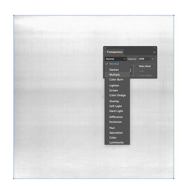
Adjust the size of the texture image to match the background rectangle, then in the Transparency panel, change the blending mode to Multiply.
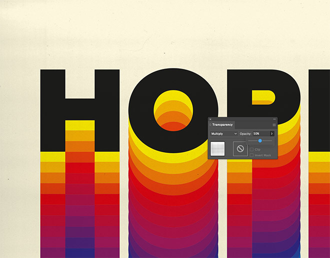
Reduce the opacity of the texture to leave a subtle amount of grain to complete the retro appearance.
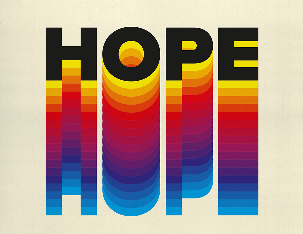
The final result is a colourful retro style text effect with a rainbow gradient that works perfectly for poster art, quote designs, and even brand identities.


I love this! Thank you, Chris!!!
Kamall.
Awesome work, I was looking ofter this type of effect. Thank you so much.
Keep up the good work.
love and peace, keep clean
Thank you! I really enjoy your blog.
You can also achieve the same thing using the appearance-panel, and add a bunch of fills each with increasing offset. I think it’s easier to update text and fonts and way. The work is a bit more repetitive, but can be utilized if you have the same word, but want a color to stick out. Then you’d offset that color on both axis. ;)
Hello, I followed your tutorial, thank you, it’s very interesting, but I have a question: on phase 10, when you change the color of the 2nd element, because it’s the copy of the symbol, it changes the color for all the elements. What is the procedure to change the color on a selection, because you have to keep the symbol shape to change the text. Is it necessary to break the link? Thank you for your answer
Hello, love the tutorial! Student here, everytime I go to “reverse front to back” it is turning my blended text upside down… any pointers?
Thanks!