This post was originally published in 2014
The tips and techniques explained may be outdated.
In today’s Photoshop tutorial we’re heading straight back to the 80s to play with vibrant fluoro colours. It has become a popular trend to convert the colours of modern day photographs into oversaturated fluorescent style hues to create intense sensual images. In this tutorial I’ll show you how to quickly recreate this duotone effect, then we’ll take the design to the next level with some additional tweaks to give it a modern pop art twist.
The artwork we’ll be creating is inspired by a popular duotone photo effect trend that involves manipulating images with super saturated colours. We’ll use Photoshop’s Gradient Map tool to replace a photograph’s original colours with some vibrant full saturation hues, then add various textures to provide subtle details and give the design a retro appearance.
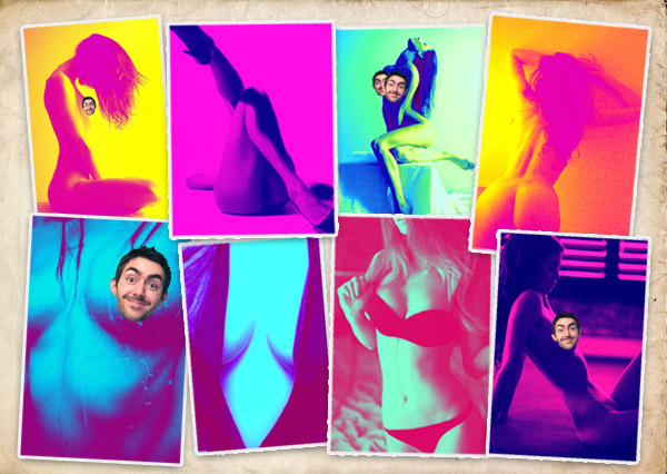
The inspiration for this artwork is thanks to a suggestion sent over by one of my readers named James. He got in touch with links to some awesome Tumblr sites that were full of 80s inspired art & photo effects. He wondered if I could help explain how the effect was done. Some of the images immediately caught my attention (because of the bright colours of course…) The unusual colour schemes give the photographs a sensual 80s vibe as if they’re lit by neon lights. Credit for these particular example goes to the artist Maddi who edits these images and shares her work at kaleidxscope.tumblr.com (Warning: May contain boobies).
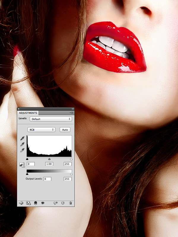
Find yourself a sensual image as a base for your fluoro pop art design. I’m keeping things work safe with this Woman with red lips photograph from Shutterstock. Make any necessary photo enhancements such as Levels adjustments.
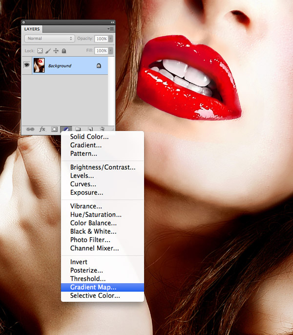
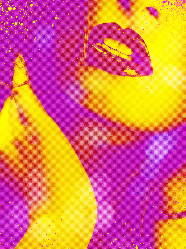
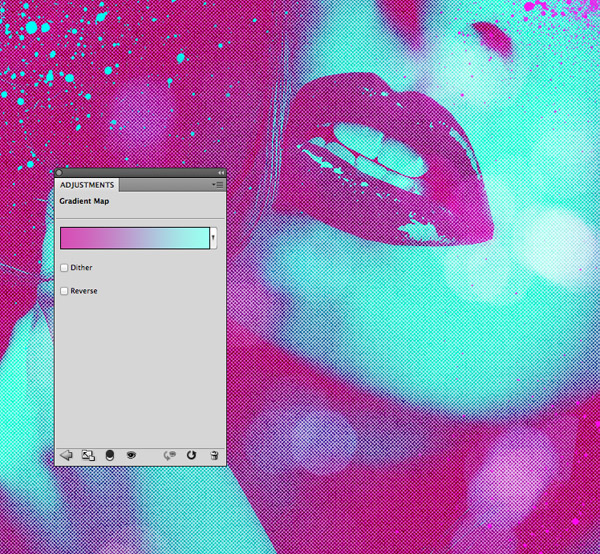
Click the New Adjustment Layer icon at the bottom of the Layers palette and select the Gradient Map option. This feature replaces all the colours within a photograph with replacements that you specify, while retaining the contrast and original tone.
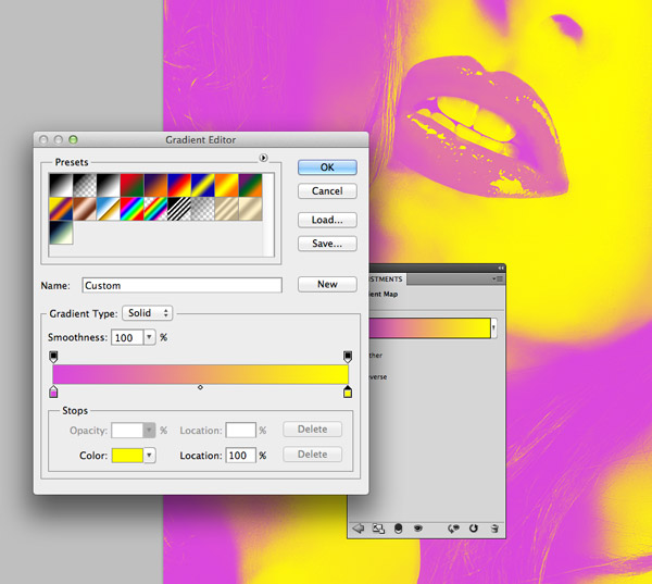
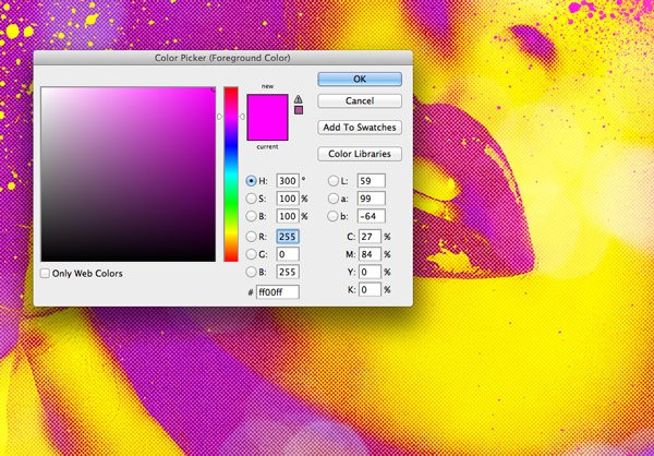
Choose completely contrasting colours for each end of the gradient scale by clicking the little handle and adjusting the colour picker. Here I’ve gone with a light Magenta (#da48dc) through to solid yellow (#ffff00), but experiment with different combinations of saturated colours with inspiration from the examples above.
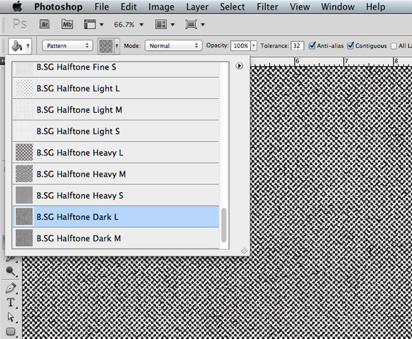
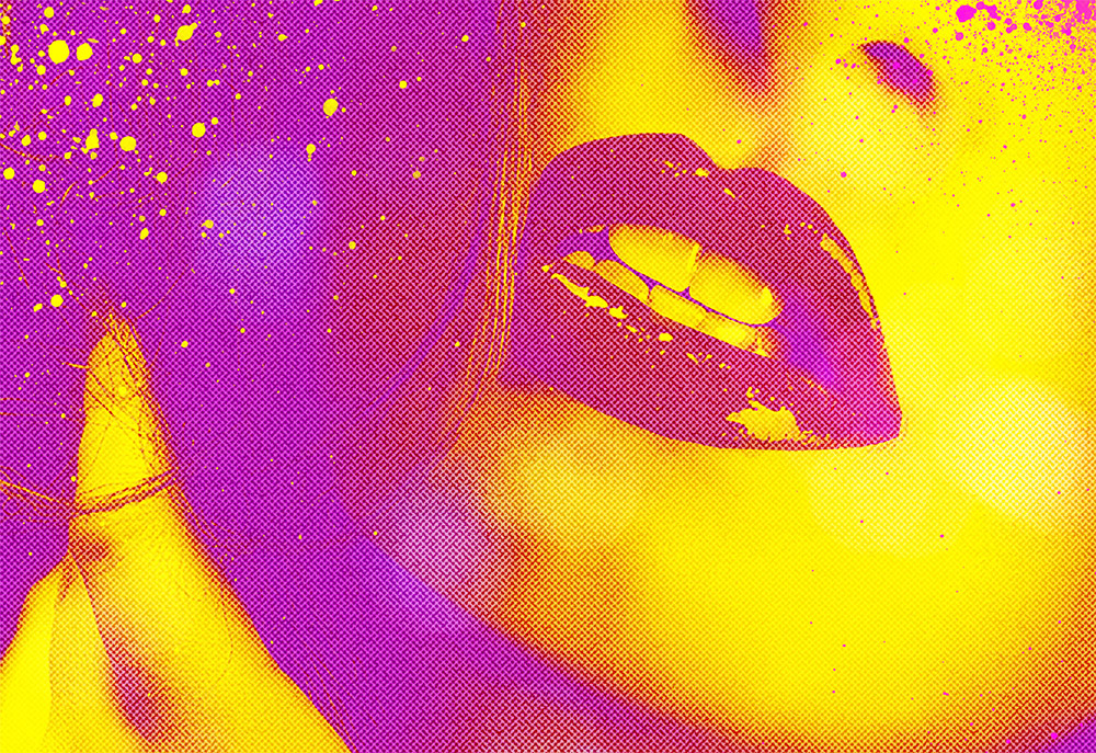
The basic photo effect is complete at this stage, but I figured that would be a pretty basic tutorial. Let’s continue working on our design to add some cool texturing to give the design a pop art theme. Download and install my free halftone patterns then create a new layer then select the Fill tool. Change the drop down menu in the header to Pattern then select the B.SG Halftone Dark L option.
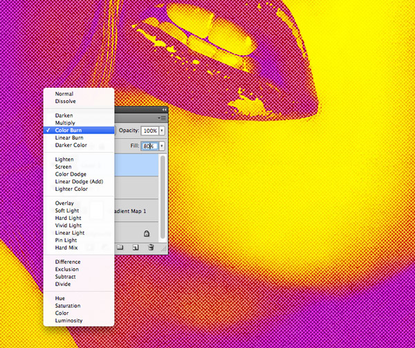
Change the blending mode of the pattern fill layer to Color Burn to allow the pattern to interact with the colours of the design. Reduce the Fill slider at the top of the layers palette to around 80% to tone down the effect.
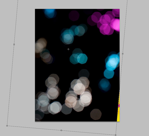
Download and place a bokeh photograph into your document. Scale it to size so the blurry elements evenly span across the entire canvas.
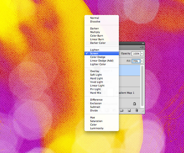
Change the blending mode of the bokeh layer to Screen to render the black background transparent, then alter the Fill to around 70% to create subtle blurry highlights across the design.
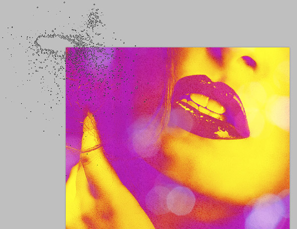
Download and install this set of dirty spray brushes then alter your foreground colour to yellow (#ffff00). Dab the brush on a new layer so that the fine sprays just creep into the edge of the design. Add small splatters in key places around the design, contrasting yellow against the pink background.
Repeat the process on another new layer, but this time use a pink fill colour and place subtle splatters over large areas of yellow.
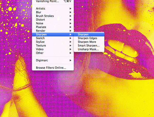
Add a quick Sharpen effect under the Filter menu to give these splatters a crisp appearance. Remember to apply the Sharpen filter to both layers.
The beauty of adjustment layers is that the effect can be non-destructively altered at any time, so now is the perfect time to experiment with other colour combinations.
The basic fluoro photo effect alone looks great by using those 80s neon inspired colour combinations to create eye catching imagery. Those continued additions of halftone textures and paint splatters really helped mix in the characteristics of pop art to compliment those saturated colours and create some really awesome artwork.

Love your face as the censor ahahahah! Great tut utilising the last free resource!
Haha I’m with Jorden, the censor killed me!
Great tutorial; such a simple but stunning effect.
Love this tutorial. The art looks so cool.
Your strategically placed face cracked me up!
Fantastic. I’ve been doing it a little differently but these halftones are amazing. And the gradient is too 80’s awesome.
Really easy and cool, i love the halftone pack. thanks chris
It’s always great to learn new things from you. Amazing. Hot Tut & Hot Pics hahahaha. Keep it up.
Fantastic tutorial. Thanks for sharing such a nice steps with us.
That’s the closest he’ll ever get to their boobs lol.
Thanks…great stuff…
show!! *____*
I`ll try this out, Valentines day is coming up and I may have a go at creating my beautiful lady a card :)
Thanks for the tut…
Great tutorial thanks :)
thank you
thanks this tutorial was super helpfull
Nice tutorial. It’s so amazing how easy to follow is this tutorial.