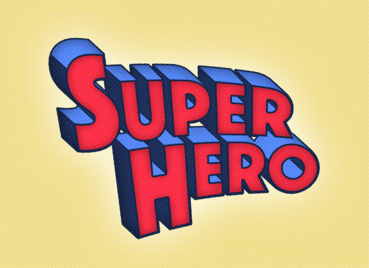
Don’t you just love those old superhero comic book covers? The early ones are really cool, especially the titles that were illustrated in a blocky 3D type effect. Follow along with today’s tutorial to reproduce a superhero comic book style text effect, similar to the original Superman title logo. We’ll lay out the text in Photoshop and generate a 3D appearance with some clever layering techniques, then bring the effect to life with bold colours and a halftone print effect.
Watch the video
Subscribe to the Spoon Graphics YouTube Channel

The text effect we’ll be creating in this tutorial is based on the original Superman comic book covers. It features a blocky 3D appearance, distorted with a slight bend and coloured in bright red, blue and yellow. To complement the retro comic book look, an overlay of halftone dots helps adds some texture to the clean digital artwork to reflect the aesthetic of low quality comic book prints.
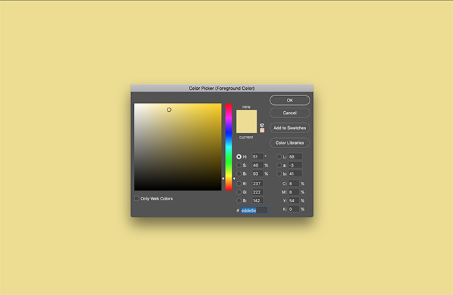
Begin by opening up Adobe Photoshop and create a new document. I’m working at 2000x1300px. Fill the background with a pale yellow colour, such as #edde8e.
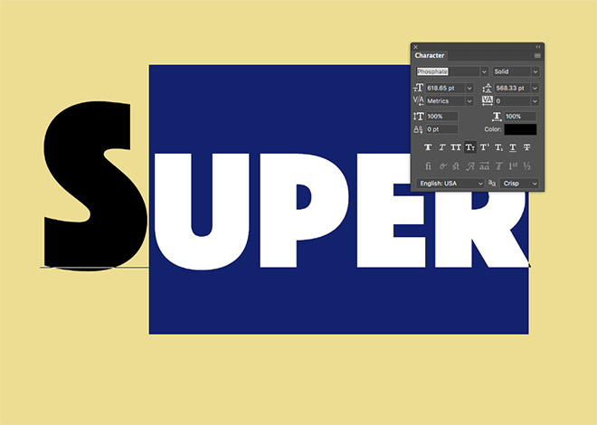
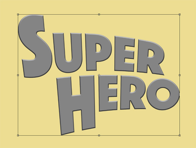
Use the Type tool to set out your superhero name in a bold font. I’m using a typeface named Phosphate, but any strong geometric sans-serif will do. Use the Small Caps option to scale down all the characters with the exception of the first letter.
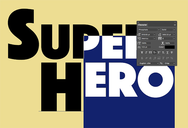
In my example I’m splitting my Super Hero text over two lines, so the Baseline Shift was adjusted to align the small caps to the top of the first character.
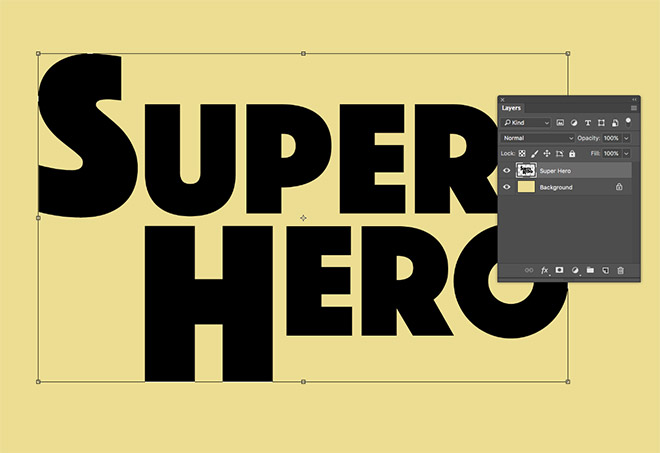
Merge the two type elements with the CMD+E shortcut, then press CMD+T to Transform.
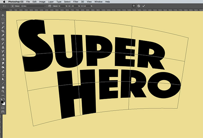
In the top toolbar, click the Warp icon, then select Arc from the dropdown menu. Add a Bend of 10 and a Horizontal value of -20.
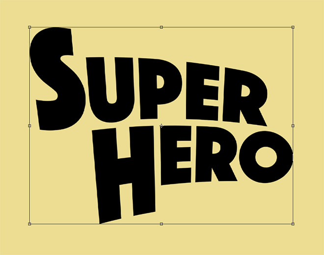
Hit the Enter key to apply the Warp transformation, then use the CMD+T shortcut to Transform the text again. Drag the side handle inwards to squash the text to bring back the correct proportions. Use the roundness of the letter ‘o’ as a guide.
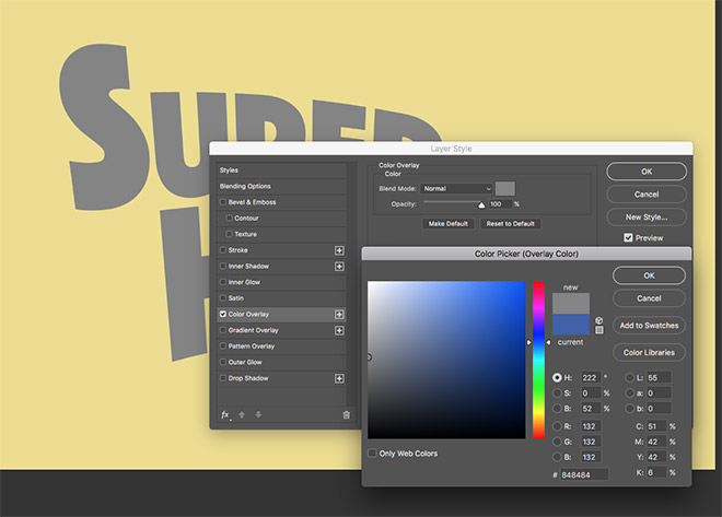
Double click the layer to add some Layer Styles. Begin with a Color Overlay using a mid-grey of #848484.
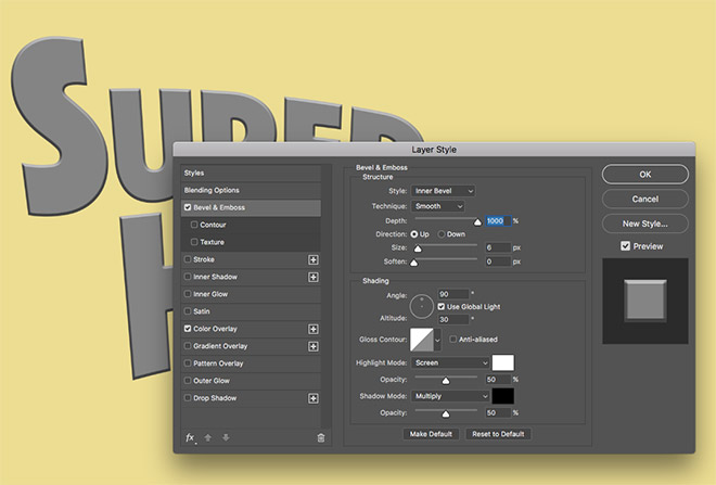
Add a Bevel and Emboss effect using the default settings, but boost the Depth to 1000%.
We’ll use the Transform and Transform Again commands to duplicate this layer. Begin by pressing CMD+T to Transform, then nudge the text down and right 1px using the keyboard cursor keys. Hit the Enter key to apply the transformation.
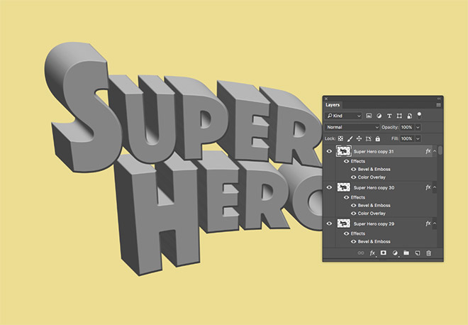
Repeatedly press the shortcut CMD+ALT+Shift+T to perform the Transform Again command, which also generates a new layer for each duplicate. Each new layer is offset by 1px to create a 3D appearance as the Bevel and Emboss shading is layered up. Keep pressing the shortcut to produce 31 layers.
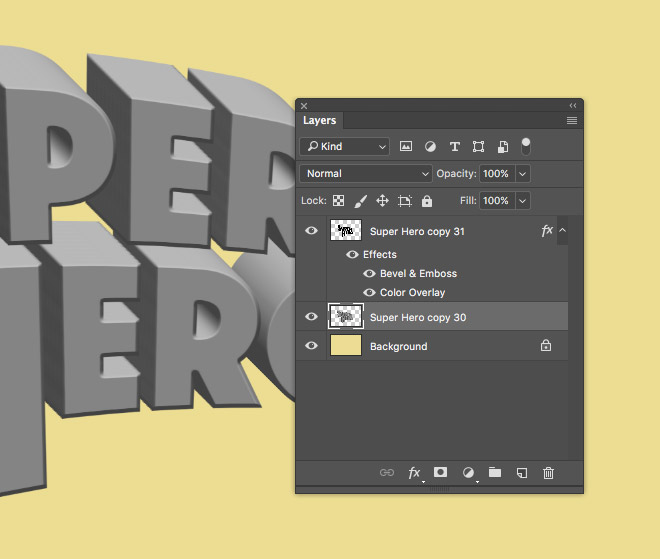
Select Layer 30, then hold the Shift key and select Layer 1. Use the shortcut CMD+E to Merge Layers.
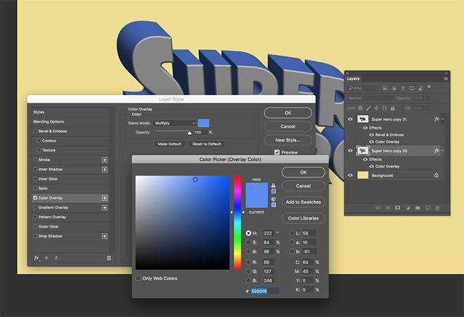
Double click the merged layer to add some new Layer Styles. Apply a new Color Overlay using a mid blue of #5989f6, with the Multiply blending mode.
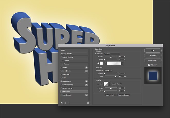
Add an Outer Glow, using the settings Normal, 50% Opacity, White and a large Size of around 215px.
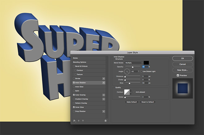
Set up an Inner Shadow using Black, Multiply, 50% Opacity and a Size of around 60px. Adjust the Angle to -45° so the shadow flows from the back of the 3D shape, fading towards the front face.
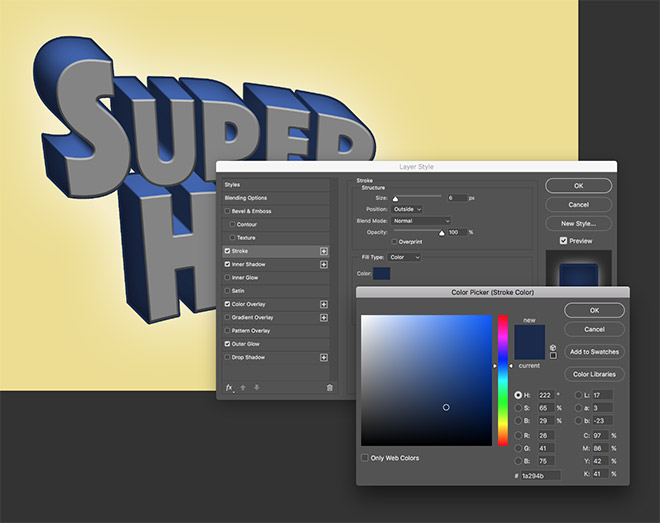
Apply a Stroke using a dark blue of #1a294b, 6px Size, positioned to the Outside.
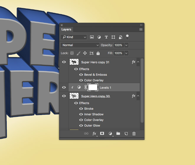
Add a Levels Adjustment Layer above the 3D text layer, then hold the ALT key while clicking between the layers to apply a Clipping Mask.

In the Properties window, adjust the Levels handles so the shadows, midtones and highlights overlap in the centre of the histogram. Move the Output Levels slider underneath to brighten the darkest areas.
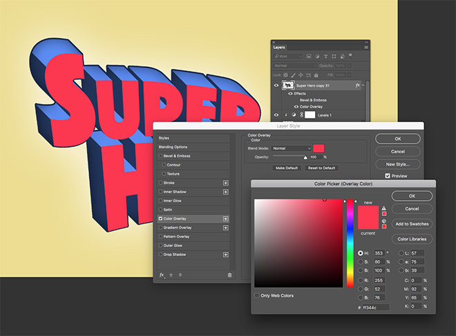
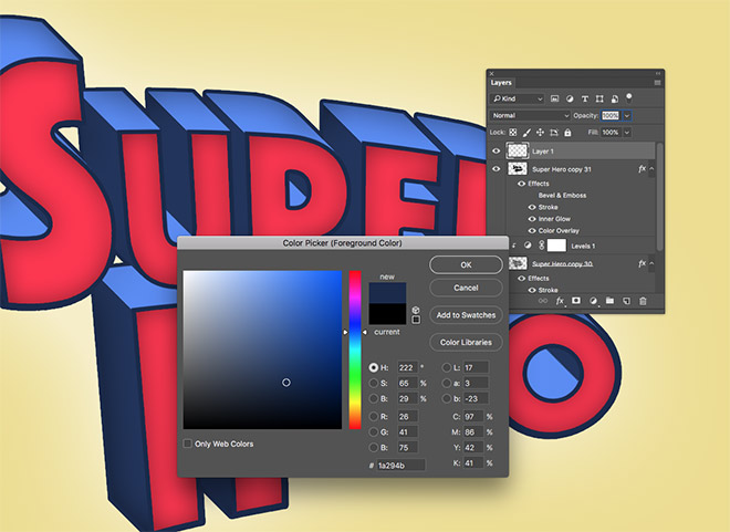
Double click the text face layer to edit its Layer Styles. Begin by turning off the Bevel and Emboss effect, then add a new Color Overlay of #ff344c.
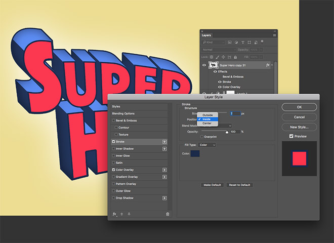
Add a Stroke, which will apply the same settings previously used. Change the Position of the stroke from Outside to Inside.
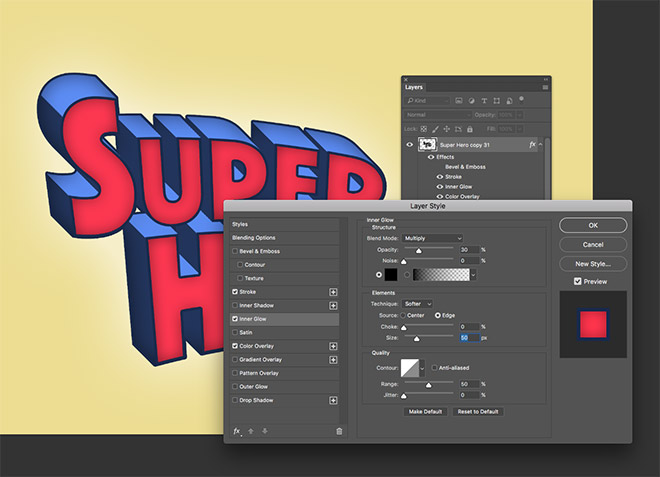
Finally apply an Inner Glow effect to this layer using Black, Multiply, 30% Opacity and a Size of around 50px.
Create a new layer at the top of the layer stack, then sample the dark blue stroke as the foreground colour.
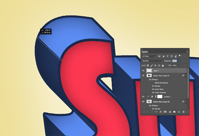
Select the Line tool and set the options to Pixels and a Weight of 5px in the top toolbar. Draw a line over the areas where the colour changes from the darker to lighter blue.
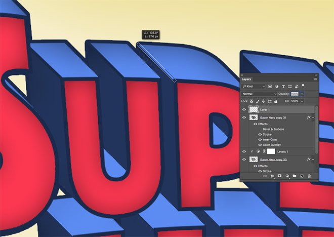
Continue adding diagonal lines across the text to fill in the bold outline wherever the stroke effect is missing.
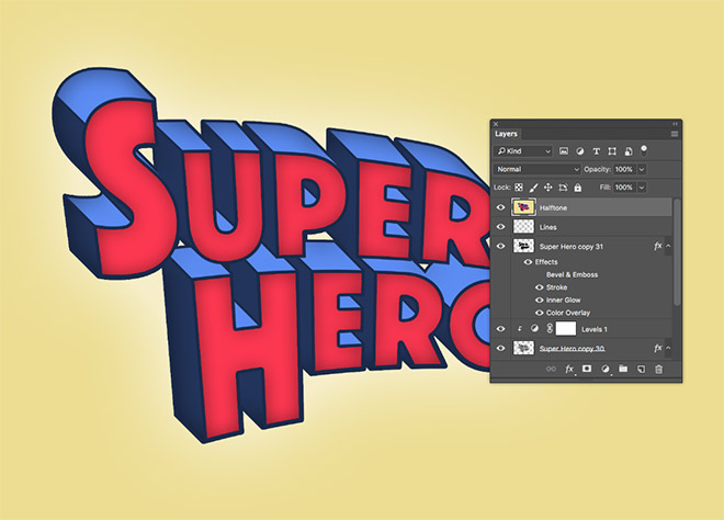
To finish off the artwork with a halftone print effect, using the shortcut CMD+Shift+ALT+E to create a merged copy on a new layer.
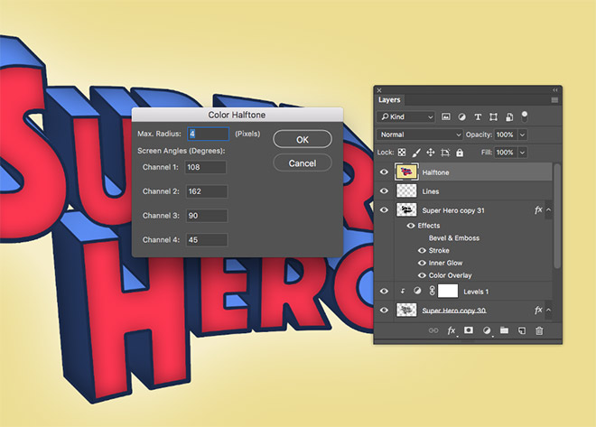
Go to Filter > Pixelate > Color Halftone and enter 4px as the Max Radius. Leave the Channel settings as their default values.
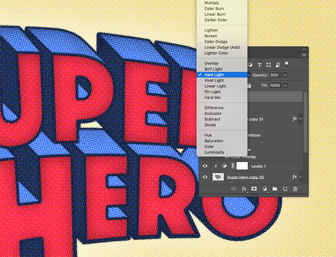
Reduce the opacity of the halftone layer to 30% and change the blending mode to Hard Light. This overlay adds some great texturing to the artwork, while the subtle shading from the Layer Style glow effects produce some great halftone dot details!
The final artwork is a fun text effect based on classic comic book titles. The bright colours and cheesy 3D effects match the art style of the original covers, while the halftone overlay helps give the effect a retro print appearance.

Really good tutorial. Thank you! I also appreciate the fonts and other resources that you sell.
Thank you very much!
Another great tutorial! Thanks Chris!
Thanks Andrea!
How fun! LOL Thank you, Chris!
Great result! Why did you go with creating lots of copies instead of just using the blend tool or the 3D extrude tool?
You could use the Blend or 3D Extrude in Illustrator, but this step+repeat technique is the easiest in Photoshop. You could also use Photoshop’s 3D tool for more realism, but it takes a while to render
Great tutorial! Thanks Chris!
As always, a terrific, easy to follow and very useful tutorial. Using the transform/repeat method for the 3D effect is a really neat trick.
It’s a really cool trick! Here’s another tutorial where I use it to create a more detailed text effect: http://spoon.graphics/2p4db3s
Lanat Teri SHkal Py Kanjr
Finally a tutorial that properly explains the Super hero Text effect :) been wanting to try something like this in my comics for a while. Thank you so much, Chris! Huge fan.
hi spoongraphic nice tutotrials very helpfull to me and nice and easy tutorial
Chris, you are a godsend. Though there are a plethora of ways to receive design tips and tutorials these days, yours seem to come at just the right time (hats off for the intuitive sense) and the waste-no-time instruction allows for one to grasp the workflow, then go back and really learn the tools and processes. I am a part-time, semi-professional designer without formal training… and I couldn’t be more appreciative of all you offer and the way that you do so.
Many, many thanks!
oops, meant to post this to the “rocket ship” video tutorial… I’ll repost it there. Same goes!
Hey, Chris
Thanks for sharing the detailed tutorial. I follow your blogs on regular basis. You have made very informative blogs on every topic. Thanks for providing such an amazing guides.
Waiting for many more to read