I received an email from a Spoon Graphics reader last week who wanted some advice for creating a striped type effect in Illustrator, citing a retro 70s style logo as an example. I was sure I’d created a similar effect in a recent tutorial, but it turned out to be the title art I produced for my Washed & Worn textures that I was thinking of. In today’s Adode Illustrator tutorial I’ll take you through my process of creating such artwork to produce a similar 70s inspired type style, then follow it up with an alternative process that has the advantage of preserving the live text.
Watch the video
Subscribe to the Spoon Graphics YouTube Channel
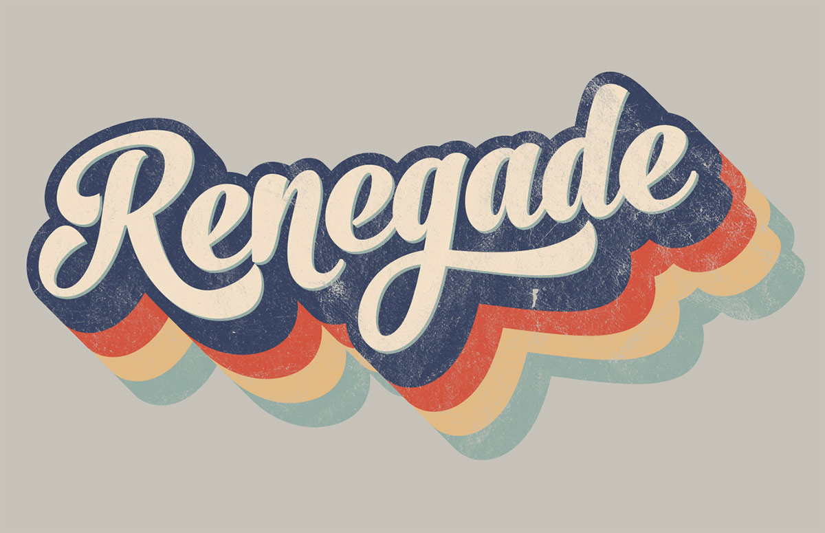
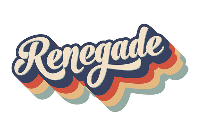
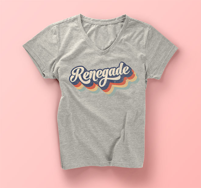
The artwork we’ll be creating in this tutorial is a retro type design in the style of 70s brand logos that feature the striped trend from the era. My example uses the word Renegade, set in a lovely bulbous script font, with a series of alternating rainbow stripes with a nostalgic palette of muted hues. To finish off the artwork, we’ll use those Washed & Worn textures to make the type look like a classic t-shirt.
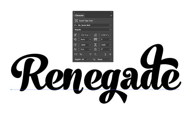
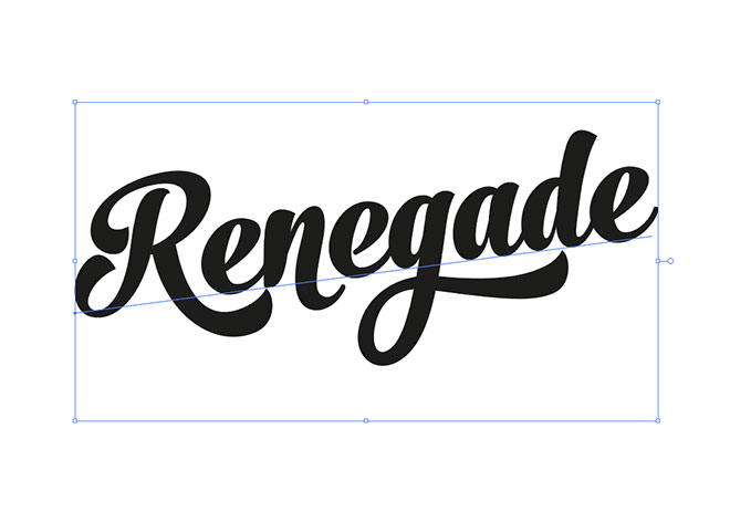
The secret ingredient for creating beautiful script type, aside than becoming a hand-lettering master, is to use a quality premium typeface which contains professional OpenType features. One of my go-to typefaces is named No. Seven. Set your chosen wording with the Type tool in a new Illustrator document to see the font in its default form.
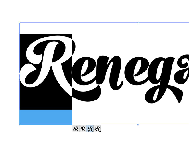
The wonderful OpenType features of alternate characters allows you to completely customise your type so each letter is composed perfectly with the next. Highlight each character in turn and cycle through the various glyphs available to produce a totally unique type design.
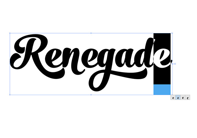
One of the telltale details that distinguishes custom hand-lettering from a basic font is the repetition of characters, but the alternate glyphs available in OpenType enabled fonts allow you to reduce any uniformity with different letter styles.
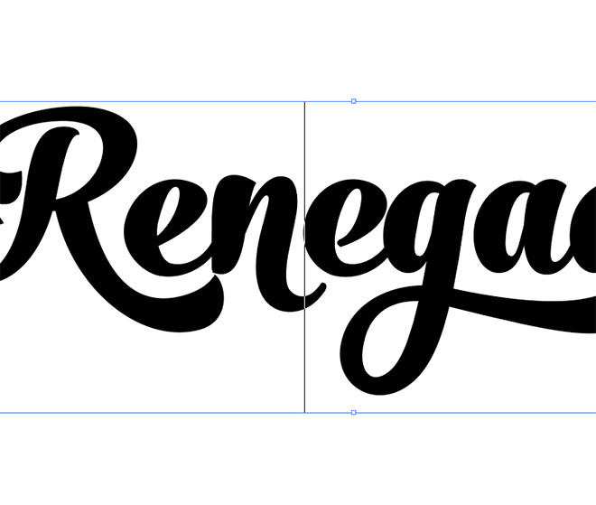
Make any necessary kerning adjustments by placing the cursor between the relevant letters, then use the ALT and left/right cursor keys to alter the gap.
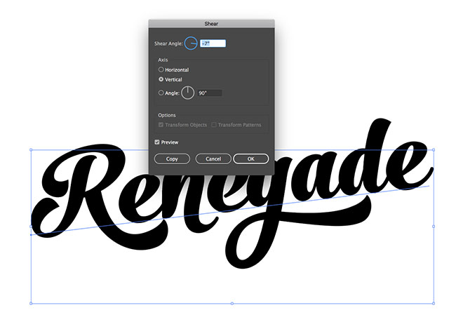
Give the text a bit of extra flair with a Shear transformation (Object > Transform > Shear). Enter -7° with the Vertical option checked.
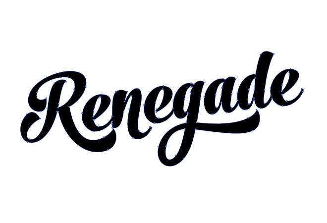
Out of habit, I tend to outline my type in order to then apply a series of modifications. I’ll cover an alternative approach later which preserves the live text, but right click and choose Create Outlines on this text element.
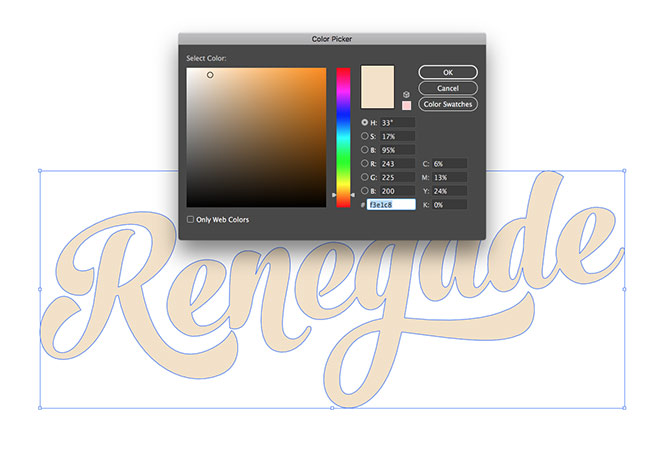
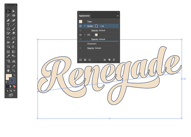
Change the fill colour to a light beige hue (#f3e1c8). I mix and matched the colours from a couple of palettes from ColourLovers, named Old T-Shirt and I Need Your Love.
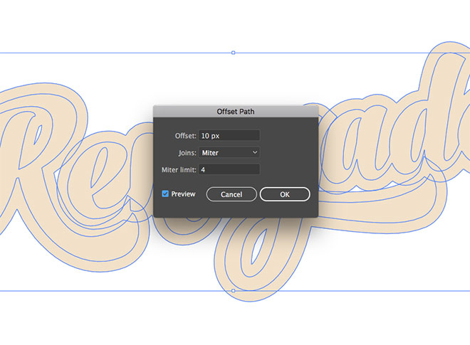
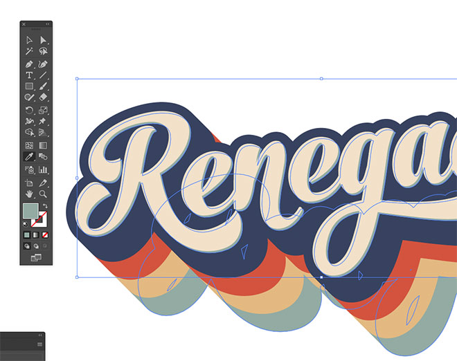
Go to Object > Path > Offset Path and enter 10px to produce a wider outline around the type. Give this new outline a dark blue fill colour of #374160.
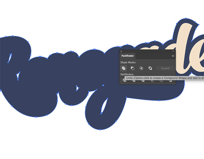
Use the Pathfinder panel to merge all the individual letter outlines into one continuous shape using the Unite button.
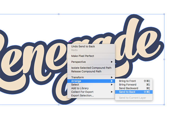
Place this blue outline below the beige text by selecting the Arrange > Send To Back menu.
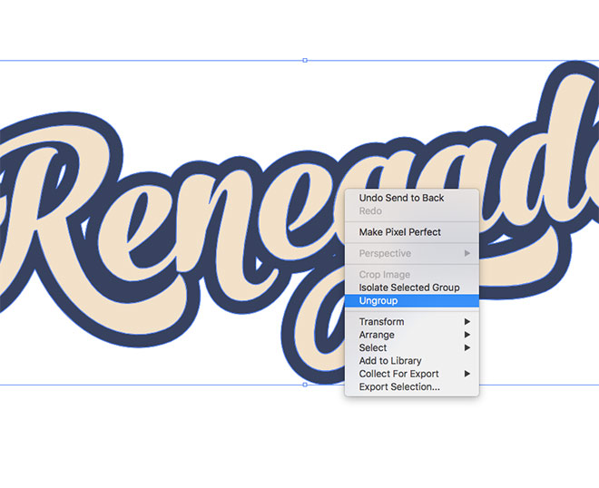
By default the offset path is grouped with the main text. If you deselect and select the element again, both items will be selected. Right click and choose Ungroup to separate the elements.
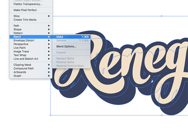
Select just the blue outline then hit Copy (CMD+C) and Paste in Back (CMD+B). Hold the Shift key while nudging the duplicate down and right. Make a selection of both blue shapes, then create a blend under the Object > Blend > Make menu.
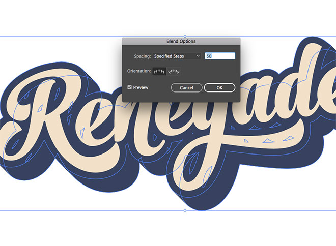
Head back to Object > Blend > Blend Options and alter the settings to Specified Steps and enter a high value to effectively create a smooth transition between the shapes.
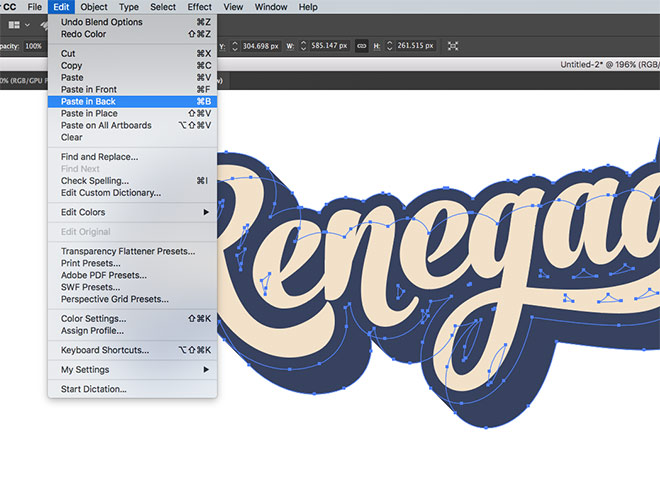
Make a copy the whole blend element and paste in back a duplicate.
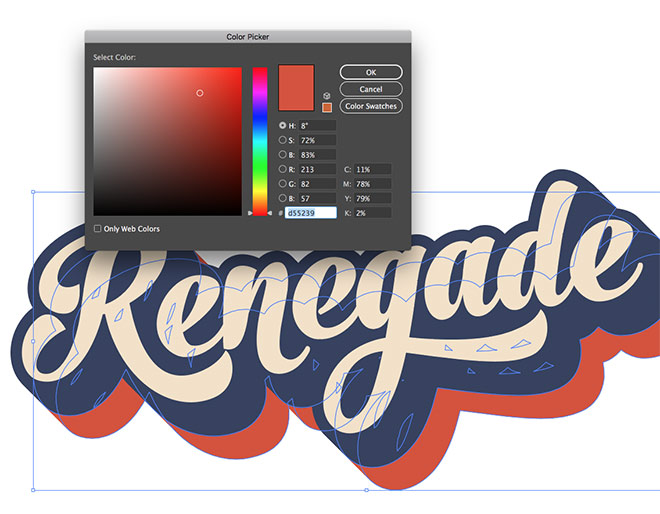
Alter the fill colour to a red from the palette (#d55239), then hold Shift and nudge the outline twice the distance so it extends the layout.
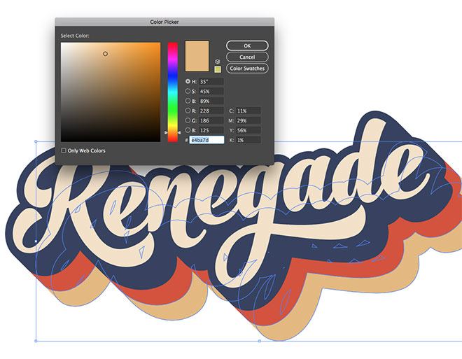
Repeat the process of pasting a duplicate with the CMD+B shortcut, then alter the colour (#e4ba7d browny-yellow this time) and nudge it into place to continue the striped effect.
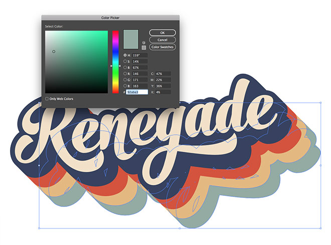
Make sure each new stripe is offset by an equal number of nudges downwards and to the right to keep the striped effect aligned. The last colour for this artwork is a pale green of #92aba3.
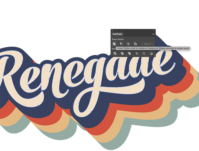
All the main letters have been separated with the Ungroup command earlier. Select them all and use the Pathfinder panel to Unite them.
Copy and Paste in Back a duplicate of this element, then give it the same pale green fill colour (#92aba3). Nudge it down and right twice without holding the Shift key this time.
This method of building a design out of shapes is my natural process, but it permanently produces the artwork. Any edits to the wording would mean recreating it from scratch. Here’s an alternative approach that makes use of just the Appearance panel by layering a variety of fills and strokes.
Live Type Method
Rewind right back to the start where we had a neat piece of type in an editable text element.
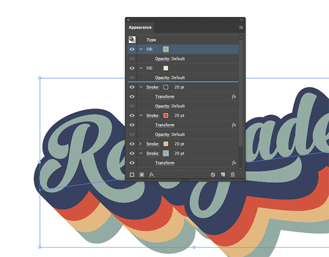
Make sure you have the Appearance panel visible, as that’s where we’ll be doing all the work for this method. Alter the fill to the light beige hue (#f3e1c8), then apply the dark blue outline colour (#374160) as a stroke. By default the stroke appears on top of the fill, which means you can see the outline of each letter. Drag this stroke underneath the fill in the Appearance panel.
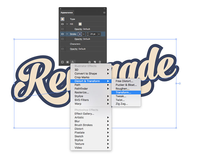
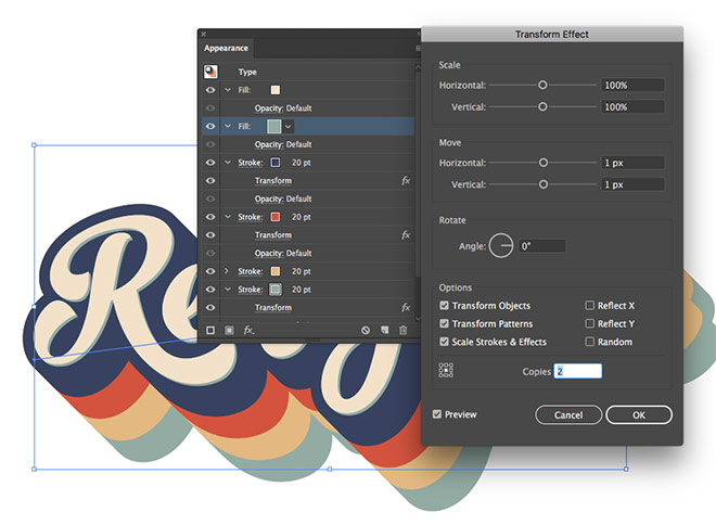
Increase the stroke weight to 20pt to produce the same effect as the offset path earlier. To mimic the Blend, we can instead use the Transform effect from the FX menu at the bottom of the Appearance panel.
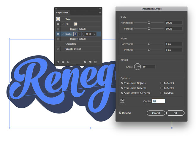
Enter 1px in both the Horizontal and Vertical Move options, then apply 20 Copies near the bottom of the settings.
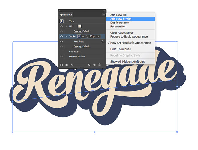
To add each different coloured stripe, a new stroke can be applied from the menu in the top corner (or the icon at the bottom of the panel). With the Appearance panel you can layer up numerous strokes onto one element.
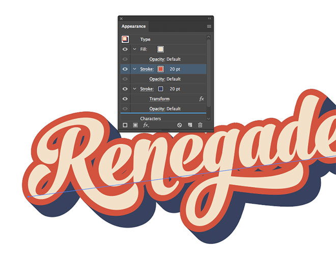
Change the colour of this second stroke to red (#d55239). The stroke is stacked on top of the blue stroke, so drag it underneath.
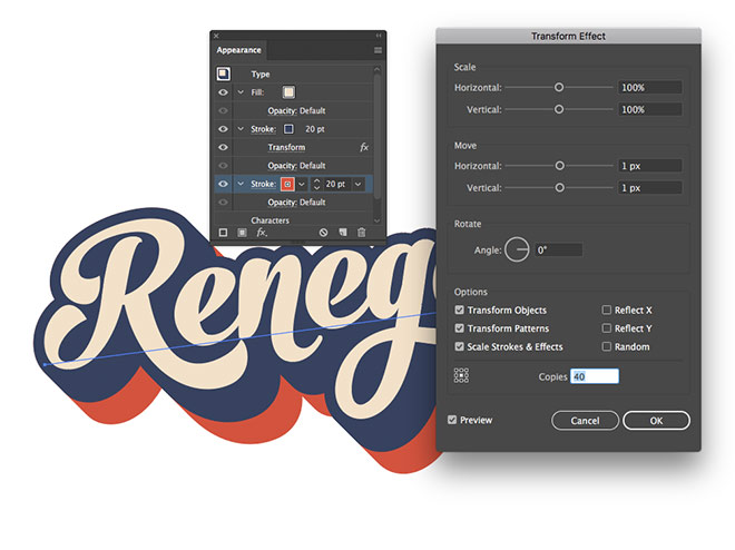
Apply a Transform effect and enter the same 1px Move figures, but this time add 40 copies to extend the effect twice as far so it protrudes from behind the blue stroke.
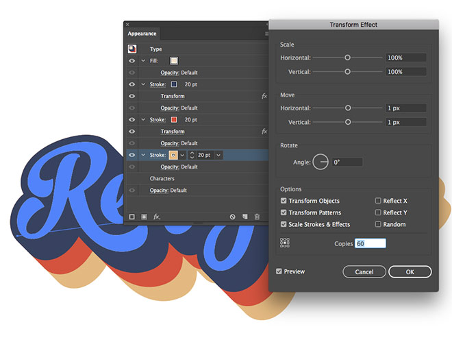
Repeat the process with a new stroke for yellow (#e4ba7d). Drag it underneath the others then add 60 copies in the Transform settings.
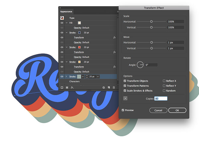
The fourth stroke is green (#92aba3), which is placed at the bottom with 80 copies in the Transform effect options.
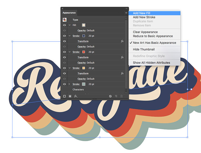
Add a new fill to create the thin green offset text in the original artwork.
Drag this new green fill underneath the beige fill, but keep it above the blue stroke.
Apply a Transform effect, using the 1px Move values, but this time with just 2 copies.
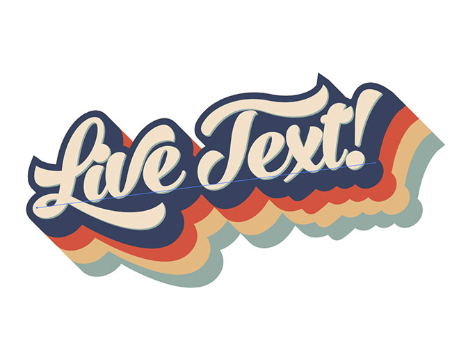
This alternative method produced the exact same artwork, but using just the Appearance panel rather than a collection of Illustrator’s shape-building tools. The main difference is you can still edit the text to change the wording, all the effects will remain applied to the type. You can even save these effects as a Style to apply them to any other element with a single click.
Applying a texture in Illustrator
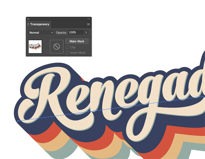
Since we modelled this text effect on my Washed & Worn textures artwork, we might as well make use of one of those textures. To apply a texture in Illustrator, click Make Mask in the Transparency panel (group all the objects if using the first method).
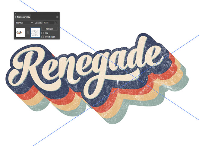
Click on the square thumbnail on the right in the Transparency panel to activate the mask, then Drag one of the textures into Illustrator, or use the File > Place command. Scale and move the texture into position. Click on the square thumbnail on the left to exit back out of mask mode.
The texture in the mask will non-destructively punch out details from the artwork to allow whatever background it’s placed against to show through, giving it an aged and distressed appearance like an old t-shirt print.
Want more? Check out these great related products
The following resources cost a little money, but I definitely recommend checking these related products out to complement my Retro Text Effect tutorial.
Vintage Text Effects Vol. 6
RetroType – Illustrator Retro Effects & Graphics Kit
50 Vintage Text Effects Bundle

Thank you for sharing this. I have achieved this look using many more steps than needed. Once again you make it so easy!
Great tip, again :) Thank you! I wonder how they make text look like it is pressed into paper too.
Lovely tutorial, thanks Chris :)
Amazing article!
I love the second method as it allows it to be saved as a template, just easily change the text. However, mine ended up looking weird. The copies created look like separate layers. Here’s a screenshot:
https://www.screencast.com/t/htPnAnsHu
What did I miss?
it looks like you only applied 10 copies of each effect colour, thus having a jagged edge as a result. If you increase the number of copies, the edge should become smooth.
Super cool tutorial, Chris! Thanks a lot.
Again you have shared the amazing tutorial.
I always appreciated you to create the advanced level tutorial.
This is an awesome post. I find it really interesting and informative. I find this helpful as well. Thank you for sharing!
Lovely Tutorial, bulbous script font looks so pretty with this retro 70’s style.
I have created such a unique logo for a client’s heritage coffee cafe.
Thanks again Chris!