I’ve been playing around in Adobe Illustrator blending together vibrant colours to produce some cool gradient effects. In this tutorial I’ll show you how to use the Gradient Mesh tool to create a colourful circular orb, which can also be modified into a cool abstract shape with Illustrator’s Warp tool. Being vector based means these graphics are extremely versatile, so they can be used for all kinds of branding projects, or just to create fun artwork.
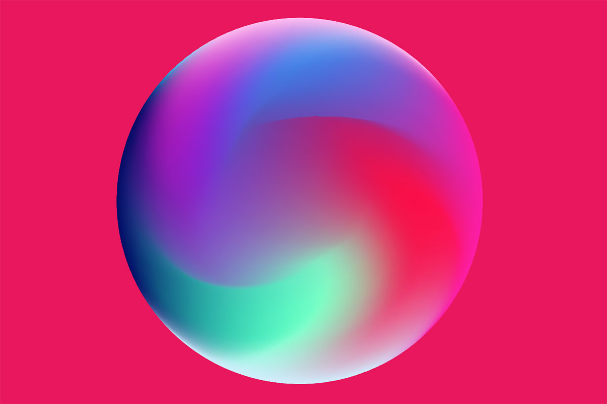
The artwork we’ll be creating in this Adobe Illustrator tutorial is a colourful gradient orb that smoothly blends a range of hues together. These kinds of vibrant gradient effects are really popular at the moment and are great for brand designs, app interfaces, or even phone backgrounds as seen on the new iPhone X. By using different colours and random selections, you can create a unique orb every time!
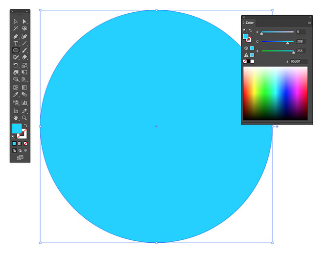
Create a new document in Adobe Illustrator at any size, but use the RGB colour mode for a full spectrum of vibrant colours. Draw an Ellipse on the artboard, holding the Shift key to keep it perfectly circular. Clear out the default black stroke and add a bright colour fill.
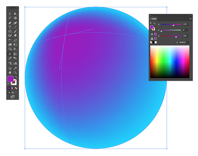
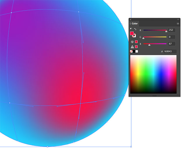
Select the Gradient Mesh tool and click somewhere inside the circle. Change the colour fill of this point to a complementing hue. It could be close to the original colour, or something that totally contrasts.
Add another gradient mesh point in some empty space and choose another colour. The mesh will gradually blend all the fills together to create smooth transitions between them.
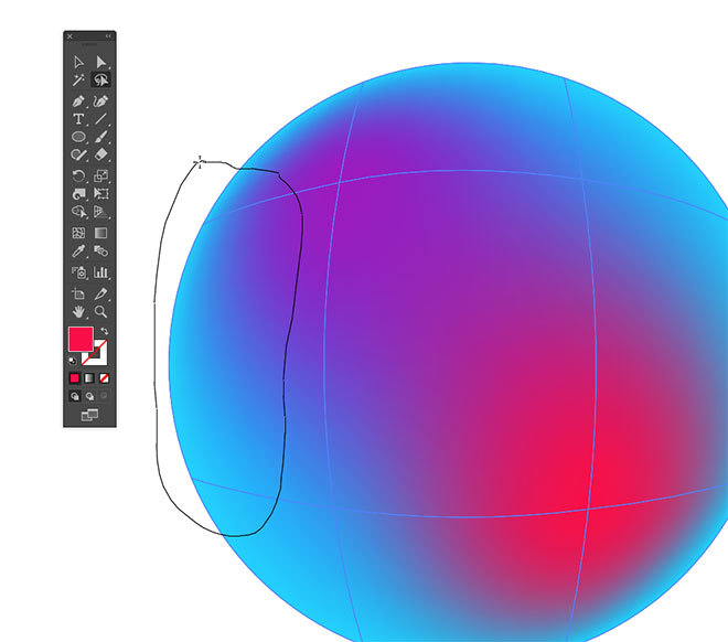
Adding mesh points also creates additional points around the edge of the shape. Use the Lasso tool to select of couple of these outline points by drawing a selection around them.
Alter the colour fills by either moving the sliders in the Color panel, eye-dropping a hue from the full spectrum, or double click the Fill in the toolbar to open a Photoshop style colour picker.
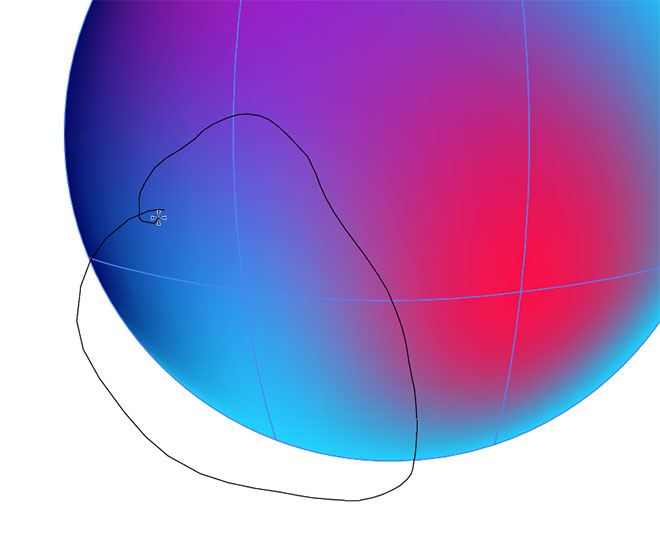
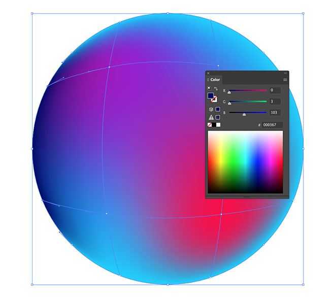
Continue selecting points with the Lasso tool in order to add more colours. Aim to eliminate any large areas of the original fill.
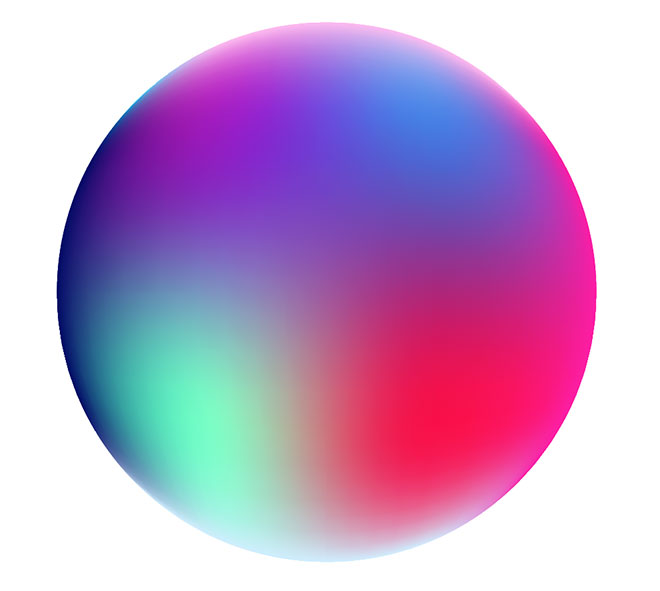
Selecting just the edge points and giving them a brighter colour fill can help add a glow effect. The circle should now be filled with a variety of colour gradients that smoothly transition throughout the shape.
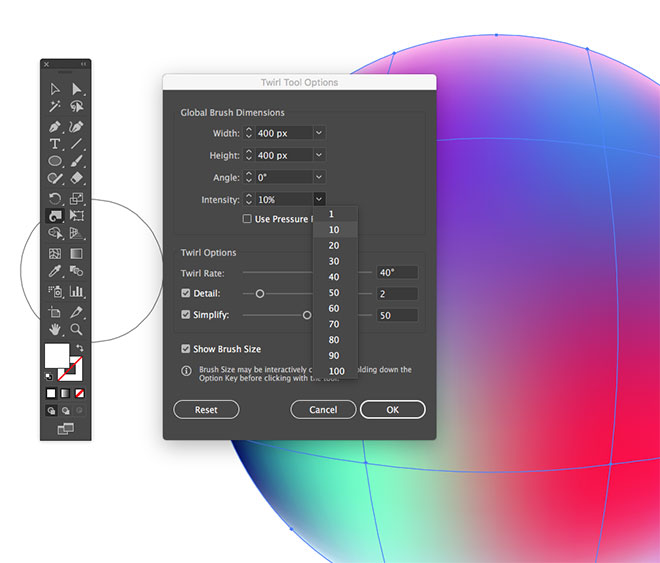
To mix up the colours further, select the Twirl tool from under the Warp tool’s group in the toolbar. Double click the tool to edit its settings. Alter the size to closely match the dimensions of the circle, then reduce the Intensity to 10%.
Carefully click in the centre of the circle to begin mixing the colours a little. Make small adjustments to avoid glitches from distorting the mesh paths too much.
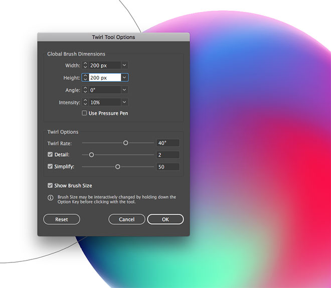
Double click the Twirl tool again to edit its settings and reduce the size to around 200px.
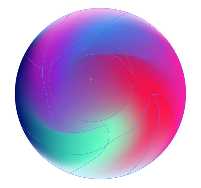
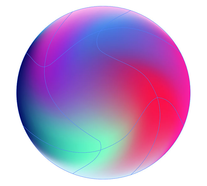
Use this small tool size to mix up the hues in specific areas, again making small adjustments with each click.
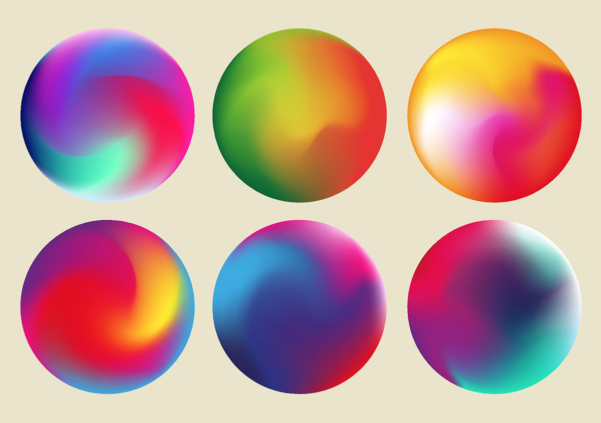
The finished gradient orb looks great with a mix of colours that swirl and blend together. Follow the process again to experiment with different colour selections to create a collection of gradient circles.
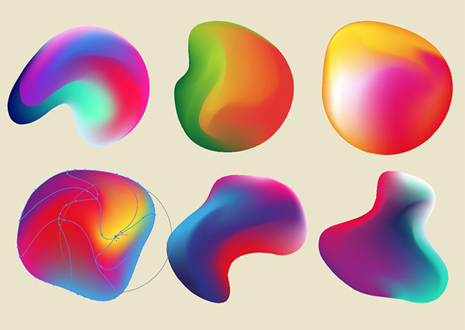
Circles are cool, but we can take this tutorial a step further by converting the artwork into abstract shapes. Select the Warp tool from the toolbar and click and drag to distort the shapes.
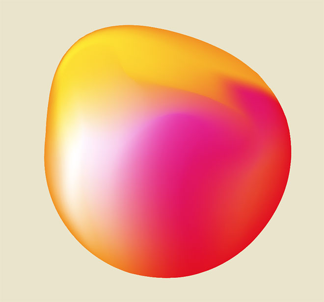
Some of these distorted shapes would make really cool logo graphics. They look great with either subtle warping on just one side, or extensive distortion to give the graphic more of a fluid appearance.
Thanks for sharing Chris.
Thank you for sharing! This is a great tutorial.
Thank you Anthony!
Nice tutorial. Thanks for sharing.
Just a word of advice for print designers – these look great for logos/graphics on the web but when converted to CMYK for print all those beautiful hues become dull and look terrible. If the logo will be printed, try creating the mesh with simple cmyk values that are easy to replicate on paper.
Great tutorial, Thank you for sharing with us..
May with some texture added, this can look like a water color effect! Good stuff, Chris. Thanks for sharing.
This is such a cool effect! I love it! Thank you!
This is such a wonderful stuff Chris. Thanks for sharing. I am definitely going to try this out.
Hi Chris, I love the tutorials about the mesh tool because over the years it was a bit intimidating.
That’s great Gabrielle!
Great tut man, your page is awesome.
Thank you very much!
Where is the: Warp – Twirl Tool…
5.1 only has a Twist tool which doesn’t do the same thing!
Nice tut otherwise!!! :-)