This post was originally published in 2013
The tips and techniques explained may be outdated.
My number one most popular tutorial from last year described the process of creating a trendy retro cityscape in Photoshop. I’ve noticed the retro and vintage styles are still in vogue, so today let’s take a look at creating another design that captures the abstract theme of old album art. Follow this step by step Photoshop tutorial to manipulate a landscape photo with various color adjustments and lay out a typographic quote to create a retro style landscape design.
The design we’ll be creating is based on the theme of a mountain and uses a landscape photo to create an abstract layout that would work perfectly as a retro style album cover. Clippings of the original photo are used to make up the layout of the design, then a range of color adjustments and textures are added to give the artwork that classic retro style.
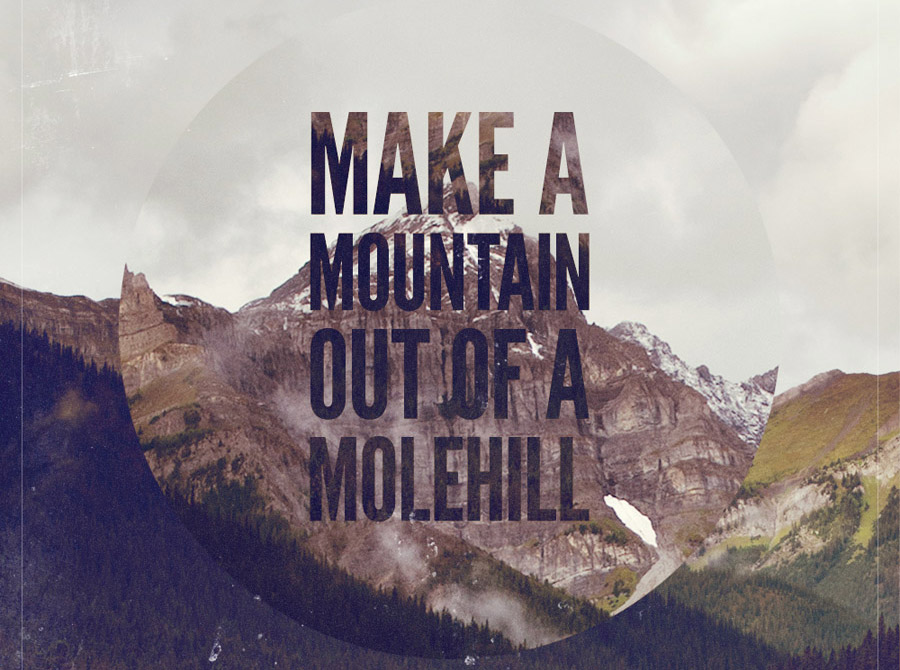
View the final abstract retro landscape design
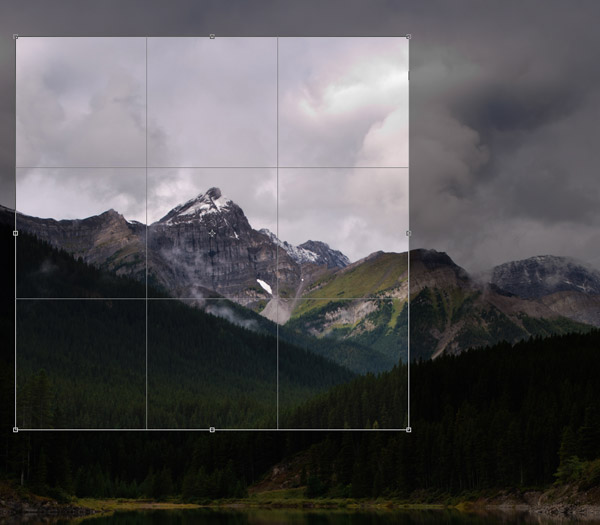
The whole design relies on a landscape photo of some kind. The photo I picked out is a scenic mountain view from Shutterstock. Download the Super sized version and crop the photo into a square format to capture the main mountain peak.
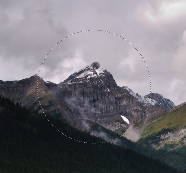
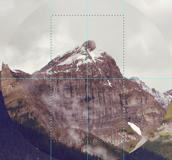
Select the Elliptical Marquee tool and draw a selection around the main mountain peak. Press CMD+C to copy this selection of the image to the clipboard. Go to Image > Image Size and scale down the super sized image to a more suitable document, this will allow the circular selection to be pasted back in at a larger proportion to the rest of the image.
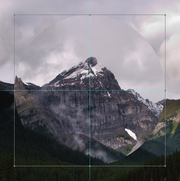
Add guides to identify the centre of the document then paste and scale the circular selection to fill a large portion of the design.
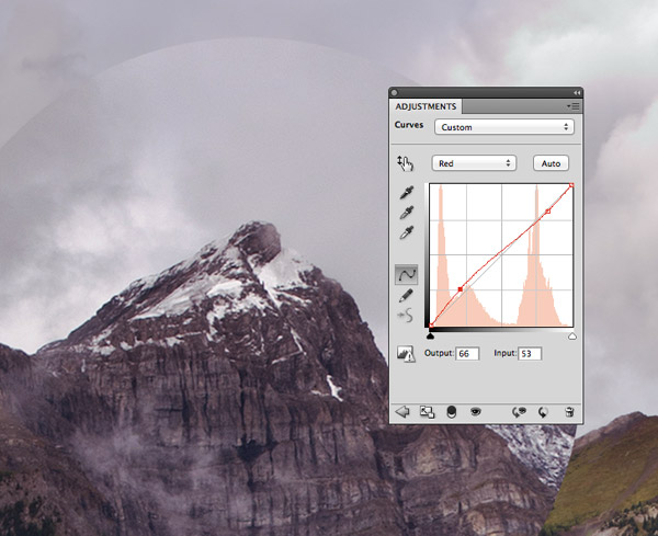
Create a new Curves adjustment layer in the Layers palette and change the drop down menu to the Red channel. Add a slight bend to the curves graph to increase the reds in the shadows and very subtly decrease them in the highlights.
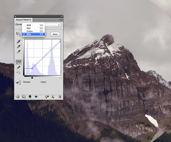
Change the drop down menu to the Blue channel then adjust the lower point to crop the shadows inwards towards the first grid point. Move the upper point downwards to clip the highlights.
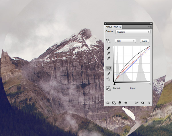
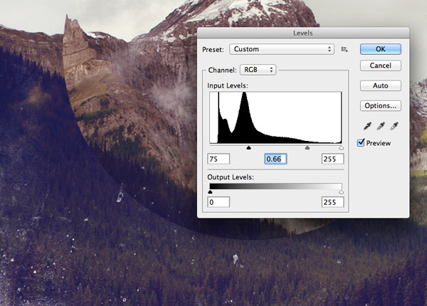
Switch back to the full RGB channel and adjust the curve profile to a smooth convex line, thus brightening the image in the midtones.
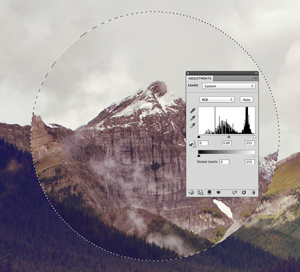
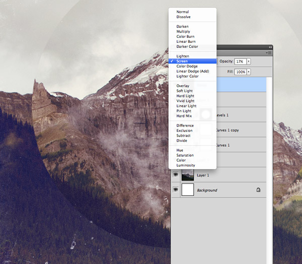
Duplicate the Curves adjustment layer in the Layers palette but reduce the opacity of this new copy to 60%. CMD-click the thumbnail of the circular clipping layer to load its selection, then add a Levels adjustment layer. Move the midtones marker to the right slightly to darken the centre image.
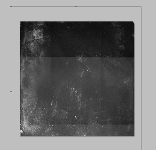
Download a cool grungy film texture from LostandTaken and paste it into the main design document. Scale the texture to size to allow the distressed marks to fill the square canvas.
Change the blending mode of the film texture to Screen to render the black areas transparent, then adjust the shadows and midtones markers in the Levels window (CMD+L) to darken the image and tone down the distressing effect.
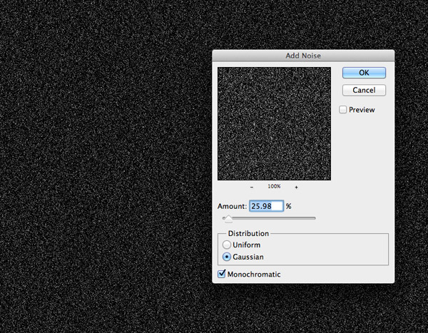
Add a new layer at the top of the stack and fill it with black. Go to Filter > Noise > Add Noise and alter the settings to 25%/Gaussian/Monochromatic.
Change this layer’s blending mode to Screen and its opacity to around 20%. These grainy textures really help capture the aged appearance of old album covers.
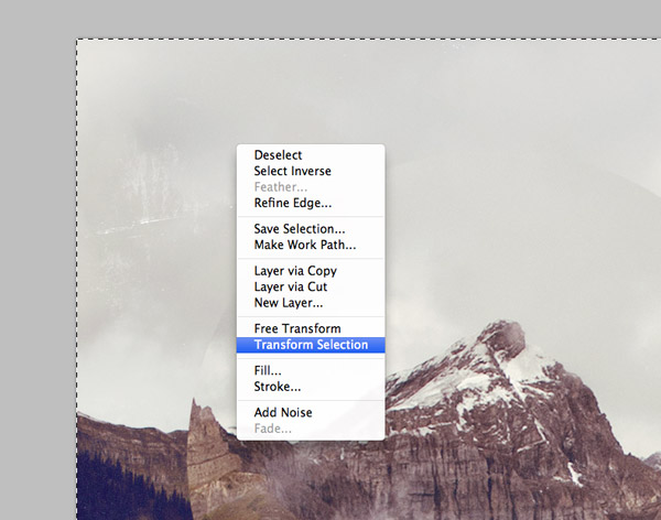
Create a new layer then press CMD+A to Select All. Right click on the canvas with the Marquee tool to open up the fly out menu and choose the Transform Selection option.
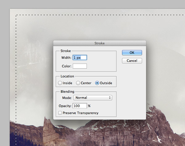
Alter the dimensions of the selection to 95% in the header bar then press Enter. Right click again and this time Select the Stroke option. Set the size to 1px and colour to White.
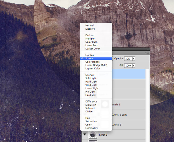
Change the blending mode of the stroke outline layer to Screen and reduce its opacity to 30% to give it a more of a subtle border effect.
Select the Rectangular marquee tool and hold Alt while dragging out a selection from the centre of the document. Choose a suitable width for the typographic elements and add guides to identify the area.
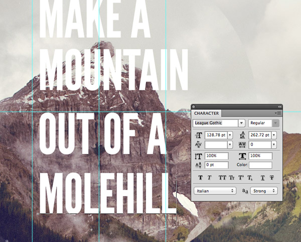
Use the Type tool to lay out multiple lines of the quote “Make a mountain out of a molehill”. I’ve chosen the fantastic League Gothic font for its strong but slim appearance.
Press CMD+T to transform each section of type and scale it to fit within the guides. Don’t forget to hold Shift to constrain the proportions to avoid squashing or stretching the text.
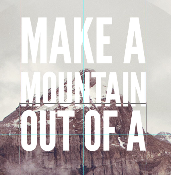
Butt up each line to the previous then hold the Shift key while nudging with the keyboard cursor keys to set an exact amount of spacing between each line, then group all the elements and align them centrally.
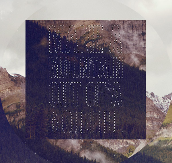
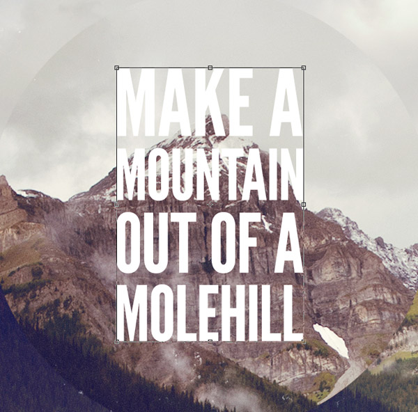
Select the background layer and copy/paste a large clipping from the lower left corner. Move this layer above the circular layer but below the adjustment layers, then press CMD+Shift and click the thumbnails of the various text layers to load their selections.
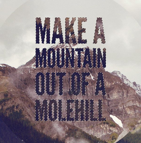
Turn off the visibility of the text elements group, then click the Create Layer Mask icon at the bottom of the Layers palette to clip the background selection to the outline of the text.
The final artwork boasts a kind of collage effect with the various elements being created from clippings of the same background photo, then the addition of colour adjustment layers and distressing textures all help give the design a trendy retro album sleeve appearance.
Another great tutorial. It always amazes me the lengths you go to to explain what you do. So thank you.
Awesome! Really great tutorial. The texture add a nice effect. It could be used as an image for a CD cover.
Really great tutorial Chris, the results on the final piece are fantastic
Its Really Owsome :) its was Amazed me :)
Wow! this is just awesome! thanks boss
New lesson today for me.Great and superb share.Thanks
A clear and concise tutorial and great design. Thanks!
Hi, can anyone help. I’ve got all the way to the last step and got stuck. I’ve selected my text but the ‘create layer mask’ icon is greyed out on the layers panel so I can’t clip the background to the text. Up til then, so far so good.
Any advice appreciated, thanks, Laura
Hi Laura,
Before creating the layer mask you should be sure to have the cropped background layer selected because if no layer is selected the layer mask cannot be created.
Thank you Olivier, I’ve just tried it and your advice worked. Many thanks, Laura :)
I tried it with another mountain picture and it worked great! Lots of fun, thanks for the tutorial.
http://i.imgur.com/63yf1N8.jpg
That’s really cool thanks for the tutorial.
It’s a GIFT, thank you ! I love so much vintage design and obviously this tutorial is clear and pleasant.
Great work in photoshop.
Thanks for sharing a very useful article.
Here’s my spin on the technique:
bit.ly/10neI6S
Thanks for another great tutorial, I loved the last one with the Go Kart Race, I actually did it and put my own spin on it. I can’t wait to try this one! Thanks Again
Really lovely tutorial, thanks for sharing this.
Very cool and interesting tutorial, thanks for sharing this with us! :)
Here is my retro Mt. Fuji. I am going again this year. Wish me luck.
http://img.photobucket.com/albums/v645/duceduc/themes/conquer-mt-fuji-or-die-trying-retro-poster_zpse77bce72.jpg
That’s really cool thanks for the tutoria.love it