I've been busy working on a revamp behind the scenes of Blog.SpoonGraphics recently with aims to push the site forward and make use of the new features of WordPress 2.7 as well as CSS3 styling rules that are gaining wider support with the near release of Firefox 3.1.
Here's my little roundup of what's new!
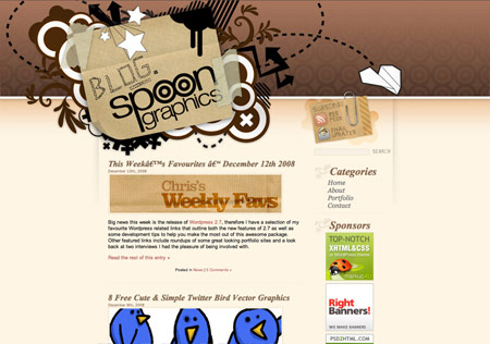
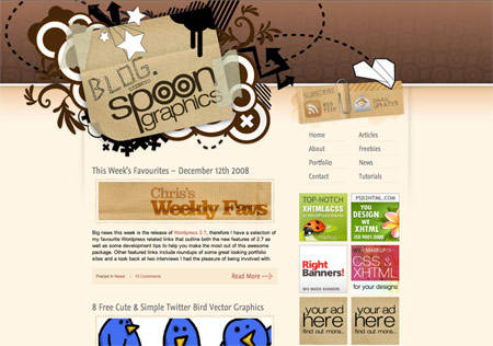
The large illustrated header, colour scheme and general style of the site have become largely recognisable and still gain good responses from new visitors, therefore this main styling was something I wanted to keep intact with the newer design.
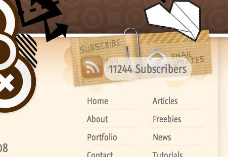
One main change visually is the larger content area allowing for the wider, two column sidebar. By also shortening the header this allows the sidebar content to appear further up the page, and helps spread out the links into two sections.
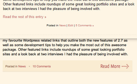
The restyled page elements also add a bit more visual interest to the site, whereas before they a little plain, they now tie in to the overall design much better.
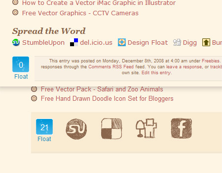
On the post pages, the social bookmarking icons have been swapped out with the Doodle Blogger Icons recently released!
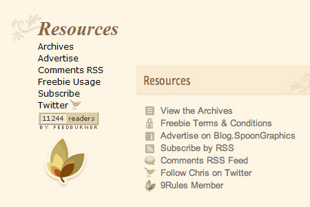
Looking a little deeper there's the new search bar, and restyled resources list, now making use of some little icons to indicate the meaning of each link.
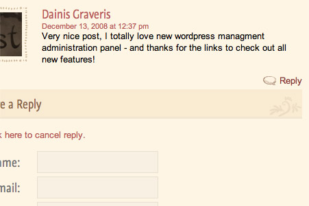
One of the main reasons behind the revamp was to implement the new threaded comments feature of WordPress 2.7. You'll now notice a small reply button next to each message, allowing users to respond to each other giving more of a flowing conversation.
Other than the noticeable visual changes, the site has also been completely reconstructed and recoded. I've managed to reduce the HTTP requests by 8 which I'm sure will help out when multiplied by a day's worth of visits. Otherwise, clean html code and a Strict Doctype make the site more presentable to the web design community.
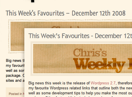
I've also enjoyed putting into practice some CSS3 styling, including @font-face, border-image and border-radius. Right now, @font-face is only viewable in Safari, but is a feature bundled with Firefox 3.1, this simply degrades back to standard web fonts for other browsers. Border-image can be seen by those on Safari and Chrome, but is also a feature coming with Firefox 3.1. Finally, gone is the large background image for the tooltips, now replaced with a small tiling background and border-radius rule to smooth off the corners, which simply degrades down to square corners for non-supporting browsers.
With jQuery already being introduced to create the tooltip effect, a few additional fancy pants features have also been included. Such things as the back to top scrolling and lightbox on a few image links make for a slightly more enjoyable browsing experience.



Looking good!
Yes, quite nice Chris.
Some good little visual changes.
nice revamp .. but there some minor alignment problem in ff2.
Thanks for the heads up, I assumed FF2 would be fine but a set of screens from Browsershots showed mis-alignment in the footer, was there anything else that you spotted?
Welcome Chris, there another I spotted is the alignment of the blue Float square.
Check the ss.
http://img234.imageshack.us/img234/9849/ssou0.jpg
Eeek! What’s that doing over there?! Thanks for the screenshot – really helps out.
All solid improvements, Chris. This is by far one of my favorite websites. Absolutely great job here!
I like the way you laid out the sidebar a lot more now. Definitely an improvement
Nice work Chris. I like how you kept the basic look and just revamped it a bit.
Evolutionary design man, that’s where it’s at!
Awesome all the way around. Looks like you’ve thought all the details through, which often sets designs apart from the crowd.
Sorry to piss in your pond Chris, but you have some rendering issues using some CSS3 rules. Your site is stable with Safari, Google Chrome and FF3. But you need to address some alignment problems with IE6 and IE7. IE8 is okay. Tip: downlaod “ietester” at “my-debugbar.com/ietester”. That will help you visually correct the rendering problems. I love your site and it is a “must see” for me on a daily basis. Keep up the great work.
No problem Ed, I appreciate any warnings if the site isn’t working correctly. I’ve been using IETester for IE6 and IE7 and layout wise it seems ok – just the PNG issue in IE6 (which I’ve yet to find a fix that doesn’t bork background-position) and the degradation of border-radius back to square corners in IE7.
If you could send over any screenshots of alignment problems that would be fantastic!
Thanks for the kind comments everyone!
Yes i know all of them cause i visiting your site 5 day at a time only just wanted to see your next graphic/photoshop tutorial
threaded comments is one of the benefits of upgrading to the latest version of WordPress. this is something i need to do with my blog.
good work on the site, keep it up!