In this week’s roundup of creative goodness, we have a selection of handy website wireframing templates; an article highlighting some interesting factors that boost the ‘wow factor’ in web designs; an interesting discussion about the risk of being unique; a fabulous vibrant Photoshop illustration tutorial; and a showcase of stationery and print design inspiration.
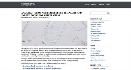
GeekChix
This great collection of resources from GeekChix pulls together some really useful templates that can be used to plan out your website design or application in sketch format. The roundup includes grids, browser interfaces, page templates and iPhone interfaces.
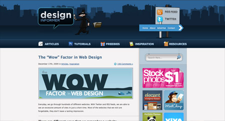
Design Informer
Design Informer host this interesting article that highlights some of the features that give a selection of websites that additional ‘wow factor’. I discovered a bunch of little design easter eggs on some of the sites that I had never seen before.
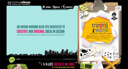
Tripping Words
This interesting article from Tripping Words discusses some of the choices designers have to make when creating websites; Do they stick within the boundaries already created or break free and dare to be different?
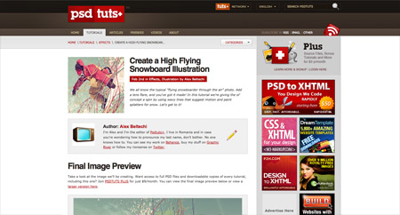
PSDTuts
I recently stumbled across this handy Photoshop illustration tutorial from the archives of PSDTuts and decided it was worth bringing back to life for anyone who might have missed it the first time round.
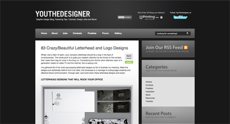
YouTheDesigner
I personally find design for print one of the best sources for design inspiration. This roundup of fantastic stationery designs from YouTheDesigner is packed full of various design styles that can help inspire you for your next project.


Great collection Chris, I stumbled upon the Psdtuts+ tutorial a couple of weeks back, a great one.
nice share, chris! thank you!
Hi isen´t there missing some comments?
By the way, where can i find this type of blog
Thanks for this post – i regularly read You the Designer and think it’s great, but wasn’t familiar with the other ones and they are well worth checking out – as is your site (my first time here!)
Tripping Words won this weekly fav. I really enjoy simplicity, but when you go the extra mile and it’s still clean then that deserves a second look.
Awesome collection, thanks
Someone did it, not me: http://btemplates.com/2010/01/31/blog-book/demo/
That GeekChix’s site is really cool. I am going to start doing some printing. Thanks!
Loving the sketch templates for iphone has come in handy for interface development.
Hi Chris, thanks again for including the article. I really appreciate it. The GeekChix post was a nice find! Thanks for sharing it.
Great collection…
another good colection.
Thx for sharing!
was conducted using a combination of social media and email solicitation. It began with a Twitter post which was then re-posted by users onto Facebook and blogs. In addition, an email list of approximately 2,500 marketers was asked to take the survey.
I also like the http://tinyurl.com/yh5k6od/ at the end, like you have it